
README file from
GithubTabsdown
Tabsdown turns ordinary Markdown into theme-native tabs in Obsidian. Tabs can contain notes, queries, embeds, callouts, math, Mermaid diagrams, and compatible community-plugin blocks.
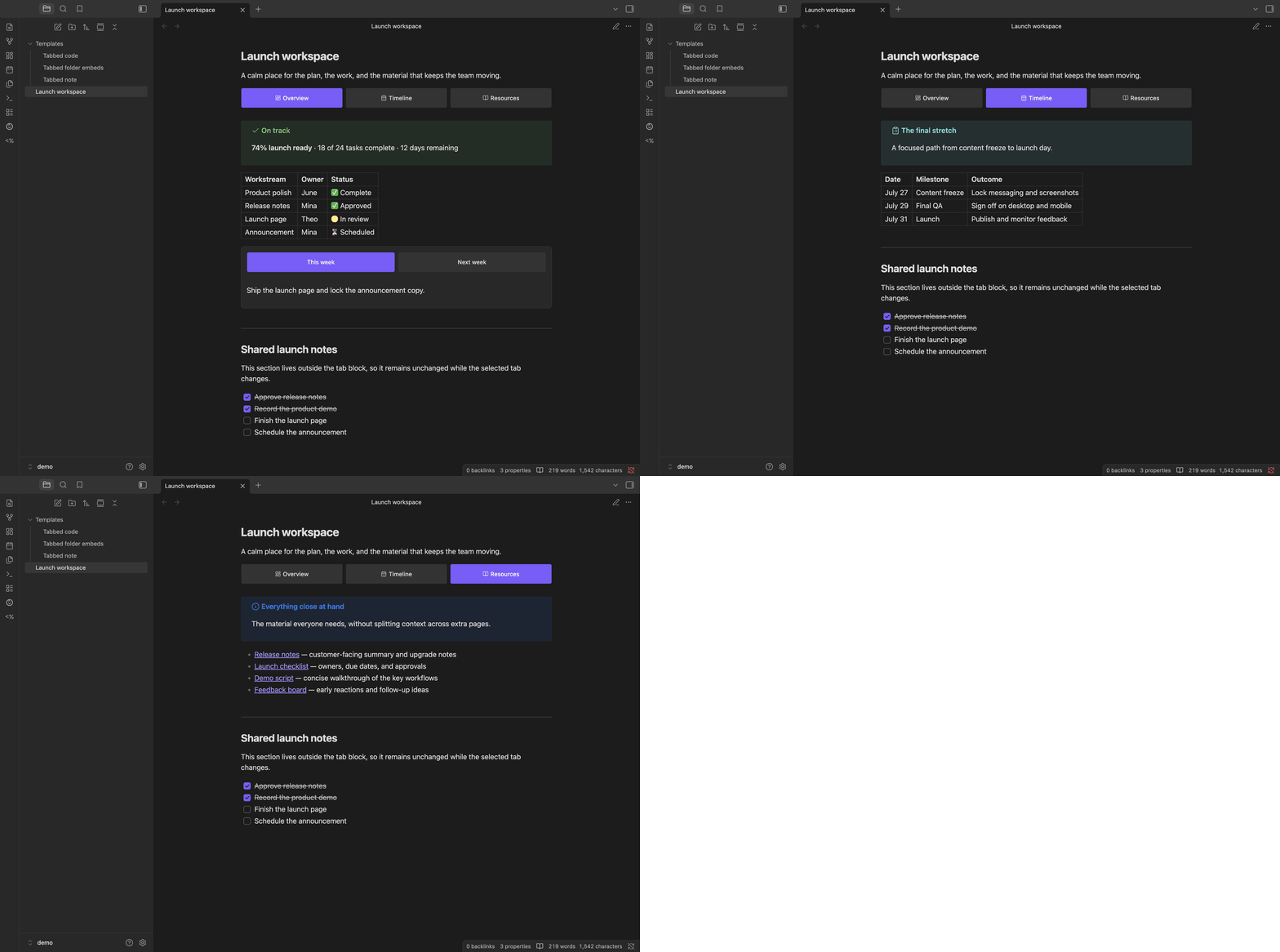
What it does
- Keeps each tab set in a fenced
tabsdownblock, so the note stays readable Markdown. - Works in Reading View and Live Preview on desktop and mobile.
- Supports nested tabs, formatted labels, Lucide icons, and tab lists on any side.
- Uses Obsidian's Markdown renderer, so links, embeds, and compatible plugin blocks keep working.
- Matches the active theme and can be adjusted with Style Settings or CSS snippets.
Syntax
Start each tab with a column-zero tab: <label> marker. A block needs at least two non-empty, unique labels. Add optional block settings as comma-separated property=value entries on a column-zero config: line before the first tab, or right-click the block in Reading View or Live Preview and choose directly from the Position, Overflow, Density, Personality, Palette, and Alignment submenus.
The context-menu action is available only when the rendered block has a writable backing Markdown file.
Add, rename, and delete tabs
- Right-click a block and choose Add tab to append a tab with an empty body.
- Double-click a tab to rename it, or right-click its label and choose Rename tab.
- Right-click a tab and choose Delete tab to remove it and its contents after confirmation. Delete is disabled when only two tabs remain.
- Enter saves the label. Escape or clicking outside cancels. A new tab is saved only after you enter a non-empty, unique label.
- The editor shows the name, including Markdown formatting. Any
icon:prefix stays hidden and is preserved when saving.
These actions update the backing Markdown, including nested and embedded blocks. If the note changes while a label is being edited, the save stops to avoid overwriting other changes. Ordinary tab switching never edits the note.
Add tab appears first in the context menu. Tab actions are separated from the block's style settings. Menus use Obsidian's platform-native behavior. Menu icons appear where Obsidian supports them; its current native macOS menu bridge omits icons.
Writing a block
````tabsdown
tab: Greedy

Greedy chooses the largest usable coin.

tab: Dynamic programming

```dataview
TABLE file.mtime
FROM "Algorithms"
```
````
Use matching backtick or tilde fences. The outer fence must be longer than any matching fence inside it. The example uses four backticks outside and three around the Dataview query. Increase the outer fence again if a tab body contains a longer fence.
~~~tabsdown
config: position=left, layout=multi, density=compact, personality=rail, palette=secondary, alignment=center

tab: Python
print("Hello Tabsdown")

tab: JavaScript
console.log("Hello Tabsdown");
~~~
position=top|left|right|bottom places the tab list and layout=one|multi keeps labels on one scrollable line or allows wrapping. Other overrides are density=default|compact, personality=button|underline|separator|rail, palette=primary|secondary, and alignment=start|center|equal-width. The example is the canonical form saved by the menu. Choices update Markdown immediately and stop without overwriting when the rendered block no longer matches the note.
Omitted values inherit in this order: explicit block override, automatic Compact density on mobile or at a container width of 28rem or less, position Style Settings, global Style Settings, then the built-in fallback. Explicit Default or Compact density stays authoritative on every device and width. The first tab starts active. Empty tab bodies are valid. To render a literal marker-looking line, escape it as \tab:.
Icons
Start a label with icon:<name> to put one of Obsidian's bundled Lucide icons before it:
```tabsdown
tab: icon:code Python
tab: icon:file-text Notes
```
An unknown icon name renders no icon, and every tab still needs a label. Escape a literal label as tab: \icon:name.
Label formatting
Labels support exactly **bold**, *italic*, ~~strikethrough~~, and backtick inline code. The same formatting works after an icon:<name> prefix and in public mountTabs labels. Multiple non-overlapping formats can share one label.
Links, wikilinks, images, raw HTML, headings, lists, and other Markdown stay visible as literal text. Unmatched, nested, overlapping, empty, or whitespace-only delimiter runs also stay literal; labels never create links or other interactive descendants.
Nested tabs
A tab body can hold another tabsdown block, as long as its fence is shorter than the one around it:
````tabsdown
tab: Backend

```tabsdown
tab: Python
tab: Go
```

tab: Frontend
Markers inside a nested block belong to that block, so the inner tab: lines above do not split the outer one and need no escaping. Each level places its own tab list and keeps its own active tab. A config: line applies only to the level that declares it.
Obsidian modes
| Mode | Behavior |
|---|---|
| Reading View | Interactive tabs on desktop and mobile. Switching tabs never edits the note. |
| Live Preview | Interactive tabs while the cursor is outside the block; fenced source while editing inside it. |
| Source Mode | Raw fenced Markdown only. |
Installation
Community plugins
Use this method after Tabsdown is listed in Obsidian's Community Plugins directory:
- Open Settings → Community plugins.
- Select Browse, search for Tabsdown, then select Install.
- Select Enable.
BRAT
Published releases and prereleases can be installed with BRAT:
- Install and enable Obsidian42 - BRAT from Community Plugins.
- Run BRAT: Add a beta plugin for testing from the command palette.
- Enter
grafanaKibana/obsidian-tabsdown. - Enable Tabsdown under Settings → Community plugins.
BRAT can install only a published release or prerelease, not an unpublished draft.
Manual installation
- Download
main.js,manifest.json, andstyles.cssfrom the same GitHub release. - Create
<Vault>/.obsidian/plugins/tabsdown/. - Copy the three downloaded files directly into that directory.
- Reload Obsidian.
- Enable Tabsdown under Settings → Community plugins.
Do not mix assets from different releases.
Guides
- Publish Tabsdown blocks with Quartz
- Embed plugin-owned panels with
mountTabs - Configure Tabsdown with Style Settings
- Customize Tabsdown with CSS snippets
- Generate Tabsdown blocks with Templater
Troubleshooting
- Fenced source instead of tabs: Enable Tabsdown, switch to Reading View, or move the cursor outside the block in Live Preview.
- Diagnostic shown: Check that
tab:markers start at column zero, labels are unique, and the block has at least two tabs. - An inner code block closes Tabsdown: Make the outer fence longer than every fence inside it, or use tildes.
- An embed or plugin block fails: Test the same Markdown outside Tabsdown first.
- Still stuck: Open an issue with the source block, Obsidian version, theme, and any related plugins.
Development and releases
Tabsdown runs entirely inside Obsidian and makes no network requests. It collects no telemetry, requires no account or payment, shows no advertising, accesses only files inside the vault, and includes no closed-source components.