
README file from
GithubPretty properties
This plugin makes properties in notes and bases more visually appealing with images, colors and custom visual elements.
The main features:
- add custom colors to properties and tags;
- insert cover image near the metadata block;
- add banner and icon to the note;
- hide specific properties from the note;
- set custom date format for date properties;
- show number property as progress-bar;
- apply your own custom formatting to any property using the template language.
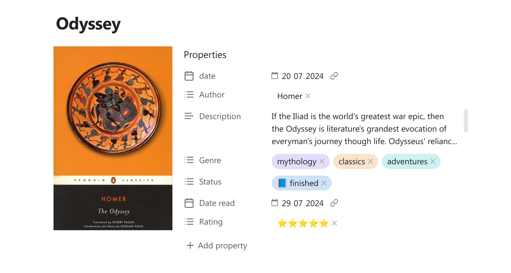
Table of contents
- Cover image
- Banner
- Icon
- Hiding properties
- Colored properties and tags
- Relative date colors
- Custom date formats
- Formatting templates
- Progress bars
- Property quick search
- Extra features
Cover image
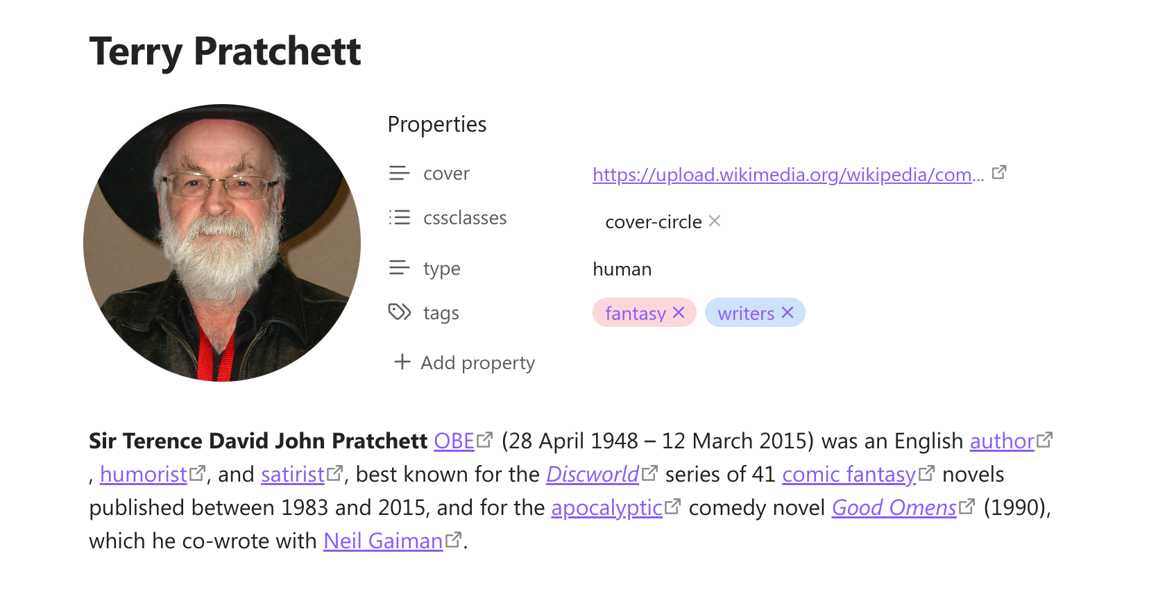
Add image near the metadata block to save space in the note. Works great for book notes, people profiles etc. You can change the shape and size of the image.
To add cover image you can use command "Select cover image" from the command pallete. Then you can select a local image from your vault or add a link to the external image. You can set specific folder in the settings to look for the local cover images.
Adding the cover will add the "cover" property to your note. Do not delete the property, it is needed for the image to show. You can hide the property instead.
In the settings you can add more then one cover property. If you put them into a note, only the first one will be rendered, but you can use the different cover properties in different notes if you wish so.
You can also edit the cover property manually instead of using the command. The plugin supports various types of data that can be pasted into a property and rendered as cover image:
- wikilinks:
![[My cover]]or[[My cover]]; - markdown links:
or[My cover](My%20cover.png); - raw URL links:
https://...; - raw file links:
file://...; - base64-encoded images:
data:image/...base64...; - links to youtube videos (will be rendered as video previews);
- Any custom text (if it is not recognised as one of the above, it will be rendered as Markdown).
You can add custom formatting template to a cover property, so the property data is transformed before rendering.
Right-click on the cover to change it's shape, position or select another image. You can use initial shape with 3 custom widths, vertical, horizontal, square and circle. You can set the custom width for every shape in the settings.
[!NOTE]
Cover shapes would look a bit different in narrowed windows or on devices with small screen. This is intentional to make them look more neat in the limited space.
Changing position allows you to place the cover on the left, right, top or bottom of the metadata block. You can set the default position in the settings.
Banner
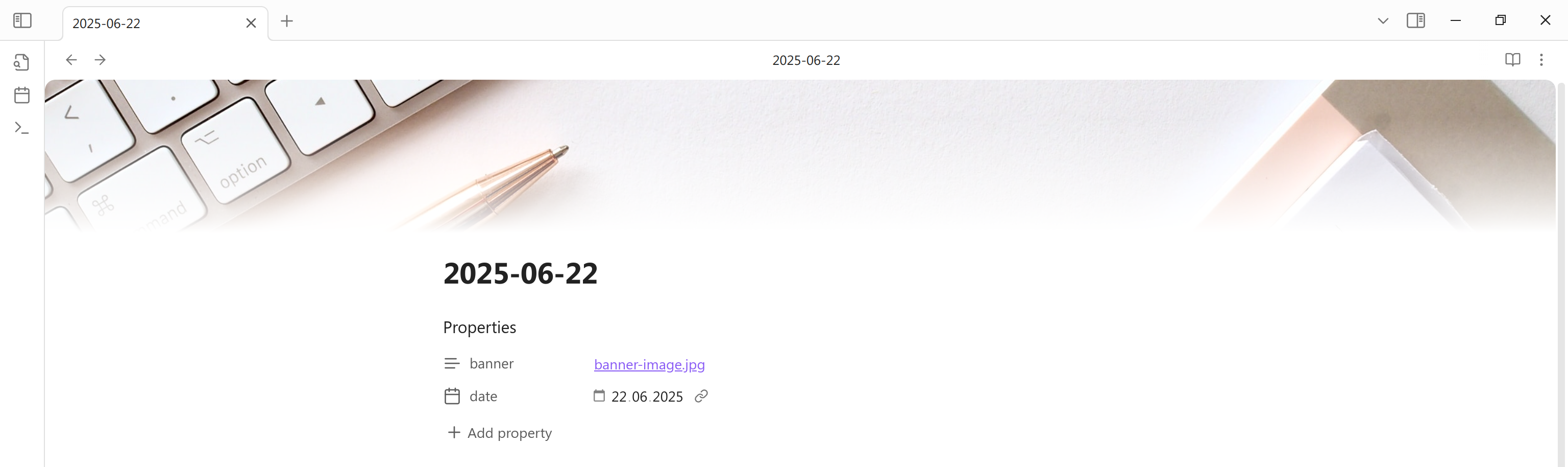
You can add banners to your notes. To do so run command "Select banner image". It will add the "banner" property to your note. Right-click on the banner to change the banner image or it's position.
You can set specific folder to look for the local banner images.
You can edit the banner property manually. There are the supported kinds of property data for banners:
- wikilinks:
![[My cover]]or[[My cover]]; - markdown links:
or[My cover](My%20cover.png); - raw URL links:
https://...; - raw file links:
file://...; - base64-encoded images:
data:image/...base64....
If you are using some other banner plugin, like Pixel Banner or Simple Banner, it may conflict with the Pretty Properties' banners. To avoid this you can go to the settings and turn the banner feature off. Alternatively you can just change the banner property. This way you can use Pretty Properties' banners in some notes and the different plugin's banners in another notes.
Icon
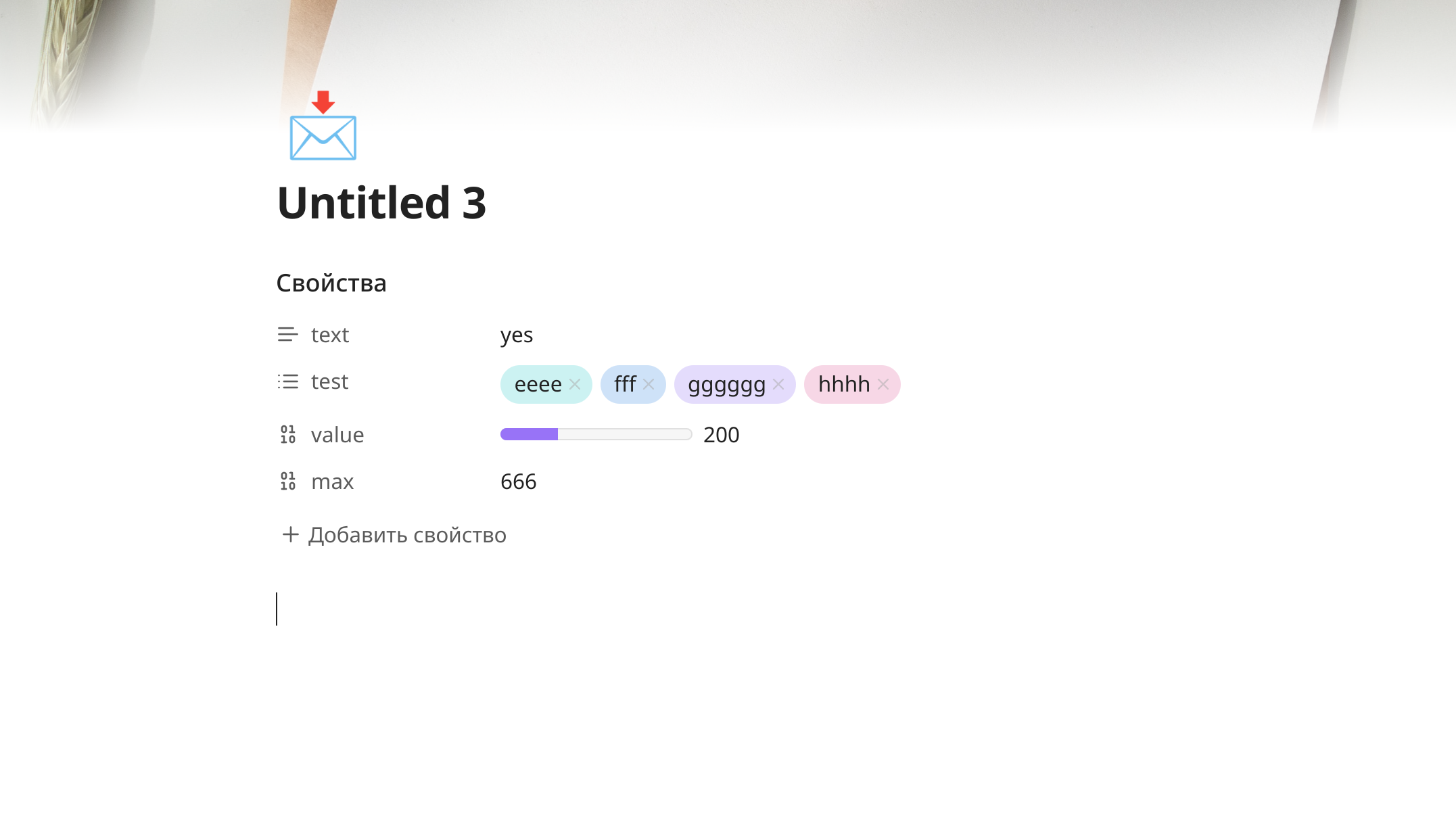
You can add icons alongside tha banner or just on their own. To do this run the command "Select icon". This will ad the "icon" property to you note. For the icon you can use images, built-in Obsidian icons or any symbols, including emoji. You can set a specific folder to look for local icon images.
You can edit the icon property manually. There are the supported kinds of property data for icons:
- for image icons:
- wikilinks:
![[My cover]]or[[My cover]]; - markdown links:
or[My cover](My%20cover.png); - raw URL links:
https://...; - raw file links:
file://...; - base64-encoded images:
data:image/...base64...;
- wikilinks:
- for SVG icons add the name of the icon, for example
star; - any other text will be rendered as is, you can use it to add the one or several emojis or some additional title. Just keep in mind that the icon text will not wrap, so don't make it too long.
In the settings you can select the opion to show icon inside the inline title instead of the top of the note.
Hiding properties
If you have many properties in the note, you may want to hide some of them while keeping the others visible. This plugin makes it easy. Click on the property icon and select "Hide property" in menu. If you want to see it again, run command "Toggle reveal / hide all hidden properties". After that you will see the hidden properties and can mark them as not hidden.
Banner, cover and icon properties can be hidden or revealed from the menus opened by right-clicking on the banner / cover / icon image.
You can also mark the property to only be hidden if it is empty. Or you can set all empty properties to be hidden by default in the settings.
Additionally you can hide the properies header and property adding button. There is also an option to hide the whole metadata block if all properties in it are hidden.
If you are using the keyboard navigation, all hidden elements will be temporarily revealed when you focus on them with keyboard. I allows you to edit any properties without unhiding them.
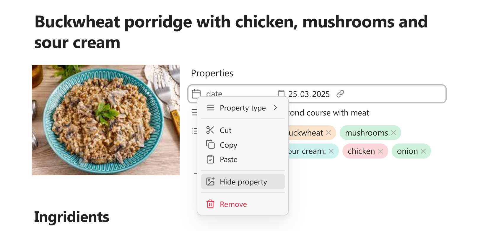
Colored properties and tags
You can assign their own colors to the property values. It includes list properties, text properties and tags. Assigning colors to tags affects both frontmatter tags and inline tags inside the note.
To change the color of the list or tag property open the color menu by right-clicking on the property pill. To change the color of the text property hover over property value to reveal the color button. Remember, then the color assigned to the specific text, so if you edit the text the color may disappear.
Chosing the "Select color" option will affect both text color and the background of the property pill. By default the text color is set to have the same hue as the background color but with enough contrast to be readable. Chosing the "Select text color" option will only change the text color independently of the background.
In the color selection menu you can chose from the set of the rainbow colors and the accent color that are defined by you theme. You can also chose a custom color from the color picker. Finally you can chose the options "none" or "default". "None" will make the property background transparent and the property text the same as the regular text color. "Default" will return the property colors to those that are defined by your theme.
You can edit the color menu by adding your own saved custom colors and disable the theme colors you don't want to use.
You can also add you own styling to the properties via CSS. For this each property element get special data-attribute containing the actual value. It can be used for styling like this:
[data-property-pill-value="my-list-property-value"] {    /* my styles */}
[data-property-value="my-text-property-value"] {    /* my styles */}
[data-property-value="my-tag-value"] {    /* my styles */}
If you are using Pretty Properties alongside the Notebook Navigator plugin, you can enable sync the property colors of two plugins. You can set the options to change Notebook Navigator colors when Pretty Properties colors are edited, or change Pretty Properties colors when Notebook Navigator colors are edited, or both.
Relative date colors
Every date property gets an attribute "data-relative-date" with the possible values being "past", "present" and "future". It allows to style dates differently based of their relation to the current time. You can add some css yourself or you can select the colors from the pickers in the settings to mark past, present and future dates.
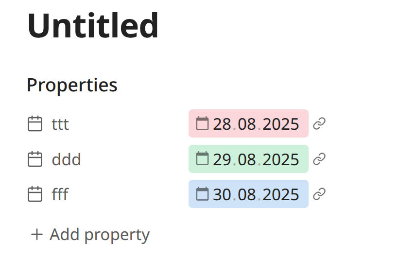
Relative date attributes are not updated automatically as the time pass. If the time have come for the "present" date to be turned into the "past" date, you need to reopen the note to change the color.
Custom date formats
You can select custom formats for the date and datetime properties. Set format in the settings using the moment.js syntax.
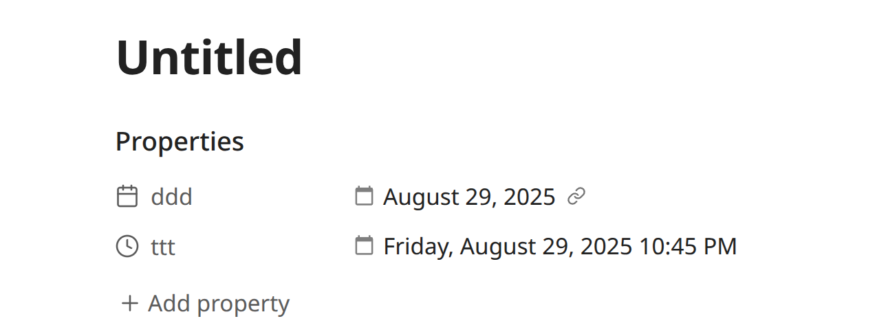
Custom dates in bases are disabled by default, because they can make bases slower. You can turn them on in settings (an alternative could be a formula in bases like datetime_property.format("YYYY-MM-DD HH:mm:ss")).
Formatting templates
The formatting settings is an experimental feature that allow you to display properties differently by replacing the value with a special template. This allows you to for example store a number property that represents a duration in seconds (eg. 829), but render it visually as a human readable duration (eg. 13m 49s). This avoids having to store the same value twice in a note in multiple formats.

You can set the formatting templates in the plugin settins. The template should be written using Handlebars, a templating language similar to Obsidian's built in date/time template syntax.
The syntax uses double curly braces around helper names. Arguments are passed as space-separated values and can be nested.
Pretty Properties adds {{propertyValue}} and {{propertyName}}, which will be replaced by the respective content.
Supported helpers
Currently supported helper packages are:
- just-handlebars-helpers for general utilities;
- handlebars.moment for time and duration.
Additionally to make some functionality more easily accessible Pretty properties also adds custom helpers:
{{durationAbbreviated}}**
Converts a duration into an abbreviated format, omitting leading zero units.
Params:
time{Number}: The input valueunit{String}: The unit of the input valuereturns{String}
{{durationFormatted}}
Turns a duration into the specified format. Params:
time{Number}: The input valueunit{String}: The unit of the input valueformat{Boolean}: Optional. See dayjsreturns{String}
{{durationHumanized}}
Converts a duration into a natural-sounding string. Params:
time{Number}: The input valueunit{String}: The unit of the input valuewithSuffix{Boolean}: Optional. Will add "in " at the front or " ago" at the end.returns{String}
Example Templates
Show a duration originally in seconds as human readable (eg. 829 -> in 14 minutes):
{{durationHumanized propertyValue "s" true}}
Show a duration originally in seconds as a clock (eg. 829 -> 00:13:49):
{{durationFormatted propertyValue "seconds" "HH:mm:ss"}}
Show a duration originally in seconds as abbreviated (eg. 829 -> 00h 13m 49s):
{{durationFormatted propertyValue "seconds" "HH"}}h {{durationFormatted propertyValue "seconds" "mm"}}m {{durationFormatted propertyValue "seconds" "ss"}}s
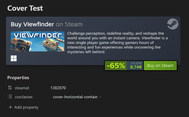
Show a steamid property as an iframe (to render cover as iframe add this template to the cover setting instead of the property format settings):
<iframe src="https://store.steampowered.com/widget/{{propertyValue}}" frameborder="0" width="100%" height="190"></iframe>
Progress bars
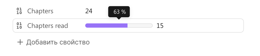
Right-click on the number property icon to add simple progress bar to any number property. By default maximum value of progress bar is 100 and property value is treated as percent. If you want to add custom number as progress maximum, you need to add additional number property to the note and in the first property menu select the option "Set max progress from another property".
Progress bars are not supported in bases, because you can create progress-bars using regular base formulas. Here is a couple of examples of formulas you can use (or you can write your own).
Progress-bar formula:
if( note["maxProperty"], html("<progress class='metadata-progress' max='" +
note["maxProperty"] + "' value='" +
if(note["valueProperty"], note["valueProperty"], 0) +
"' aria-label='" +
if(note["maxProperty"], (if(note["valueProperty"], note["valueProperty"], 0) / note["maxProperty"] * 100).round(), " ") + " %" +
"' data-tooltip-position='top' data-tooltip-delay='500'>"), "")
Progress circle formula:
if(note["maxProperty"], html("<div class='metadata-circle-progress'  style='background: radial-gradient(closest-side, var(--background-primary) 64%, transparent 65% 100%), conic-gradient(var(--color-accent-1) " + if(note["maxProperty"], (if(note["valueProperty"], note["valueProperty"], 0) / note["maxProperty"] * 100).round(), 0) + "%" + ", var(--background-secondary) 0);' aria-label='" +
if(note["maxProperty"], (if(note["valueProperty"], note["valueProperty"], 0) / note["maxProperty"] * 100).round(), " ") + " %" +
"' data-tooltip-position='top' data-tooltip-delay='500'></div>"), "")
Selection buttons
You can add selection buttons to the text properties. Clicking the button opens dropdown menu that allows you to select from predefined options. It can be useful, for example, to quickly switch between note statuses.
To add selection button go to the additional elements settings and add the rule for the selected property. You can add different sets of options based on the note folder. For example, in the "Books" folder your "status" property can have options "want to read", "reading" and "finished", but in the "Tasks" folder you statuses can be "to do", "done" or anything else.
If the property is added to the list but have no rules, selection button will show all it's existing values instead. These values can not be filtered. Clicking on the property directly, instead of the button, will show the original selection dropdown.
Property quick search
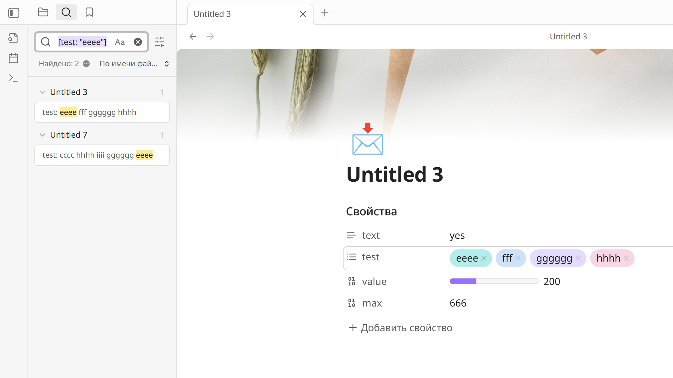
If you Ctrl+click on any property value, the plugin will open search for this value in the search tab (works only on desktop). If the property value is a link you should click outside the link.
Extra features
There are couple of the extra features added mostly to reuse the existing code. They will be not developed furter but you may find them useful.
-
Commands in command pallette to insert a local image or an emoji into a note. Let you chose an image or emoji from the visual selection menu, the same as used when you select a cover or an icon.
-
When you right-click on an inline tag in a note in the editor menu added the option to quickly delete the tag.