
README file from
GithubFolio
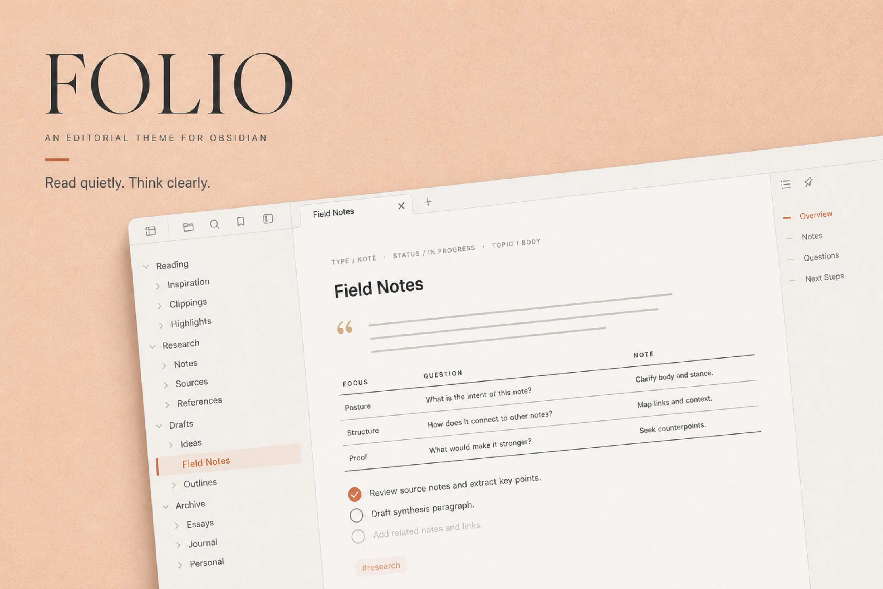
An editorial theme for Obsidian. Read quietly. Think clearly.
中文介绍 · Light and dark · Desktop and mobile · No plugin required
Folio gives long notes the pace of a manuscript. Warm paper tones soften the screen. Spacious type, restrained color, and quiet controls keep attention on the page.
It suits writing, research, and knowledge work that asks you to stay with a document for a while.
Design language
Folio uses a compact palette with clear roles:
| Color | Role |
|---|---|
| Ivory | Reading and writing surface |
| Slate | Text and headings |
| Clay | Links, focus, selection, and active states |
| Charcoal | Dark mode surface |
The light theme uses several warm ivory values to separate the editor, sidebars, tabs, and floating surfaces. The dark theme follows the same hierarchy in charcoal rather than reversing the light palette.
Headings and body text share a sans-serif family by default. This keeps mixed Latin and CJK text steady across sizes and platforms. Interface text remains subdued, while code uses a dedicated monospace stack.
Details that shape the page
- Typography: a 17px reading size, relaxed line height, compact heading scale, and deliberate spacing between sections
- Blockquotes: a small quotation mark and indentation replace the usual vertical border
- Tables: three editorial rules define the table without vertical lines, zebra stripes, or a card frame
- Links and tags: links inherit the text color until hover; tags use a pale clay tint
- Tasks: circular checkboxes fill with Clay, while completed items fade without a strikethrough
- Navigation: slim Clay indicators mark the current file and outline position
- Callouts: eleven semantic colors use light tints and a narrow accent edge
- Code: warm syntax colors distinguish keywords, strings, numbers, comments, and symbols
- Paper texture: a fine grain sits inside the reading surface and stays out of print and PDF output
Folio also covers properties, embeds, Canvas, menus, modals, inputs, settings, keyboard focus, high-contrast mode, and reduced-motion preferences.
Optional snippets
Folio keeps one default appearance. The bundled snippets offer a few deliberate variations:
folio-heading-font-serif.cssrestores serif headings while leaving body text and interface chrome sans-serif.folio-font-serif-anthropic.cssswitches document text and headings to a reading serif stack led by Charter and CJK serif fallbacks.folio-h2-color.cssgives H2 headings a warm clay tone.
Copy a snippet into <vault>/.obsidian/snippets/, then enable it under Settings → Appearance → CSS snippets.
Installation
Install Folio from the Obsidian community theme browser:
- Open Settings → Appearance → Themes → Manage.
- Search for Folio.
- Install and enable the theme.
For manual installation, download theme.css and manifest.json from the latest release and place them in:
<vault>/.obsidian/themes/Folio/
Compatibility
- Obsidian 1.5.0+
- Light and dark modes
- Desktop and mobile
- No plugin dependency