
README file from
GithubReport Writer
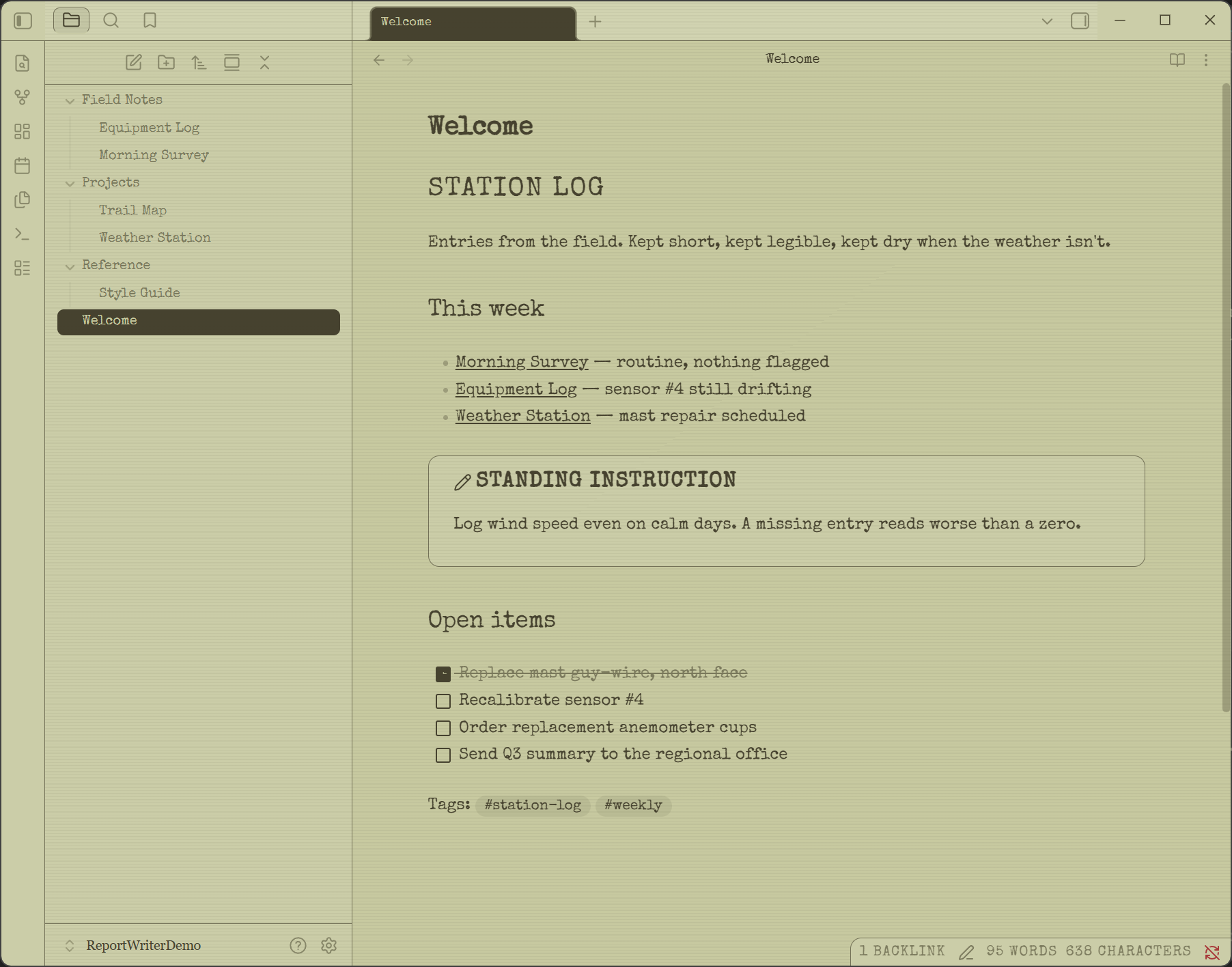
An Obsidian theme built around old-display aesthetics — three selectable Display types (LCD, E-Ink, Color E-Ink), each with its own light and dark look, layered under a shared Cartridge hue picker, a device/document typography split, and a consistent set of chrome (rounded device-panel modals, hairline borders, hard-contrast inverted-fill selection bars), the way a reflective monochrome LCD (Game Boy Pocket / Pokédex / graphing calculator / digital clock) reads.
| Light | Dark |
|---|---|
 |
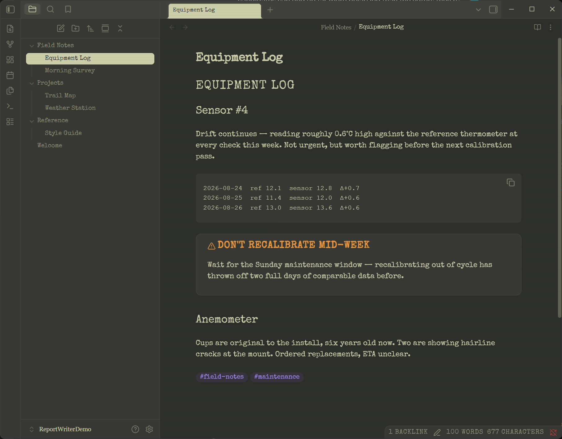 |
Shown with Style Settings configured, not necessarily the raw install defaults — a fresh install looks like LCD display, Sage cartridge, Special Elite typewriter throughout (headings, body, and chrome), with VT323 as the pixel face whenever you opt into Pixel anywhere.
Features
- Three display types — LCD, E-Ink, Color E-Ink, each with its own light and dark palette
- Cartridge hue picker — Sage, Dusty Blue, Amber, Paper, or a custom pair of hex colors
- Device/document typography split — a pixel font for the screen's own chrome, a typewriter font for the document it's showing, independently adjustable
- Five font pickers — Pixel, Typewriter, Heading, Device, Body —
nine fonts total, embedded directly in
theme.css, no network dependency - Deeply configurable via Style Settings — every bullet above is live-adjustable from Obsidian's own Settings pane; the theme still looks correct with sensible defaults if you don't install it (full list in Style Settings below)
- Confirmed working on desktop and Obsidian Mobile
Display (Style Settings)
- LCD (default) — a fully-saturated duotone screen tint + ink text, rounded "device" panels, soft shadow, optional scanline texture.
- E-Ink — a neutral paper surface only lightly tinted (~22%) by the Cartridge hue, flat (no shadow), smaller "paper" corner radius — closer to a Kindle/Kobo.
- Color E-Ink — the same flat paper chrome as E-Ink, plus four fixed
accent hues (tan
#d1c6b4→text-tuned, pink#d7a8be→text-tuned, gold#ded4ab→text-tuned, blue#85a0b8→text-tuned) applied to headings, links, tags, code, and callouts by type — muted colors layered over one scene, the way a Game Boy Color game palette-swaps sprites, or a Kaleido-style color e-paper panel renders a few desaturated colors at once. The primary heading (H1) and success/tip callouts use the current Cartridge's own ink/screen tone instead, so the Cartridge picker still matters here.
Light and dark
Each Display type has its own light/dark pair, and Obsidian's own light/dark setting switches between them (the Cartridge and Display choices carry over to both):
- LCD — Light is "reflective": screen-tint background, ink text. Dark is "backlit": a neutral charcoal ground with the cartridge showing through in the text and accents, rather than the cartridge ink deepened. That distinction matters — deriving the dark ground from the ink gave a milky sepia sidebar, and made Amber flood everything brown and Dusty Blue flood everything navy. Only an 8% tint of the cartridge reaches the ground now, so cartridges still feel different without taking the room over.
- E-Ink — Light is warm paper with near-black text; Dark is a neutral grey paper, like a Kindle/Kobo night mode.
- Color E-Ink — same paper/night structure as E-Ink, on a deliberately neutral grey ground so the four accent hues stay the only color in the room, brightened for dark mode so they still read.
In all three, elevated surfaces (sidebar, tab bar) lift toward a neutral sage-grey rather than pure white — mixing a tinted dark with white is what turns it milky — and in small steps (roughly 17% → 21% → 25% lightness).
Typography
The organizing idea is an e-reader: a screen whose own chrome is pixel-rendered, showing a document that is typeset. Two independent layers:
- Device — the screen talking about itself: status bar, buttons, menus, modal titles, callouts, settings headers, dropdowns.
- Document — the page it's showing: note headings, body text, sidebar file/folder names, tab titles, search results.
Both layers ship defaulting to typewriter, so the theme reads as an old-fashioned instrument out of the box rather than a retro-game readout. Pixel is there as an accent you can bring in for either layer independently — anywhere from a single opted-in element up to "pixel everywhere" — five Style Settings pickers control it:
Pixel font — which dot-matrix face draws the Device layer (and Heading/Body when set to Pixel). All SIL OFL 1.1:
- VT323 (default) — green-phosphor terminal
- Silkscreen — true 8×8 dot-matrix
- Press Start 2P — arcade, wider/bolder
- Pixelify Sans — softer, real lowercase
- DotGothic16 — digital-clock dot matrix
- Jersey 10 — scoreboard/jersey digits
VT323, Jersey 10, and Press Start 2P are auto-compensated in size against the others — their natural x-heights are quite different, so switching between them shouldn't mean also hand-tuning size.
Typewriter font — which face draws the Document layer (and Heading/Body/Device when set to Typewriter):
- Special Elite (default, Apache 2.0) — inked and slightly distressed
- Courier Prime (SIL OFL 1.1) — clean modern typewriter
- Cutive Mono (SIL OFL 1.1) — thin vintage strike
Heading font — note headings specifically, split out from the rest of the Document layer so you can tune it on its own:
- Typewriter (default) — headings read as part of the document
- Pixel — headings move to the dot-matrix face, so the note itself reads like a device readout
- Match body font — removes the distinction from Body entirely
Only H1 takes uppercase+tracking under Typewriter, so it reads as a title stamped at the top of the page while H2–H6 keep a normal typeset hierarchy.
Device font — the whole chrome layer at once:
- Typewriter (default) — chrome matches the document
- Pixel — the "screen talking about itself" look
- Match heading font — ties the two together
This is the main dial for how much LCD/E-Ink pixel identity shows up at all — the default keeps both layers on the document's own typewriter face.
Body font — the actual note text, reading and writing:
- Typewriter (default) — reuses whichever face is picked above
- Serif — a Georgia system-font stack, not bundled
- Pixel — also reuses the face above; included because it's your call to make, not a recommendation — genuinely hard to read at length
All nine fonts are embedded directly in theme.css as base64 data URIs
rather than external files — Obsidian resolves relative url() paths
against its own app shell, not the theme's folder, so external font
files silently fail to load; embedding sidesteps that entirely, needs
no network access, and works offline and on mobile, at a cost of
~250KB. License texts for all nine are still in fonts/ for
attribution, even though the font data now lives in theme.css.
Installing
Via Obsidian (once approved as a Community Theme): Settings → Appearance → Themes → Manage → search "Report Writer" → Install.
Manually: download this repository and place its contents — keeping
manifest.json and theme.css together (the fonts are embedded in
theme.css itself; the fonts/ folder only holds license texts for
attribution) — in a folder named Report Writer inside your vault's
.obsidian/themes/ directory. Then in Obsidian: Settings →
Appearance → Themes, select Report Writer.
Style Settings (optional, recommended)
Install the community plugin Style Settings to unlock:
- Display — LCD (default), E-Ink, or Color E-Ink. See above.
- Cartridge — swap the screen's hue family: Sage (default, khaki-olive), Dusty Blue, Amber, Paper, or a Custom pair of hex colors. Drives LCD and E-Ink fully; Color E-Ink uses it only for the primary/success hue (see above).
- Pixel font / Typewriter font / Heading font / Device font / Body font — see Typography above.
- Device text scale — size of device-chrome text (sidebar nav labels, buttons, dropdowns, menus, settings section headers) relative to Obsidian's own UI text. Default 0.78.
- Device corner rounding — how rounded panels/modals/cards are on LCD. E-Ink and Color E-Ink always use their own flatter corners.
- Disable scanline texture — turn off the faint horizontal-line overlay, on by default on LCD for extra CRT/LCD grit (never shown on E-Ink/Color E-Ink, regardless of this).
Without Style Settings installed, the theme still looks correct — it just uses the built-in defaults: LCD display, Sage cartridge, Special Elite throughout (device chrome, headings, document, body), VT323 as the pixel face if you opt into Pixel anywhere, 18px rounding, scanlines on.
Installing on mobile
Same as desktop: copy the Report Writer folder into .obsidian/themes/
in your vault — via a sync service (Obsidian Sync, iCloud, a git-based
sync plugin) since there's no in-app file browser on mobile to place it
manually. Confirmed working on mobile: the theme renders correctly, the
embedded fonts load (no fallback to system fonts), touch targets are
usable, and the Style Settings pickers are reachable and functional in
the mobile Settings UI.
Status
v0.1.2. Defaults changed from v0.1.0: Pixel font now defaults to VT323 (was Silkscreen), and Body font and Device font now both default to Typewriter (were Serif and Pixel) — the out-of-box look is now typewriter throughout, with pixel as an opt-in accent rather than the default chrome. Fixed a real sizing bug this exposed: device-chrome font-size was multiplying by whichever Pixel font happened to be selected regardless of whether that layer was actually displaying it — e.g. Device set to Typewriter still inherited VT323's 1.3× size compensation. Each layer (Body/Heading/Device) now tracks its own active scale, only applying pixel compensation when pixel is what's actually rendering. Also added a "Device text scale" slider and fixed the note title and Properties panel (frontmatter) never having been targeted, silently falling back to Obsidian's default font. Core Obsidian UI is covered: workspace, sidebars, tabs, modals, command palette and menus, settings, checkboxes, scrollbars, form inputs, the native title bar, and all three Display types in both light and dark. Bases (table/card views) has a first pass — it's a newer core feature that doesn't expose a font-family hook the way it does for size, so styling it took more forcing than everything else and hasn't been checked against every view type. Confirmed working on Obsidian Mobile (rendering, fonts, touch targets, Style Settings). Not yet covered: third-party plugin UI (Kanban, Dataview, Excalidraw, etc. may look inconsistent until each is checked individually).