README file from
GithubAtelier
A warm, editorial Obsidian theme — cream/parchment paper, a coral accent, Newsreader serif display headings with coral italic emphasis, and mono small-caps labels, with intentionally-dark "honor / CTA" cards. Light-first with a warm dark variant.
Its signature is a webpage-like card system you compose in plain Markdown, plus reusable text
utilities so any run of text can be restyled inline. Everything resolves through --at-* design tokens,
so a single accent picker recolours the whole theme.
Companion theme: Lucid shares the same card / column / utility syntax — switch between them and your layout is preserved; only the skin (frosted glass
- blue) changes.
Install
From Obsidian (once published): Settings → Appearance → Themes → Manage → search Atelier.
Manually: copy manifest.json + theme.css into <vault>/.obsidian/themes/Atelier/, then pick
Atelier under Settings → Appearance.
Requires Obsidian 1.5.0+. Install the Style Settings plugin to customise colours, fonts, sizes, the default-style dropdowns, and animations. Bundled Google Fonts (Newsreader / Inter / JetBrains Mono) need internet on first load — turn on "Use system fonts" in Style Settings for offline/mobile.
Tutorial
1. Cards — a layout + a style
Wrap any number of cards in > [!grid]; they flow into as many columns as fit and reflow on resize.
> [!grid]
> > [!card] One
> > [!card] Two
> > [!card] Three
- Lock columns:
> [!grid|cols2]…cols6. - Span a card:
span2,span3,spanfull. - Nest a
[!grid]inside a card.
Nesting rule: child cards use
>>and must be separated by a blank>line.
Pick a card style with > [!card|<style>] (bare [!card] follows the Default card style dropdown):
| Style | Look |
|---|---|
skill |
kicker, big serif title, dark command bar, coral 01 02 03 steps |
section |
flat column block — coral ###### I · LABEL (use in cols3) |
step |
coral ring + ###### Step 0N (use inside a hero) |
profile |
centered avatar, coral label, serif name, link |
honor |
dark — rank badge, ringed avatar, serif pull-quote, big coral stats |
channels |
dark — table of #channel | LABEL rows |
hero |
big serif display heading + buttons; add split for a side-by-side hero |
Surfaces: add dark or accent (> [!card|profile dark], > [!card|hero accent]).
Buttons (hero): **[Label](url)** → filled pill; [Label](url) → outline.
Emphasis: *italic* words in any title/heading render in coral.
2. Multi-column notes — [!columns] + [!col|wN]
Plain note content in columns of any ratio:
> [!columns|ruled]
> > [!col|w3]
> > ### Narrow
> > - point one
> > [!col|w7]
> > ### Wide
> > ~70% of the width.
Weights w1…w10; add ruled for dividers.
3. Infobox — [!infobox|right]
A wiki-style text infobox that floats left/right/center and lets body text wrap beside it.
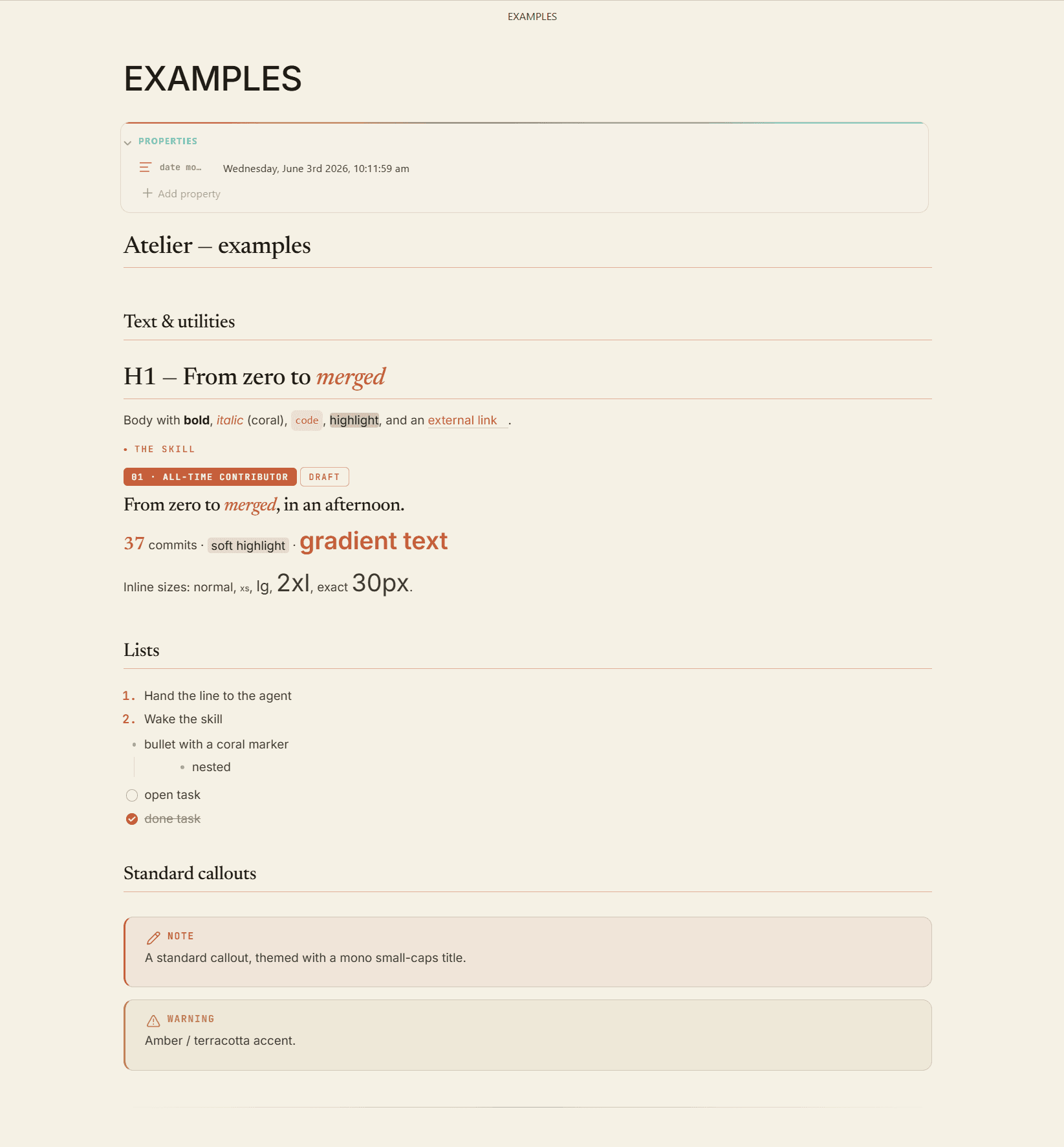
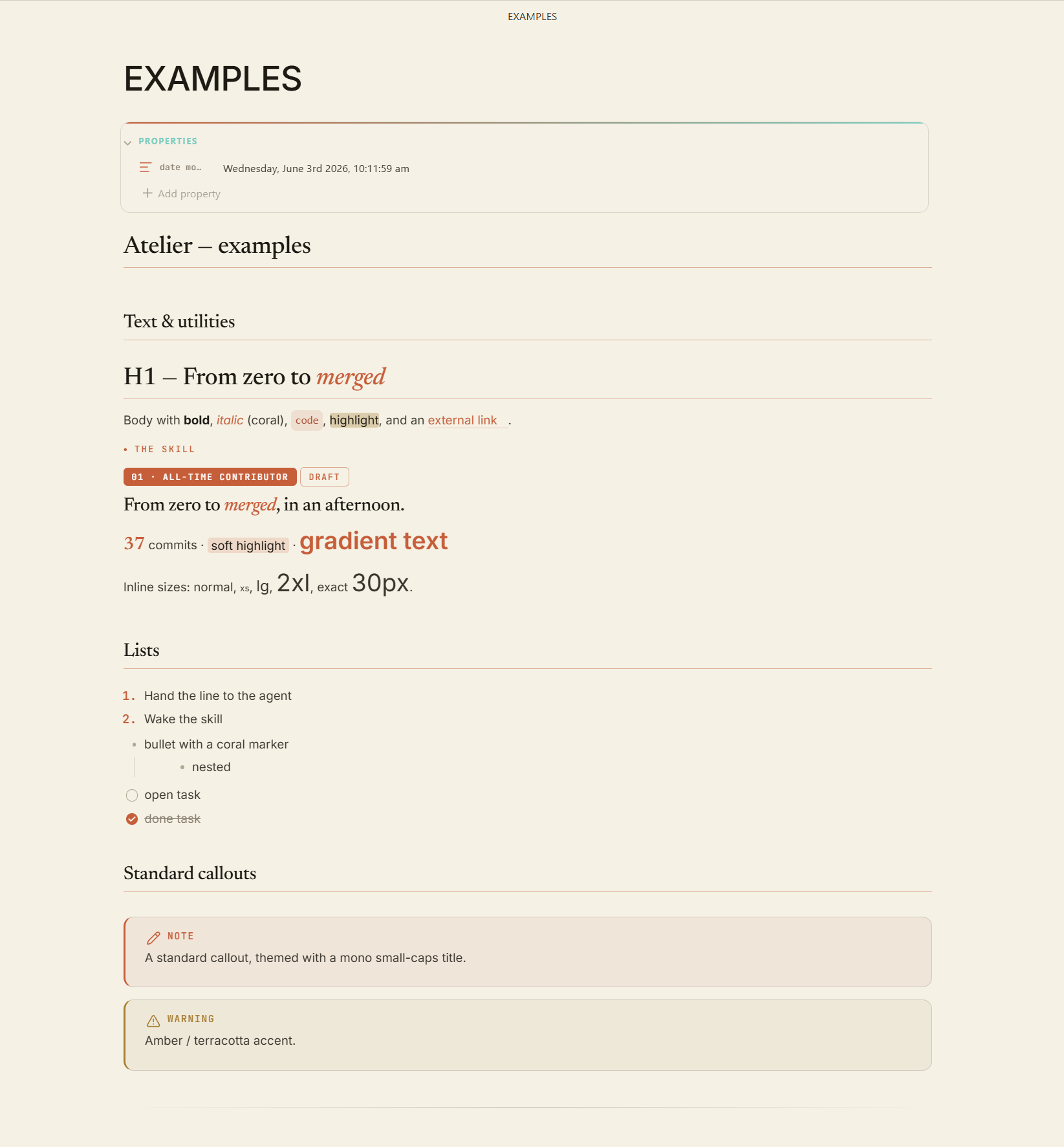
4. Reusable text utilities (inline HTML, restyle with the palette)
| Class | Effect |
|---|---|
at-kicker |
mono small-caps coral label with a dot (.no-dot to drop it) |
at-badge |
filled coral pill (.ghost = outline) |
at-display |
serif display line (<em> → coral) |
at-lead |
large muted lead paragraph |
at-stat |
big coral numeral |
at-mark |
soft coral highlight |
at-gradient |
single accent-colour text (a gradient in Lucid) |
Inline font size: at-xs · at-sm · at-md · at-lg · at-xl · at-2xl · at-3xl · at-4xl, or exact with
at-fs + style="--fs: 30px". They compose — e.g. class="at-gradient at-2xl".
5. Tags, headings, body size
- Tags auto-tint by category; Tag style dropdown: pill · outline · mono-caps · underline.
- Headings — Heading style dropdown; per-heading
#center/#right/#left. - Body size — Style Settings slider, or per-note
cssclasses: [text-lg].
See EXAMPLES.md for a ready-to-paste note exercising every feature.
Customising
Settings → Style Settings → Atelier — accent & colours, font dropdowns, note width, roundness, default card/infobox/tag/heading styles, body size, gradient colour, and animations.
Credits
- Inspired by the open-design.ai community page.
- Fonts: Newsreader, Inter, JetBrains Mono (Google Fonts).
- License: MIT.