
README file from
GithubEnglish · 中文 · 日本語 · 한국어 · Français · Español · Italiano
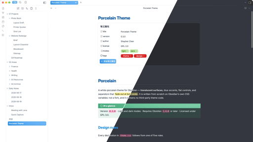
A white-porcelain Obsidian theme — translucent surfaces, blue accents, flat controls, separators that fade at both ends.
Written from scratch on Obsidian's own CSS variables. It is not a fork and contains no third-party theme code.
Design rules
The theme follows five rules, and every declaration in theme.css is downstream of
one of them:
- Surfaces are translucent and share one tint. Panes are not opaque cards. The
glass is a single fixed, empty layer — putting
backdrop-filteron a container that holds the interface makes every child repaint invalidate the whole filtered layer, so hovering a file list costs a full-window blur recompute. - Nothing is embossed. Depth comes from one 1px outline. No stacked inset highlights, dark inset edges, or drop shadows.
- Separators fade out at both ends. A border spans its element exactly, so sibling containers with different padding produce lines that start and stop at different offsets. A gradient with transparent ends has no endpoint to misalign.
- Colored blocks carry an off-axis bloom. Three radial gradients with different focal points, sizes, and falloffs — no linear direction reads through.
- State changes alter color only. Never padding, border width, or position, so nothing shifts under the cursor.
Install
- Download
manifest.jsonandtheme.css. - Put both in
<vault>/.obsidian/themes/Porcelain/. - Settings → Appearance → Themes → Porcelain.
Recommended
- Appearance → Translucent window: on. The surfaces are translucent by design; with it off they render as flat color.
Customising
Tokens are declared at the top of theme.css under .theme-light / .theme-dark
and body. The ones worth knowing:
| Variable | Controls |
|---|---|
--pc-tint / --pc-veil |
Base surface color (rgb triplet) and coverage |
--pc-sidebar-tint / --pc-sidebar-veil |
How far the sidebars sit off the content plane |
--pc-line |
Separator and outline color |
--pc-blue / --pc-orange |
Selection and hover fills |
--pc-bloom-light / --pc-bloom-dark |
Bloom gradient strength on colored blocks |
--pc-fade-in / --pc-fade-out |
Where separators start and stop fading |
--pc-popup-bg / --pc-popup-blur |
Menu, modal, and settings glass |
Override them in a CSS snippet rather than editing theme.css, so updates don't
overwrite your changes.
Plugin support
- Notebook Navigator — selection and hover states, quick-action buttons, and header layout are matched to the theme.
License
GPL-3.0. See LICENSE.
You may use, modify, and redistribute it, including commercially. If you distribute a modified version, it has to stay under GPL-3.0, ship its source, and state that it was changed.