
README file from
GithubFluent
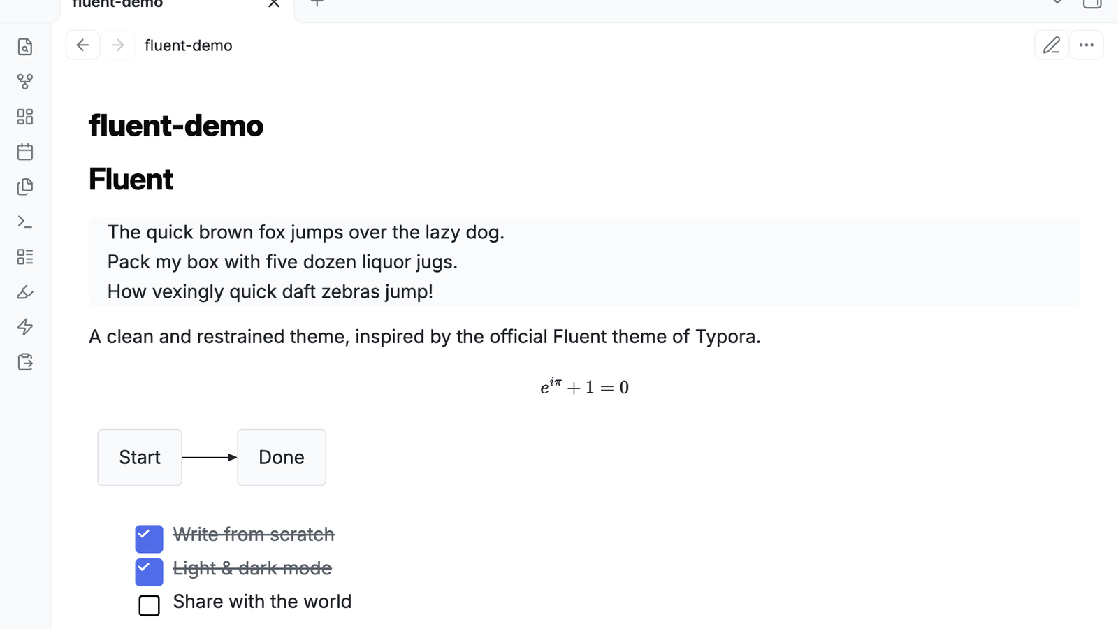
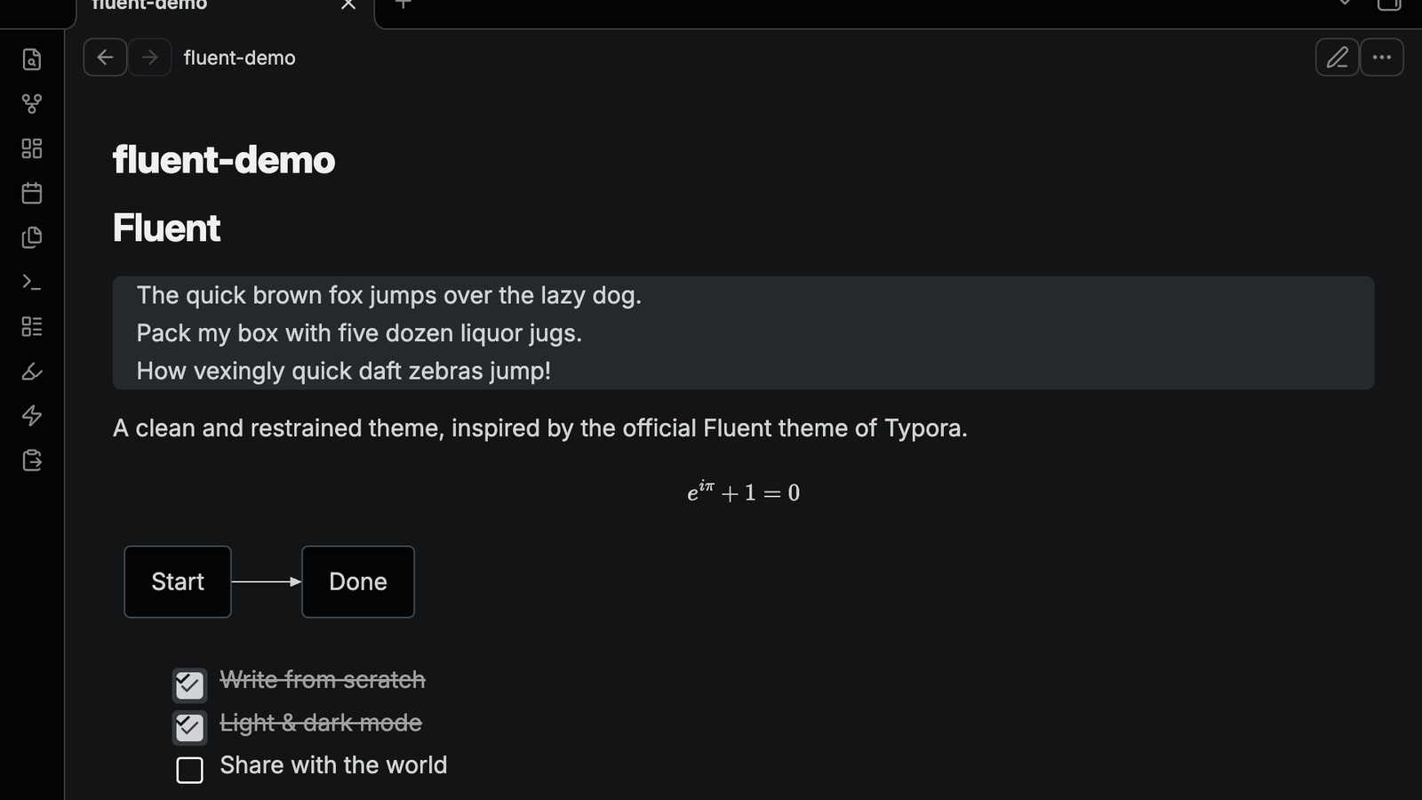
A clean and restrained Obsidian theme, inspired by the official Fluent theme of Typora. All CSS is written from scratch.
| Light | Dark |
|---|---|
 |
 |
English
Highlights
- Two-layer gray interface — pure white content (
#ffffff) on light gray cards (#fafbfc); graphite base (#131416) with a near-black sidebar (#030405) in dark mode - Card-style blockquotes — no left accent bar, just a soft gray card, exactly like Typora's Fluent; the gray padding above and below the text is adjustable (0–24px)
- Card-style tables — 8px rounded corners, hairline borders, zebra stripes, tabular numerals (
tnum) - Rendered preview cards — Mermaid diagrams and LaTeX math blocks render inside the same gray Fluent card with rounded corners
- Fluent checkboxes — 24px square task-list checkboxes whose SVG directly draws a blue fill and white checkmark in both light and dark mode
- Six callout accent colors — bookmark (indigo), star (blue), tip (yellow), note (teal), warning (red), question (pink); also supports Typora's "blockquote + heading" syntax
- macOS-style radius — blockquotes, tables, code blocks and callouts share a unified 8px corner radius
- Typography — Inter for headings and body text, JetBrains Mono for code; loaded from CDN with automatic system-font fallback (PingFang SC / Source Han Sans for CJK)
- Style Settings support — optional Style Settings integration: tooltip bubble toggle, card-radius and blockquote-radius sliders, and blockquote top/bottom padding
Installation
Community theme store: Settings → Appearance → Themes → Manage → search “Fluent”.
Manual: copy theme.css and manifest.json into <your vault>/.obsidian/themes/Fluent/, then enable it under Settings → Appearance.
Customization
With the Style Settings plugin (recommended), you get a Fluent section in its settings panel:
- Light tooltips in light mode — switch tooltips between the default dark bubble (white text) and a light bubble (dark text)
- Card corner radius — 0 to 16px slider for tables, code blocks, callouts and rendered preview boxes (Mermaid, LaTeX)
- Blockquote corner radius — independent 0 to 16px slider for blockquotes
- Blockquote top/bottom padding — 0 to 24px slider for the gray padding above and below quote text (left and right stay fixed); set it to 16px for equal padding on all four sides
Without any plugin, override the CSS variables directly in Settings → Appearance → CSS snippets:
/* Light bubble with dark text for tooltips in light mode */
.theme-light .tooltip {
    --tooltip-background: #ffffff;
    --tooltip-color: #1f2328;
}

/* Corner radius for tables / code blocks / callouts / preview boxes */
body {
    --fluent-radius: 10px;
}

/* Corner radius for blockquotes (independent) and gray padding above/below quote text */
body {
    --fluent-quote-radius: 8px;
    --fluent-quote-vborder: 12px;
}
Other useful variables: --text-link (link color), --elevated-background (card background), --mark-bg (highlight background).
Compatibility
- Obsidian 1.4.0+
- Reading view, Live Preview and Source mode
- Dark mode follows the app appearance setting automatically
中文
设计要点
- 双层灰阶界面:浅色为纯白底(
#ffffff)+ 浅灰卡片(#fafbfc);深色为石墨底(#131416)+ 近黑侧栏(#030405) - 纯灰底引用块:没有左侧竖线的卡片式引用块,与 Typora Fluent 一致;文字上、下方的灰色厚度可在 0–24px 间调节
- 卡片式表格:8px 圆角外框、细边框、斑马纹、等宽数字(
tnum) - 预览卡片统一风格:Mermaid 图表与 LaTeX 公式块同样渲染为灰底 Fluent 卡片,带圆角
- Fluent 复选框:24px 方形任务列表复选框,SVG 在浅色与深色模式下均直接绘制蓝色底与白色勾号
- 六种 Callout 语义色:收藏(蓝紫)、星标(蓝)、灵感(黄)、笔记(青绿)、警告(红)、疑问(粉),同时兼容 Typora 的「引用块 + 首行标题」写法
- macOS 风格圆角:引用块、表格、代码块、Callout 统一 8px
- 字体:标题/正文 Inter,代码 JetBrains Mono,在线加载、离线自动回退系统字体(中文回退苹方 / 思源黑体)
- 支持 Style Settings 插件:可切换提示气泡深浅样式、拖动调整卡片圆角、引用块圆角与上下灰边厚度
安装
社区主题商店:Obsidian → 设置 → 外观 → 主题 → 管理 → 搜索 “Fluent”。
手动安装:将本仓库的 theme.css 与 manifest.json 复制到 <你的库>/.obsidian/themes/Fluent/ 目录下,然后在 设置 → 外观 中启用。
自定义
装了 Style Settings 插件(推荐)后,在它的设置面板里会出现 Fluent 分区:
- 浅色模式使用浅色提示气泡——在默认深灰气泡(白字)和白底气泡(黑字)之间切换
- 卡片圆角——0 到 16px 滑块,控制表格、代码块、Callout、Mermaid / LaTeX 预览框的圆角
- 引用块圆角——引用块独立的 0 到 16px 圆角滑块
- 引用块上下灰边厚度——0 到 24px 滑块,控制灰底在文字上方、下方的厚度(左右固定不动);拉到 16px 即四边等宽
不装插件也可以直接在 设置 → 外观 → CSS 代码片段 里覆盖变量:
/* 浅色模式提示气泡改为白底黑字 */
.theme-light .tooltip {
    --tooltip-background: #ffffff;
    --tooltip-color: #1f2328;
}

/* 圆角大小:表格 / 代码块 / Callout / 预览框统一生效 */
body {
    --fluent-radius: 10px;
}

/* 引用块圆角(独立)与灰底上下厚度 */
body {
    --fluent-quote-radius: 8px;
    --fluent-quote-vborder: 12px;
}
其他可调变量:--text-link(链接色)、--elevated-background(灰底卡片色)、--mark-bg(高亮底色)。
兼容说明
- 支持 Obsidian 1.4.0+
- 同时适配阅读视图、实时预览(Live Preview)和源码模式
- 深色模式随 Obsidian 外观设置自动切换,无需额外配置
Repository structure
├── theme.css             All theme styles (light & dark)
├── manifest.json         Theme manifest
├── screenshot.png        Store thumbnail (512×288, light)
├── screenshot-dark.png   Store thumbnail (512×288, dark)
├── cover-light.png       README preview (1600×900, light)
├── cover-dark.png        README preview (1600×900, dark)
└── LICENSE               MIT
Credits & License
Visual design inspired by the official Fluent theme of Typora. The Obsidian implementation is original work, released under the MIT License.