README file from
GithubEmber
A warm, low-glare Obsidian theme — charred near-black in dark mode, warm parchment in light mode, with an ember-orange accent. Palette inspired by gethaunts.app.
Fonts
Ember ships with no bundled or remotely-loaded fonts — it defaults to your system font stack, so it works fully offline with zero network calls. For the intended look, install the three recommended fonts locally (all are free and open-source) and point Obsidian at them.
| Role | Recommended font | Download |
|---|---|---|
| Body / UI | Hanken Grotesk | Google Fonts |
| Headings | Bricolage Grotesque | Google Fonts |
| Code | JetBrains Mono | jetbrains.com/lp/mono · GitHub releases |
1. Download
From each link above, choose Get font → Download all (Google Fonts) or grab
the release .zip (JetBrains Mono). You'll get a folder of .ttf / .otf
files.
2. Install on your OS
- macOS (Homebrew) — the quickest route, no manual download needed:
brew install --cask font-hanken-grotesk font-bricolage-grotesque font-jetbrains-mono - macOS (manual) — unzip, select all the font files, double-click and choose Install Font (or drag them into the Font Book app).
- Windows — unzip, select all the font files, right-click → Install for all users.
- Linux — copy the font files into
~/.local/share/fonts/(or/usr/share/fonts/for all users), then runfc-cache -f.
Restart Obsidian after installing so it picks up the newly-available fonts.
3. Tell Obsidian to use them
Install the Style Settings community plugin, then set the text, heading,
and monospace fonts under Settings → Style Settings → Ember → Typography —
type the exact font name (e.g. Hanken Grotesk, Bricolage Grotesque,
JetBrains Mono).
Alternatively set the base interface/text font under Settings → Appearance → Font, and the code font under Settings → Appearance → Monospace font.
If a named font isn't installed, the theme falls back to the system stack automatically — nothing breaks, you just won't see that specific typeface.
Palette
| Token | Dark | Light |
|---|---|---|
| Background | #0e0c0b |
#fbf4ea |
| Surface | #161109 |
#fffaf2 |
| Text | #f4ece2 |
#211913 |
| Muted | #9c9085 |
#6b5d50 |
| Ember (core) | #e8732c |
#e8732c |
| Accent / links | #ffc26a |
#b8410f |
| Selection | ember @ 22% | ember @ 18% |
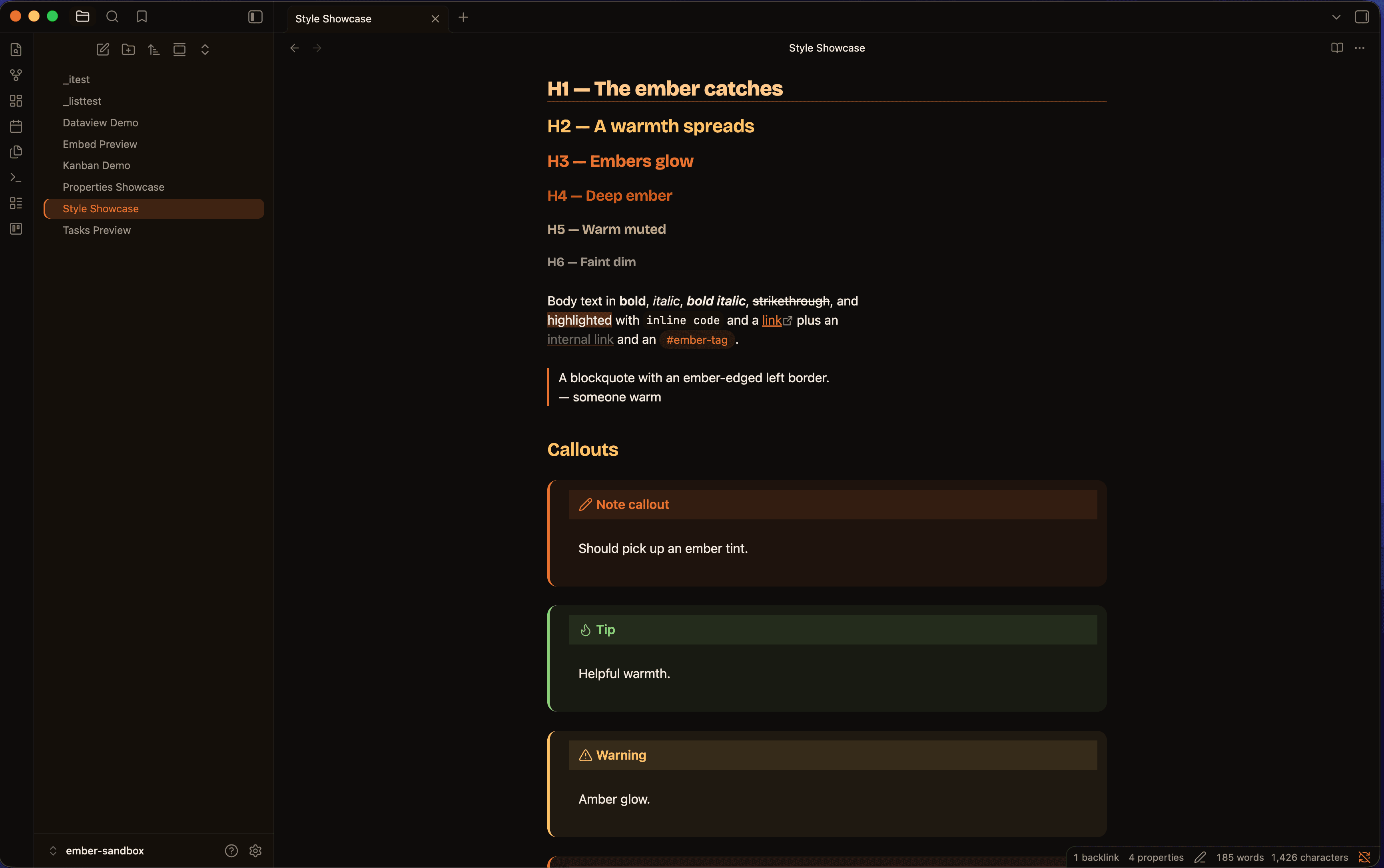
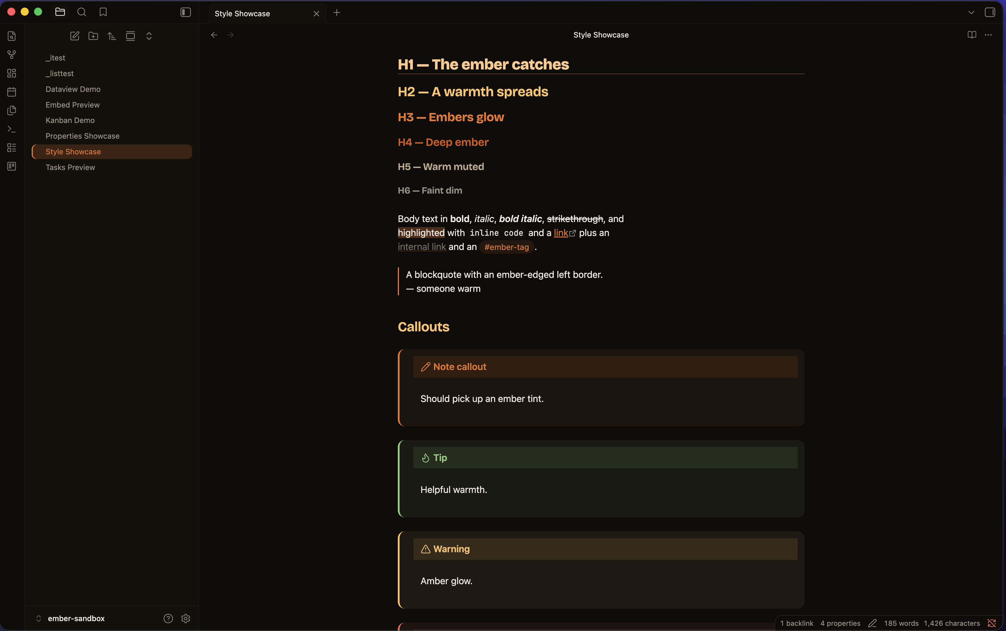
Heading ramp
h1→h6 step through a warm ember ramp (glow → amber → ember → deep ember →
muted → dim). h1 also gets an ember underline. Edit the --ember-h1…
--ember-h6 variables in the .theme-dark / .theme-light blocks to retune.
Features
- Full dark + light variants, with an HSL-driven palette (every colour derives from a few hue/saturation knobs)
- Style Settings support — accent (HSL) picker, bundled Catppuccin / Nord palettes, true-black OLED mode, font controls, reading measure, compact density, reduced-motion and dyslexia-friendly options, plus per-element toggles
- Properties / frontmatter styled as a calm card with per-type coloured icons (date, list, number, checkbox, tags…), themed pills and an optional banner
- Callouts ember-tinted per type, sharing one colour language with tasks and properties
- Syntax highlighting in an ember palette across reading view (Prism) and live preview (CodeMirror)
- Custom task statuses — 25 Lucide-icon markers, colour-coded, in reading view and live preview
- UI chrome: command palette, modals, menus, settings, status bar, tooltips
- Styled embeds, optional list relationship lines, mobile polish, and light plugin theming (Dataview, Kanban)
- Tables, pill tags, ember-edged blockquotes; themed titlebar, tabs, scrollbar
- Ember-highlighted selected/active rows in every sidebar
Task statuses
Use - [X] where X is one of the markers below. Each renders as a
colour-coded Lucide icon, keyed off Obsidian's data-task attribute, in
both reading view and live preview. Colours come from the --task-* variables.
| Marker | Meaning | Colour | Marker | Meaning | Colour | |
|---|---|---|---|---|---|---|
/ |
incomplete | amber | b |
bookmark | teal | |
x |
done | ember (struck) | i |
information | teal | |
- |
canceled | muted (struck) | S |
savings | green | |
> |
forwarded | teal | I |
idea | amber | |
< |
scheduling | teal | p / c |
pros / cons | green / red | |
? |
question | teal | f |
fire | red | |
! |
important | red | k |
key | amber | |
* |
star | amber | w |
win | green | |
" |
quote | muted | u / d |
up / down | green / red | |
l |
location | teal | D/P/M |
PR draft/open/merged | muted/green/purple |
Markers are drawn as a Lucide SVG
maskover the checkbox'sbackground-color(masks render on checkbox inputs in every Obsidian build, where pseudo-elements don't). The glyphs are generated fromlucide-staticintosrc/_tasks.scss— to retune one, swap its Lucide icon there and rebuild. A few markers (e.g.I= idea) are special-cased by Obsidian core; the full set is most reliable alongside the Tasks plugin.
Install / enable
The theme lives at .obsidian/themes/Ember/. Enable it via
Settings → Appearance → Themes → Manage → Ember, or set
"cssTheme": "Ember" in .obsidian/appearance.json.
For best results set Settings → Appearance → fonts to Default so the
theme's fonts win, and the Accent color to #e8732c (or #ffc26a).
Customising
The easiest route is the Style Settings plugin — accent colour, palette (Ember / Catppuccin / Nord / OLED), fonts, density, reading width, per-element toggles and accessibility options, all from the settings UI with no CSS editing.
For deeper changes, every colour is a CSS variable. The palette derives from a
small HSL foundation (--base-h, --base-s, --accent-h/s/l) in the
.theme-dark / .theme-light blocks (prefixed --ember-* / --task-*).
Building from source
The theme is written in SCSS and compiled to theme.css (the file Obsidian
loads and the one attached to releases).
npm install
npm run build      # src/*.scss → theme.css
npm run watch      # rebuild on change
Partials live in src/: _base (palette, typography, Style Settings),
_schemes, _tasks, _properties, _callouts, _code, _chrome,
_embeds, _lists, _plugins, _mobile; entry point src/theme.scss.