README file from
GithubPreface
A dark Obsidian theme with a precise, structured aesthetic, built for personal knowledge management, journaling, project tracking and markdown-based workflows. Near-black blue backgrounds, structured panels, cool-toned text hierarchy, thin borders and indigo as the default accent.
The entire palette is driven by two HSL hues. Change --accent-h and every heading, link, border and interactive element follows -- no manual color picking required.
Please note that I built this theme mostly for myself, so it may not fit every use case.
If you like the theme
It is completely free, but if you want to throw a few coins in the hat, here is a link.
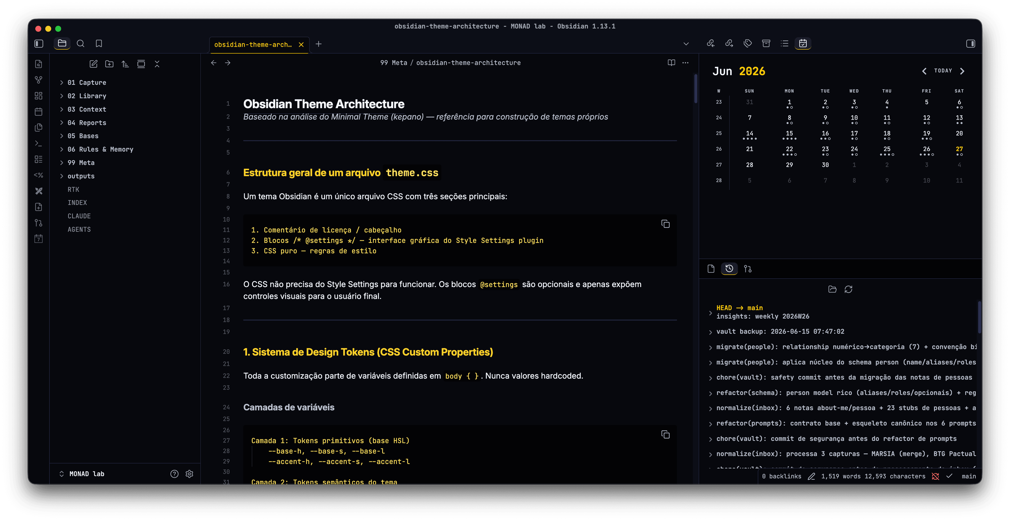
Screenshots
| Dark | Light |
|---|---|
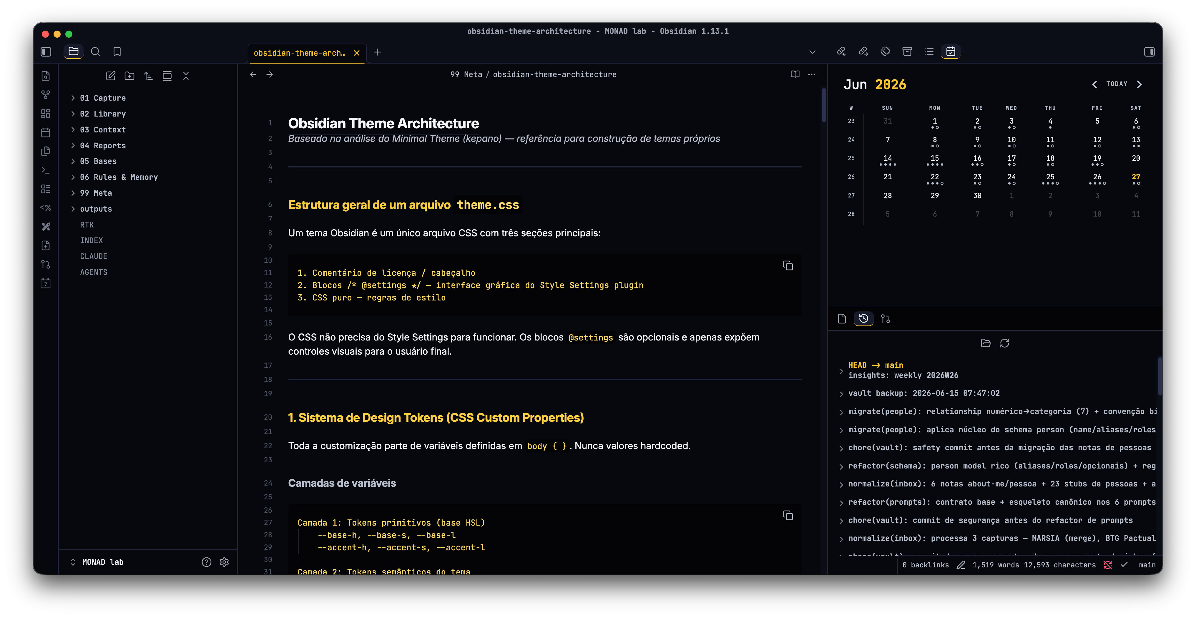 |
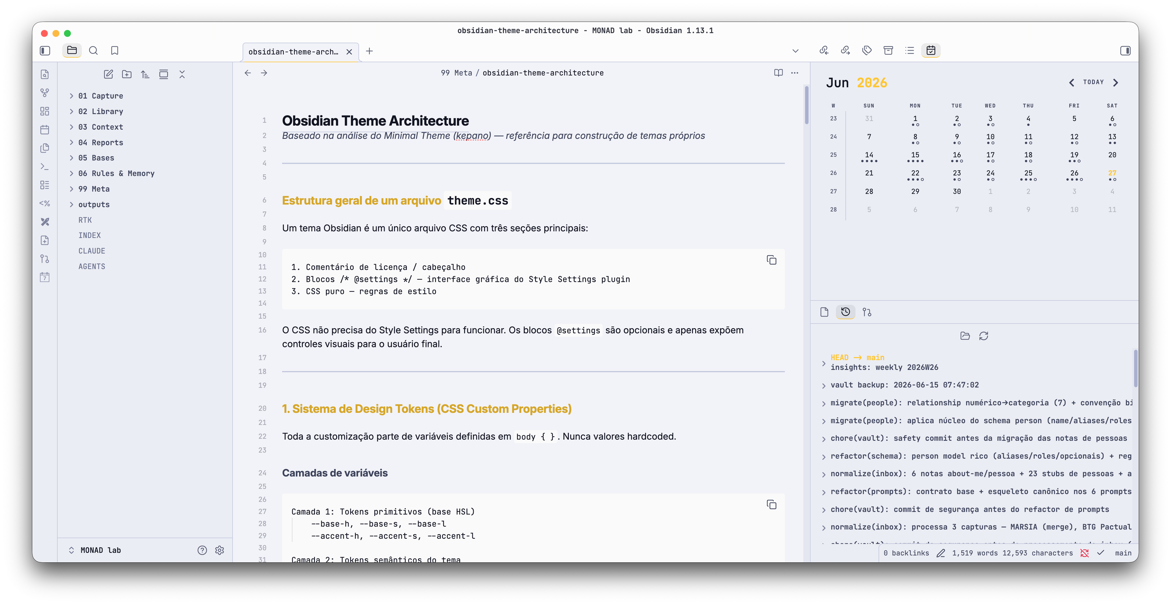 |
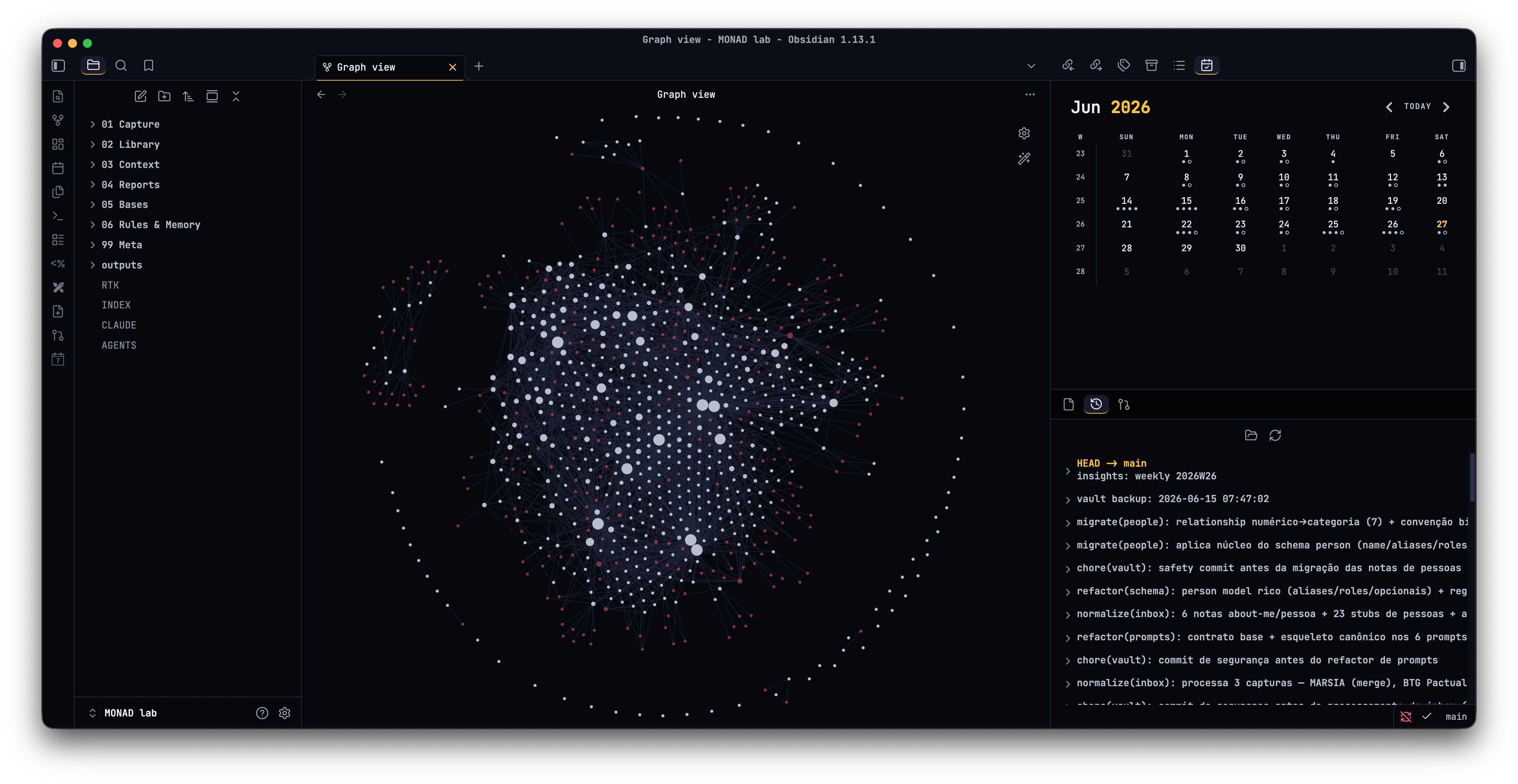 |
 |
Main Features
- HSL token system. Change
--base-h(background hue) and--accent-h(accent hue) and the entire palette follows. Every background, border and accent is derived through HSL math. Pick any hue and the theme adapts. - Dark and light variants. A near-black blue dark theme plus a light variant calculated from the same tokens.
- Style Settings integration. Tweak colors and toggle behaviors without editing CSS (requires the Style Settings plugin).
- Semantic callouts. Left-border accent per type: cyan for info, green for success, amber for warning, red for danger, muted for quotes. An outlined variant is available.
- Task states. Each
data-taskvalue gets a distinct checkbox icon and color, natively (no plugin required):[ ]todo,[/]in progress,[>]forwarded,[?]question,[x]done,[-]cancelled. - Tag pills. Tags render as rounded pills with an indigo tint. A plain text variant is available.
- Typography. Inter for prose, JetBrains Mono for code, metadata, tables and tags. The full heading scale (h1-h6) is configurable through size, weight, style and variant tokens.
- Terminal-style code blocks. Deepest background, accent left border, tinted inline code. Horizontal scroll is available.
- Monospace table headers. Uppercase label style with tabular figures. Full-width and wide layouts are available.
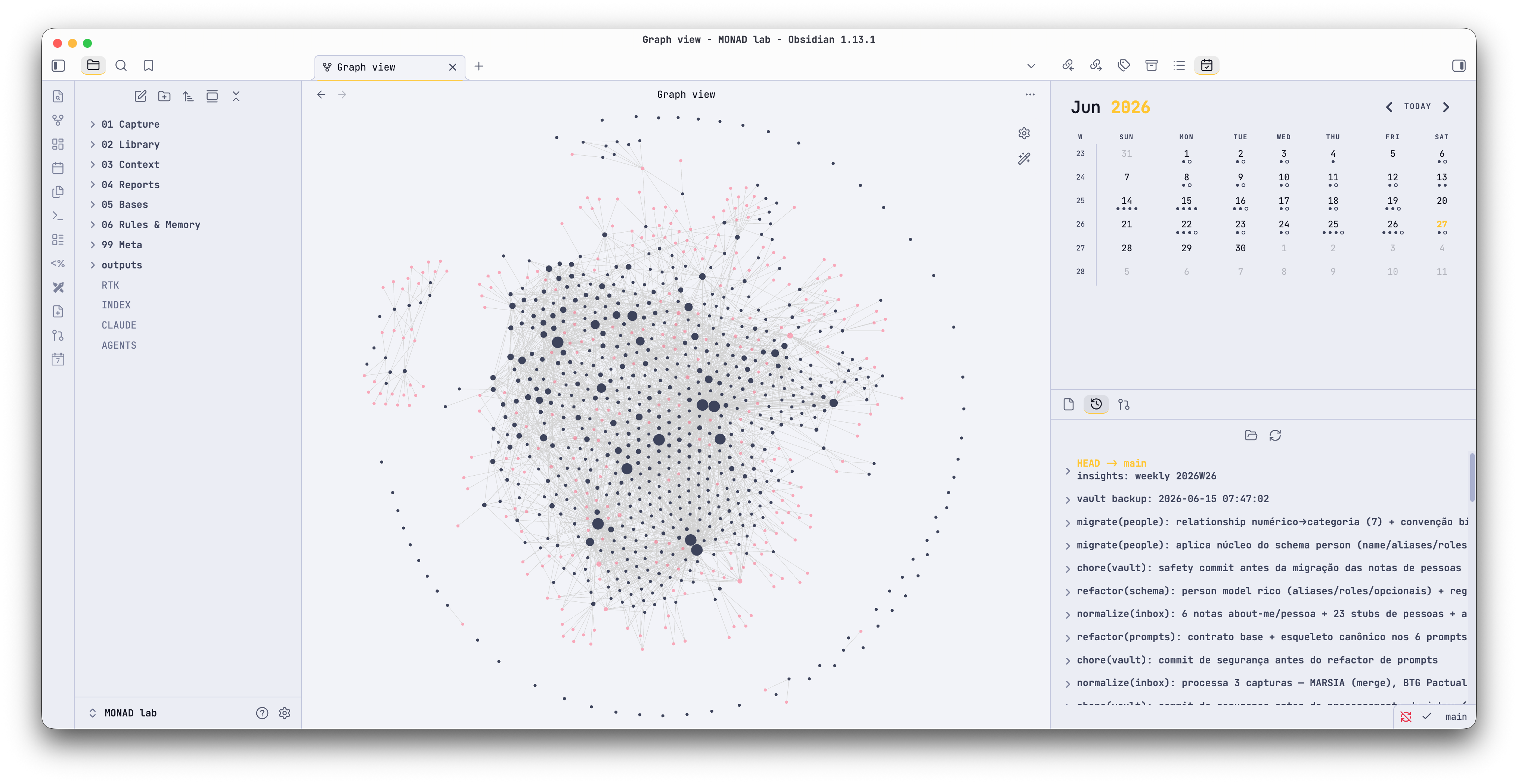
- Graph view and Canvas. Nodes, tags, attachments and unresolved links follow the semantic palette. Canvas cards, edges and focus states use the accent.
Additional Features
- Subtle grid overlay on the workspace.
- Five-level text hierarchy that stays readable in grayscale.
- Readable line width with independent widths for tables and images.
- Active line highlight (opt-in).
- Hide markdown syntax in Live Preview (opt-in).
- Minimal status bar and auto-hiding ribbon (opt-in).
- Disable or speed up animations.
How to use the Style Settings plugin
- Install the Style Settings plugin, then enable it.
- Go to Settings, then open the "Style Settings" tab.
From there you can:
- Set the base hue and saturation (background temperature).
- Set the accent hue and saturation (primary interactive color).
- Enable/disable the active line highlight.
- Hide markdown syntax in Live Preview.
- Show/hide editor line numbers.
- Make code blocks scroll horizontally instead of wrapping.
- Hide the ribbon (show on hover).
- Use a minimal status bar (show on hover).
- Disable or speed up all animations.
- Use square checkboxes.
- Render tags as plain text.
- Use outlined, border-only callouts.
- Strip embed borders and titles.
- Use full-width or wide tables.
Recommended plugins
- Style Settings (required for the visual controls above).
Changelog
See CHANGELOG.md.