
README file from
GithubGlassfelt
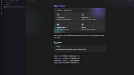
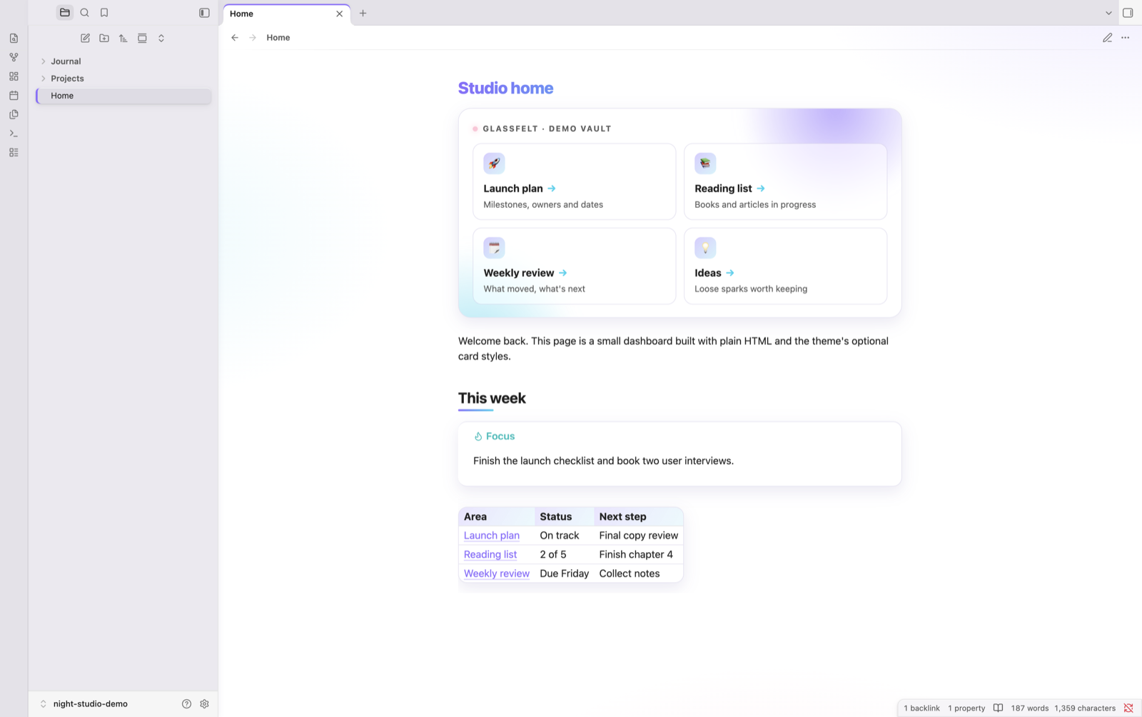
A dark, matte, tactile frame around a glassy, softly lit note area. Works in dark and light mode.
What it does
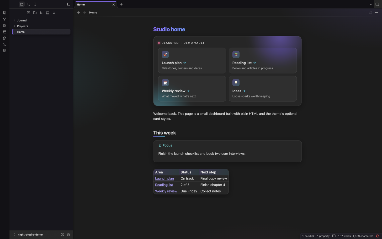
The frame (sidebars, tabs, menus)
- Matte charcoal panels with a fine grain, soft elevation shadows and dark seams.
- Tactile controls: icons and file rows rise on hover and press in when clicked.
- The open file and active tab sit as raised slabs with a violet edge.
- Menus, the command palette and link previews are solid matte cards.
The notes
- A soft violet, cyan and pink wash behind every note.
- Frosted glass tables, callouts, embeds, code blocks and Bases views.
- Gradient page titles and short gradient bars under section headings.
- Notes fade in when opened; tables, callouts and embeds lift gently on hover.
Accent: violet by default. If you choose your own accent colour in Settings → Appearance, yours wins for buttons and links.
Motion: all animation switches off when your system's "Reduce motion" setting is on.
Adjust it
Install the free Style Settings community plugin (Settings → Community plugins → Browse → "Style Settings"), then open Settings → Style Settings → Glassfelt. You can change:
- Colours: the main, second and highlight colours, separately for light and dark mode.
- Note area: background wash strength, glass tint and blur, corner roundness, home card width, plain page titles.
- Frame: the outer frame, sidebar and raised-surface colours, and the grain texture.
- Motion: turn off all motion, or just the note fade-in, the hover lift or the drifting header glows.
Everything works without the plugin; it only adds the controls.
Install
Settings → Appearance → Themes → Manage → search "Glassfelt" → Install and use.
Manual: copy theme.css and manifest.json into <your vault>/.obsidian/themes/Glassfelt/, then pick it in Settings → Appearance.
Optional: dashboard header and cards
The theme includes styles for a dashboard-style header with link cards (shown at the top of the screenshots). To use them on a note:
-
Add this to the note's properties:
--- cssclasses: - vault-dashboard ---vault-dashboardalso hides the properties box on that note. -
Paste this HTML into the note and change the links and text:
<div class="vt-hero">
<div class="vt-kicker">My vault · home</div>
<div class="vt-cards">
<a class="internal-link vt-card" href="Projects/Launch plan.md"><span class="vt-card-icon">🚀</span><span class="vt-card-title">Launch plan</span><span class="vt-card-text">Milestones, owners and dates</span></a>
<a class="internal-link vt-card" href="Ideas.md"><span class="vt-card-icon">💡</span><span class="vt-card-title">Ideas</span><span class="vt-card-text">Loose sparks worth keeping</span></a>
</div>
</div>
Each
hrefis the path to a note from the vault's root folder.
Licence
MIT. See LICENSE.