
README file from
GithubClear Contrast HC
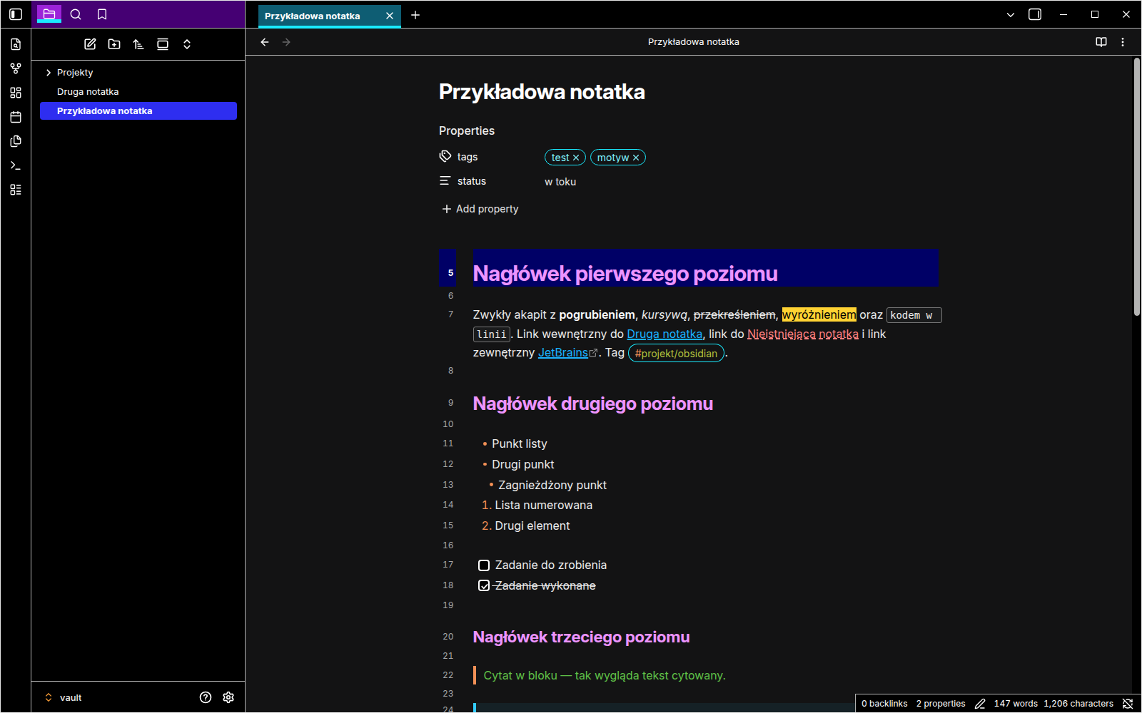
A high-contrast dark theme for Obsidian, modelled on JetBrains High Contrast (the IntelliJ IDEA / PyCharm / WebStorm theme) and built for people with low vision.
The theme is designed for strong visual separation and high text contrast. Primary text and syntax colors are tuned to reach WCAG 2.2 AAA (7:1) on their intended base backgrounds where practical. Interactive states such as hover, selected, active and focus are designed to remain clearly distinguishable, but not every possible color pairing across Obsidian and third-party plugins is guaranteed to meet 7:1. The theme works well with screen magnifiers and large zoom levels.
🤖 Created with the help of Claude by Anthropic – see Credits.
Why this theme?
Most dark themes use grey text on a grey background, thin icons and subtle hover effects. At 200–400% magnification those details disappear. JetBrains High Contrast solves this in the IDE, and this theme brings the same look to Obsidian:
- Pure black UI with white text and light borders instead of shadows.
- Clear state indicators:
- the active tab has a teal background and a cyan underline,
- the selected item is solid blue,
- keyboard focus has a cyan outline.
- No transparency, blur or shadows, so every element has a clear edge.
- Thick white caret and a navy highlight on the current line, so you don't lose your place when zoomed in.
- Links are always underlined and never rely on color alone. Unresolved links use a dashed red underline.
- Wide, always-visible scrollbars.
Screenshots
| Reading view | Command palette |
|---|---|
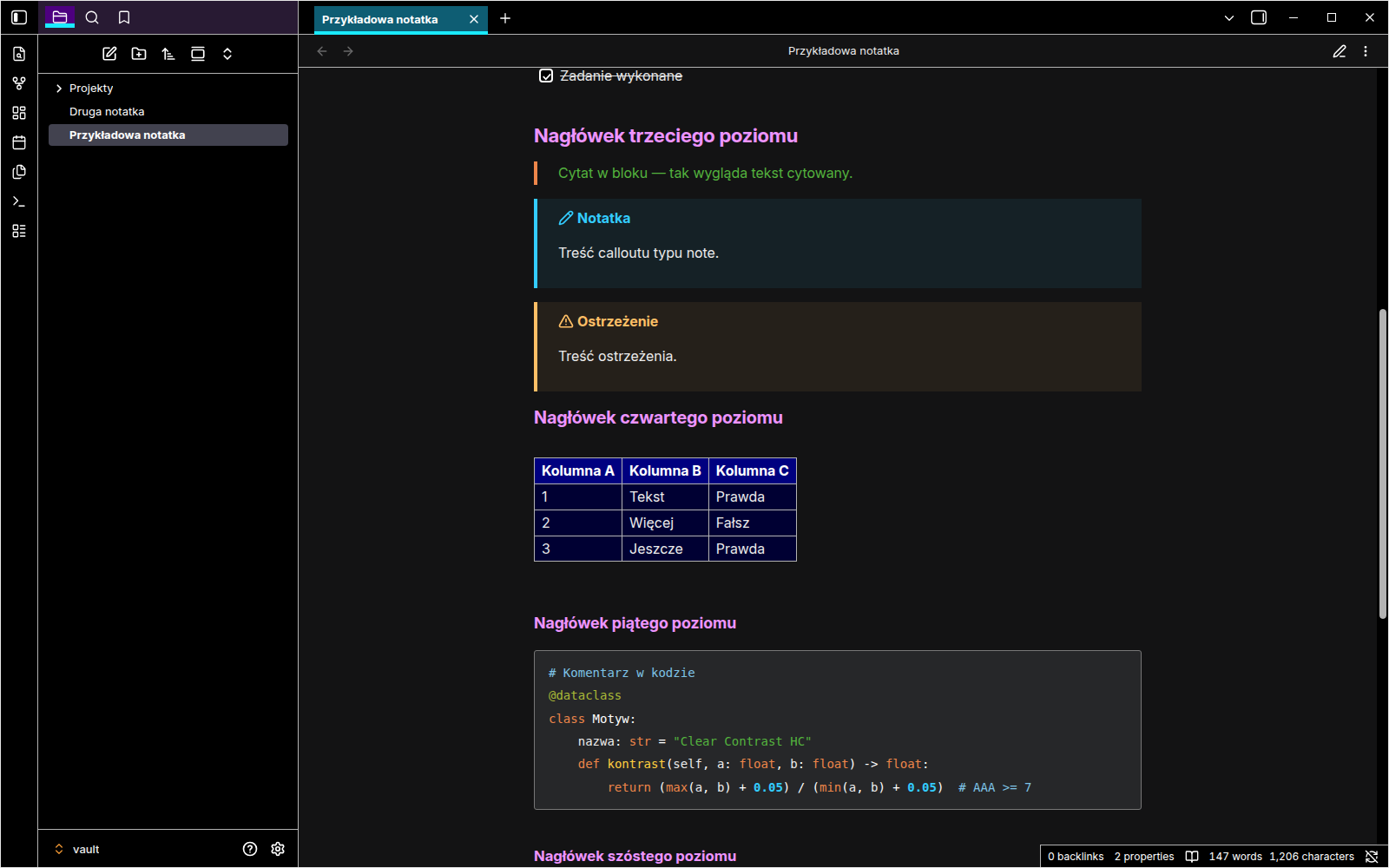 |
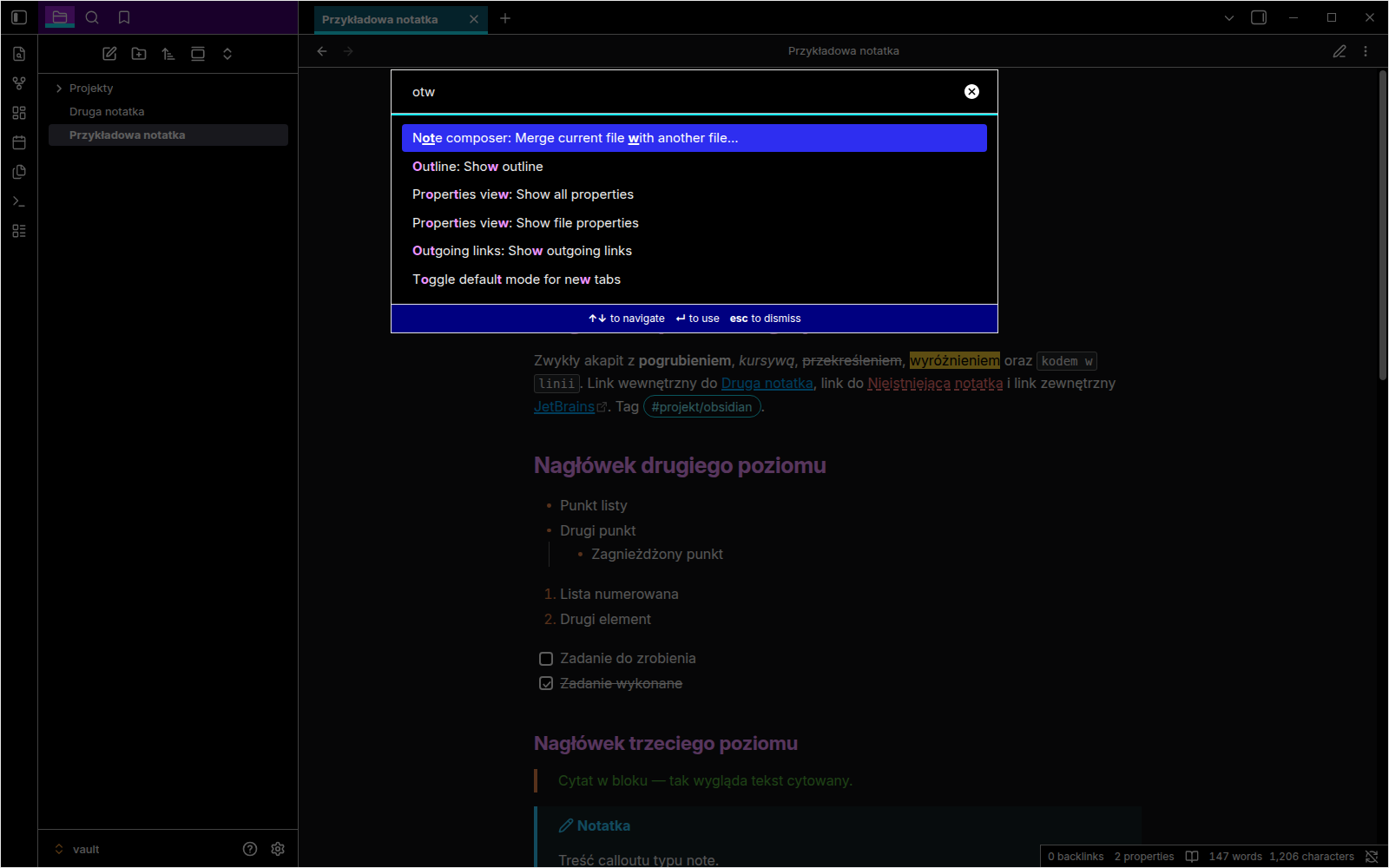 |
| Context menu | Settings – Islands variant |
|---|---|
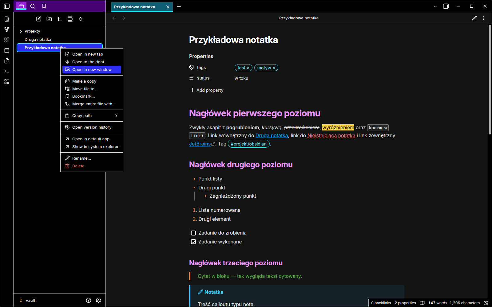 |
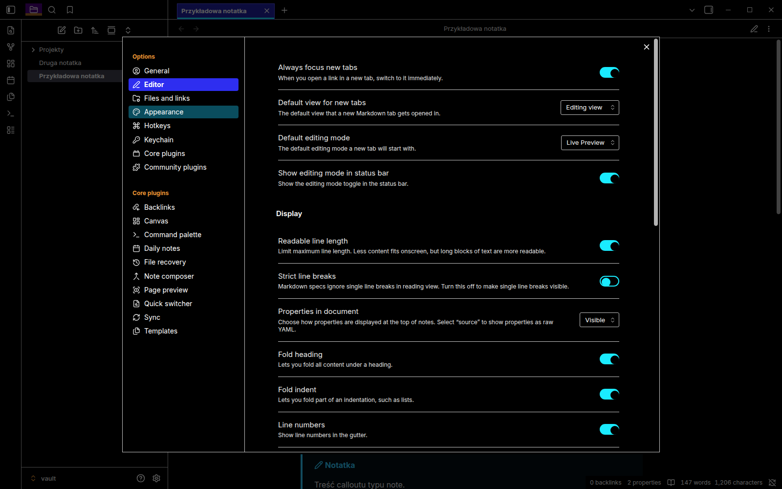 |
What is carried over from JetBrains High Contrast
Colors are taken directly from the open-source IntelliJ Platform files, not eyeballed from screenshots.
Interface
| Element | Look |
|---|---|
| Sidebars (tool windows) | Purple header (#450073), dimmed when the panel is not focused (#281A33); selected tab #9C23D9 with a 5px cyan underline |
| Editor tabs | Active tab #0E5D73 with a 4px cyan underline |
| Selection in lists and trees | Blue with white text; grey (#42424F) when the panel is not focused |
| Buttons | Black with a white border; primary button cyan with black text |
| Toggles | Off: black; on: navy (#000080); white border and knob |
| Checkboxes | Black with a white border and white check mark |
| Menus and popups | Black with a light border, white separators, blue hover |
| Command palette footer, notifications, table headers | Navy (#000080) |
| Tooltips | Purple (#450073) with a light border |
| Counters and badges | White with black text |
| Search matches | Black text on yellow (#FFD333) |
| Matched letters in quick switcher | Pink, bold |
| Disabled elements and hint text in empty fields | Orange text, as in JetBrains |
| Window | Thin light border around the whole window |
Editor ("High contrast" color scheme)
| Element | Look |
|---|---|
| Headings | Pink (constant color) |
Markdown markers (#, **, -, >) |
Orange (keyword color) |
| Blockquotes | Green text, orange bar |
| Links | Blue, underlined |
| Current line | Navy (#000066) |
| Matching brackets | Bold yellow with an outline |
| Find in note | Navy background with a blue outline |
| Code blocks | Keywords orange, strings green, numbers bold blue, comments light blue, functions yellow, annotations olive |
| Callouts | JetBrains Markdown alert colors (note, tip, important, warning, caution) |
| Tags | Cyan outline; on hover, black text on cyan |
Changes from the original (for accessibility)
- Slightly brighter colors. About ten JetBrains colors were just below the 7:1 ratio on the theme's primary editor/background surfaces, for example green strings (
#54B33E) and orange keywords (#ED864A). They were adjusted by the smallest practical amount to reach or improve toward AAA on those intended surfaces. Each original value is noted in a comment intheme.css. - Thicker caret than in the IDE (3px).
- Headings are not italic by default. Italic is harder to read, but you can turn it on in the options.
- Font: the theme prefers Atkinson Hyperlegible, a typeface designed for low vision, with JetBrains Mono for code. If they are not installed, system fonts are used. You can change fonts in Settings → Appearance.
Installation
From Obsidian
- Open Settings → Appearance → Themes → Manage.
- Search for Clear Contrast HC.
- Click Install and use.
Manually
- Download
theme.cssandmanifest.jsonfrom the latest release. - In Obsidian, open Settings → Appearance and click the folder icon next to Themes.
- Create a folder named
Clear Contrast HCand put both files in it. - Go back to Obsidian, click the refresh icon and choose Clear Contrast HC.
Options (Style Settings)
Install the Style Settings plugin to access these options:
| Option | Description |
|---|---|
| Islands variant | The new JetBrains UI (2025+): black sidebar headers, black editor, blue (#2121A6) active tab, cyan toggles |
| Colored heading levels | Each heading level gets a different color instead of all pink |
| Italic headings | Matches JetBrains exactly |
| Hide window border | Removes the thin light frame around the window |
Tips for low vision users
- Increase font size in Settings → Appearance → Font size, and zoom the whole interface with Ctrl/Cmd + and Ctrl/Cmd −.
- Turn on Settings → Editor → Line numbers. The current line number is highlighted in white on navy.
- Keep Readable line length on when using a magnifier, so you don't have to pan sideways.
Compatibility
- Obsidian 1.13.7 or newer (tested on 1.13.7)
- Windows, macOS and Linux
- Dark theme only; the theme stays dark even if Obsidian is set to light mode
Reporting problems
If something is hard to read, please open an issue. A short description of where it happens is enough, for example "Settings → Hotkeys, the key names are hard to read". A screenshot helps but is not required.
Credits and license
- Colors are based on the JetBrains High Contrast theme and High contrast editor color scheme from JetBrains/intellij-community, licensed under Apache 2.0. Source files:
platform/platform-resources/src/themes/HighContrast.theme.jsonplatform/platform-resources/src/themes/islands/HighContrast.theme.jsonplatform/platform-resources/src/themes/highContrastScheme.xml
- This project is not affiliated with or endorsed by JetBrains. JetBrains, IntelliJ IDEA and related names are trademarks of JetBrains s.r.o.
- Theme code: MIT. Attribution for the JetBrains colors: NOTICE.
- Created with the help of Claude, an AI assistant by Anthropic. Claude analysed the JetBrains theme files, wrote the CSS, checked the contrast ratios and tested the theme in Obsidian. Design decisions and accessibility feedback came from the author.
🇵🇱 Po polsku
Clear Contrast HC to ciemny motyw Obsidiana o wysokim kontraście, wzorowany na motywie JetBrains High Contrast i zaprojektowany z myślą o osobach słabowidzących. Główne kolory tekstu i składni są dobierane tak, aby na swoich podstawowych tłach osiągać — tam, gdzie jest to praktycznie możliwe — poziom WCAG 2.2 AAA (7:1). Stany interaktywne, takie jak hover, selected, active i focus, są projektowane tak, aby pozostały wyraźnie rozróżnialne, ale motyw nie gwarantuje kontrastu 7:1 dla każdego możliwego zestawienia kolorów, szczególnie w interfejsach wtyczek zewnętrznych. Motyw dobrze współpracuje z lupą systemową i dużym powiększeniem.
Najważniejsze cechy:
- czarny interfejs, biały tekst, jasne ramki zamiast cieni,
- fioletowe nagłówki paneli bocznych,
- aktywna karta z turkusowym podkreśleniem,
- niebieskie zaznaczenie,
- gruby biały kursor i granatowa aktywna linia,
- linki zawsze podkreślone,
- szerokie, zawsze widoczne paski przewijania,
- kolory składni ze schematu edytora JetBrains.
Instalacja:
- W Obsidianie otwórz Ustawienia → Wygląd → Motywy i kliknij ikonę folderu.
- Utwórz tam folder
Clear Contrast HCi skopiuj do niego plikitheme.cssorazmanifest.json. - Odśwież listę motywów i wybierz Clear Contrast HC.
Opcje: po zainstalowaniu wtyczki Style Settings możesz włączyć:
- wariant „Islands” (nowy interfejs JetBrains),
- kolorowe poziomy nagłówków,
- nagłówki kursywą,
- ukrycie ramki okna.
Zgłaszanie problemów: jeśli coś jest nieczytelne, załóż zgłoszenie. Wystarczy krótki opis miejsca, w którym występuje problem.
Jak powstał: motyw został stworzony przy pomocy Claude, asystenta AI firmy Anthropic. Claude przeanalizował pliki motywu JetBrains, napisał kod CSS, sprawdził kontrast kolorów i przetestował motyw w Obsidianie. Decyzje projektowe i uwagi dotyczące dostępności pochodzą od autora.