
README file from
GithubArcubic
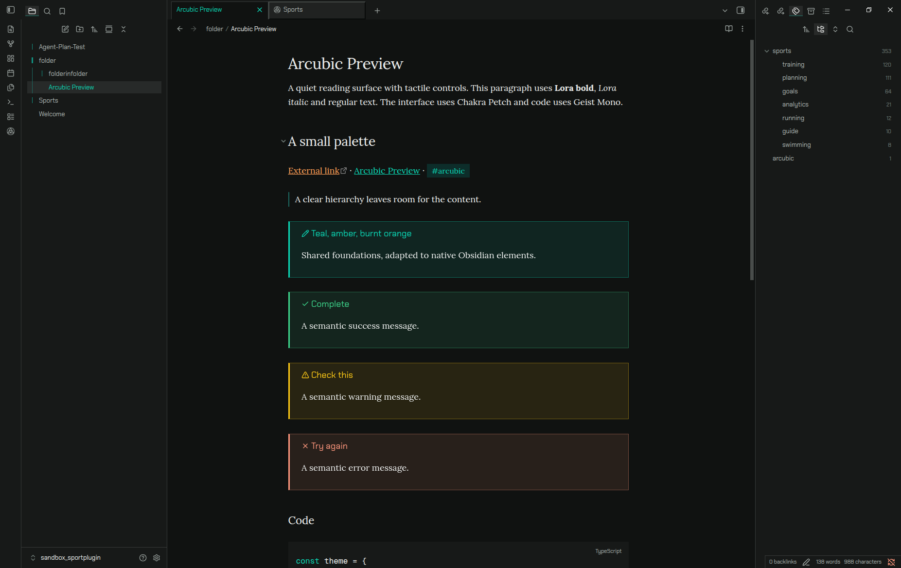
Teal, amber and burnt orange on neutral grayscale surfaces. A reusable design system with square panels, raised controls, inset fields and a sliding triangle switch.
React and Next.js
Install the public npm package:
npm install --save-exact @trainvent/arcubic
Import the stylesheet once in your application layout:
import '@trainvent/arcubic/styles.css';
Use the components inside an Arcubic theme:
'use client';

import { Theme, Button } from '@trainvent/arcubic';

export default function Example() {
  return (
    <Theme appearance="dark">
      <Button variant="outline">Get started</Button>
    </Theme>
  );
}
The package includes React 19 components, TypeScript declarations, light/dark tokens and bundled Chakra Petch, Lora and Geist Mono fonts. In Next.js, put a site-wide Theme in a client provider rendered by the root layout. See the package guide for exports and integration details.
leonmarq.com uses the published npm package; its source shows the layout, appearance provider and component imports.
Releases and updates
Matching numeric version tags automatically publish the package to npm through GitHub trusted publishing and create the companion GitHub downloads. No npm token is stored in GitHub. See the maintainer release guide.
Consumers commit an exact package version and its lockfile. The personal website uses Dependabot to propose new Arcubic versions daily; its PR checks build the site, and merging deploys it. Other projects can use the same Dependabot setup.
Obsidian and terminal
Use the latest GitHub release for the Obsidian ZIP or terminal palette. The separate theme.css and manifest.json downloads support Obsidian's automatic installer. Shared web tokens are included in the npm package as @trainvent/arcubic/tokens.css.
See the Obsidian guide, terminal guide, and release notes. Arcubic remains an alpha release. Its code is MIT licensed; bundled fonts retain their OFL licenses.
Styling guidelines
Arcubic aims for a precise, technical interface with a tactile feel. Clear structure, restrained color and deliberate geometry should make the controls feel coherent across websites and applications.
- Use depth where interaction benefits from it. Raised buttons suggest pressing; inset fields and tracks suggest input. Keep content panels quiet and flat. A thin bevel is usually enough, especially on compact controls; preserve space for their text and icons.
- Keep the structure geometric. Favor square edges, aligned boundaries and consistent spacing. Active document tabs should connect to their page, while inactive tabs recede into the surrounding surface.
- Make triangles functional. Use them for direction, state and progress: the switch moves from top-left when off to bottom-right when on, and the loader follows a triangular path. Keep angles, proportions and internal spacing consistent as these elements scale.
- Keep hover, selection and focus distinct. Hover is a small change in brightness or text color. Selection persists after the pointer leaves. Keyboard focus stays visible with a light, single outline. Avoid stacked focus rings, heavy hover boxes and separate highlights around button text.
- Give color a clear role. Surfaces and body text use neutral grays. Each adapter assigns roles centrally. Teal is the primary accent and marks tags; Amber and Burnt orange provide secondary emphasis. Reserve green for success, red for errors or destructive actions, and blue for links. These functional colors sit outside the three-color identity palette.
- Let typography do its job. Use a technical interface face, a comfortable reading face and a true monospace for code. Keep labels legible at small sizes and leave enough room for descenders, including in placeholders, tags and truncated labels.
- Make motion explain a change. Keep transitions short and purposeful: a button depresses, a switch travels and rotates, a loader indicates progress. Respect reduced-motion preferences.
- Adapt to the host without losing the system. Preserve native behavior and keyboard interaction. Test normal, hovered, pressed, selected, focused and disabled states in context, in both light and dark modes. Check contrast against the actual surface behind the text.
The guiding principle is restraint: geometry gives Arcubic its character, while depth and color help people understand what they can do.
Shared core and adapters
| Part | Location | Purpose |
|---|---|---|
| Shared colors | src/palette.ts |
Full Radix scales, semantic roles and contrast-aware text |
| Shared text roles | src/core/text-colors.ts |
Contrast-checked text roles and blue links |
| Shared design | src/core/design.ts |
Typography roles and proportional switch geometry |
| Framework-free CSS | packages/core/arcubic-tokens.css |
Generated tokens for websites and other adapters |
| React components | src/components/ |
Radix components with Arcubic styling |
| npm package | packages/react/ |
Published @trainvent/arcubic package and public exports |
| Web preview | src/main.tsx |
Colors, terminal, interface and component examples |
| Obsidian | ports/obsidian/ |
Standalone native theme, built from the shared core |
| Terminal | ports/terminal/ |
ANSI palette and terminal exports |
App-specific selectors stay in their adapters. Obsidian does not introduce a dependency into the web components.
Develop
Requires Node 24+.
npm ci
npm run dev
npm run build
npm run build:themes
npm run build:react
The preview has Web, Terminal, Interface and Components pages, with light and dark modes. build:themes regenerates the plain CSS tokens, Obsidian theme and terminal palette; build:react builds the npm package. pack:react creates its installable archive, and package:release assembles the GitHub downloads.
The root manifest.json, theme.css and versions.json are generated Obsidian distribution files. Native source stays in ports/obsidian/; web components stay independent.
Colors
The official palette has three families in curve order:
| Family / token | Role | Default seed |
|---|---|---|
Teal / --teal-* |
Titles, selection and controls in Obsidian | #12A594 |
Amber / --amber-* |
Secondary accent | #FFC53D |
Burnt orange / --orange-* |
Section headings in Obsidian | #F76B15 |
The vivid seed is the accent anchor, not the background or body-text shade. Every family exports 12 solid and alpha steps plus foreground roles. Native Radix Teal, Amber and Orange scales are preserved; edited anchors use generated OKLCH scales.
Special cases use a separate RGB rule:
| Color | Purpose |
|---|---|
| Green | Success and positive status |
| Red | Errors and destructive actions |
| Blue | Links that navigate to a page or resource |
Use strong, recognizable hues with readable shades for each appearance, rather than literal pure RGB values for text. Tags stay teal. These functional colors do not add stops to the identity curve.
Backgrounds and ordinary text stay achromatic: charcoal #111111 and white body text in dark mode, with neutral grayscale surfaces and text in light mode. Foreground roles check contrast against their actual surfaces.
The three stops sample positions 0, 0.5, 1. The default profile uses the established Radix anchors. The original profile retains the cubic formula:
hue(i) = 17.79 + (1 − i)³ × 152.09, 0 ≤ i ≤ 1
See hue curves for how the profiles and curve samples relate. npm run build:brand regenerates the three-dot curve, three-color triangle and title banner from the shared defaults. SVGs are the canonical assets; PNG compatibility exports can be refreshed with node scripts/build-brand.mjs --png when Sharp is available.
Typography
- Interface: Chakra Petch Regular.
- Reading: Lora, including real bold and italic faces.
- Code and terminal: Geist Mono.
Chakra Petch, Lora and Geist Mono are installed through Fontsource and included under their OFL licenses. The Obsidian theme embeds all three; no separate font download is needed.
Framework-free use
The npm package exports tokens separately as @trainvent/arcubic/tokens.css. The generated source sheet and its selectors are documented in the shared core guide.