
README file from
GithubFramer Theme
A clean, polished Obsidian theme inspired by Framer's design system. Framer uses a deep black canvas in dark mode, a warm cream canvas in light mode, and carefully tuned pink / rose-gold accents.
The theme focuses on a lightweight interface, readable notes, minimalist tags and properties, expressive code colors, and subtle macOS-like motion.
Version 1.3.4 — Build pipeline optimization, CSS cleanup, and size reduction.
Screenshots
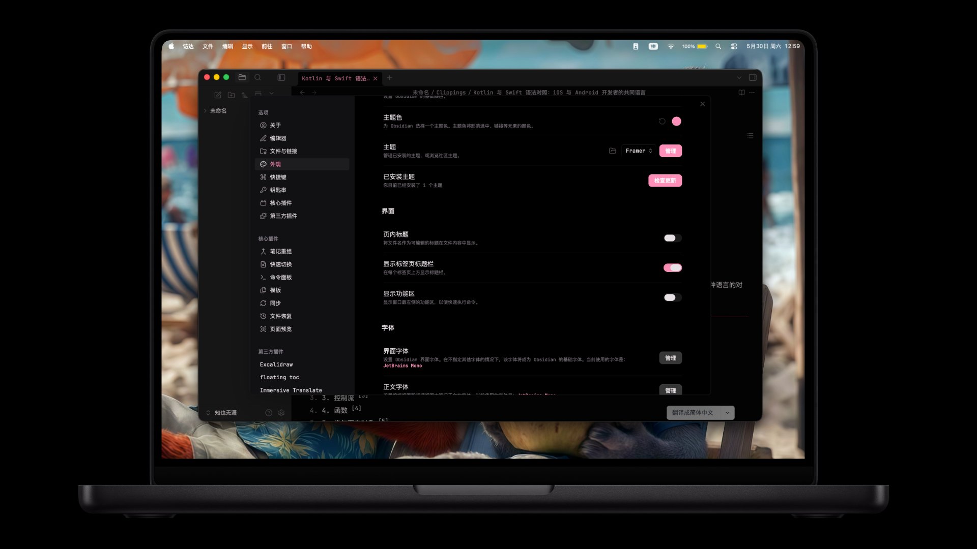
Dark mode with hot pink accents
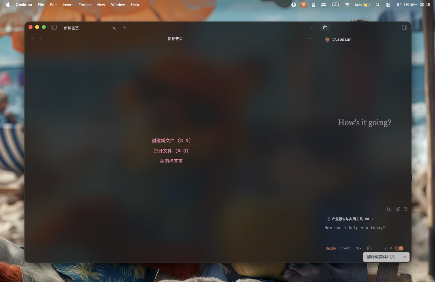
Translucent window mode
Version 1.3.4 Fixes
- CSS compression added to the build pipeline:
theme.cssreduced from 77 KB to 61 KB (\u221220%). - Unused CSS variables audited and removed (21 variable definitions across
src/), keeping only standard Obsidian overrides. - Long selector chains simplified: motion animations now gated via
--motion-durCSS variable instead of repeatedbody:not(.reduce-motion):not(.framer-simple-motion)guard; unnecessary::before/::afterpseudo-element selectors removed in90-borderless.cssand92-nav-chrome.css. translucent-bg.pnglosslessly compressed from 3.26 MB to 2.01 MB (\u221238%).- Validation script updated to work with minified output.
- Zero
!importantusage retained.
Version 1.3.2 Fixes
- Fixed icon background black blocks in Editing Toolbar plugin (all aesthetics: Glass, Default, Custom, Tiny).
- Fixed black box appearing below the toolbar when hovering in Glass aesthetic mode.
- Fixed flickering issues in Glass aesthetic mode by removing
backdrop-filter(Chromium/Electron rendering limitation). - Replaced
!importantwith higher CSS specificity selectors for Obsidian community review compliance. - All Editing Toolbar aesthetic modes now display semi-transparent backgrounds for visual consistency.
- Toolbar dropdown menus and popovers now have consistent visual styling with the theme.
Version 1.3.1 Fixes
- Removed link underline styling properties that trigger Obsidian 1.4.5 CSS lint compatibility warnings.
- Raised light theme rose-gold heading and muted UI text contrast to meet WCAG AA for normal-sized text.
- Slightly improved dark theme muted UI text contrast on panel surfaces.
Version 1.3.0 Highlights
- Restored the original bold pink text color (
#FF69B4). - Refined the active tab into a softer rounded pill with lighter depth.
- Fixed whole-window flicker caused by heavy translucent overlay effects.
- Improved translucent mode readability for settings, menus, prompts, and dense panels.
- Kept tags and note properties lightweight and minimal.
- Upgraded code blocks with clearer panel separation and multi-color syntax highlighting.
- Added subtle macOS-like motion for icons, modals, tab activation, and file explorer folders.
- Added jelly-style folder open / close motion in the file explorer.
- Cleaned up risky visual effects and avoided
backdrop-filter, fixed background effects, and forced overrides.
Features
- Dark mode: Hot pink accents (
#FF8FB8) on a black canvas. - Light mode: Rose-gold accents (
#C4837A) on a warm cream background (#FDF8F5). - Original pink bold text: Bold text uses
#FF69B4. - Accent variants:
accent-blue,accent-cyan, andaccent-purpleare supported through Style Settings or custom CSS. - Minimal tags: Tags stay text-forward and understated.
- Lightweight note properties: Properties avoid heavy block backgrounds.
- Readable code: Code blocks use a distinct surface, left accent, and multi-color syntax tokens.
- Translucency support: Works with Obsidian's translucent window setting while preserving panel readability.
- Smooth motion: Subtle transitions for icons, modals, active tabs, and file explorer folders.
- Plugin styling: Includes optional styling for Dataview, Kanban, Calendar, and line numbers.
Installation
From Obsidian Community Themes
- Open Obsidian -> Settings -> Appearance.
- Under Themes, click Manage.
- Click Browse and search for "Framer".
- Click Install.
Manual Installation
- Download or clone this repository.
- Copy the theme files into your vault's
.obsidian/themes/Framer/directory. - Go to Settings -> Appearance -> Themes and select Framer.
Style Settings
Framer includes Style Settings options for:
- Interface font.
- Accent style: pink / rose gold, blue, cyan, or purple.
- Reduced motion.
- Plain headings.
- Quick Actions styling.
- Dataview, Kanban, Calendar, mobile, reading mode, and line number styling.
Accent Variants
Add any of these classes through Style Settings or a CSS snippet:
body.accent-blue   { /* blue accent */ }
body.accent-cyan   { /* cyan accent */ }
body.accent-purple { /* purple accent */ }
The default accent-pink style is built into the base theme.
Color Palette
| Token | Dark | Light |
|---|---|---|
--color-bg |
#000000 |
#FDF8F5 |
--color-surface |
#000000 |
#FFFFFF |
--color-brand |
#FF8FB8 |
#C4837A |
--color-hot |
#FF5FA2 |
#D49088 |
--color-text |
#E7E0E5 |
#4A3F3D |
--bold-color |
#FF69B4 |
#FF69B4 |
Note
Windows users should try not to turn on the semi transparent effect. Due to technical feasibility and performance costs, the official has removed this effect from the settings. Please be aware of this. Alternatively, if you have confidence in the performance of your computer, you can install plugins to obtain support for semi transparent effects.
翻译:Windows 用户尽量不要开启半透明效果,由于该功能因技术不可行性与性能开销,官方已在设置中移除此效果。请务必悉知,或者如果你对电脑性能有信心,可以安装插件获得半透明效果支持。
Changelog
See AGENTS.md for earlier version notes.
Credits
Created by TheViviana.