README file from
Github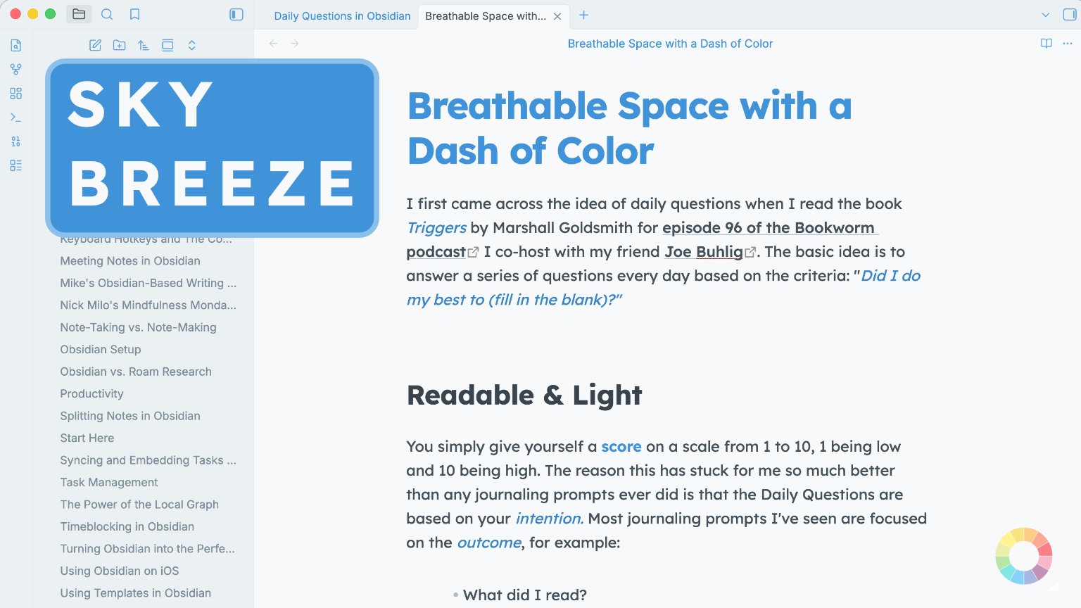
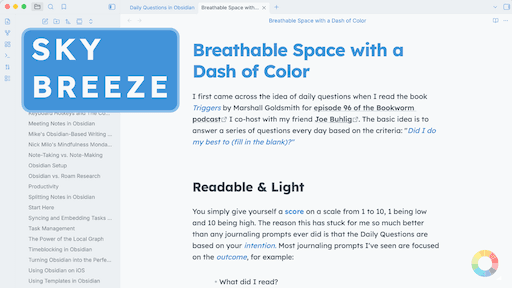
Breathable space with a dash of color.
Sky Breeze is a theme made to be easy to read for a long time, easy to skim through documents, and just overall light and pleasant to look at.
It softens borders, simplifies colors and leaves plenty of space so that everything can comfortably breathe. Even thought subtle - color changes can significantly impact the overall feel of the theme, while keeping it light and clear.
I made it as a theme for myself. One that I personally would enjoy the most and decided to share it with the world.
Installation
Until Obsidian reviews and approves the theme to be featured directly in their app, Manual Installation is the only option:
Manual installation
- Download
theme.cssandmanifest.jsonfrom this repository- Click on each file, then
...in top right and download.
- Click on each file, then
- Navigate to
<your_vault>/.obsidian/themesand create a new folder inside of it calledAK Sky Breeze- If you can't see the
.obsidianfolder inside your vault (it's hidden by default)- On MacOS press
command + shift + .(period) - On Windows: Show Hidden Files - Microsoft Support
- GNU/Linux: In most file explorers, press
ctrl + h
- On MacOS press
- If you can't see the
- Place
theme.cssandmanifest.jsoninto the folder you just created - Open Obsidian →
Settings→Appearance→Themesand select AK Sky Breeze - Optionally download the
Style Themesplugin to tweak the warmth of the theme
Screenshots
Default Settings: Cool Neutrals + Blue Accent
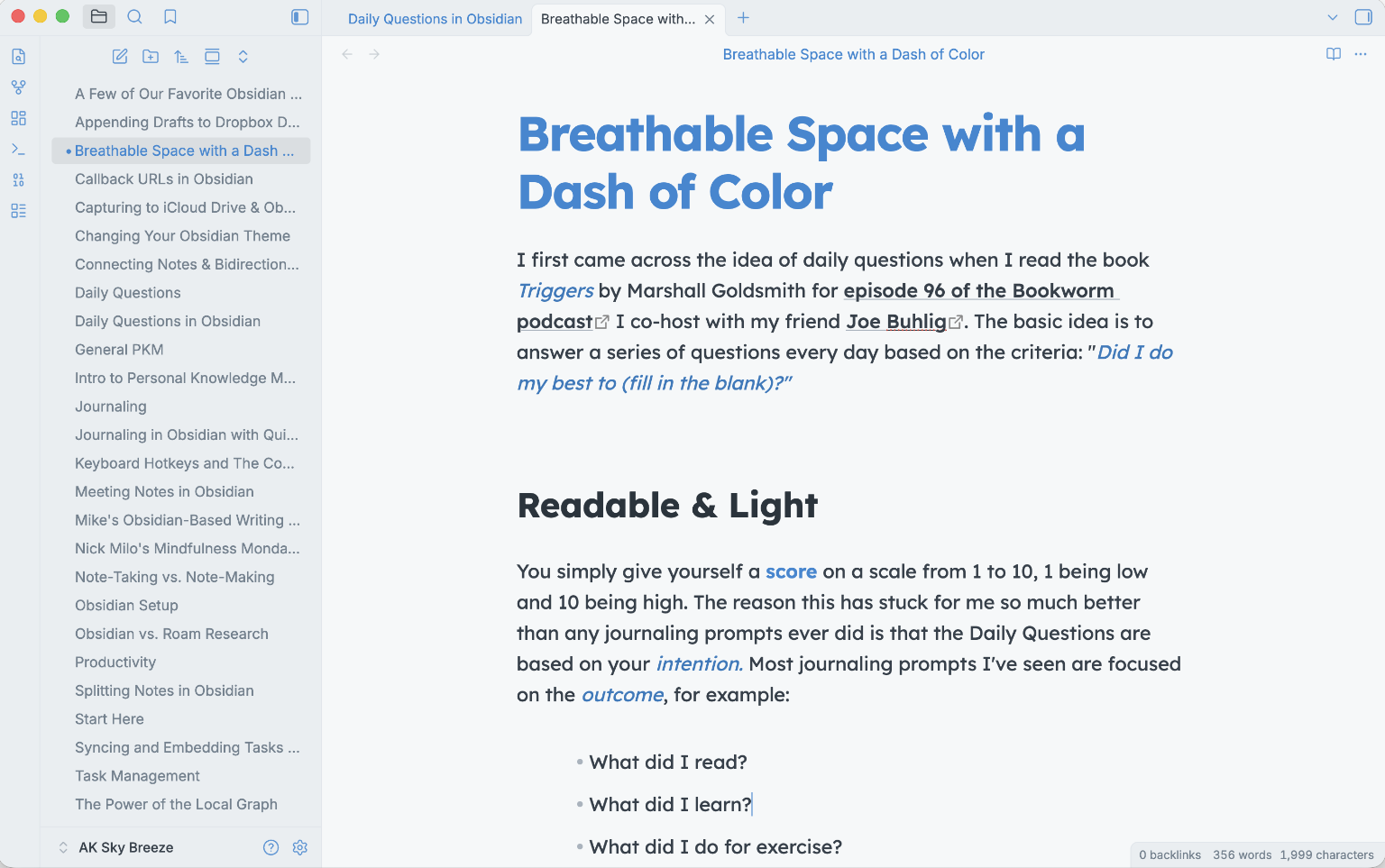
Warm Neutrals + a Freely Chosen Orange-Red Accent
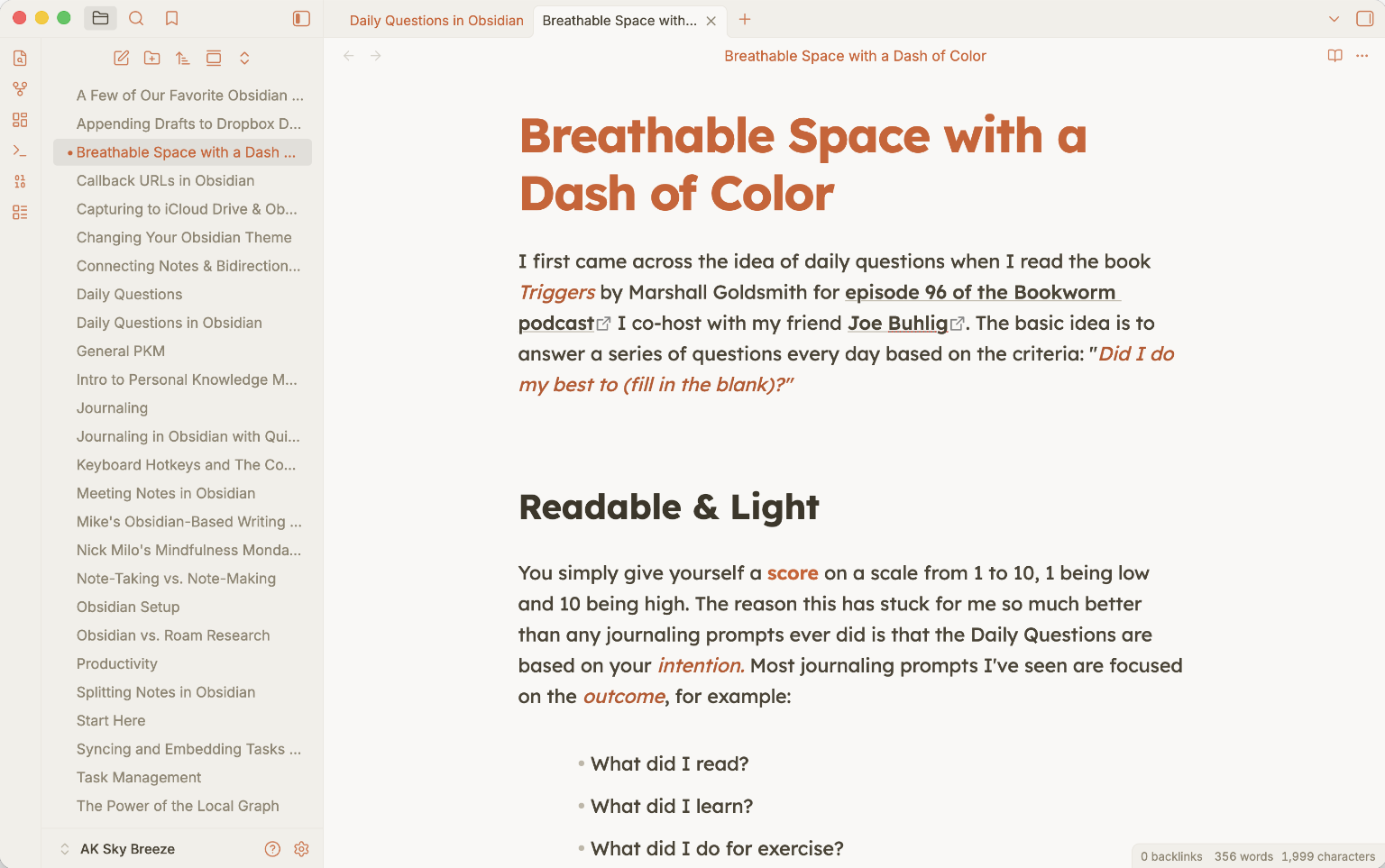
Neutral Neutrals + a Freely Chosen Hot Pink Accent
Fonts and Colors
It focuses on very readable fonts, good contrasts and overall keeping it simple and spacious. But since I also love colors, I had to keep them present, but still out of the way.
For now, you can change the warmth of the background colors via Style Settings plugin, and the theme will obey your accent hue and font size. I strongly recommend 20px, and for colors - feel free to experiment with color + warmth combinations.
Headings and Emphasis
Headings are big and strong, with plenty of space around them, to make skimming in long documents very easy to do. The theme focuses on H1-H3 mainly, leaving H4-H6 quite small and unobtrusive, more to be used like labels or subheadings if you will.
Visually, H4-H6 and bold are all identical.
Speaking of bold, together with italic it is colored to the chosen accent making sure that key words or phrases stick out from the rest.
Links are styled subtly so that the heavily linked texts still flow and remain easy to read.
The theme also supports all the default callout styles. Together with code blocks, they are the only thing that remain in their own, fixed colors, rather than following accent.
Tables, lists, bases (table and card view), quotes, page popover, strikethrough were all given attention as well, and I made sure they fit with the rest.
Summary
Sky Breeze is a single color accent theme. The accent you set is the only color used, against a three-choice neutrals. It is my first theme and I wanted to keep it simple.
I think it flows nicely and overall I’m happy with the result. It is a light only theme, as dark themes hurt my eyes, but I might add a dark option at a later date.
I hope you enjoy it, and if you feel like it, consider supporting me via my links.
Peace, AK