
README file from
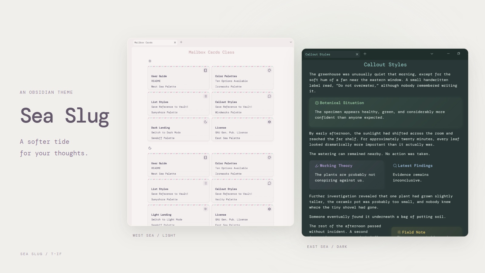
GithubSea Slug
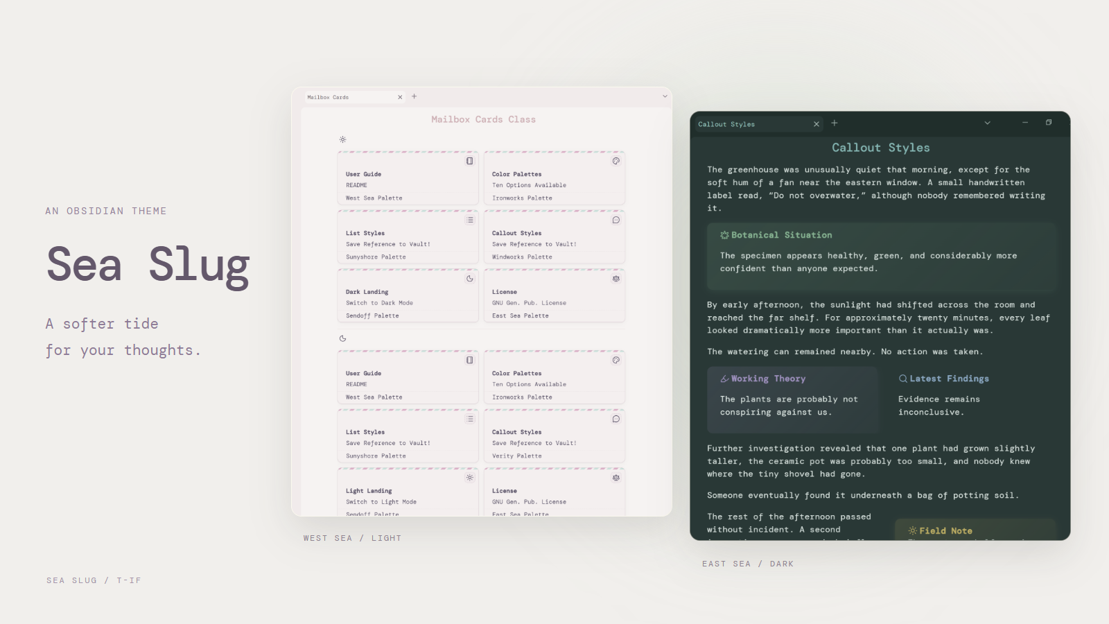
Soft colors, flexible callouts, and styled Bases. A practical remix of Chime for Obsidian 1.13+. Style Settings is recommended.
Differences from Chime
- Updated for current Obsidian layouts, callouts, and plugins.
- Adds inactive-pane dimming, hover-expanding ribbon, dark-mode media dimming, list and outline threading, seamless embeds, and banners.
- Builds in list grids/cards, tree lists, floating and multi-column callouts, alternate checkboxes, and priority tags.
- Adds styling for Bases, Commander, Calendar, and Kanban.
- Removes Chime's legacy layouts, background images,
wiki-page,novel, outdated color schemes, Page Gallery, and other obsolete plugin rules. - Everything else is labeled under
Obsidian Settings → Style Settings → Sea Slug.
Styling Guide
- See callouts, lists, and other note components here.
- See available color schemes here.
- See Base styles below.
Page Classes
Add these under the note's cssclasses property.
| Use | Classes |
|---|---|
| Width | width-800, width-900, width-1000, width-1200, width-1600 |
| Cleanup | no-backlinks, no-count, no-fold, clean-embed |
| Banners | banner, banner-fade |
| Bases | no-head, center-card, no-fade, no group, frameless-cards, mailbox-cards, pcbox, musicshelf |
| Text | colorful-headings, colorful-headings-alt, underlined-highlight |
| Headings | h1-center–h6-center, h1-bottom-border–h6-bottom-border |
aside-left and aside-right are HTML element classes for margin notes, not page classes.
Bases
Add classes to the note containing the embedded Base, then select a Cards view in the Base. They style the view, not the individual notes listed in it. Classes affect all Bases embedded in that note.
---
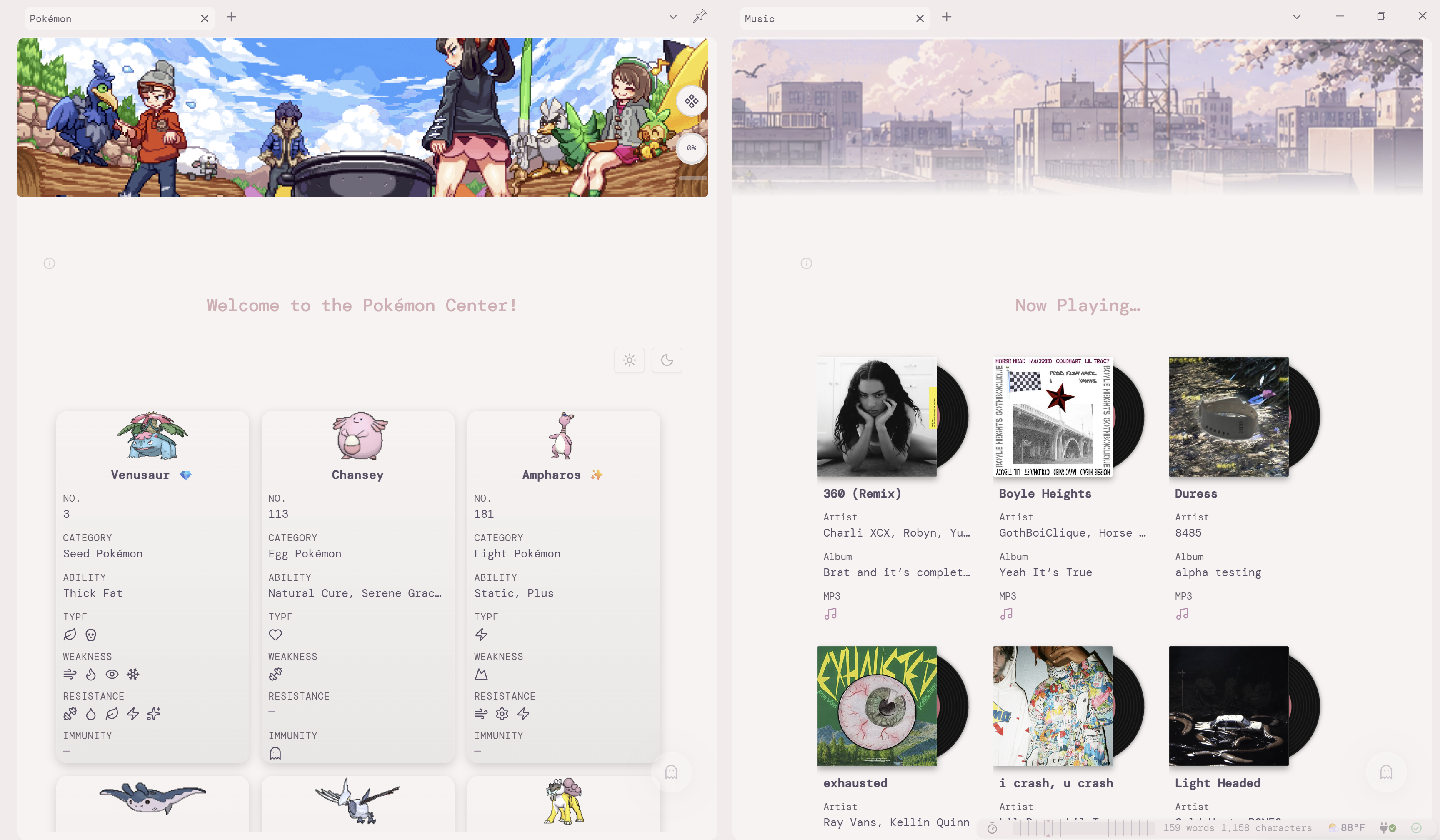
cssclasses: [pcbox, no-fade]
---


![[Collection.base]]
| Class | Effect |
|---|---|
pcbox |
Collection cards with centered titles and a gentle hover lift. |
musicshelf |
Album-style covers with a vinyl record behind them; configure an image/cover property in the Cards view. |
mailbox-cards |
Airmail cards with hidden property labels; stays fully opaque. See the property names below. |
no-fade |
Keeps other card styles fully opaque without hovering. |
no-group |
Hides group property label |
no-head |
Hides the embedded Base's toolbar/header; also works with other view types. |
center-card |
Centers card titles. |
frameless-cards |
Cards without any background or container. |
Bases Formulas
If frameless-cards and center-card cssclasses are both applied to a note, formula.center-subtitle displays a property as a centered heading.
In a Card Base view embedded in a note with the cssclass mailbox-cards, add these formulas with these exact names in this order:
icon: the stamp row; return the icon you want to display.mailbox-bold: bold heading text, such as the file name.- Your other properties: dates, descriptions, etc.
mailbox-cards: the footer with a separator above it.
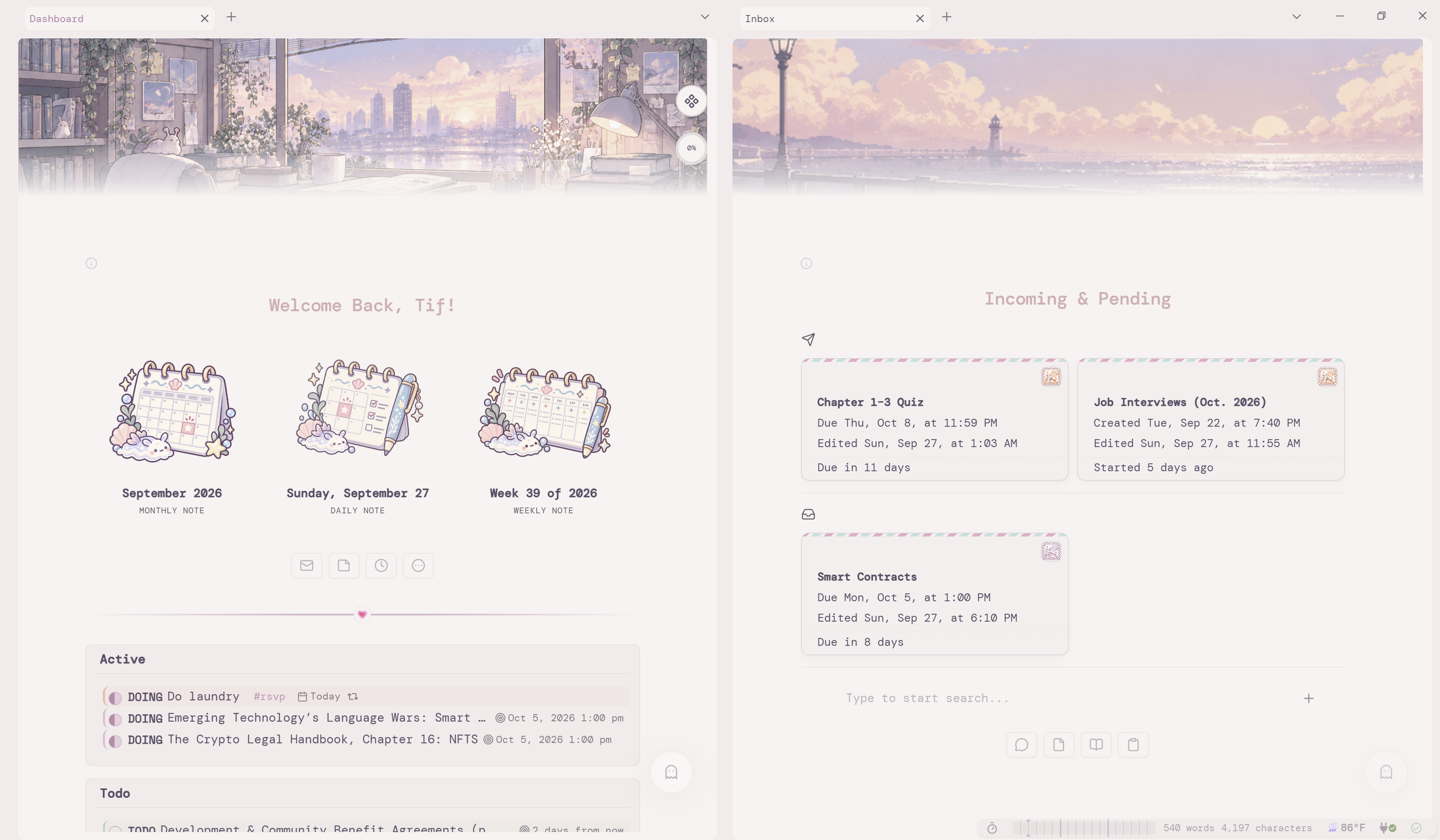
These are formula names, not display labels; CSS targets center-subtitle, formula.icon, formula.mailbox-bold, and formula.mailbox-cards. The styling does not create formulas or calculate values for you.
Banners & Images
---
cssclasses: [banner, banner-fade]
---
![[image.jpg|banner]]
Image aliases also support center and right.
Asides
Put an HTML aside before the paragraph it belongs to:
<aside class="aside-right">A short side note.</aside>


Your main paragraph goes here.
View in Reading view with Readable line length enabled. Asides sit in the outer margin when the pane is wide enough; in narrower panes, text wraps beside them. Use plain text or HTML inside the aside, rather than Markdown formatting.
Lists
| Tag | Result |
|---|---|
#mcl/list-grid |
Column grid |
#mcl/list-card |
Card grid |
#tree-view |
Collapsible threaded tree |
Put the tag inside the list. It is hidden in Reading view.
Callouts
> [!polaroid] Polaroid
> ![[photograph.jpg]]

> [!note|float-right-small] Small floating note
> Text wraps around it.

> [!lucide-scale|custom-icon purple] Custom icon
> Omit the color metadata to use the purple default.
| Group | Types or metadata |
|---|---|
| Other types | email, conversation, conversation-outline, conversation-minimalist, timeline, polaroid |
| Custom icon | [!lucide-icon|custom-icon]; add a color after custom-icon when needed |
| Layout types | blank, multi-column |
| Colors | gray, brown, red, orange, yellow, green, cyan, blue, purple, pink |
| Cleanup | no-bg, no-background, no-icon, no-title, blank, wide, black-and-white, b-w |
| Floats | left, right, float-left, float-right; sized forms: float-left-small / float-right-small (also medium, large) |
| Timeline | horizontal, numbered, skip |
sep |
Hover-to-Expand
When enabled in Style Settings, ordinary callouts start with their content hidden and reveal it on hover. Add + immediately after the closing bracket ([!note]+) to start expanded instead. Use this for layouts that need their content visible, such as multi-column groups or image card.
In multi-column layouts, for example, add + to both the outer container and each nested callout:
> [!multi-column]+
> > [!info]+ Title
> > Content
>
> > [!warning]+ Title
> > Content
>
> > [!tldr]+ Title
> > Content
Checkboxes
| Marker | Meaning | Marker | Meaning | Tag | Meaning |
|---|---|---|---|---|---|
/ |
Incomplete | - |
Canceled | #A |
High priority |
> |
Forwarded | < |
Scheduled | #B |
Medium priority |
? |
Question | ! |
Important | #C |
Low priority |
* |
Star | “ |
Quote | #rsvp |
Recurring |
l |
Location | b |
Bookmark | #show |
Event |
i |
Information | I |
Idea | #productivity |
Productivity |
S |
Savings | p |
Pro | ||
c |
Con | f |
Fire | ||
k |
Key | w |
Win | ||
u |
Up | d |
Down | ||
R |
Rule | m |
??? |
Installation
- Install and enable BRAT.
- Choose
Add a beta themeand enterhttps://github.com/t-if/sea-slug. - Select
Sea SlugunderSettings → Appearance → Themes.
Credits & License
Based on Chime, with adapted work from MCL Multi Column, Obsidian Banner Snippet, Fancy-a-Story, Minimal, r-u-s-h-i-k-e-s-h's snippets, Maple, and Adrenaline. Source comments contain detailed attribution.
Licensed under GPL-3.0-or-later.