
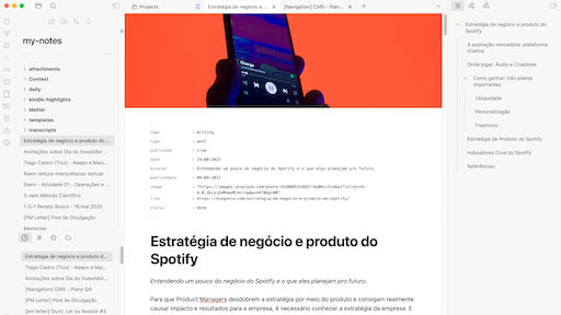
README file from
Githubcreated: 2026-08-22
Obsidianotion

Contents
- About Obsidianotion
- What changed in 2.0
- What this theme does — and doesn't do
- To install
- Checklists styles
- Customizing
Do you have any suggestions or feedback, please, let me know: https://forms.gle/AnQgXjt56NSmhDnn6
About Obsidianotion
Your Obsidian with a similar look and feel of Notion. But it's better because it's Obsidian!
I know it can be challenging to migrate between tools, and the process can greatly impact your productivity. That's why good design can help accelerate the learning curve by creating a familiar context of experience to help us focus on the only thing that matters: note-taking.
This theme can help people who are migrating from Notion to Obsidian to feel more comfortable with the new flow and interface. It can also be a beautiful theme for those who already use Obsidian frequently.
What changed in 2.0
Version 2.0 is a full rewrite, built directly on top of Obsidian's official CSS variable system (as documented at docs.obsidian.md) instead of ad-hoc selectors. It brings over Notion's core visual pillars:
- Colors — a warm off-white sidebar, white note canvas, near-black body text, and Notion's single signature blue reserved for links and active/focus states. A separate dark ("night") palette follows the same logic.
- Typography — Inter (with a system-font fallback stack), heavy bold headings with tight tracking, and a calm 400-weight body text at comfortable line height.
- Content formatting — headings, paragraphs, blockquotes, inline code and the page title (
inline-title) are all restyled to read like a Notion document. - Properties (YAML frontmatter) — the property list is restyled to match Notion's quiet key/value rows: muted labels, no heavy borders, subtle hover states.
- Sidebar structure — spacing, radius and muted/active text colors for folders and files follow Notion's file tree rhythm, with a hairline separating the icon ribbon from the file explorer.
- Shape & elevation — Notion's radius scale (4 / 8 / 12 / 16px) and "barely-there" shadow system for modals, popovers and menus.
- Colored callouts — note/warning/error/success/etc keep Obsidian's own per-type colors, just reshaped to the theme's radius and a softer tinted border instead of a flat grey one.
- Alternate checklist styles — carried over from Obsidianotion 1.x (credit: Minimal theme), always on. See Checklists styles below.
- Cycled tag colors — the
tagsproperty and inline#tagscycle through a 7-color palette by position (see note below — this is a CSS-only approximation, not a per-tag identity color).
What this theme does — and doesn't do
This theme reproduces Notion's design pillars — color, type, spacing, shape — not Notion's specific UI widgets. On purpose, it does not:
- add page-cover images or large icons above the title
- reskin tables, kanban boards, or tabs to look like Notion's own
- bundle custom fonts (it relies on Inter being available, or falls back to your system's UI font)
- give a tag a stable color tied to its name — Obsidian themes are CSS-only (no JS), so there's no way to hash "#project" to always be the same color the way Notion does. Tags are colored by their position in a list instead, cycling through 7 hues. The same tag can land on a different color if the list order changes. For a truly stable per-tag color, pair this theme with a plugin like Colored Tags.
If you want any of the above, pair this theme with a plugin built for that purpose (banners, icons, etc.) — see Companion plugins below.
To install
- Open the Settings in Obsidian;
- Navigate to Appearance tab;
- Under the Themes section, click on the
Managebutton across from Themes - Search for
Obsidianotionin the Search field text - Click
Useand then you're done! 🎉
Checklists styles
Obsidianotion supports a wide number of alternate checkbox types, always on:
**Basic checklists:**
- [ ] normal
- [/] incomplete
- [x] done
- [-] canceled
- [s] forwarded
- [<] scheduling

**Extras checklists:**
- [?] question
- [!] exclamation
- [*] star
- ["] quote
- [l] location
- [b] bookmark
- [i] information
- [S] savings
- [I] idea
- [p] thumbs up
- [c] thumbs down
- [f] fire
- [k] key
- [w] win
- [u] up
- [d] down
Credit: Minimal theme.
Credits
- Checklist glyphs adapted from the Minimal theme.
- Sidebar file-type icons (folder / note / base) from Lucide — ISC/MIT licensed, the same icon set Obsidian's own UI is built on.
Customizing
The theme is built entirely on Obsidian's standard CSS variables, so you can override any of it with a CSS snippet — no Style Settings plugin required. The most useful variables to tweak:
body.theme-light {
  --interactive-accent: #0075de; /* the single accent color */
  --background-secondary: #f6f5f4; /* sidebar background */
  --font-text-theme: Inter, sans-serif;
}
See Obsidian's CSS variables reference for the full list.
Companion plugins
To install the plugins that have a good fit with Obsidianotion:
- Go to
Community pluginsand turn offSafe mode - Under community themes search for the plugins name and click
Install, thenEnable
Plugins that pair well: