
README file from
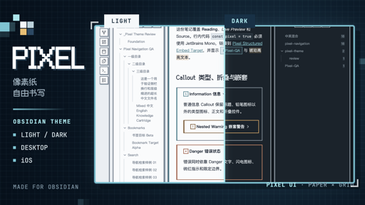
GithubPixel gives Obsidian a calm paper workspace, a crisp pixel identity, and a clear signal system for navigation and focus. It is not a retro filter: body text stays comfortable for long sessions, native interactions remain intact, and personality is concentrated where it helps orientation.
Desktop and iOS are the priority platforms. Both receive purpose-built layouts for Markdown, properties, navigation, Bases, Canvas, Graph, PDF, and the small states that make a workspace feel coherent.
Recent updates
Pixel 1.0.2 refines code panels, adds language nameplates, and fixes overlay scrollbar obstruction:
| Release | What changed |
|---|---|
1.0.2 |
Adds language nameplates, keeps scrollbars clear of code, and improves editing and PDF readability. |
1.0.1 |
Fixes plugin toggle overflow and search-clear backgrounds covering field borders. |
1.0.0 |
First stable release; restores native Claudian content controls and fixes doubled message bubbles and oversized action rows. |
0.9.9 |
Refined motion, reading, search, PDF, Bases, and Canvas, with stable task strikethrough and clearer dark surfaces. |
0.9.8 |
Refined Markdown images, task feedback, and fenced-code identity, while polishing Templater prompts and documentation readability. |
0.9.7 |
Replaced the heavy file-tree context target with a compact cyan cursor, then restored clear contrast and state feedback for Project Manager add actions. |
0.9.6 |
Brought Project Manager task tags, truncation, and removal controls into Pixel's compact capsule system. |
0.9.5 |
Docked Project Manager settings actions, unified custom-field controls, and added a dedicated Project Manager Insights treatment. |
0.9.4 |
Redesigned the task editor and assignee display, improved long-title layouts, and made destructive feedback quieter. |
0.9.3 |
Introduced Pixel Boy, the Claudian integration, and a more coherent system for settings, search, tags, and status information. |
Pixel Boy
A new tab with somewhere to go
A blank tab becomes a pocket console. Obsidian's native Create, Open, and Close actions stay fully functional inside a dot-matrix display, while the shell, D-pad, face buttons, power light, and speaker complete the handheld.
The console contracts for narrow panes without turning decoration into an interaction layer. Keyboard shortcuts, pointer targets, forced colors, and reduced-motion preferences continue to belong to Obsidian.
Feature map
Gallery
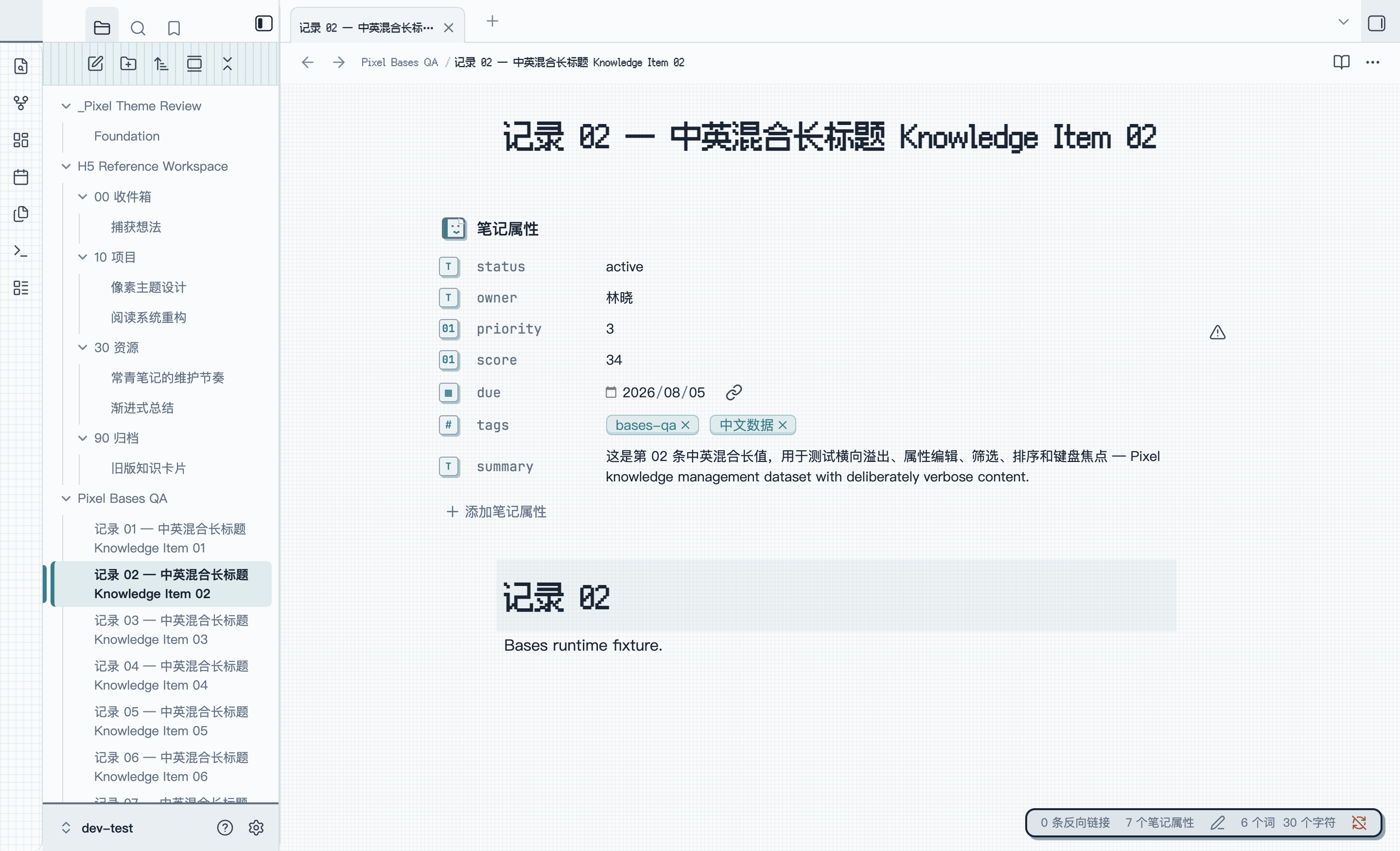
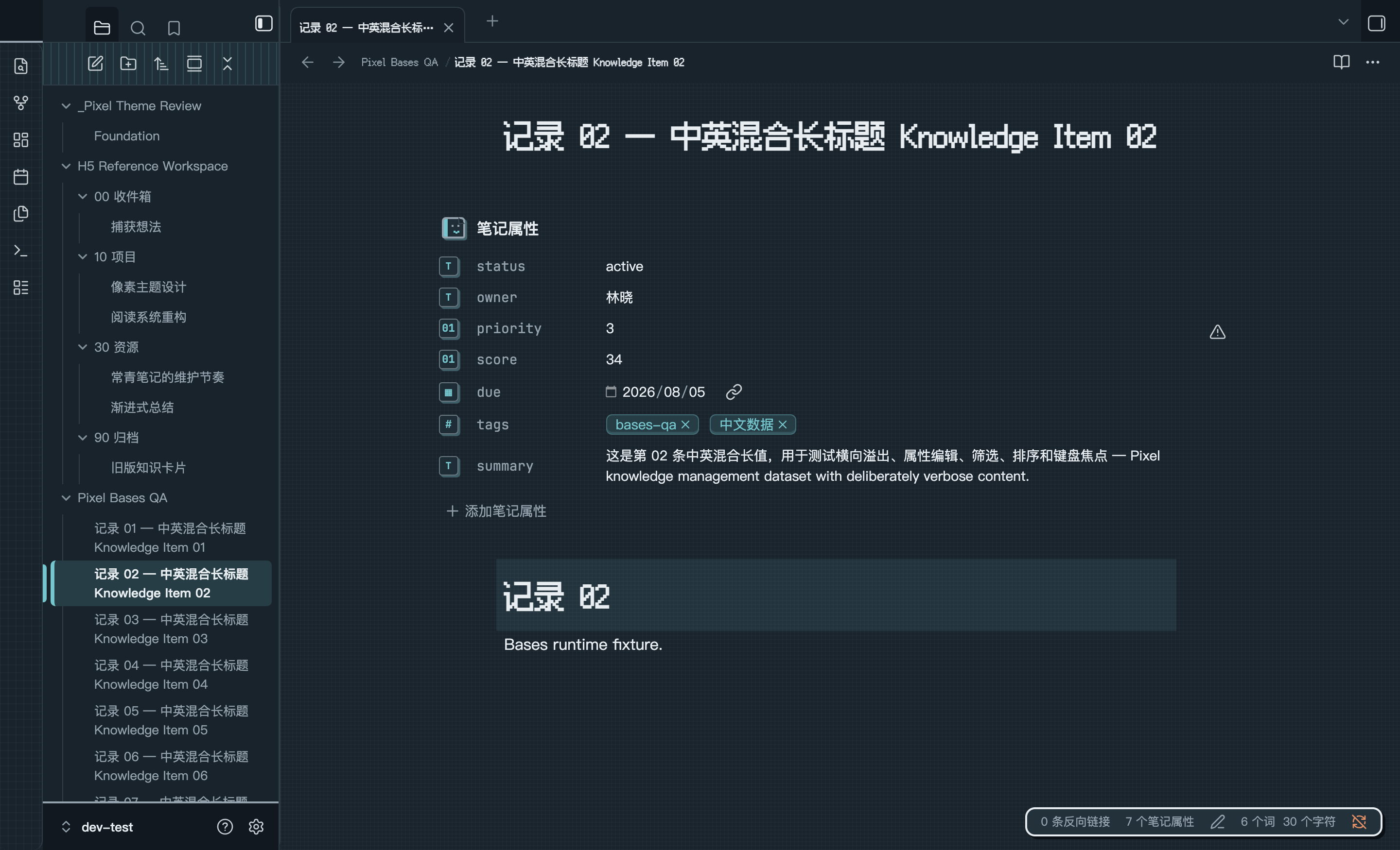
Desktop · one continuous work surface
Navigation lives on the left, the note keeps the center, and context settles on the right. The compact status pod follows the live right-dock width so the workspace reads as one deliberate console rather than a stack of panels.
Markdown · A closer look
Real Reading mode details from Theme Debug/Pixel Markdown 全格式调试 in the dev-test Vault. Open an image to inspect it at full resolution.
Visual language
| Role | What it communicates |
|---|---|
| Paper | Notes, menus, settings cards, and primary reading surfaces. |
| Canvas | The cool workspace around content and secondary regions. |
| Cyan | Active navigation, links, caret, controls, and keyboard focus. |
| Amber | Properties, attached context, emphasis, and attention. |
| Brick | Errors, warnings, destructive actions, and the Pixel Boy controls. |
| 4 / 6 / 10px radii | Pixel structure at small sizes and comfortable touch geometry at larger sizes. |
Light and Dark use independently tuned semantic colors rather than simple inversion. Normal text, secondary text, focus indicators, and meaningful control boundaries are designed against accessible contrast targets.
Built across Obsidian
- Consistent heading rhythm across Source, Live Preview, and Reading modes.
- Links, emphasis, lists, quotes, tasks, continuous tag capsules, highlights, footnotes, math, and comments.
- Local overflow for code, tables, embeds, and media without compressing the full note.
- Clear selection, caret, active line, folding, and indentation states.
- File navigation, tags, search, bookmarks, outline, backlinks, and outgoing links.
- Note properties and property suggestions, including iOS editing states.
- Global and Local Graph controls and semantic states.
- Canvas cards, groups, media, edges, selection, and editing.
- Bases tables, lists, cards, filters, sorting, and property editing.
- PDF chrome, sidebar, thumbnails, search, and selection while preserving document pixels.
- Independent setting cards, stable hover and focus feedback, compact native controls, and a circular accent-color well.
- Normal text targets at least
4.5:1contrast; meaningful icons and control boundaries target at least3:1. - Keyboard focus uses outline, surface, and position cues instead of color alone.
- Reduced motion, forced colors, and increased contrast preferences are supported.
- User fonts, font sizes, accent, selection, and caret settings remain authoritative.
- Claudian: plugin-native conversation and composer controls, with a boundary excluding shared Pixel control decoration from its content pane. Pane chrome, inherited theme variables, and shared Markdown styling remain themed.
- Project Manager: task editing, project settings, custom fields, assignees, tags, long titles, and action feedback.
- Project Manager Insights: filters, metrics, assignee summaries, and task details for the read-only workload view.
- Templater: compact prompt inputs with a quiet hairline edge and accessible focus fallbacks.
Installation
Pixel is available in Obsidian's community theme directory:
- Open Settings → Appearance in Obsidian.
- Select Manage under Themes.
- Search for Pixel, install it, and select Use.
Obsidian's built-in theme updater delivers later published versions from the matching GitHub Releases.
Manual installation
- Download
manifest.jsonandtheme.cssfrom the latest GitHub Release. - Create
.obsidian/themes/Pixel/in the target Vault. - Put both files in that directory.
- Restart Obsidian if necessary, then select Pixel under Appearance.
Use tagged Release assets for a stable manual installation. Files on main
may contain work intended for the next version.
For a synced Vault on iOS, wait for .obsidian/themes/Pixel/ to finish syncing
before restarting Obsidian.
Customization
Pixel respects Obsidian's own appearance settings without requiring a companion plugin:
- Light or Dark mode
- Text and interface fonts
- Base font size
- Accent color
Pixel does not currently expose custom Style Settings controls. The Style Settings plugin is optional and is not required to install, use, or customize the theme.
Fusion Pixel is embedded for identity headings. Code and technical status use Obsidian's configured monospace font with system fallbacks, while body text uses the user's text font and operating-system fallback for uncommon characters.
The named community-plugin integrations are listed under Built across Obsidian. Other plugins that use official Obsidian variables and Setting components generally inherit the theme naturally, but individual community plugins are not compatibility commitments unless named there.
Compatibility
| Item | Current information |
|---|---|
| Current version | 1.0.2 |
| Obsidian requirement | 1.12.0 or newer |
| Priority platforms | Desktop / iOS |
| Verified desktop environment | Obsidian 1.13.4 / macOS |
| Appearance modes | Light / Dark |
| Distribution | Obsidian community theme directory / GitHub Releases |
| Installable files | manifest.json, theme.css |
| Theme license | MIT |
| Embedded font license | SIL Open Font License 1.1 |
Development
Pixel requires Node.js 24 and npm:
npm ci
npm run build
npm test
npm run check
npm run buildcompilestheme.cssand optionally deploys to the dedicated development Vault.npm run devwatches Sass sources.npm testruns structural, compatibility, and release-contract tests.npm run checkverifies that generated output matches the source without modifying it.
src/scss/index.scss is the only Sass entry point. Edit sources under src/;
do not edit generated theme.css directly.
For guarded deployment, see the Chinese development details.
Releasing
manifest.jsonis the authoritative current version.versions.jsonpermanently maps every published theme version to its minimum Obsidian version.- Only an unprefixed
x.y.zannotated tag triggers release CI. - A verified release publishes only
theme.cssandmanifest.json, with GitHub build provenance attestations. - Public tags, Releases, and assets are immutable; regressions are fixed forward with a new PATCH.
See the complete release and Obsidian community update guide.
Feedback
Use GitHub Issues for public feedback. Include Pixel and Obsidian versions, operating system, Light or Dark mode, reproduction steps, screenshots, and any enabled CSS snippets or community plugins.
License
Pixel is released under the MIT License. The embedded Fusion Pixel
font retains its SIL Open Font License 1.1 terms; source, checksum, and license
details are available under src/assets/fonts/.