
README file from
GithubPastello
A soft pastel theme for Obsidian, in light and dark, made for long reading sessions.
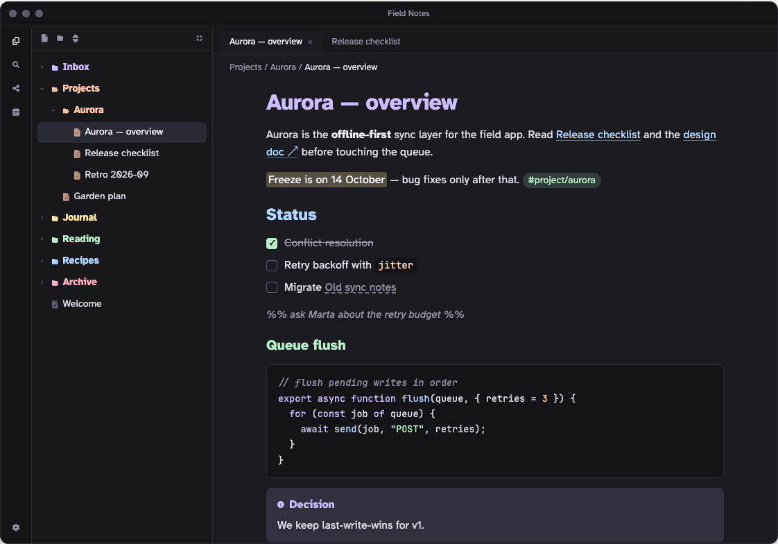
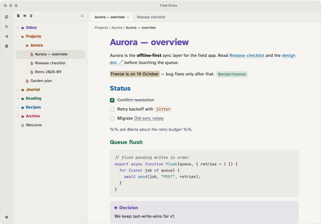
Screenshots show the Colorful by position folder option; with the default, Colorful by name, folder hues follow their names instead.
- Easy on the eyes. Soft charcoal and warm paper backgrounds instead of pure black or white, the hyper-legible Atkinson Hyperlegible typeface, and a relaxed 1.6 line height.
- Every element is distinct. Headings, links, tags, inline code, code syntax and comments each get their own hue and their own shape (size, weight, italic, underline, pill), so color is never the only cue.
- Colored folders. Each top-level folder in the file explorer gets one of six pastel hues (lavender, peach, butter, mint, sky, rose), picked from its name, and everything inside inherits it.
- Readable in both modes. Body text, muted text and all six hues reach at least 4.5:1 contrast (WCAG AA) on the note background, in light and dark.
- Desktop and mobile. Touch-sized file tree rows (44px), mobile heading sizes, and code blocks that scroll instead of wrapping on phones.
Install
From Obsidian: open Settings → Appearance → Themes → Manage, search for Pastello, then select Install and use.
Manually: download manifest.json and theme.css from the latest release, put them in <your vault>/.obsidian/themes/Pastello/, and choose Pastello under Settings → Appearance → Themes.
Pastello needs Obsidian 1.5.0 or later.
Options
Pastello works without any plugin. To change the file explorer style, install the Style Settings plugin and open Settings → Style Settings → Pastello:
| Setting | Options | Default |
|---|---|---|
| Folder colors | Colorful by name: each top-level folder gets a hue from the first letter or digit of its name. Colorful by position: hues cycle in order down the list. Monochrome: neutral folders. | Colorful by name |
| Colored folder style | Colored text: folder names in their hue. Tinted row: a soft tinted row with neutral names. Has no effect in Monochrome. | Colored text |
Colorful by name keeps every folder's hue fixed, even while scrolling a long tree. Letters and digits map to hues in order (a, g, m, s, y and 0, 6 are lavender; b, h, n, t, z and 1, 7 are peach; and so on), so an alphabetically sorted list still cycles through the colors. For names like 01 Inbox, 02 Projects the second digit counts, so they differ too. Two neighbors with the same first letter share a hue, and names starting with an emoji or a non-Latin letter stay neutral.
Colorful by position spreads the hues best (no two neighbors match), but see the known limitation below about long trees.
To pick a folder's hue yourself, add a CSS snippet with a rule like this one, using the folder's name and one of lavender, peach, butter, mint, sky, rose:
.nav-files-container :is([data-path="Work"], [data-path^="Work/"]) { --pf: var(--pastello-mint); }
The accent color (buttons, selection, the mobile "+" button) is lavender by default and follows Obsidian's Settings → Appearance → Accent color if you pick one. Headings, links, tags and code keep their pastel colors.
Fonts
Text uses Atkinson Hyperlegible (regular, italic and bold), which is bundled with the theme, so nothing is downloaded. Bold italic is not bundled, to keep the theme small; the browser slants the bold instead. Code uses JetBrains Mono if you have it installed, or your own monospace font if you've set one under Settings → Appearance → Font, then the system default.
Known limitations
- Colorful by position in very long file trees. This option assigns hues by position among the top-level folders. To stay fast, Obsidian removes rows that are scrolled far out of view, and folders that aren't on the page don't count. So in a long tree a folder's hue can change while you scroll. Small and medium vaults aren't affected. The default, Colorful by name, doesn't have this problem.
- Code block scrolling on mobile works in Reading view. In Live Preview and Source mode, code lines follow the editor's line-wrapping setting.
- The accent-tinted "+" button in the mobile bottom bar needs Obsidian 1.12 or later; older versions show the default button.
Development
src/theme.css is the source. The theme.css at the repository root is generated from it with the fonts and icons embedded, so don't edit it directly. Both scripts need only Python 3.8+ with no dependencies.
python3 build.py      # build theme.css from src/theme.css, fonts/ and icons/
python3 contrast.py   # check WCAG contrast of the color tokens (fails below 4.5:1)
The community directory reviews themes with stylelint-config-obsidianmd. To run the same checks locally (needs Node 22+), install them in a scratch folder outside the repo:
REPO="$PWD"
mkdir -p /tmp/pastello-lint && cd /tmp/pastello-lint
npm install --no-save stylelint@17 stylelint-config-obsidianmd
echo '{"extends":"stylelint-config-obsidianmd"}' > .stylelintrc.json
npx stylelint "$REPO/theme.css" --config .stylelintrc.json
cd "$REPO"
Only its warnings matter for the review; the formatting errors it also prints come from stylelint-config-standard and are ignored there. Keep theme.css under about 100 KB.
Releasing: bump version in manifest.json, rebuild, commit, then create a GitHub release whose tag is exactly that version (for example 1.1.0, no v) and attach manifest.json and theme.css.
test-vault/README.md explains how to set up a test vault with the theme linked in.
Credits and licenses
- Pastello theme: MIT, © raccoon-overlord-dev.
- Atkinson Hyperlegible by the Braille Institute of America, embedded under the SIL Open Font License 1.1. The embedded copies have their hinting removed to keep the theme small; all characters are kept.
- Folder and file icons from Lucide (
folder,folder-open,file-text), embedded as a three-icon subset of the Lucide icon font, ISC License. - Six-hue palette adapted from a pastel Starship prompt preset ("2a colorful").