
README file from
GithubOpus
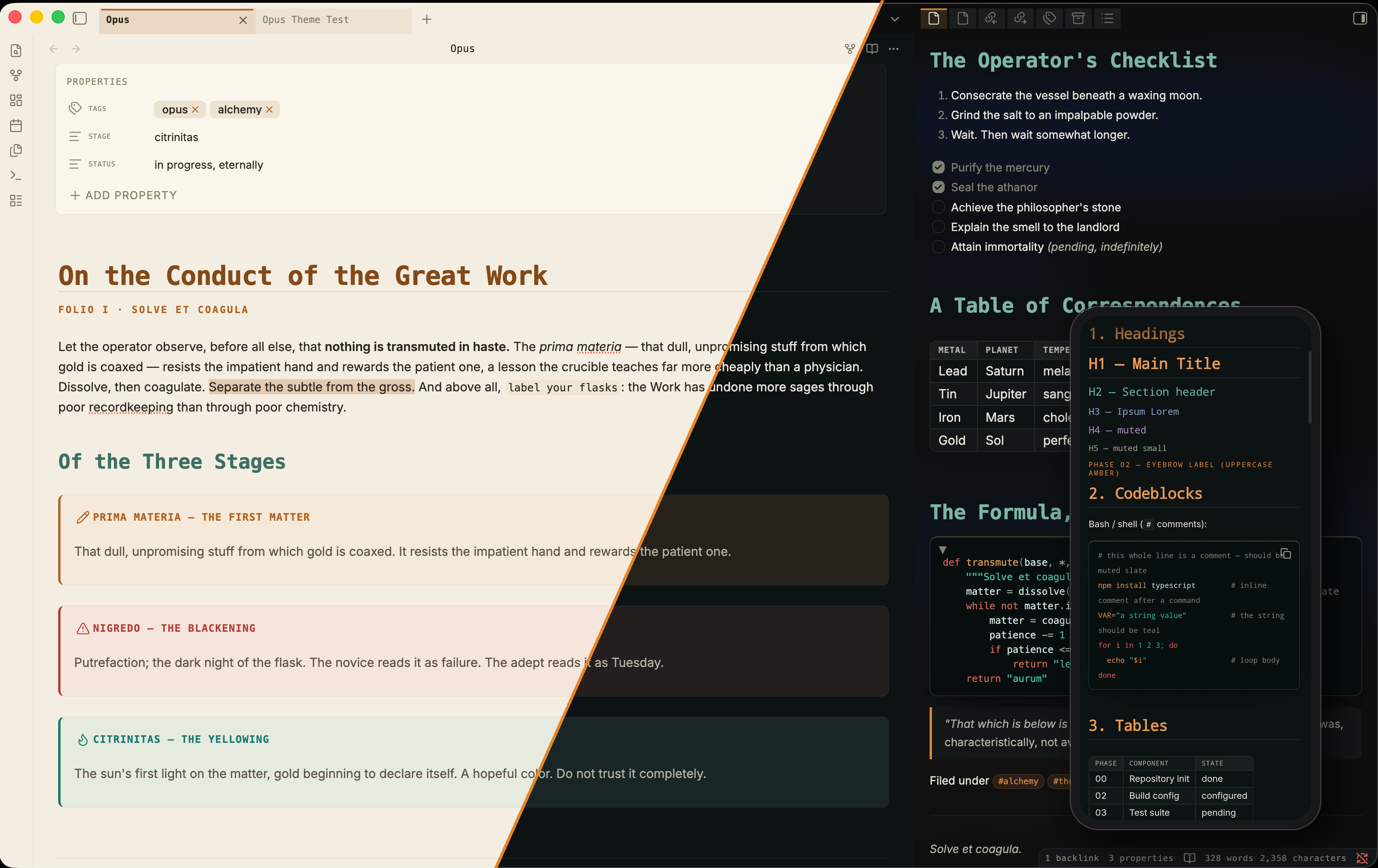
A cold, monospace-forward Obsidian theme with a small, consistent color system. Two palettes drawn from the alchemical Magnum Opus, each tuned for light and dark. At home on desktop and mobile.
The idea
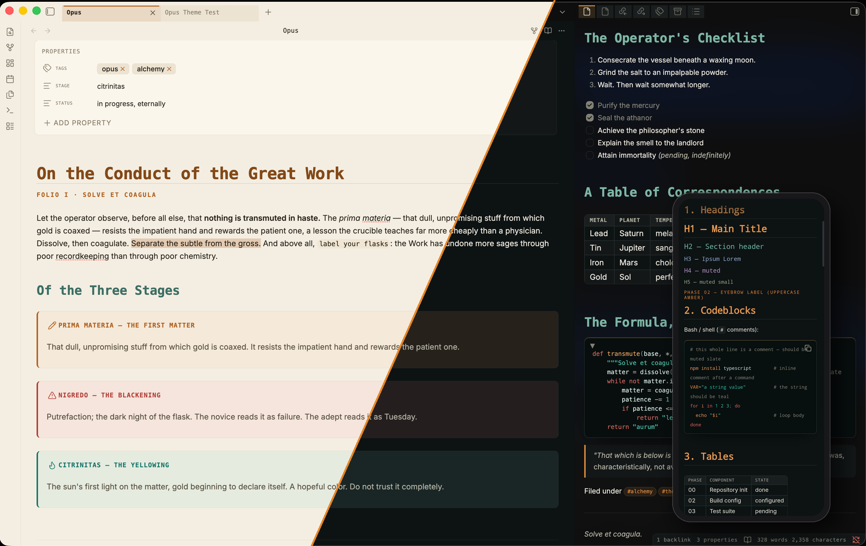
Opus keeps color on a short leash. Most of the interface is plain ink, with a single amber accent pointing at structure and whatever you have active. Teal shows up when something's good, clay when something's wrong, and that's about it. Because those jobs never change, a callout, a task, a code block, and a board all end up reading the same way.
Headings are monospace on a fixed scale, each level tinted its own hue at the same lightness, so a long note scans by structure without drifting into rainbow territory. If you'd rather have hierarchy by weight alone, a toggle brings the monochrome ladder back.
- Monospace headings on a fixed type scale, tinted as one family.
- Amber, teal, and clay mean the same thing everywhere they show up.
- Code reads the same in Reading and Live Preview, with comments in muted slate.
- A canvas that stays sharp when you zoom out.
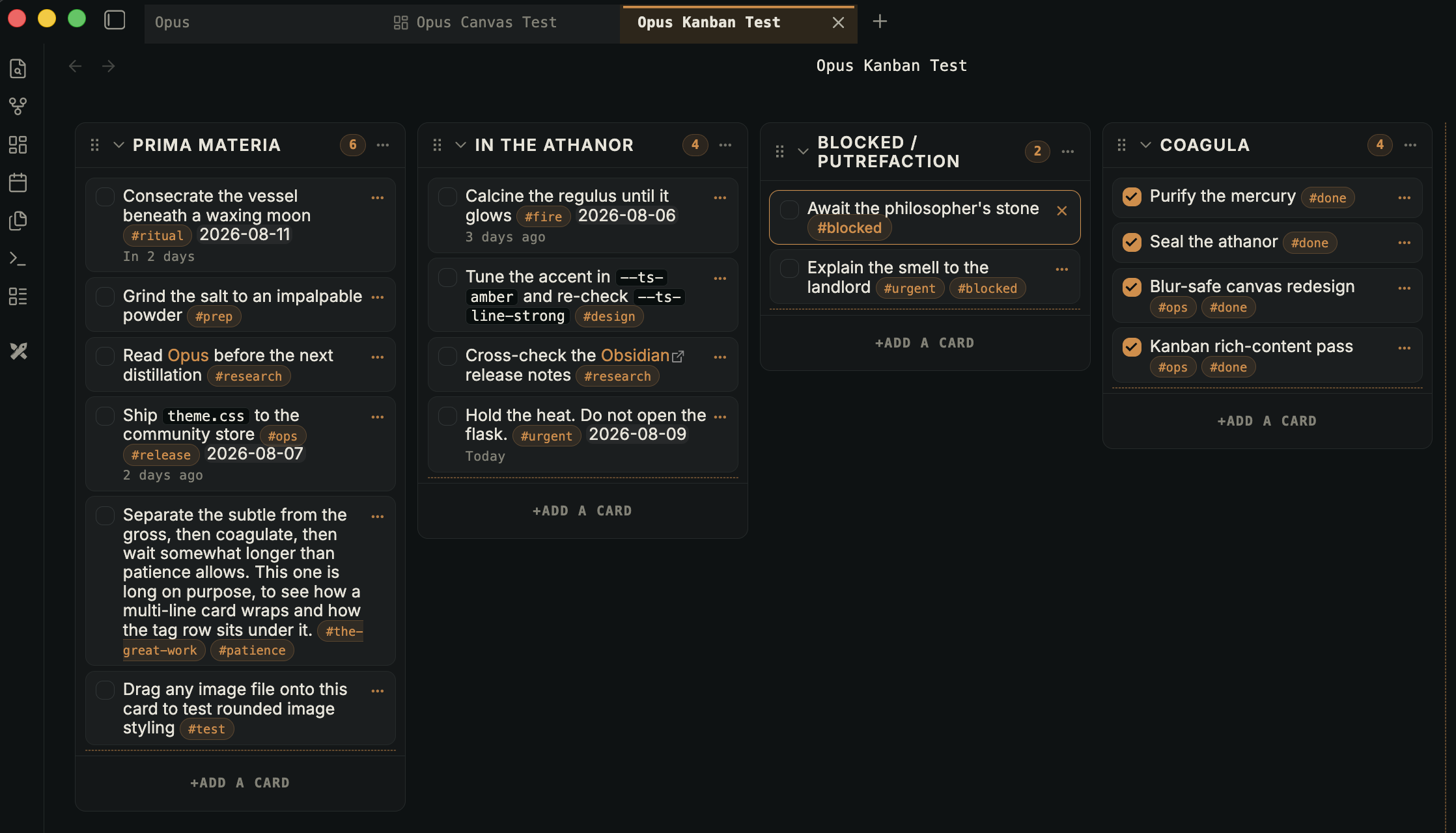
- Kanban treated as a first-class surface.
- Bigger touch targets and phone-tuned reading width on mobile.
- Dataview, Graph, Properties, tables, embeds, and print all styled to match.
Canvas and Kanban
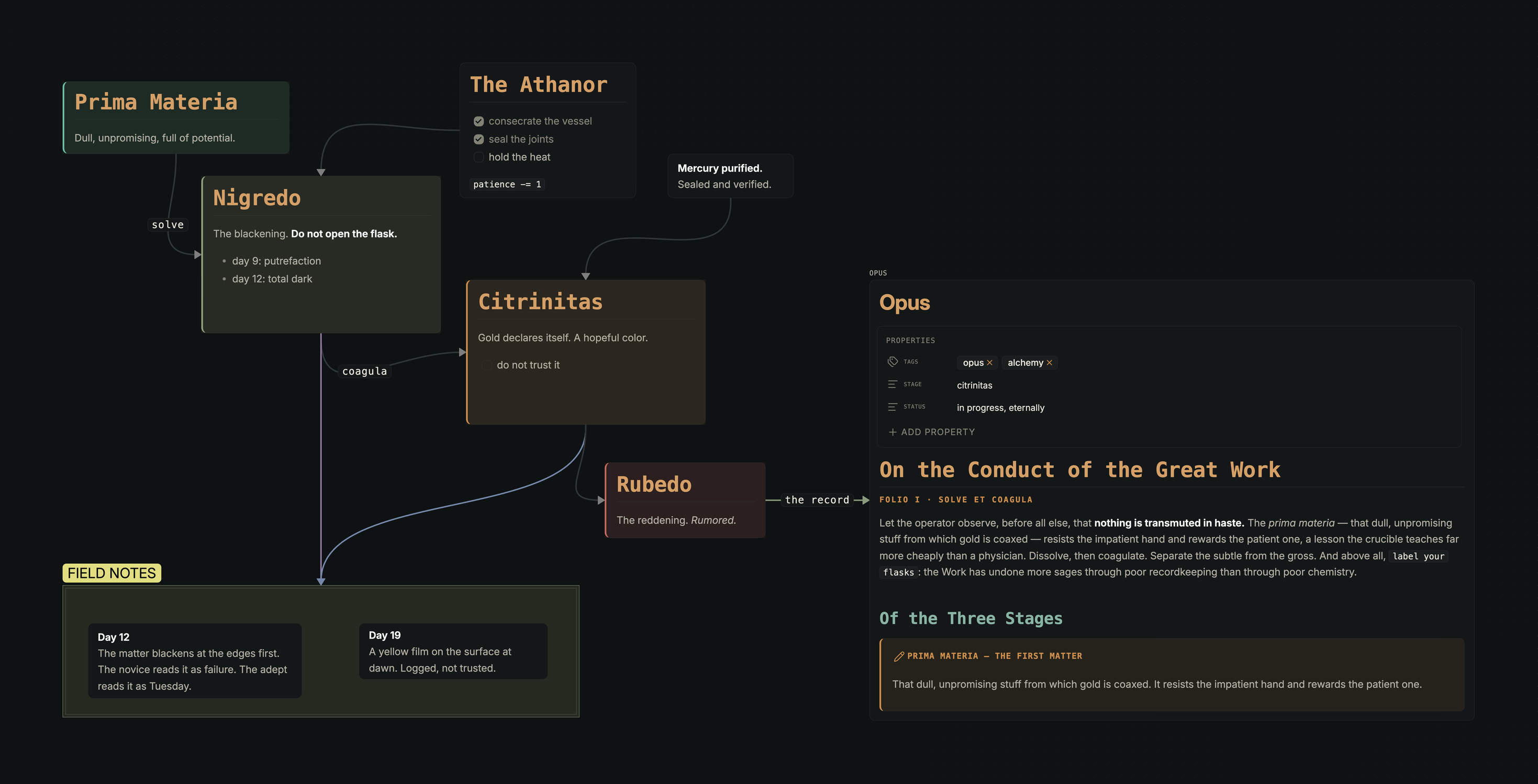
Zoom out on a canvas in most themes and the text goes soft. It doesn't here. Nodes are rounded cards with a color spine, groups are quiet labeled regions, edge labels are big enough to read, and the six preset colors are remapped to a muted set where red means warning and green means good.
Kanban gets the same care. Tags are quiet pills, dates are small mono stamps, images stay inside the card, links and code look like the rest of the theme. Colors you set in the plugin's own settings are left alone.
Flavors
Switch them in Style Settings. Each one is a full contrast-checked palette in light and dark. True black isn't a flavor of its own anymore, since the OLED toggle bakes it onto whichever one you run.
| Flavor | Stage | Palette |
|---|---|---|
| Prima Materia | the first matter (default) | neutral slate (dark) / warm latte (light), amber accent, cold heading ramp |
| Citrinitas | the yellowing | warm & cozy, Gruvbox-spirited, warm heading ramp |
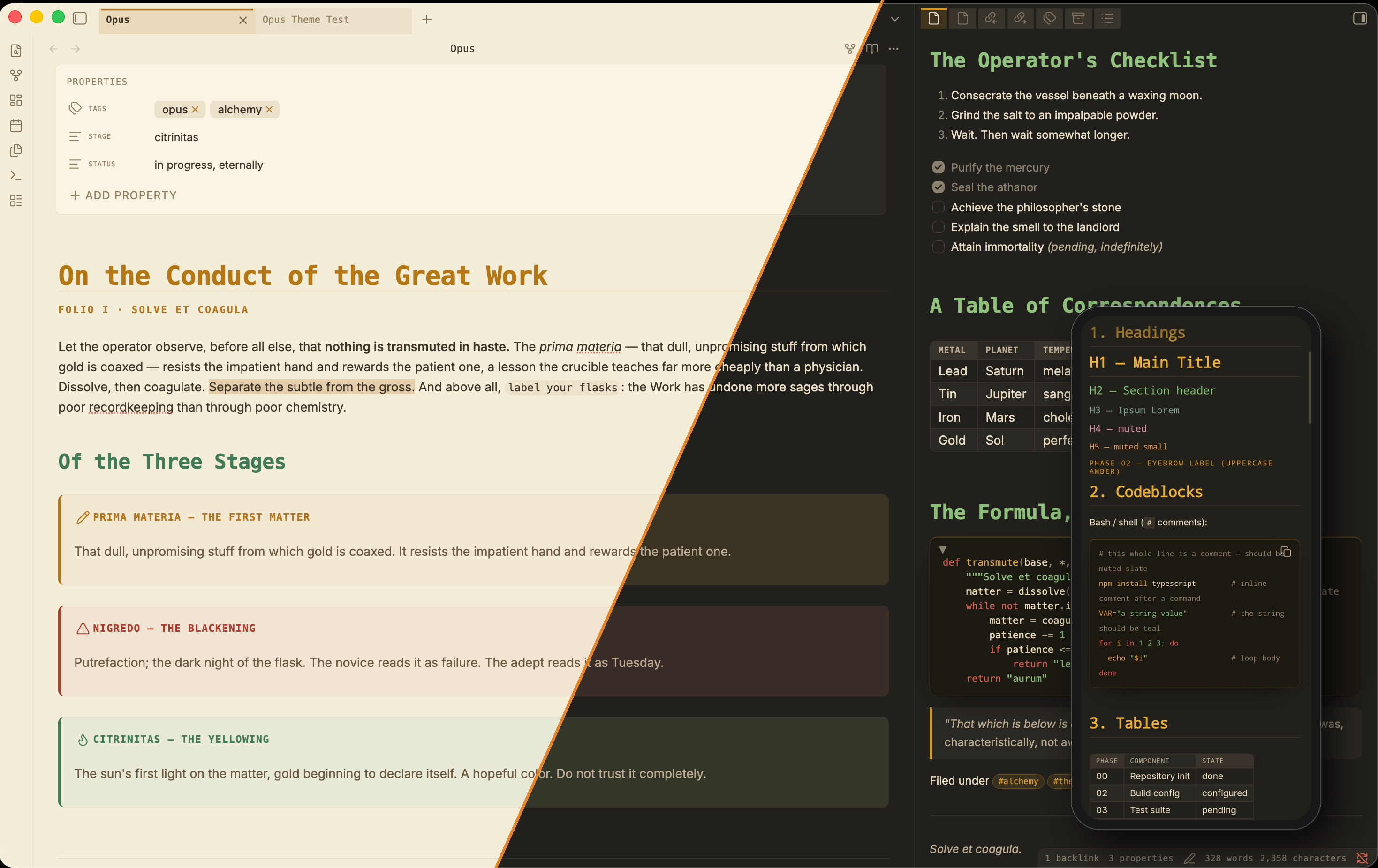
Prima Materia is the hero shot at the top. Citrinitas trades the slate for lamplight and levels its heading ramp on the Gruvbox warm set.
Install
From the community store, go to Settings → Appearance → Manage themes and search for Opus.
For a manual install, put manifest.json and theme.css in YourVault/.obsidian/themes/Opus/, then pick Opus under Settings → Appearance → Themes.
Style Settings
Opus works on its own. The Style Settings plugin adds a panel under Settings → Style Settings → Opus.
- Flavor switches between the two palettes.
- Accent color is one picker, and it overrides the current flavor. Teal and clay stay fixed.
- Layout & motion covers heading spacing, a compact mode, and a motion toggle.
- Measure sets line width, font size, and line height.
- Typography holds the monochrome-headings toggle, sans-serif headings, and font overrides.
- Features can hide the active rails, flatten code blocks, run dark code in light mode, and turn on vivid canvas colors.
- OLED & contrast gives dark mode true black and a higher-contrast ink.
- Mobile scales text and slims the note header.
Compatibility
Obsidian 1.4.0+. Light and dark, Reading and Live Preview, desktop and mobile, both flavors.
License
MIT.