
README file from
GithubAvatar Theme
A vibrant dark theme for Obsidian inspired by the four elements, featuring a carefully crafted color palette of aqua, purple, gold, and pink accents.
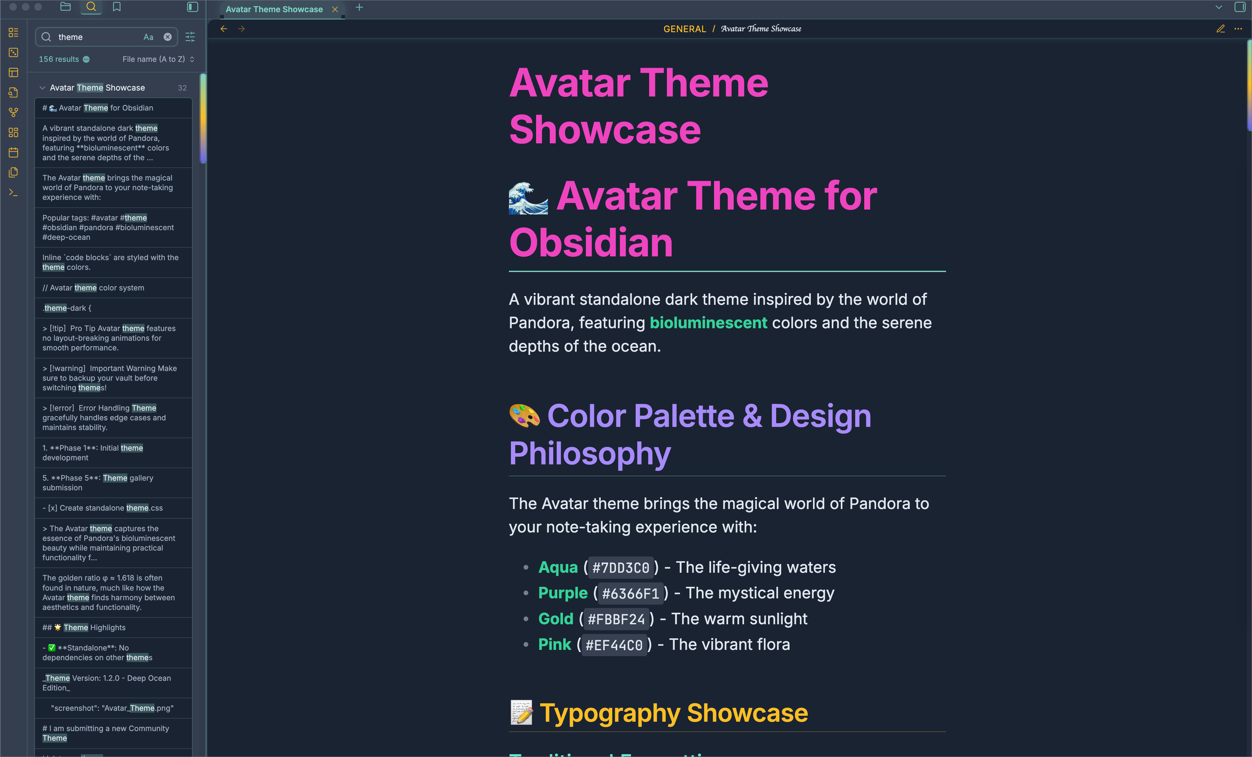
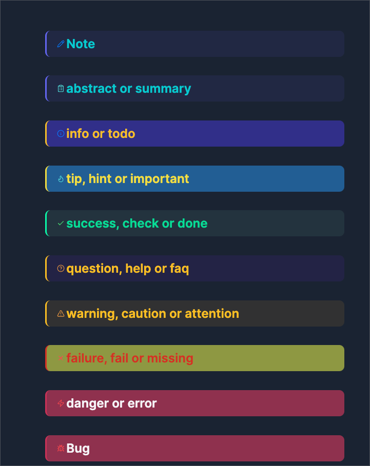
🎨 Color Palette
- Aqua
#7DD3C0- Water element (info, success, links) - Purple
#6366F1- Spirit element (notes, abstracts) - Gold
#FBBF24- Fire element (warnings, highlights) - Pink
#EF44C0- Life element (headers, errors)
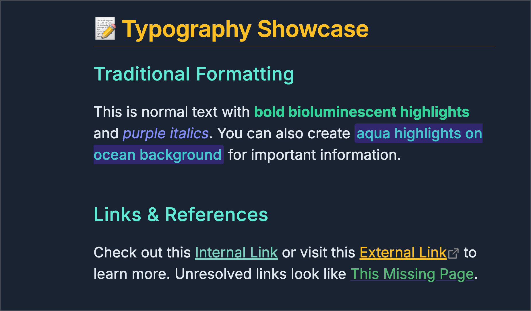
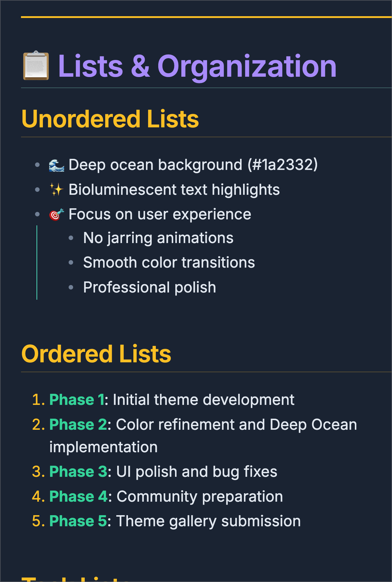
Typography
- Custom header colors for each heading level (H1-H6)
- Enhanced text formatting
- Improved code block styling
- Custom link colors
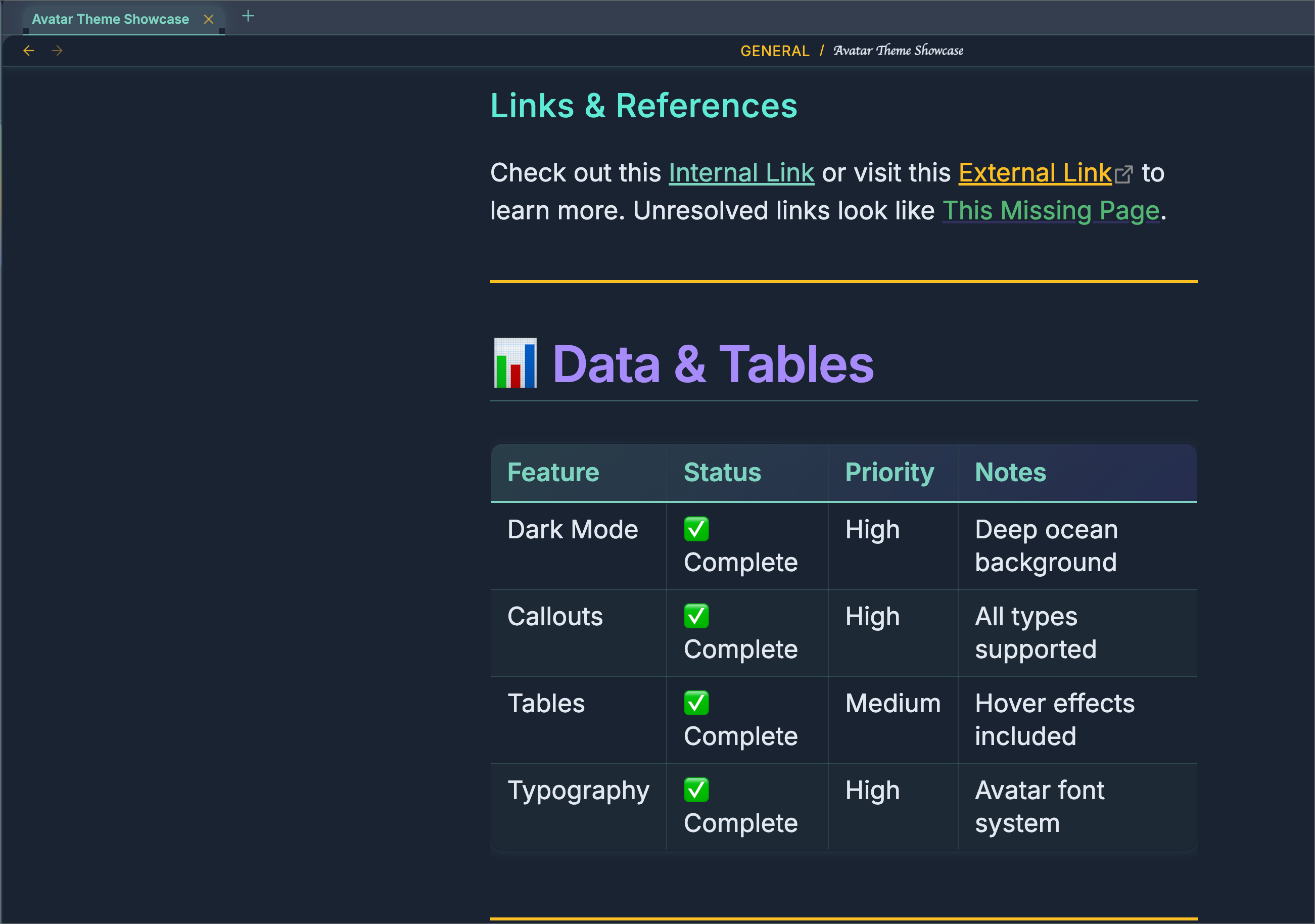
- All tables automatically receive the Avatar treatment with gradient headers and hover effects
📦 Installation
Method 1: Manual Installation
- Download
theme.cssandmanifest.json - Place both files in your vault's
.obsidian/themes/avatar/folder - See Below 'NOTE' for Final Installation Step regarding css snippet:
🛠️ Customization
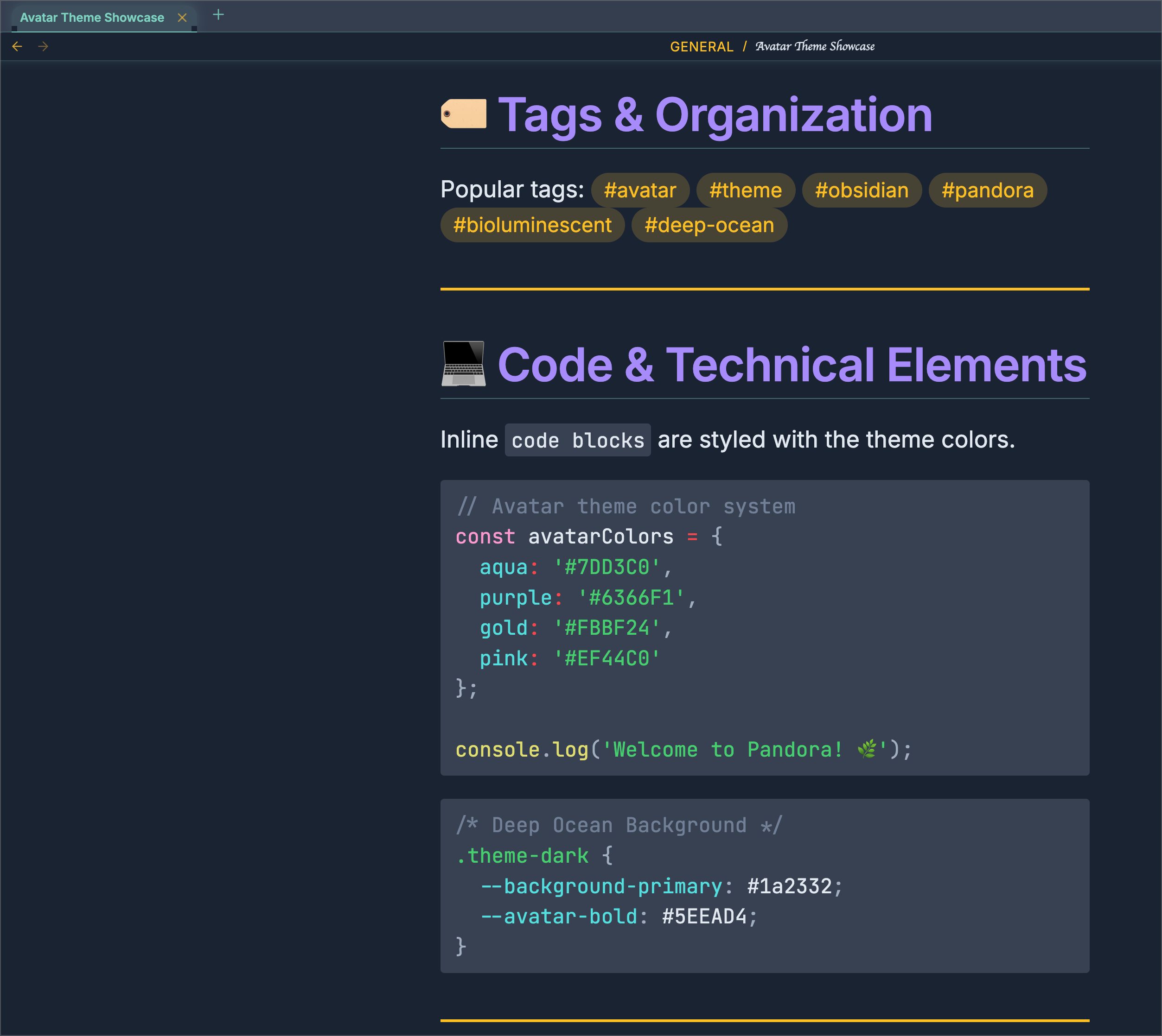
Avatar theme uses CSS custom properties, making it easy to customize:
🐛 Bug Reports & Feature Requests
Found an issue or have a suggestion? Please open an issue on GitHub.
!!! NOTE !!!
You may need to add a CSS snippet to completely force all the changes. I was unable to find a way around it. Below is the snippet to add:
/* ─────────────────────────────────────────────────────────────────────── */
/* Keep the Avatar Theme tab-bar & divider matched, even when unfocused */
/* ─────────────────────────────────────────────────────────────────────── */

/* Dark mode overrides */
.theme-dark {
  /* unfocused tab-bar background → use your focus color */
  --background-secondary: var(--avatar-focus-color) !important;

  /* the 1px line beneath the bar → use your turquoise border */
  --background-modifier-border: var(--avatar-focus-border) !important;

  /* (optional) also force the focused‐state var to the same, if you like) */
  --background-secondary-alt: var(--avatar-focus-color) !important;
}


/*──────────────────────────────────────────────────────────────────────────*/
/* avatar-left-square.css

   Squared 90° corners on all left-side elements (ribbon, drawer, leaves,
   file-explorer) in Avatar Theme (dark mode)    */
/*──────────────────────────────────────────────────────────────────────────*/

/* 1) Sidebar ribbon (icon bar)                                            */
.theme-dark .side-dock-ribbon,
.theme-dark .workspace-ribbon {
  border-top-left-radius:    0 !important;
  border-bottom-left-radius: 0 !important;
}

/* 2) The left “drawer” panel container around your file explorer         */
.theme-dark .workspace-drawer.mod-left,
.theme-dark .workspace-drawer.mod-left .workspace-drawer-inner {
  border-top-left-radius:    0 !important;
  border-bottom-left-radius: 0 !important;
}

/* 3) Any workspace leaves inside that left split (if your theme still    */
/*    applies .workspace-split.mod-left-split rounding)                    */
.theme-dark .workspace-split.mod-left-split .workspace-leaf,
.theme-dark .workspace-split.mod-left-split .workspace-leaf-content {
  border-top-left-radius:    0 !important;
  border-bottom-left-radius: 0 !important;
}

/* 4) The file-list itself (nav-files-container)                         */
.theme-dark .nav-files-container {
  border-radius: 0 !important;
}


/*==============================================*/
/* avatar-breadcrumb-unify.css
Make every breadcrumb segment (including the last file) ALL-CAPS,
use your main font, and your turquoise/gold color (var(--avatar-gold))
/*─────────────────────────────────────────────────────────────────────────*/
.theme-dark .view-header .view-header-breadcrumb,
.theme-dark .view-header .view-header-breadcrumb * {
  font-family:   var(--font-text)    !important;  /* main UI font */
  text-transform: uppercase          !important;  /* ALL CAPS */
  font-style:    normal              !important;  /* kill italics */
  color:         var(--avatar-gold)  !important;  /* unify in gold */
}

/* (Optional) Dim the “/” separators slightly for contrast */
.theme-dark .view-header .view-header-breadcrumb span.delimiter {
  opacity: 0.6 !important;
}