
README file from
GithubCyriform
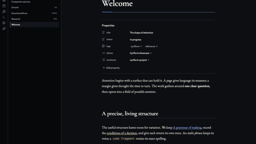
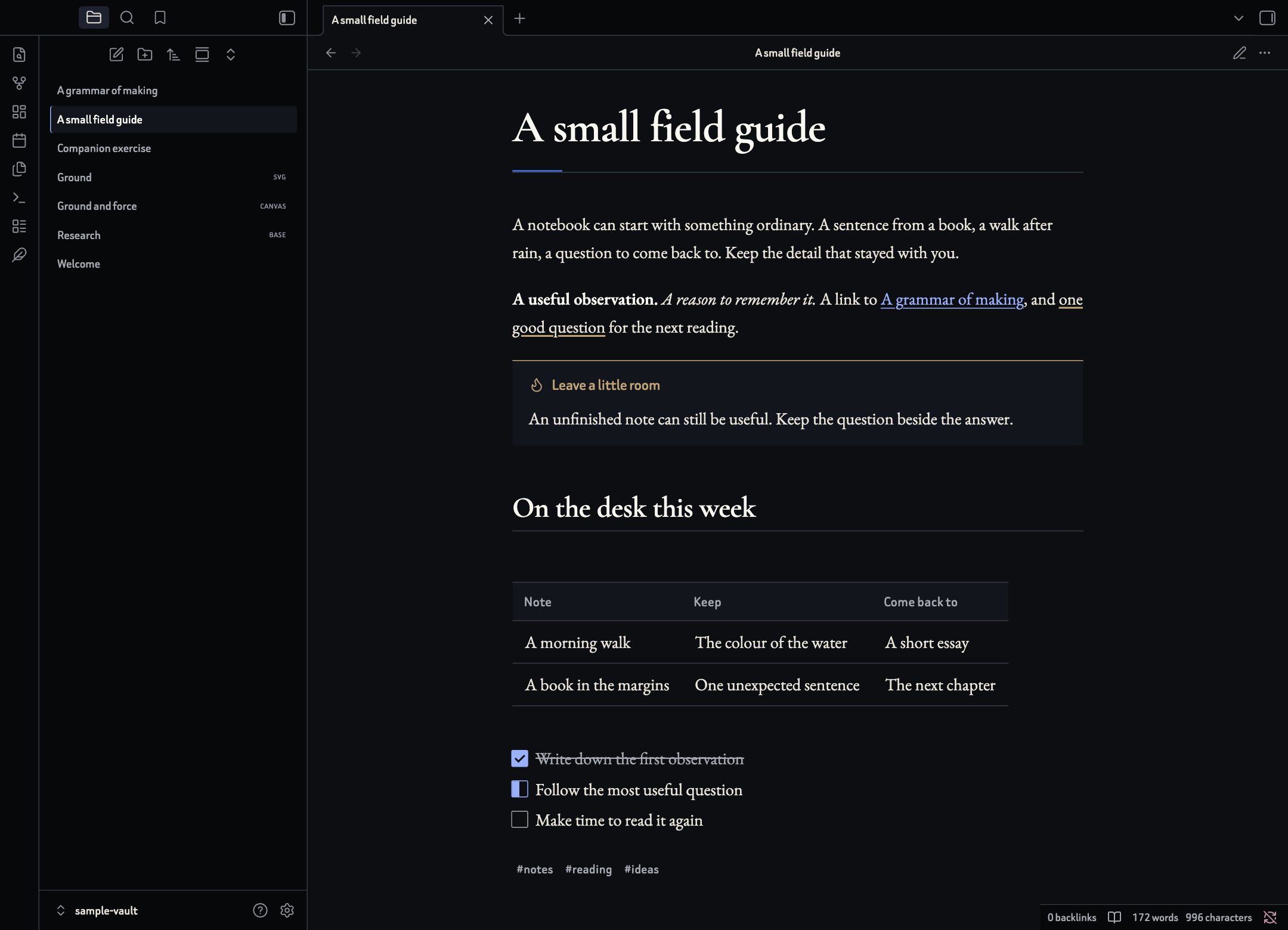
Cyriform is an Obsidian theme with serif text, generous margins and thin dividing lines. Dark mode pairs near-black backgrounds with warm-white text. Light mode uses cream-coloured pages and dark ink. Blue links, gold highlights and muted red accents help you find your way through a note.
The theme works on its own. Add Style Settings to change its appearance across your vault, or Cyriform Companion to style individual notes and insert callouts, highlights and task markers.
Dark mode
Light mode
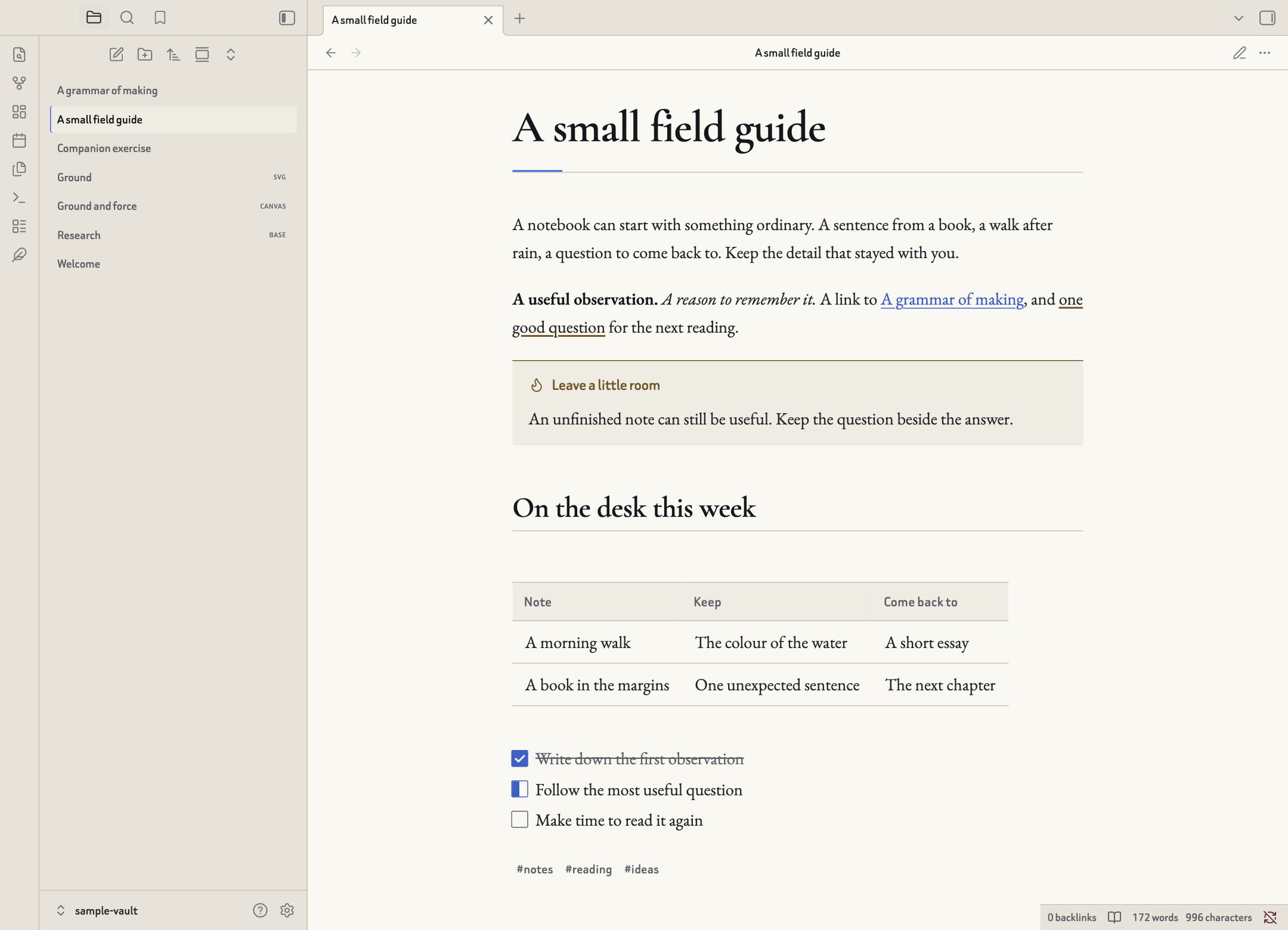
Both images show Obsidian with the theme's default fonts and an original demonstration note.
Install Cyriform
Cyriform requires Obsidian 1.13.0 or later.
- Open Settings → Appearance → Themes → Manage.
- Search for Cyriform, open its page and choose Install and use.
- Choose Light, Dark or Adapt to system under Base colour scheme.
You can also open the Obsidian Community listing. For a manual installation, download theme.css and manifest.json from the latest release, put both files in .obsidian/themes/Cyriform inside your vault, then select Cyriform in Appearance settings.
Reading, writing and everyday details
Cyriform styles both Reading view and Live Preview. Its default reading font is EB Garamond, with Cormorant Garamond for headings and Beiruti for the interface. These three families are bundled with the theme and work offline. Code uses your installed IBM Plex Mono, JetBrains Mono, Menlo or Consolas, falling back to the system monospace font.
Text starts at 19 px, with a line height of 1.65 and a reading width of 70ch, roughly 70 characters. You can change the reading, heading, interface and code fonts separately.
The smaller details include the following.
- Headings and paragraphs. Each of the six heading levels has its own size, weight and colour controls. Optional H1–H6 labels appear on rendered headings. You can adjust paragraph spacing, letter spacing and reading-view first-line indents.
- Callouts and highlights. Standard Obsidian callouts keep their usual folding controls. Cyriform also styles
important,referenceandexperimentcallouts. Choose a line along the top, a full outline, a tinted background or an open layout. Highlights can use an underline, a soft background or a solid fill. - Lists, links and tags. Choose round, square or depth-dependent list markers, add indentation guides, and adjust link underlines and unresolved-link styling. Tags can be plain, outlined or coloured by words such as
urgent,done,referenceandidea. - Tasks. Extra markers distinguish work in progress, deferred or scheduled tasks, questions, important items, favourites and quotations. Numeric markers show progress circles. The examples below show the exact syntax.
- Tables and properties. Tables use evenly spaced numerals. Optional row stripes and cell borders help with dense data; wide tables can extend beyond the text column. Properties have a compact layout option.
- Code, maths and diagrams. Code blocks have adjustable text size, wrapping and ligatures. Maths and Mermaid diagrams share the theme's colours, with optional horizontal scrolling for large diagrams. Footnotes, blockquotes and embedded notes are also styled.
- Images. Adjust image corners, shadows and maximum width. Individual images can become banners, sit beside text, use a smaller grid-sized layout or invert their colours in dark mode.
- The rest of Obsidian. Bases, Canvas, the graph, tabs, file navigation, settings, menus and prompts use the same palette. File folders can be coloured by depth or by names containing
Archive,ProjectandReference.
Task markers
- [ ] To do
- [x] Finished
- [/] In progress
- [-] Cancelled
- [>] Deferred
- [<] Scheduled
- [?] Question
- [!] Important
- [*] Favourite
- ["] Quotation
- [5] Halfway through
The digits 0 through 9 fill a progress circle from 0% to 90%. Use [x] for a completed task. These are visual treatments of the markers stored in your note. Task scheduling, recurring tasks and queries belong to Obsidian or a task-management plugin. Turn on Native task appearance in Style Settings to use Obsidian's usual checkbox styles.
Make it your own with Style Settings
Install and enable the Style Settings plugin, then open Settings → Style Settings → Cyriform. It exposes 89 controls, grouped by what they change.
| Group | What you can change |
|---|---|
| Colour and atmosphere | Choose an atmosphere and set the accent, gold, red, success, page, workspace, code and border colours. Light and dark modes have separate colour values. |
| Typography | Set four font families, body and interface sizes, line height, letter spacing, paragraph gaps, code size, ligatures, first-line indents and emphasis styling. |
| Headings | Set each level's size, weight and custom colour. Choose shared heading colours, heading rules and optional level labels. |
| Page layout | Adjust reading width, side and vertical padding, list indentation, corner radius, border width and scrollbar width. |
| Workspace | Choose compact, standard or spacious controls, solid or translucent surfaces, and plain, ruled or dotted pages. Toggle pane borders, file-tree guides, list guides, focused writing and the active-line background. |
| Note content | Change callouts, highlights, tags, folders, links, unresolved links, dividers, list markers, tasks, code wrapping, tables, diagram scrolling and property spacing. |
| Images and embeds | Set image corners, shadows and maximum width, banner height and embedded-note height. Choose a framed or open embed layout. |
| Motion and mobile | Reduce animation, change its duration, set touch-target size, use tighter mobile spacing and show the mobile ribbon. |
| Print and PDF | Choose white paper or the theme's dark palette, a serif, interface or monospace font, font size, text alignment and printed link destinations. |
The settings reference lists every control, its default and its setting ID.
Five atmospheres
An atmosphere is a preset for page width, spacing, colours and parts of the interface. Try it in Style Settings, then adjust the other controls to suit your reading habits.
| Atmosphere | What changes |
|---|---|
| Clarity | The default layout, with a 70-character text column and thin dividing lines. |
| Home | Warmer pages, a narrower 62-character column and more space between paragraphs. |
| Becoming | Layered background colours and stronger accents around the default reading layout. |
| Intimacy | A 58-character column, more room between lines and italic titles. |
| Release | A wider 74-character column, closer paragraph spacing and quicker menu animations. |
Some presets and per-note styles set their own text width and spacing. Choose Clarity and clear any per-note styles when you want to start again from the general layout controls.
Style individual notes with Cyriform Companion
Cyriform Companion adds searchable pickers with previews. Install it from Settings → Community plugins, or follow its manual installation instructions. It uses Cyriform's styles and works alongside Style Settings.
With a Markdown note open for editing, run Cyriform Companion: Open note tools from the command palette, click the feather in the ribbon, or use Cyriform tools in the editor's context menu. You can also enable the small editor toolbar in the plugin's settings. Each tool has its own command, so you can assign a hotkey to the actions you use most.
| Tool | Choices and behaviour |
|---|---|
| Page state | Important, Attention, Draft, Archived or Pinned. Adds a title label and the corresponding accent or border. |
| Note atmosphere | Home, Clarity, Becoming, Intimacy or Release. Home, Intimacy and Release have distinct note-level styles. Clarity and Becoming follow the workspace's styling in the current version. |
| Note type | Meeting, Daily note, Index, Project, Question, Note, Essay or Letter. Adjusts the title and, for some types, the note's width or spacing. |
| Reading width | Default, Narrow (54ch), Wide (90ch) or Full width. The Home, Intimacy and Release note atmospheres, and the Question and Letter types, set their own widths. Clear those choices to use the width picker on its own. |
| Note accent | Cobalt blue, old gold, oxblood red, mineral green or bone. |
| Callout | Insert any of the standard callout types, plus Important, Reference and Experiment. Selected lines become the callout's contents. |
| Highlight | Wrap selected text in a gold, cobalt, oxblood, mineral or bone highlight. Select text within one paragraph. |
| Task state | Apply any of the ten named task states shown above to the current line. Numeric progress markers can be typed directly. |
| Image layout | Standard, Banner, Left, Right, Grid or Invert in dark mode. Place the cursor in a single-line Markdown image or wikilink embed. |
Type to filter the picker, use the arrow keys to move between choices, press Enter to apply one and Escape to close it. Browsing previews leaves the note unchanged. Page tools update just their own group in the cssclasses property and keep your other classes and properties. Theme default clears that group's choice.
Content tools work on the note and selection captured when you opened the picker. They check that the target is still current before applying the change. Content edits use Obsidian's normal undo history. Disabling Companion leaves the text and classes already saved in your notes in place.
Add note styles by hand
You can use the same styles through Obsidian's cssclasses property. Put this block at the start of a note to give it an Important label, a Project title treatment, a wide column and a gold accent. If the note already has properties, add these entries to its existing cssclasses list.
---
cssclasses:
  - cyriform-important
  - cyriform-project
  - cyriform-wide
  - cyriform-accent-gold
---
State suffixes are important, alert, draft, archived and pinned. Type suffixes are meeting, daily, index, project, question, note, essay and letter. Width suffixes are narrow, wide and full-width. Add cyriform- before each suffix. Atmospheres use cyriform-atmo- followed by clarity, home, becoming, intimacy or release. Accents use cyriform-accent- followed by cobalt, gold, oxblood, mineral or bone.
Image layouts and coloured highlights
Put an image-layout token in the image description. Both of these embed forms work. Replace Landscape.png with an image in your vault.
![[Landscape.png|A view across the hills cyriform-banner|800]]

Use cyriform-banner, cyriform-left, cyriform-right, cyriform-grid or cyriform-invert. Left and right layouts wrap text in Reading view on wider screens. Live Preview and windows 600 px wide or smaller keep those images in the normal text flow. Grid gives an image a smaller inline size; place two grid images in the same paragraph to show them alongside one another. Dark-mode inversion is useful for diagrams with pale backgrounds.
Companion preserves the image description, title and dimensions when changing a supported embed. Reference-style or multiline image syntax can be edited by hand.
For a coloured highlight, use Companion or write the same small HTML tag yourself.
<mark class="cyriform-mark-gold">A detail worth keeping</mark>
Replace gold with cobalt, oxblood, mineral or bone to use another colour.
Plugins, accessibility and export
Cyriform includes styles for Calendar, Dataview, Tasks, Kanban, Admonition, Timeline and Editing Toolbar, as well as PDF-export interfaces. Each plugin continues to control its own features. Exporters that render a separate page also control that page's background and layout.
Keyboard focus remains visible. The theme responds to system preferences for reduced motion and transparency and includes forced-colour fallbacks. Mobile layouts use larger touch targets and adapt the spacing to narrower screens. Print output uses white paper by default.
The theme runs as local CSS with bundled fonts. It is free to use and works offline. You can customise it further with your own snippets; those snippets and your chosen colours can change layout and contrast.
The theme has been checked in Obsidian 1.13.7 on macOS, including Reading view, Live Preview, font settings, Bases and Canvas. Browser checks cover light and dark modes, narrow layouts, keyboard focus, reduced motion and print styling. Physical iOS and Android devices and complete third-party plugin workflows still need separate testing.
Examples, support and development
The examples folder includes demonstration notes, a Base, a Canvas and original artwork. To report a problem, include your Obsidian version, operating system, relevant settings and a small note that reproduces it.
To build the theme from source, use Node.js 20 or later.
npm run build
npm test
src/theme.css contains the styles, src/settings.json defines the Style Settings controls, and src/fonts holds the bundled fonts. The build writes theme.css at the repository root.
Licence
Cyriform's original code, documentation and example artwork use the MIT Licence, copyright 2026 Cyrius. EB Garamond, Cormorant Garamond and Beiruti retain their SIL Open Font Licence terms and copyright notices in licences. Cyriform is an independently developed community theme for Obsidian.