
README file from
GithubBlade Runner
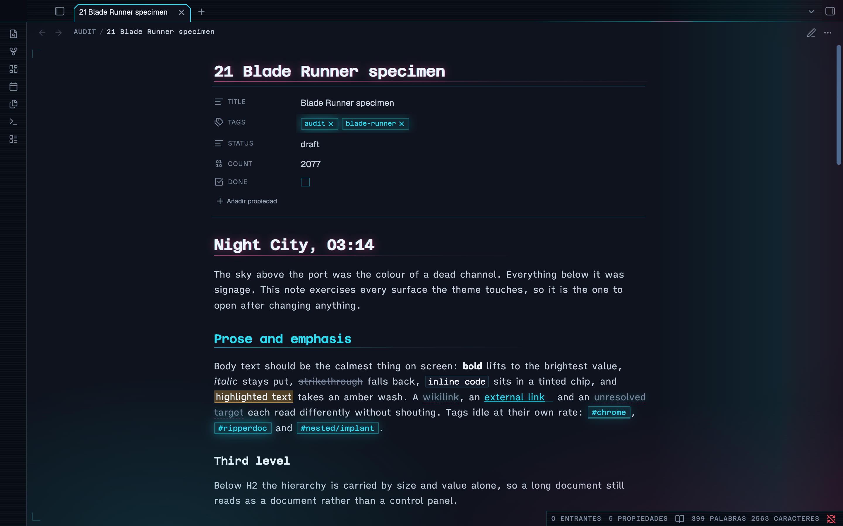
An Obsidian theme where the neon lives in the chrome and the page stays readable.
High tech, low life. The city is dark and loud with signage; the screen you work at is the one legible thing in it.
Dark and light · Style Settings · WCAG AA throughout · Obsidian 1.14+
The one rule
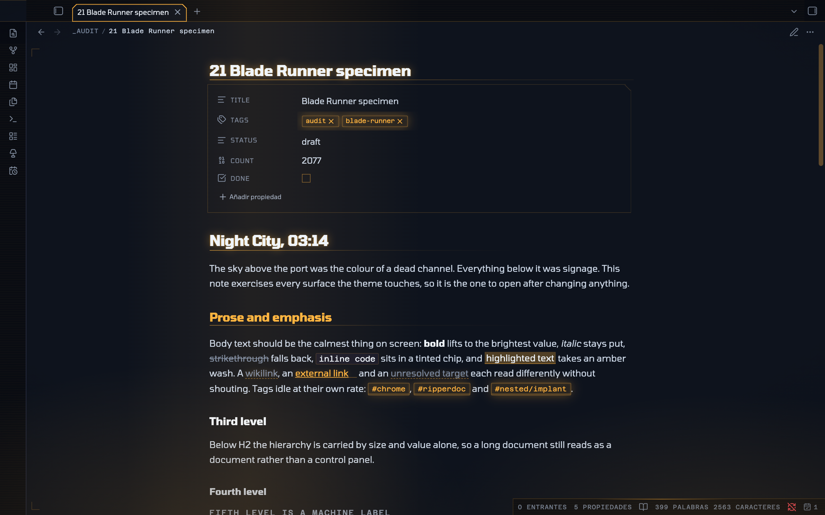
Most neon themes are unreadable after ten minutes, because they put saturated colour and glow on the running text over a true-black ground, which makes bright type halate. So this one keeps the signage in the tabs, rails, markers, alerts and status readouts, and leaves the prose alone.
- The ground is blue-black, never
#000; body text is a soft blue-white, never#fff. - The writing surface is the lightest plane in the window and the chrome around it is the darkest, so the page reads as a lit screen inside a dark city.
- Saturated colour is structural, not decorative. If a colour appears it means something: a level, a state, a kind.
- Glow is a highlight, not a texture — headings, active UI and focus only.
- Body text is never coloured, never glows and never moves.
Every text colour in both modes was measured against its real composited background, and so was every interactive control in the chrome. All of it clears WCAG AA.
Two modes, not one inverted
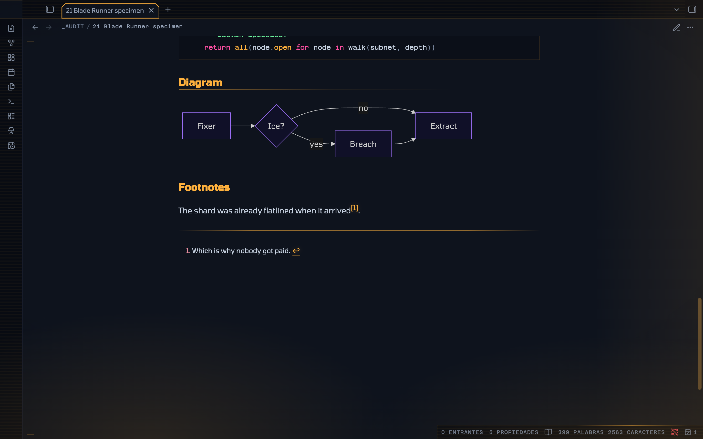
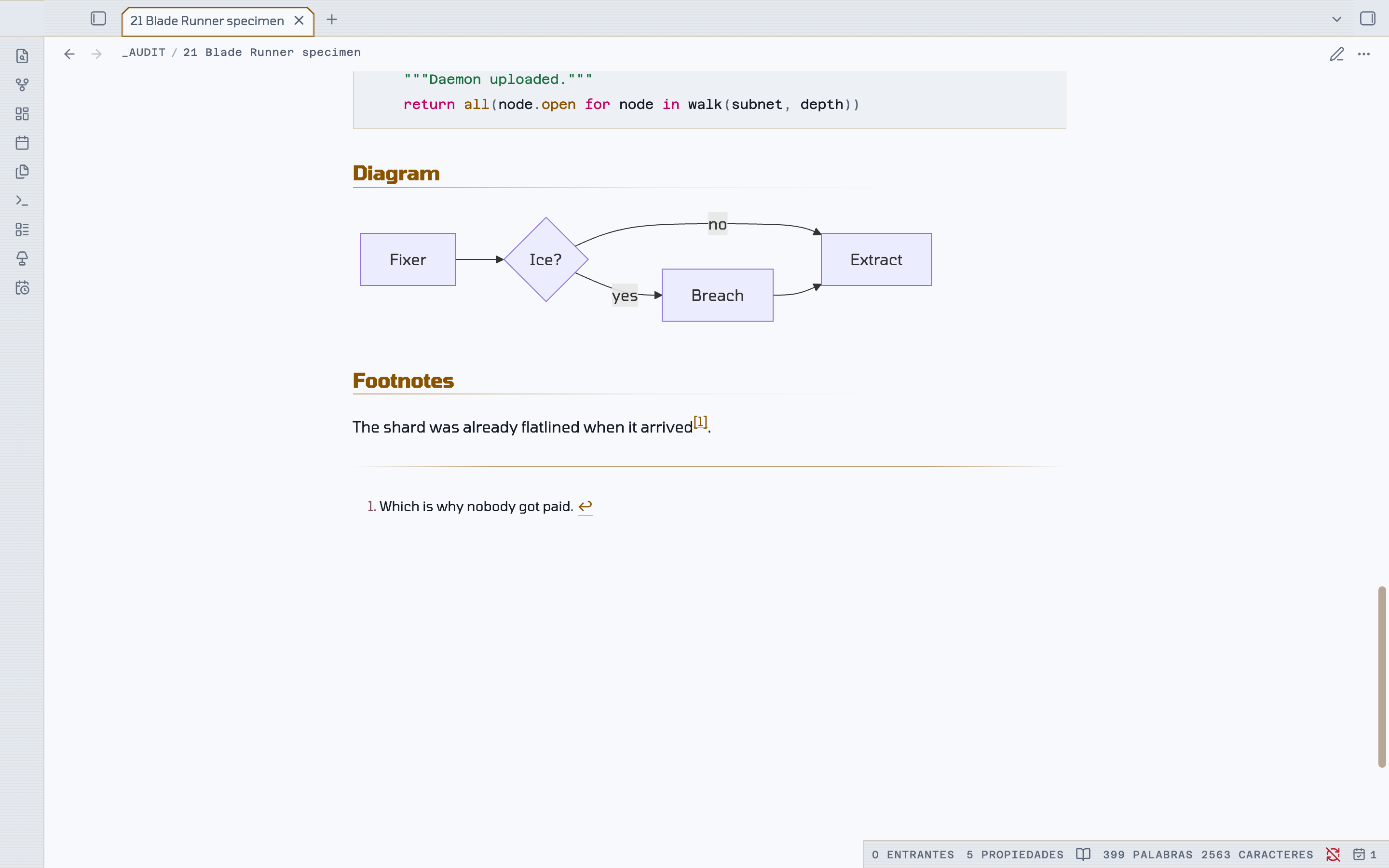
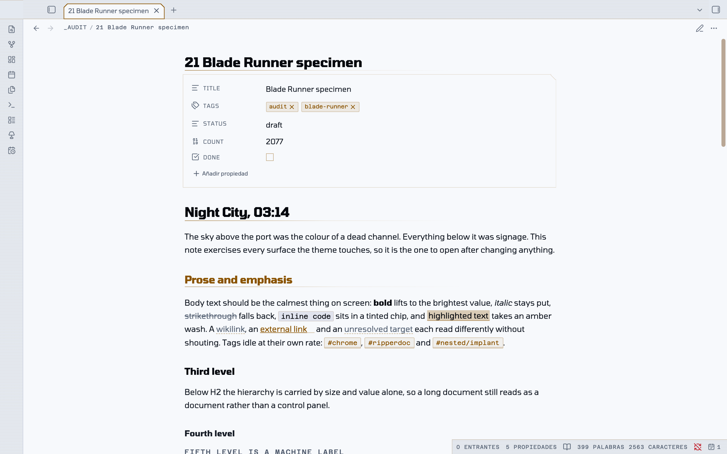
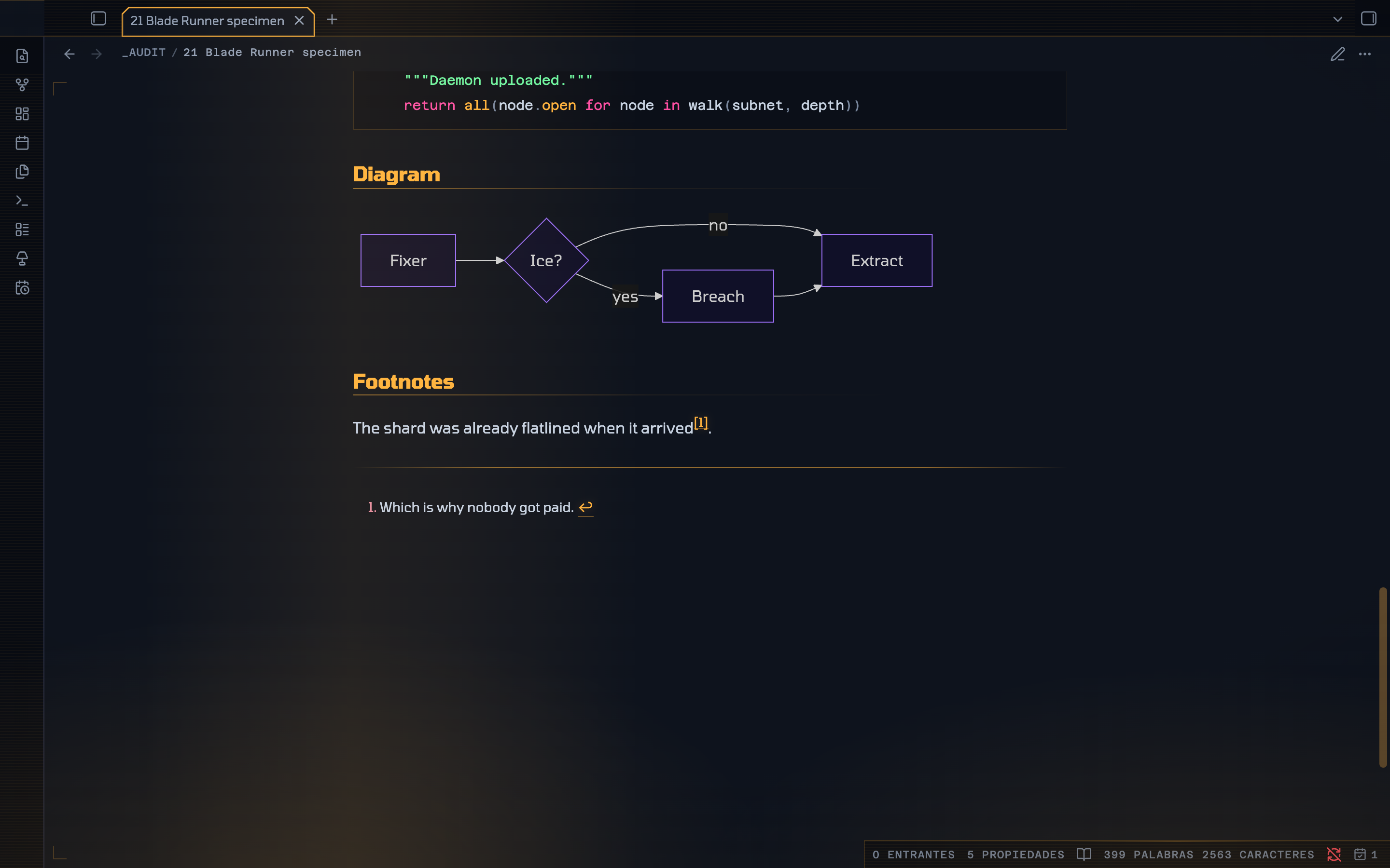
Night City is the flagship. Day Shift is a real second theme rather than an inversion: smog-pale concrete, ink text, and the same five neons pulled down to a lightness that works on paper. Glow is dropped entirely, because a glow on white is just blur. The chamfers, monospace labels and marker bars stay.
| Night City | Day Shift |
|---|---|
 |
 |
Live signage
A dark city is never still.
| Breathing | Tags, file-type chips, the alert strip on each callout and the active file's edge idle between dim and lit. |
| Faults | Three flicker patterns on four mutually prime periods — the active tab stutters, the vault plate browns out, the status readout dips mid-sweep, and only the alarm callouts develop a fault. Because 14, 23, 27, 31 and 43 seconds share no factors, no two faults in the room ever coincide. |
| Scans | A light creeps along the rail above the page, and a second runs the other way under the status bar. |
| Street | The coloured light bleeding up from below drifts over 74 seconds. |
| Rain | Two layers falling at different depths, lit by the signs. Off by default. |
| Searchlight | A soft band crosses the window every 52 seconds. |
| Cold start | The workspace warms up like a tube, once per session. |
| Charge | A file row takes a pulse of light as the pointer crosses it. |
| Tears | Bands rake across the frame, the tab rail, the ribbon icons and the tab readout, each on its own long prime period. |
Four rules keep it from becoming a strobe:
- Nothing in the prose column moves except the caret. The glow always sits on its own layer, so the glyphs underneath hold still.
- Nothing breathes in time with anything else — every element is offset, so it reads as a skyline rather than a heartbeat.
- Every animation is
transformoropacityonly, so the layer stays on the compositor and never triggers a repaint. The rain loops by translating exactly one tile height with the lean supplied by a constant skew, so it has no seam. - It is dark-mode only, it honours
prefers-reduced-motion, and Freeze the city stops all of it.
Details worth finding
Grab a divider and the frame comes up. Take hold of any panel handle and every division lights together — both ribbon edges, both sidebar edges, every resize handle, the rail above the page, the rule under the status bar — like a schematic being powered. The frame is tracked separately from content borders, so the structure lights without the code blocks and tables inside the page flashing along with it.
The title is slightly out of register. In the dark, the note title and every H1 carry a one-pixel chromatic split — the primary signal to the left, the secondary to the right — as though projected out of alignment. One pixel is deliberate: at two it stops reading as a hologram and starts reading as a typo.
Tabs are chamfered. Vertical sides, both top corners cut, open along the bottom where the tab meets the page, drawn as a lit outline.
Callouts are system alerts. Cut corner, lit edge that idles at its own rate, a title set as a machine label, and body text left at normal value so a callout can hold three paragraphs and still be read.
On a phone
The shape language holds. Obsidian declares its mobile radii on .is-mobile,
which outranks a plain body rule, so an angular theme quietly gets 44–52px
pills on the navigation bar, the drawer, every button and every input. Those are
re-declared and then chamfered rather than merely squared: things that float
take all four corners cut, sheets that rise from an edge take the two that are
free. Folder rows size themselves from --nav-item-size rather than a fixed
value, so they stay in proportion with the file rows on both platforms.
Install
Manually
- Download
theme.cssandmanifest.json. - Put them in
YourVault/.obsidian/themes/Blade Runner/— the folder name must match thenameinmanifest.jsonexactly. - Reload Obsidian, then pick Blade Runner under Settings → Appearance → Themes.
Requires Obsidian 1.14.0 or later: the theme reads --callout-color as a colour,
which is how 1.14 exposes it, and uses color-mix(in oklch, …) throughout.
Settings
Install Style Settings for the controls. Everything works without it — the plugin only overrides defaults the theme already sets.
| Group | What it does |
|---|---|
| Signal | Primary and secondary accent — amber by default, plus cyan, magenta, acid and violet — and Bloom, how far neon bleeds into the dark. 0 turns every glow off. |
| Typography | Reading face, signage face, line height, line width. |
| Structure | Corner cut, heading rules, an optional heading level index in the margin. |
| Atmosphere | Rain and rain strength, searchlight, scanlines, grain, vignette, city light, registration marks, Freeze the city, Signage life. |
| Custom colours | Replace any of the five neons; each keeps a separate value for dark and light. |
Obsidian's own Appearance settings still control the text size and can override any of the three font families.
The scrollbar derives from the accent with relative colour rather than a mix, so it keeps the accent's own hue at every preset instead of drifting to whatever sits between the accent and the rail.
Fonts
Tomorrow is bundled with the theme as an embedded face, so it renders the same on every machine with nothing to install. It carries the note title, headings, body, tabs and the whole interface.
| Role | Face |
|---|---|
| Everything | Tomorrow — bundled |
| Code blocks, HUD labels, status bar | Azeret Mono — needs installing, falls back to any monospace |
The two monospace roles stay monospace on purpose: code needs fixed width for column alignment, and the letterspaced caps in the status bar and table headers rely on it. Style Settings still offers iA Writer Quattro, Geist, Literata and Space Mono if you have them.
cssclasses
Put any of these in a note's cssclasses frontmatter.
| Class | Effect |
|---|---|
br-wide |
1000px measure |
br-full |
full-width measure |
br-terminal |
renders the whole note as a phosphor terminal session |
br-dossier |
sets the note on a bordered, bevelled panel |
br-no-title |
hides the inline title, for index and dashboard notes |
width-1000 is honoured too.
Swapping the icons
The settings and help glyphs are replaced by masking, since CSS cannot rewrite the path
data of an inline SVG: the core glyph is hidden with visibility and the replacement is
painted over it, filled with currentColor so it inherits every state the button
already has. Point --br-settings-icon or --br-help-icon at any single-colour SVG
data URI to change them.
License
MIT — see LICENSE.