
README file from
GithubTTRPG - Rathgar Gold
A gold-and-parchment Obsidian theme built for running a tabletop campaign
out of your vault. TTRPG - Rathgar Gold solves one specific problem: turning a
note full of dataview/dataviewjs queries into a real dashboard. Tag a
note with any cssclasses value containing the word "dashboard" (your own
name, not a fixed string), wrap each widget in a [!card] callout, and the
theme handles the rest: a uniform grid, glass panels, and an optional
full-bleed backdrop, with no manual CSS per note.
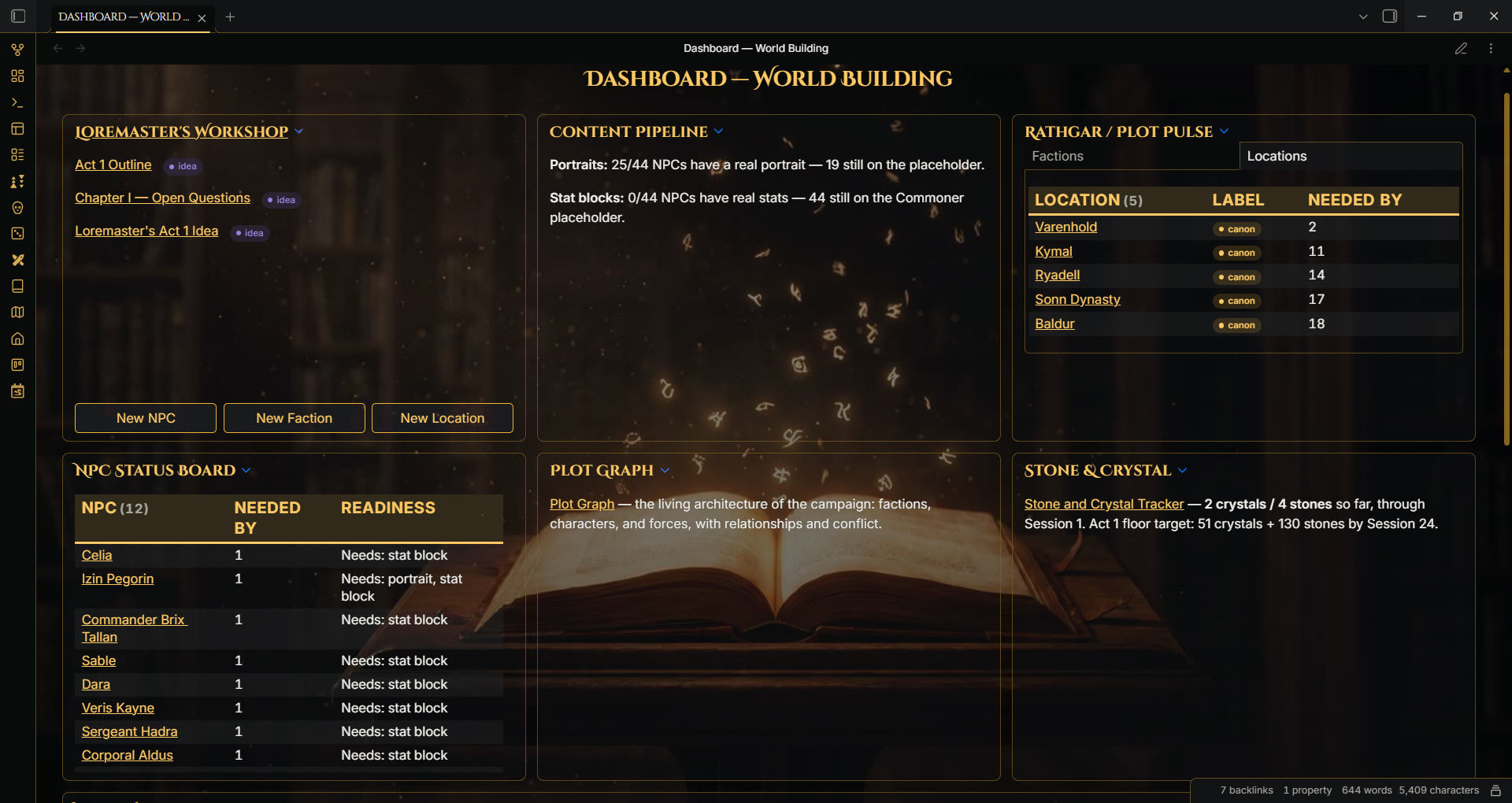
Dark and light mode are both fully supported.
Features
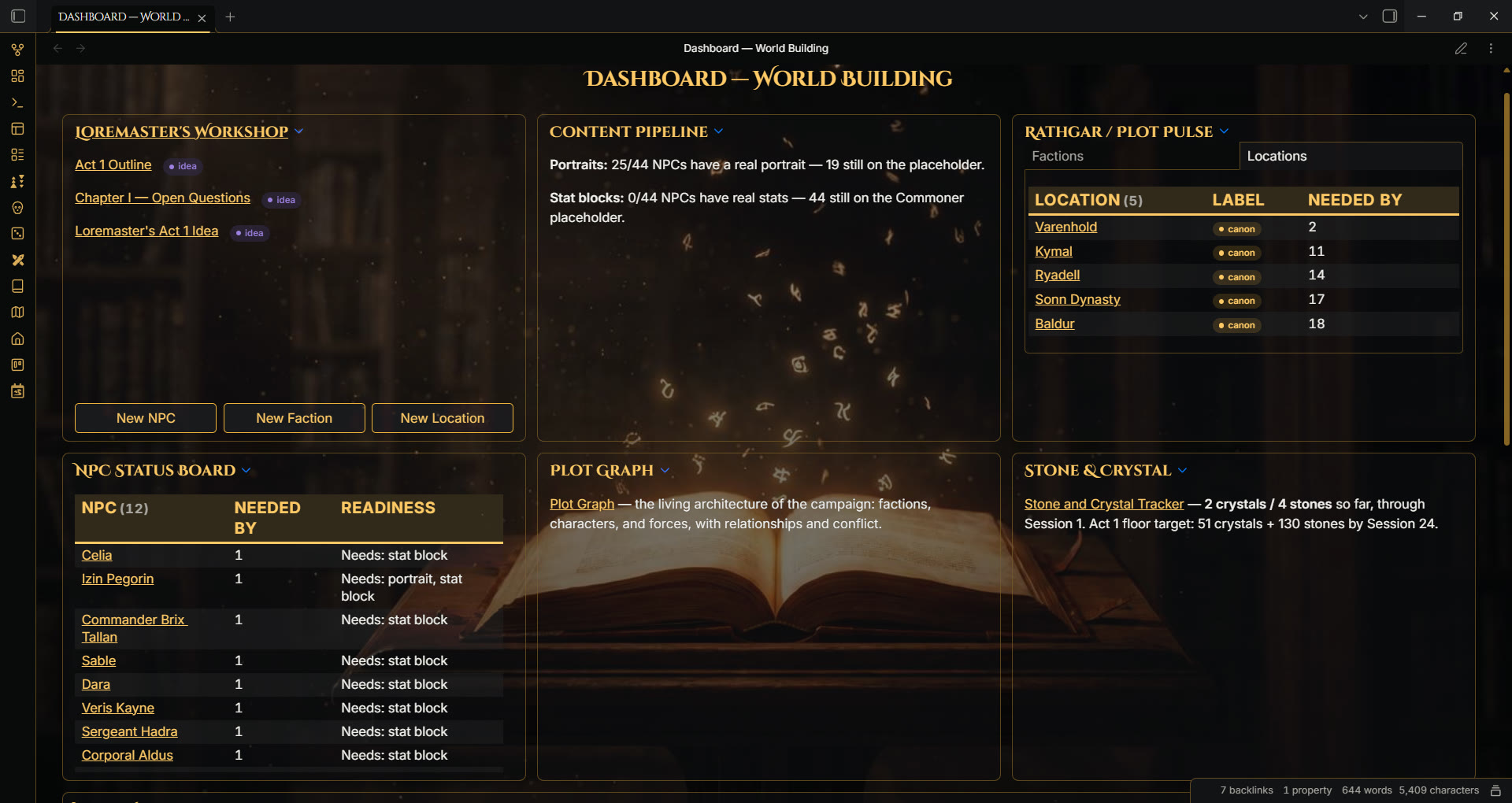
Dashboard card grids
Tag a note with a cssclasses value containing "dashboard" (dashboard-wb,
my-campaign-dashboard, whatever you want to call it, as long as the word
is in there somewhere) and every top-level [!card] callout becomes a
uniform-size grid tile. The title bar doubles as the card header; the
content area scrolls internally if it overflows. No manual CSS per widget.
A [!cardfull] callout spans the full grid width for a wider widget, and
works whether the card holds a dataview/dataviewjs query, a table, or
plain markdown.
Add "sr" anywhere in the same note's cssclasses (its own class, or
appended to your dashboard class, e.g. my-dashboard-sr) to switch to
the crimson accent and the session backdrop slot instead of gold. Leave
it out for the default gold, world-building look.
If a specific dashboard's card count is fixed and doesn't divide evenly
by 3 (seven cards, for example, leaving the last one alone in a
half-empty row), add "uneven" anywhere in that note's cssclasses
(my-dashboard-uneven, or a separate uneven class entry) to stretch
the last card to fill the row instead of leaving it stranded. This is
opt-in, not automatic: it only checks whether your cssclasses says
"uneven," not your actual card count, so only add it to a dashboard
you know is genuinely uneven and stays that way, don't add it to a
dashboard whose card count already divides evenly by 3 or one you plan
to keep adding cards to.
The core CSS:
[class*="dashboard"] .markdown-preview-sizer {
  display: grid;
  grid-template-columns: repeat(3, 1fr);
  gap: 0.85rem;
}
[class*="dashboard"] .callout[data-callout="card"] {
  height: 400px;
  display: flex;
  flex-direction: column;
}
[class*="dashboard"] .callout[data-callout="card"] .callout-content {
  flex: 1 1 auto;
  overflow-y: auto;
}
Accent colors, borders, and Canvas, all tunable with Style Settings
The gold accent pair (--rg-accent-gold, --rg-accent-gold-bright), the
crimson accent pair (--rg-accent-crimson, --rg-accent-crimson-bright),
the border/divider color (--rg-border, which also drives Obsidian's own
--divider-color), and the Canvas board background and dot-grid color
are each hardcoded with a light-mode and dark-mode value out of the box,
so the theme looks and works exactly the same whether or not you install
anything else.
Optional dependency: Style Settings by mgmeyers. Install it and you get a real settings-pane UI for all seven colors, each with its own separate light-mode and dark-mode picker. Settings -> Style Settings -> Rathgar Gold. Every default in that pane already matches this theme's built-in colors, so installing Style Settings and never touching a single control changes nothing, it's purely opt-in customization, not a requirement to use the theme.
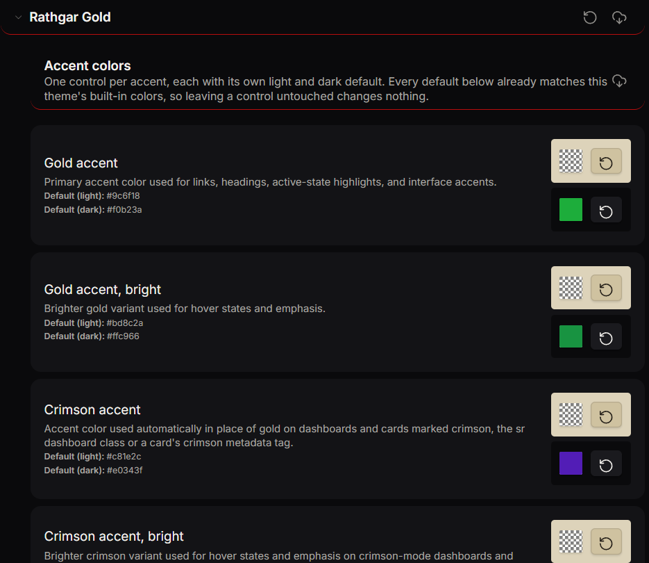
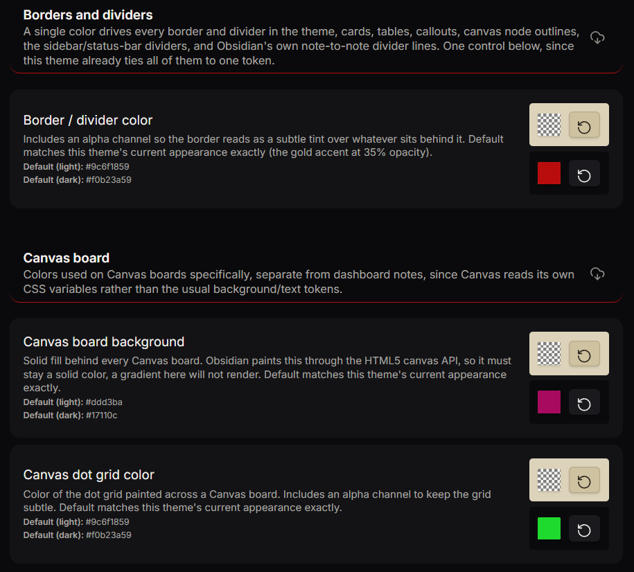
New in 1.1.0: border/divider color and the Canvas board background and dot-grid color are now Style Settings controls too, alongside the existing accent color pair. That's seven tunable colors in total: gold, gold bright, crimson, crimson bright, border/divider, Canvas background, Canvas dot grid.
Fixed in 1.1.0: switching a dashboard or card to the crimson accent
(the sr class, or a card's crimson metadata tag) recolored links,
headings, and interactive highlights, but left card borders gold. The
border color was reading a separate RGB-triplet variable that the
crimson swap never touched. Fixed by having the crimson swap reassign
that RGB variable too, so borders now switch to crimson along with
everything else.
Fixed in 1.1.1: on Obsidian 1.13.4 and later, every callout's
border and icon color rendered broken instead of the intended gold,
crimson, or status color. Obsidian's core CSS stopped auto-wrapping
--callout-color in rgb(...) on that version, and this theme's
callout rules had been supplying a bare RGB triplet (or a var()
reference to one) expecting Obsidian to do that wrapping itself. Fixed
by wrapping every --callout-color declaration in rgb(...) directly,
across both dark and light mode. No colors changed, callouts on 1.13.4+
now match how they always looked on older versions.
Fixed in 1.1.2: the last-card-spans-full-width behavior (see
Dashboard card grids above) used to fire on every dashboard note
automatically, based purely on card count. That meant a dashboard whose
card count already divided evenly by 3, a clean 2-row grid with nothing
wrong, still had its last card wrongly stretched full-width, since the
rule had no way to tell "this dashboard needs it" from "this dashboard
doesn't." Fixed by making the behavior opt-in via the new "uneven"
cssclasses value described above, instead of applying to every
dashboard by default.
Optional backdrop photos, your own
Dashboard notes and Canvas cards support a full-bleed background photo behind a gradient overlay. TTRPG - Rathgar Gold ships with no backdrop images at all and never makes a network call to load one, matching the Community Themes rule that a theme can't load remote assets. Light mode uses its own lighter overlay instead of the dark-mode gradient, so a backdrop set in light mode stays legible instead of washing out.
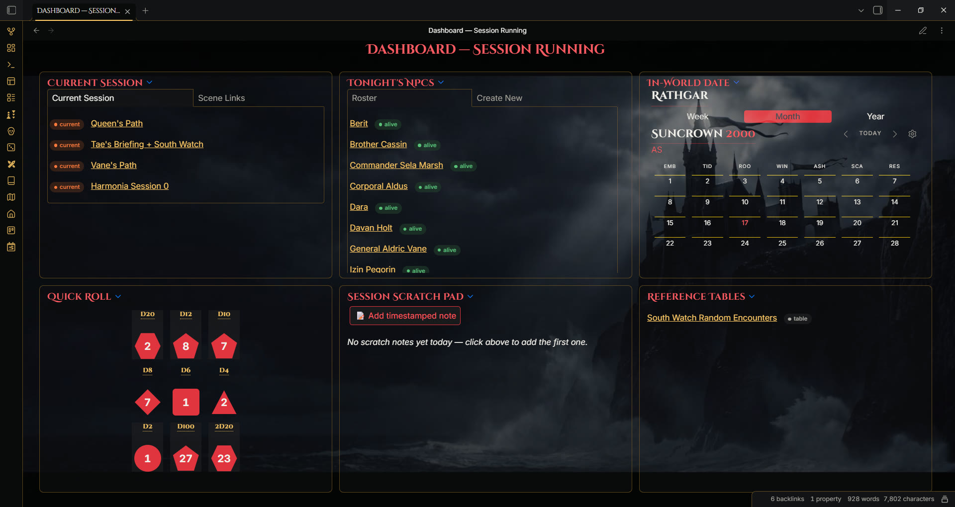
The core CSS (--rg-backdrop-session/--rg-backdrop-world default to
none; light mode uses a lighter overlay tuned for legibility instead
of reusing the dark-mode gradient):
.theme-dark [class*="dashboard"][class*="sr"] .markdown-preview-view {
  background-image: linear-gradient(180deg, rgba(6, 6, 8, 0.42), rgba(6, 6, 8, 0.64)),
    var(--rg-backdrop-session);
}
.theme-light [class*="dashboard"][class*="sr"] .markdown-preview-view {
  background-image: linear-gradient(180deg, rgba(255, 255, 255, 0.55), rgba(255, 255, 255, 0.72)),
    var(--rg-backdrop-session);
}
There are three backdrop slots, each a plain CSS variable:
| Variable | Applies to |
|---|---|
--rg-backdrop-world |
any dashboard note without "sr" in its cssclasses |
--rg-backdrop-session |
any dashboard note with "sr" also in its cssclasses |
--rg-backdrop-canvas-card |
a crimson-metadata card (`[!card |
Recommended: CSS Resource Variables, a plugin I built for exactly this.
Instead of hand-editing theme.css and pasting in a base64 image every
time you want a new backdrop, this plugin gives you a real file picker:
install it, then in Settings -> CSS Resource Variables, click Add
mapping, pick an image already in your vault, and type one of the
three variable names above (no leading --, the plugin adds that).
That's the whole setup. See its own README for what else it does.
No extra plugin? Edit theme.css directly and paste a base64
data: URI into one of the three variables above. See
images/README.md
for the exact steps. It's not elegant, but it's local, offline, and it
works without installing anything else.
Canvas boards
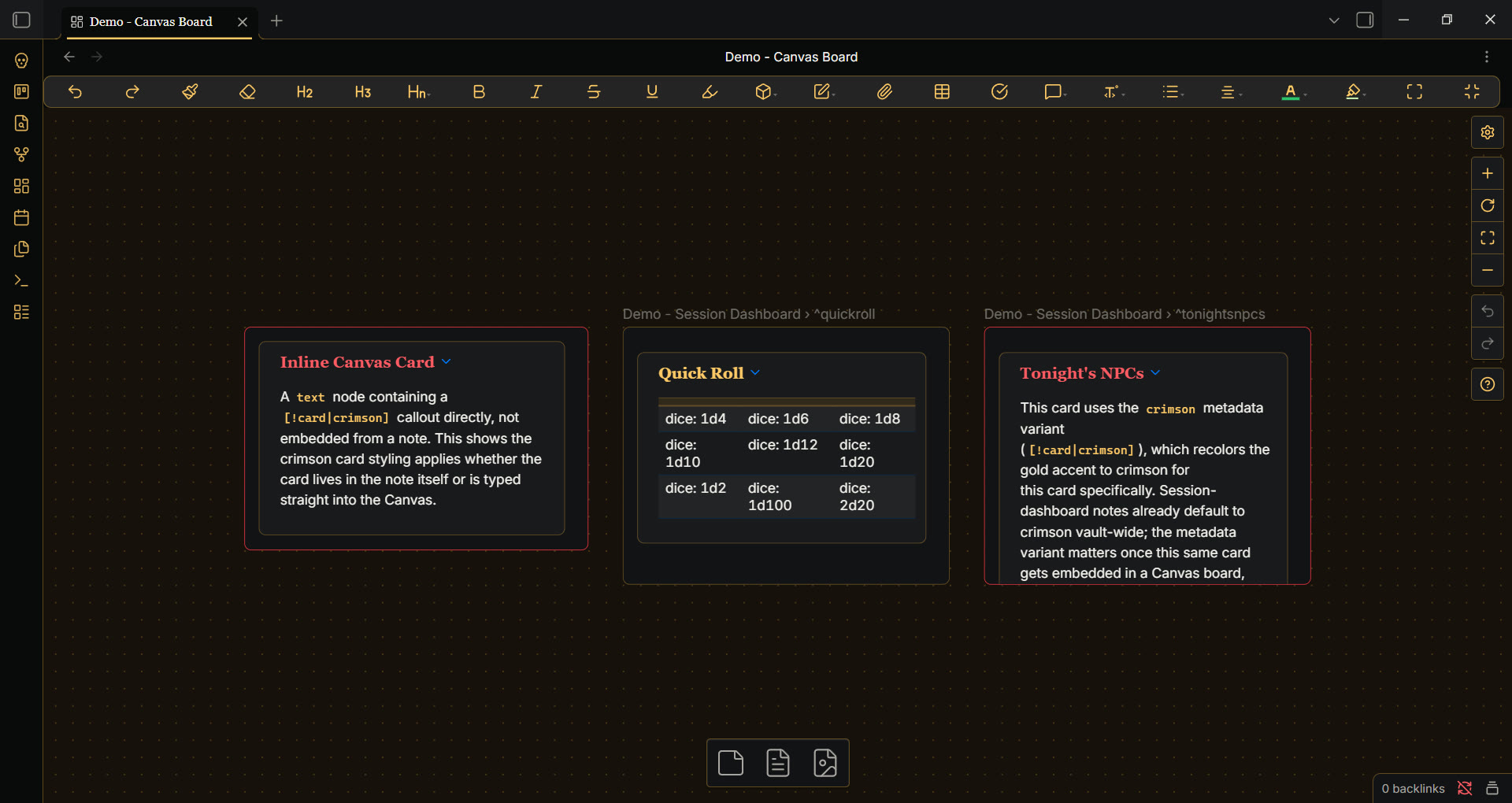
Canvas gets its own token set (background, dot-grid color) so boards
don't fall back to Obsidian's default blue-gray tint. A card's crimson
metadata variant ([!card|crimson]) carries into a Canvas embed too, and
an embedded dashboard card correctly fills its Canvas node's full height,
not just its natural content height.
The core CSS:
.theme-dark {
  --canvas-background: #17110c;
  --canvas-dot-pattern: rgba(240, 178, 58, 0.35);
  --canvas-color: 240, 178, 58;
}
.canvas-node-container:has(.callout[data-callout-metadata~="crimson"]) {
  border-color: var(--rg-accent-crimson);
}
.theme-dark .canvas-sr .canvas-node-container:has(.callout[data-callout-metadata~="crimson"]) {
  background-image: var(--rg-backdrop-canvas-card);
  background-size: cover;
}
Want the text inside a card to scale when you resize it? That's not something CSS alone can do, Canvas has its own internal zoom-based font scaling that overrides any plain stylesheet rule regardless of specificity. I built Canvas Text Scaler to solve it: resize a card, the text inside scales with it, instead of only scaling when you zoom the whole board. It also plays safely with this theme (and any theme or snippet), a "Respect existing font-size CSS" toggle makes it back off if something else is already setting font-size on a card.
Fantasy Statblocks
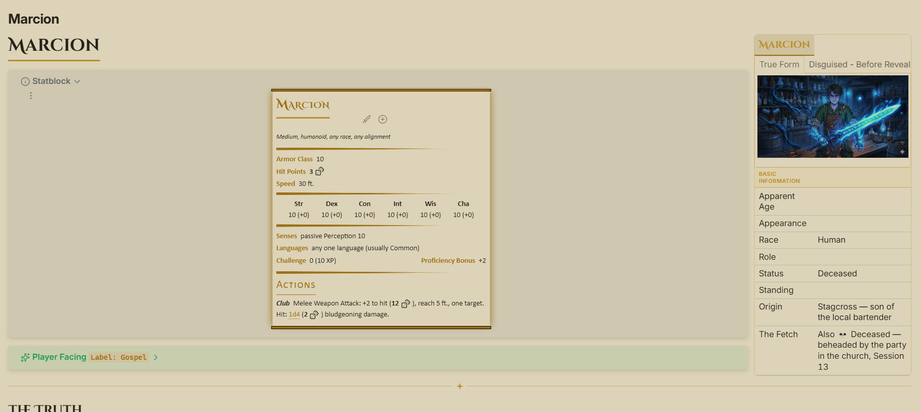
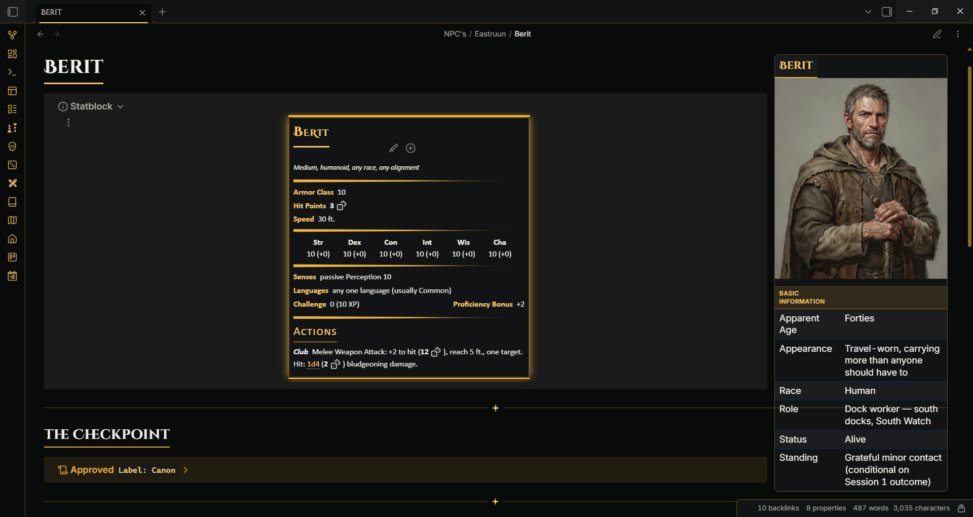
An outer gold glow around every ```statblock``` block, using Fantasy
Statblocks'
own --statblock-* theming API. Only the frame and accent colors follow
the theme; the plugin's own internal layout (ability score grid, HP bar,
etc.) is untouched.
The core CSS, using the plugin's own theming variables:
.theme-dark {
  --statblock-background-color: var(--rg-surface);
  --statblock-primary-color: var(--rg-accent-gold-bright);
  --statblock-border-color: var(--rg-border);
  --statblock-box-shadow-color: var(--rg-accent-gold);
  --statblock-box-shadow-blur: 1em;
  --statblock-heading-font: var(--rg-font-display);
}
Dice Roller
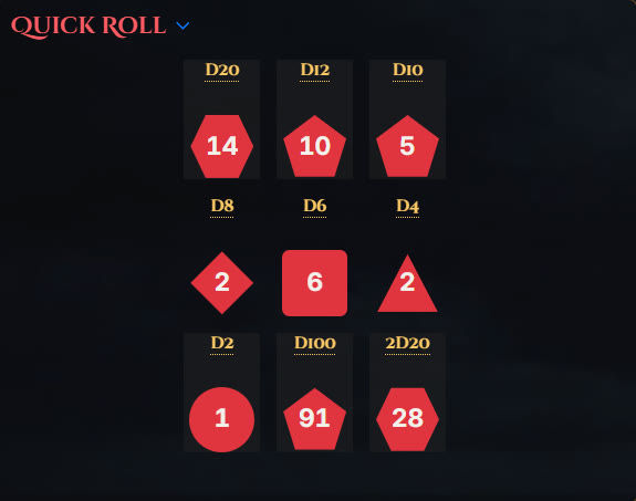
Inline dice: XdY rolls from Dice
Roller render
as die-shaped buttons (d4 triangle, d6 rounded square, d8/d10/d12/d20
polygons, d2/d100 variants) with a gold label above and the result
displayed in the same spot after rolling.
Install both Dice Roller and RPG Detect Dice
Roll
together. Dice Roller renders the die-shaped button this theme styles,
but it needs RPG Detect Dice Roll installed alongside it to actually
find and convert an inline dice: XdY string into a clickable roll in
the first place, install only one and the other half of this feature
doesn't work.
The core CSS:
[class*="dashboard"][class*="sr"] .callout[data-callout="card"] .dice-roller {
  position: relative;
  width: 52px;
  height: 52px;
}
[class*="dashboard"][class*="sr"] .callout[data-callout="card"] .dice-roller::before {
  content: attr(data-dice);
  position: absolute;
  inset: 0;
}
[class*="dashboard"][class*="sr"] .callout[data-callout="card"] .dice-roller[data-dice="1d4"] {
  clip-path: polygon(50% 6%, 96% 94%, 4% 94%);
}
Buttons, Kanban, Dataview
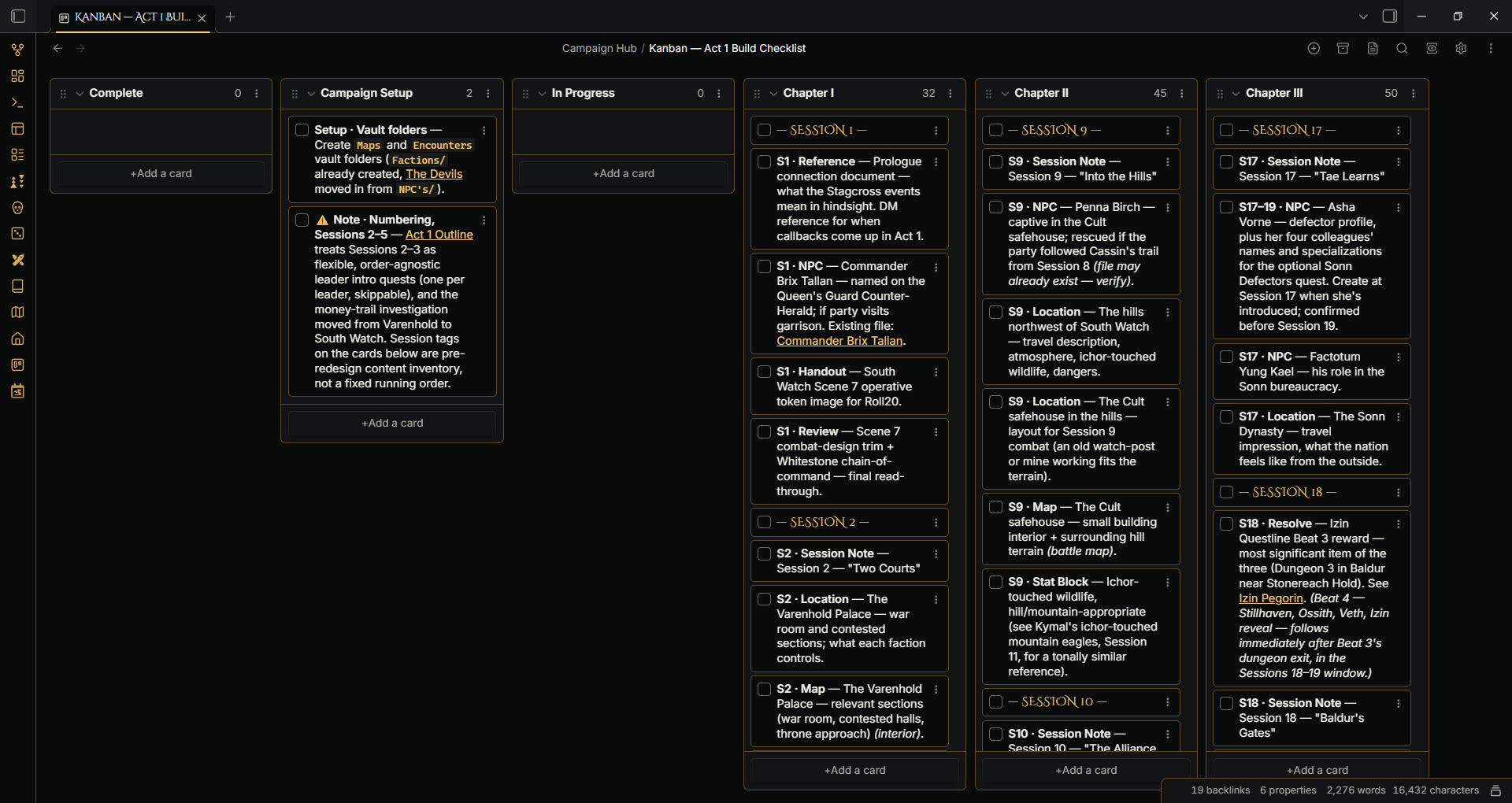
- Buttons blocks lay out in a
clean flex row when placed inside a
[!card|buttons-grid]callout. - Kanban session/chapter divider cards get a themed gold label.
- Dataview query blocks get a glass-panel treatment outside a dashboard card, and sit flush inside one.

The core CSS:
.callout[data-callout="card"][data-callout-metadata~="buttons-grid"] > .callout-content {
  display: flex;
  flex-wrap: wrap;
  gap: 8px;
}
.rg-kanban-divider {
  color: var(--rg-accent-gold-bright);
  font-family: var(--rg-font-display);
}
[class*="dashboard"] .block-language-dataviewjs {
  background: rgba(13, 13, 16, 0.6);
  backdrop-filter: blur(16px) saturate(140%);
  border: 1px solid var(--rg-border);
}
Native callouts
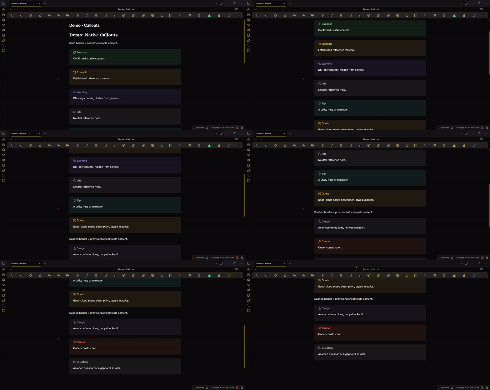
All nine built-in callout types are restyled with a consistent design language: solid border for confirmed/stable content (success, example, warning, info, tip, quote), dashed border for provisional/incomplete content (danger, caution, question).
The core CSS, one type shown (solid border, success):
.callout[data-callout="success"] {
  --callout-color: 89, 194, 122;
  --callout-icon: sparkles;
}
.callout[data-callout="danger"] {
  --callout-color: 144, 137, 160;
  border-style: dashed;
}
Wiki-style floating infobox
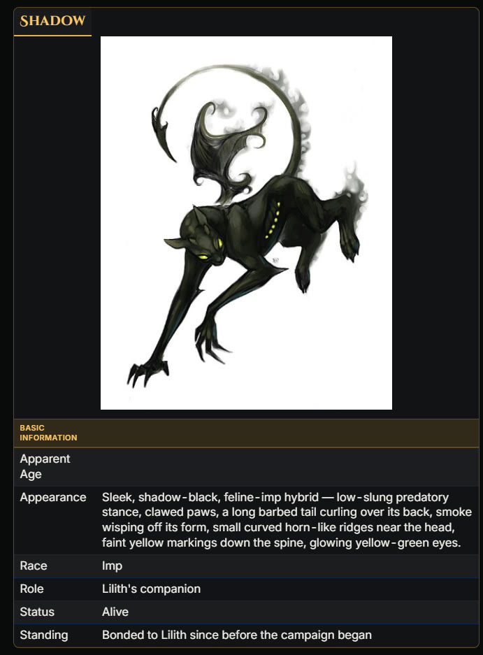
A floating [!infobox] card, with a |wide variant for denser content,
for character and item reference boxes. See Credits below.
The core CSS:
.callout.callout[data-callout~="infobox"] {
  width: auto;
  max-width: 300px;
  float: right;
  margin: 0 0 12px 12px;
}
.callout.callout[data-callout~="infobox"] > .callout-title {
  display: none;
}
.callout.callout[data-callout~="infobox"] .callout-content > :is(h1, h2, h3) {
  text-align: center;
  background: var(--rg-surface-alt);
  border-bottom: 2px solid var(--rg-accent-gold);
}
Building your own dashboard
The card grid shown in the screenshots above isn't a special widget, it's five callouts in a plain note. Here's the exact recipe:
1. Tag the note. Add frontmatter so the theme knows to grid this note instead of rendering it as normal flow. Any class containing the word "dashboard" works, so pick whatever name fits your vault:
---
cssclasses: [my-campaign-dashboard]
---
That gives you the gold, world-building-style accent. Add "sr" anywhere
in the same list ([my-campaign-dashboard-sr], or a second class like
[my-campaign-dashboard, sr]) for the crimson, session-running-style
accent instead (see Dashboard card grids above). dashboard-wb and
dashboard-sr still work exactly as before if you'd rather keep using
those.
2. Wrap each widget in a [!card] callout. Anything can go inside:
a dataviewjs query, a table, plain markdown, a [!card|buttons-grid]
variant for a row of Buttons blocks. The callout's own title bar becomes
the card's header, so you don't write a separate markdown heading:
> [!card]+ My Widget
> Whatever content you want here.
3. Watch your card count. The grid is fixed at 3 columns. If your
card count doesn't divide evenly by 3, the last card ends up in a
partially-filled row. Swap that last [!card] for [!cardfull] to span
the full width instead:
> [!cardfull]+ My Wide Widget
> Spans all 3 columns.
That's the whole recipe: tag the note, wrap each widget, use
[!cardfull] for the odd one out. Everything else (uniform height,
internal scroll, glass panels, the backdrop) is automatic.
Want a different column count or card height? Both are one-line
changes in theme.css:
[class*="dashboard"] .markdown-preview-sizer {
  grid-template-columns: repeat(3, 1fr); /* change 3 to your column count */
}
[class*="dashboard"] .callout[data-callout="card"] {
  height: 400px; /* change to your preferred card height */
}
A working example lives in this repo's test setup if you want to open
it directly rather than build one from scratch: see Demo - World Building Dashboard.md and Demo - Session Dashboard.md.
Installation
From Obsidian (once published): Settings -> Appearance -> Themes -> Browse -> search "TTRPG - Rathgar Gold" -> Install and use.
Manual install: download this repo's latest release, extract it into
<your vault>/.obsidian/themes/TTRPG - Rathgar Gold/, then enable it in Settings ->
Appearance -> Themes.
Supported plugins
TTRPG - Rathgar Gold themes the following plugins directly. None are required: your vault renders fine without them. These are the integrations that get special treatment beyond default styling.
| Plugin | Author | What TTRPG - Rathgar Gold adds |
|---|---|---|
| Canvas (core Obsidian feature, not a plugin) | the Obsidian team | Custom background token set, dot-grid color, crimson card borders/backdrops |
| Fantasy Statblocks | Jeremy Valentine | Gold glow frame via the plugin's own theming variables |
| Dice Roller | Jeremy Valentine | Die-shaped roll buttons with gold labels |
| RPG Detect Dice Roll | solorpgstudio | Works alongside Dice Roller for inline dice: XdY detection, install both together, the die-shaped button styling above depends on Dice Roller being present too |
| Dataview | Michael Brenan | Glass-panel query blocks, dashboard-card integration |
| Buttons | shabegom | Flex-row layout inside dashboard cards |
| Kanban | mgmeyers | Themed session/chapter divider cards |
| Editing Toolbar | Cuman | Gold icon/background theming for its Custom Aesthetic mode |
| Style Settings | mgmeyers | Real settings-pane UI for all seven tunable colors (both accent pairs, border/divider, Canvas background, Canvas dot grid), separate light/dark pickers per color |
TTRPG - Rathgar Gold's own CSS replaces the need for a folder-coloring plugin like File Color with a pure-CSS depth-based layering technique. Nothing to install there.
Credits
A big thank you to SlRvb, author of
ITS Theme. This
theme was built while learning from ITS Theme's own source, and it
shows: the floating [!infobox] callout and its |wide variant are a
direct port of ITS's mechanism and token mapping, adapted here to this
theme's own color tokens, and several smaller techniques elsewhere in
Rathgar Gold (Canvas icon theming, tab-bar specificity handling, and
more) were worked out by reading how ITS Theme solved the same problem
first. If you like anything about this theme, go look at ITS Theme
itself: it's one of the most complete theming systems in the Obsidian
ecosystem, and a large part of why this theme was possible at all.
This theme also themes Obsidian's own core Canvas feature, built by the Obsidian team, not a third-party plugin: the custom background token set, dot-grid color, and crimson card borders/backdrops all sit on top of Canvas as Obsidian ships it.
Beyond that, this theme themes the following community plugins directly (see Supported plugins above for what each integration does). None of this works without the plugin authors' own work, credited here by name:
- Fantasy Statblocks by Jeremy Valentine
- Dice Roller by Jeremy Valentine
- RPG Detect Dice Roll by solorpgstudio
- Dataview by Michael Brenan
- Buttons by shabegom
- Kanban by mgmeyers
- Editing Toolbar by Cuman
- Style Settings by mgmeyers
Fonts: Cinzel Decorative by Natanael Gama, licensed under the SIL Open Font License.
Contributing
Issues and pull requests are welcome.
Support
If this theme is useful to you, you can buy me a coffee.
License
MIT. See LICENSE.