
README file from
GithubOpendian
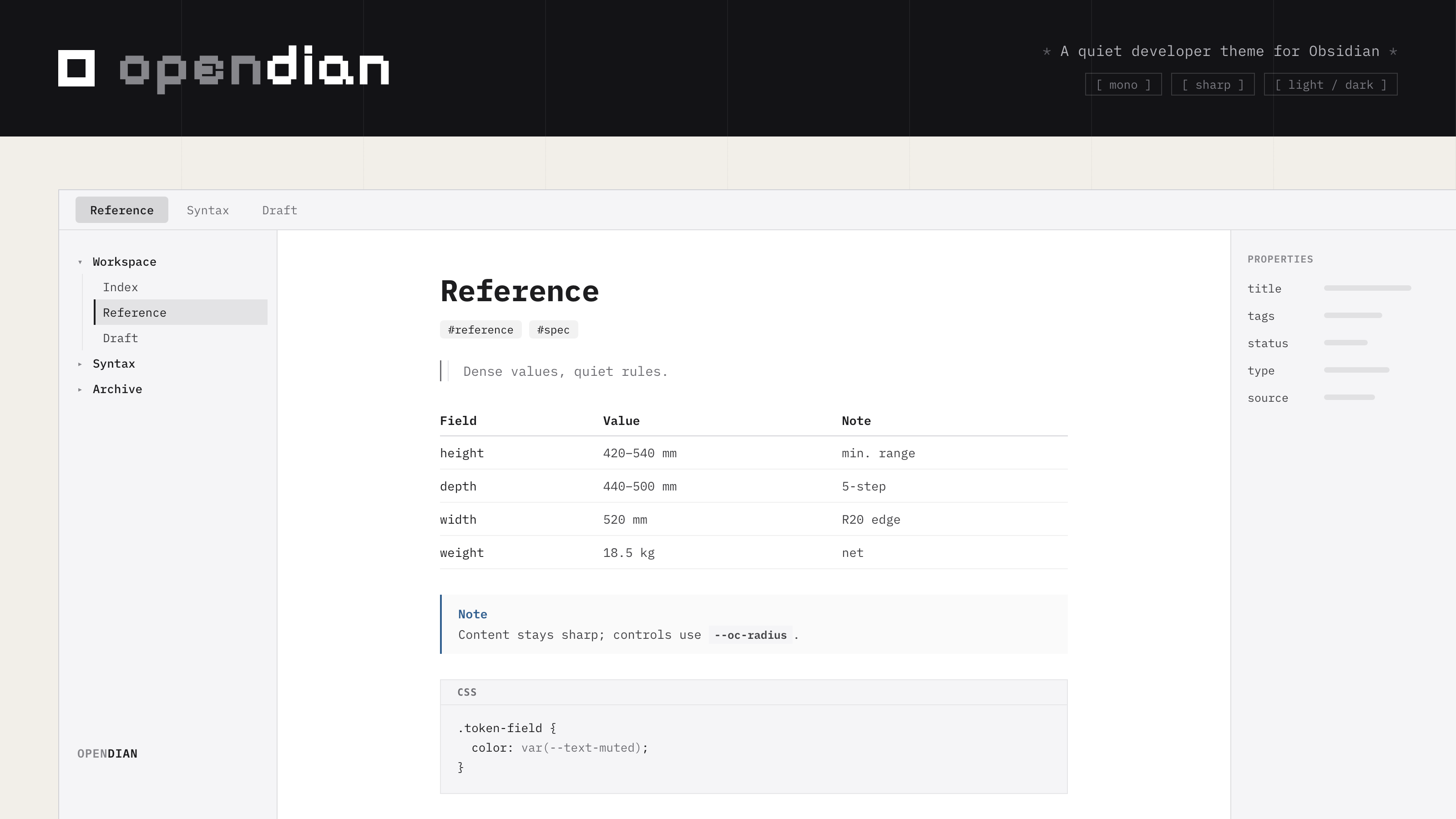
A developer-documentation theme for Obsidian. Monospace typography, a layered radius system, and minimal chrome — inspired by the OpenCode visual language. Makes your vault feel like a professional code editor, not a note-taking app.
中文介绍 · Light & Dark · Desktop & Mobile · No plugin required
Typography & Fonts
Opendian mirrors opencode.ai/docs (Starlight's system font stacks): system sans for prose and UI (SF Pro on macOS), system mono for code (SF Mono). No font installation required — every platform gets the docs-site look out of the box.
CJK comments inside code fall back to Maple Mono CN / Sarasa Mono SC (true 2:1 monospaces), then PingFang. Optionally keep the mono rhythm in CJK code with
brew install --cask font-maple-mono-cn.
Why Opendian
- Docs-grade typography — system sans prose + system mono code, the same font strategy as opencode.ai/docs. Your vault reads like a professional documentation site, not a note app.
- Layered radius system — content stays sharp (0px for code blocks, tables, callouts), controls are soft (4–8px for buttons, inputs, tabs), modals are softer (12px). One coherent principle instead of random roundness.
- Minimal-lines chrome — hard 1px borders are replaced by background-step separation. The tab bar, titlebar, and view header blend into one immersive surface.
- OpenCode color system — precise tokens derived from the OpenCode website and desktop client. Monochrome links and primary actions, with blue reserved for selection and semantic accents.
- Flat active tab — inactive tabs are plain text with hairline dividers; the active tab is a quiet tinted chip that stays aligned with the native side docks.
- Terminal-grade code blocks — softly-filled surface with language labels. No fake macOS window dots, no copy-button chrome, no drop shadows.
- Semantic callouts — a low-tint technical surface with a slim semantic rail and colored title/icon, keeping the page calmer than traditional Obsidian callout blocks.
- IDE-style sidebar — black accent bar on the active file, auto-collapsing top toolbar (Folio-style), and a dual-tone vault wordmark.
Design
Opendian is built on the OpenCode color system — a precise, monochrome-forward palette with a single blue accent:
Light mode (Docs Style):
| Token | Value | Use |
|---|---|---|
| Background | #FFFFFF |
Primary writing surface |
| Surface | #F5F5F7 |
Sidebar, inactive tabs, secondary areas |
| Border | #D2D2D7 |
Dividers, 1px lines |
| Text Main | #1D1D1F |
Body text and headings |
| Accent | #007AFF |
Selection and semantic accents |
Dark mode (Terminal Style):
| Token | Value | Use |
|---|---|---|
| Background | #0C0C0E |
Primary surface |
| Surface | #161618 |
Sidebar, inactive tabs |
| Border | #38383A |
Dividers |
| Text Main | #FFFFFF |
Body text |
| Accent | #007AFF |
Selection and semantic accents |
Typography mirrors the opencode.ai/docs system stacks, with CJK fallbacks:
- Headings and body: system sans (SF Pro on macOS) → PingFang SC / Source Han Sans SC
- Interface: same sans stack
- Code: system mono (SF Mono) → Maple Mono CN / Sarasa Mono SC
Radius Scale
| Tier | Value | Applies to |
|---|---|---|
| Content | 0px |
Code blocks, tables, callouts, blockquotes |
| Small chip | 4px |
Tags, menu items, suggestion rows |
| Control | 6px |
Buttons, inputs, dropdowns, tabs |
| Popover | 8px |
Right-click menu, command palette, tooltips |
| Modal | 12px |
Settings window and dialogs |
What Opendian Styles
Opendian covers every surface that shapes the developer writing experience:
- Code blocks — softly-filled surface with language-label header; no decorative dots, copy-button chrome, or shadows
- Inline code — borderless neutral tint + monochrome text
- Callouts — slim semantic rail + low-tint surface, with color concentrated on title/icon
- Tables — minimalist 1px horizontal hairline rows, zero radius, compact density
- Blockquotes — single quiet neutral rail, no accent color bleed
- Headings — monospace, no decorative underlines, edit-reading size parity
- Tabs — immersive bar with a flat active chip, hairline dividers, and a geometric pinned-tab marker
- Sidebar — black accent bar on active file, auto-collapsing top toolbar
- Vault wordmark — dual-tone text treatment without a hard-coded avatar box
- Buttons — solid black/white primary CTA, outline secondary, 6px radius
- Toggles — rounded rectangle (5px track, 3px knob), not a pill
- Checkboxes — monochrome custom task states, no strikethrough on done tasks (fade only)
- Dropdowns — borderless with
field-sizing: contentfor value-width sizing
Supported Checkbox States
Opendian supports Obsidian's native task syntax plus the common Minimal-style extended markers, redrawn as a black/white/gray icon set. No plugin is required; use ASCII brackets:
- [ ] todo
- [/] incomplete
- [x] done
- [X] done
- [-] canceled
- [>] forwarded
- [<] scheduled
- [?] question
- [!] important
- ["] quote
- [“] quote
- [*] star
- [i] info
- [I] idea
- [b] bookmark
- [l] location
- [S] savings
- [p] pros
- [c] cons
- [f] fire
- [k] key
- [u] up
- [d] down
- [w] win
Installation
Install from the Obsidian community theme browser:
- Open Settings → Appearance → Themes → Manage
- Search for Opendian
- Install and enable the theme
Manual installation is also possible by downloading the latest release and placing theme.css and manifest.json in:
<vault>/.obsidian/themes/Opendian/
Compatibility
- Obsidian 1.4.0+
- Light and dark modes
- Desktop and mobile
- No plugin required
- Optional: with the Style Settings plugin installed, you can tune the accent color, logo split point, inline-code tint, and content-corner radius from the settings UI (defaults apply without it)