
README file from
GithubVSCode 2026 — Obsidian Theme
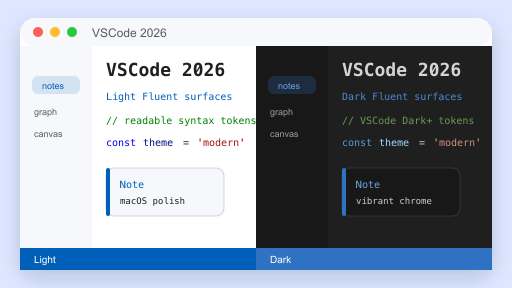
A faithful port of Microsoft Visual Studio 2026's Fluent visual language to Obsidian, with first-class macOS vibrancy support.
Features
- Light & Dark mode — both first-class, follows system color scheme
- VS 2026 Fluent UI tokens —
#005FB8/#2F72C4accent,#F6F8FC/#DDE7FFLight surfaces,#1F1F1F/#181818Dark surfaces - Complete VSCode Dark+ / Light+ syntax highlighting — keyword / string / comment / function / variable / type / number / control / regex, double-mapped for both CodeMirror 6 (editor) and Prism.js (reading view)
- macOS Tahoe-style polish — SF Pro / SF Mono system font stack, 8–12 px rounded corners, defocused-window dim,
prefers-reduced-motionsupport - Vibrancy / translucency — sidebar, status bar, command palette and modals get
backdrop-filterblur when Translucent window is enabled - Overlay scrollbars — hidden by default, fade in on hover, macOS-style
- All third-party UI themed via CSS variables — callouts (13 types), graph view, canvas, calendar, dataview — no hardcoded colors
Screenshot
Installation
From Community Themes (recommended, after marketplace approval)
- Settings → Appearance → Themes → Manage
- Search VSCode 2026
- Install → Use
Manual
- Download
manifest.jsonandtheme.cssfrom the latest Release. - Place them in
<vault>/.obsidian/themes/VSCode 2026/. - Settings → Appearance → Themes → choose VSCode 2026.
Recommended Settings (macOS)
- Settings → Appearance → enable Translucent window to activate vibrancy.
- Settings → Appearance → set Base color scheme to Adapt to system so the theme follows your system Light/Dark setting.
- Minimum Obsidian version: 1.5.0 (uses
color-mix(), requires Chromium 111+).
Customization
Every color is a CSS variable. Override in a snippet:
/* .obsidian/snippets/my-tweaks.css */
.theme-dark {
  --interactive-accent: #4EC9B0;       /* swap accent to teal */
  --code-keyword:       #C586C0;       /* purple keywords */
}
.theme-light {
  --background-primary: #FAFBFD;
}
Common variables to tweak:
| Variable | Purpose |
|---|---|
--interactive-accent |
Primary accent color (links, active tab top border, status bar) |
--background-primary / --background-secondary |
Editor and sidebar backgrounds |
--code-{keyword,string,comment,function,variable,type,number,control} |
Syntax highlight tokens |
--callout-{note,tip,info,success,question,warning,failure,error,bug,example,quote,abstract,todo} |
Callout colors (RGB triplets) |
--radius-{s,m,l,xl} |
Corner radii (default: 6 / 8 / 12 / 16 px) |
--vibrancy-blur / --vibrancy-saturation |
macOS vibrancy strength |
Credits
- Microsoft Visual Studio 2026 Fluent design tokens — DevBlogs 2026/06/15
- VSCode Dark+ / Light+ syntax color palette — microsoft/vscode
- Inspired by leozague/obsidian-vscode-dark-plus — built independently from scratch, no code reused.
License
MIT — see LICENSE.