
README file from
GithubOuroboros
中文说明 | English
Ouroboros is a clean, warm, and focused theme for Obsidian. It is inspired by the calm structure of Things, the ink-friendly warmth of Flexoki, and the needs of long-running knowledge work: reading, writing, research, planning, and plugin-heavy vault maintenance.
The goal is not to turn Obsidian into a loud dashboard. Ouroboros keeps accent color as a guide for state, focus, and hierarchy while leaving the content surface quiet enough for sustained work.
Highlights
- Warm light and dark palettes tuned for paper-like reading and low visual fatigue
- Refined typography, spacing, tables, callouts, code blocks, tags, metadata, prompts, sidebars, and search results
- Style Settings controls for accent presets, UI density, heading style, link decoration, CJK typography, code/highlight polish, reduced motion, and reading modes
- Recoverable Focus mode and Keyboard mode for dimmed chrome, visible rails, stronger focus rings, and command/switcher hints
- Semantic workflow callouts for decisions, risks, principles, insights, and iteration cycles
- Modern Obsidian coverage for Bases, Properties, Command Palette, Quick Switcher, File Explorer navigation rails, Bookmarks, Search, Outline, and Canvas
- Modern Canvas styling for nodes, groups, edges, labels, controls, color picker, and minimap
- Research reading mode for source-heavy notes with citations, footnotes, annotations, highlights, and evidence tables
- Publish / Print / PDF export support for links, footnotes, tables, code blocks, callouts, and figures
- Longform reading mode for essays, chapters, scene breaks, editorial quotes, and sustained prose rhythm
- Mobile-aware adjustments for smaller screens and touch-heavy workflows
Screenshots
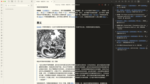
Screenshot assets are kept in sync for release surfaces:
screenshot.png— 512×288 community-theme / README preview image._resources/img/image-comparison-v1.png— high-resolution source image used to regeneratescreenshot.png.preview/CHECKLIST.md— release-quality visual QA checklist to run before replacing screenshots or expanding README claims.
Installation
From Obsidian Community Themes
- Open Settings in Obsidian.
- Go to Appearance -> Themes.
- Click Manage and search for
Ouroboros. - Click Install and use.
Manual Installation
- Download the latest release from GitHub Releases.
- Extract
theme.cssandmanifest.json. - Copy them into
.obsidian/themes/Ouroboros/inside your vault. - Open Settings -> Appearance -> Themes and select
Ouroboros.
Customization
Ouroboros exposes a broad set of options through the Style Settings plugin and CSS variables.
Notable options include:
- Style packs: Classic Paper, Things Warm, Research Desk, Longform Book, Night Ink, and Low Contrast Calm
- Accent presets: moss, amber, sage, ink-blue, clay, and slate
- Paper temperature: warm or cool paper surfaces (light and dark)
- Density presets: compact UI and airy reading
- Reading width: a column-width tier (Narrow / Standard / Relaxed / Wide) plus an advanced custom width, bound to Obsidian's readable line length
- Reading font: an optional serif / Western body-font profile (System sans / Iowan-Palatino serif / Georgia modern serif / Inter humanist) for the body and editor surface only — the interface chrome stays sans, and CJK mode / style packs still override it
- Numbered headings: optional CSS-counter outline numbers (1, 1.1, 1.1.1) for H1–H4 in both Reading View and Live Preview
- Code blocks: curated language labels (Reading View), clearer copy-button hover/active, and stronger but calm diff contrast
- Nested tags: a quiet hierarchy cue for
#parent/childtags and clearer nesting guides in the Tags sidebar - Graph view: warm-paper background, a brighter focused/current node with an accent ring, and quieter links
- Highlight pens: eight low-saturation
<mark class="red|orange|yellow|green|cyan|blue|purple|pink">colors for Reading View - Active path emphasis: a warm low-noise cue for the active tab, active pane title, and current breadcrumb segment — only the current item is emphasized
- Daily / periodic dashboard: a
dashboardcssclass that turns Dataview/Tasks blocks into calm paper widget panels (composes withcards) - Task priority palette: an opt-in mode that maps Tasks-plugin priorities (highest…lowest) to the warm progress 5-color ramp as a quiet left rail, with a warm due chip — urgency reads warm-to-cool
- Paper panes: an opt-in mode that turns editor tab groups into raised paper sheets (thin border, soft shadow, rounded corners) with a quiet accent lift on the active pane; sidebars stay flat
- Typewriter focus: a Focus-mode sub-toggle that dims inactive lines and emphasizes the active line while editing, with centered composition room (Live Preview only)
- Bullet threading: a default-on Logseq-style outline cue — a rounded accent thread connects every ancestor bullet down to the active list line (editor only, 6 indent levels)
- Clean embeds: an opt-in mode (Style Settings toggle or per-note
embed-cleancssclass) that strips the card chrome from transclusions so embedded notes read as part of the host note - Content helper classes:
cards,cards-cover,cards-compact,table-wide,table-small, andtable-clean - Low-noise navigation rails and current-path highlights for File Explorer / Bookmarks / Outline
- Image / figure / gallery helpers:
img-grid,img-wide,img-frame, andfigure-note - Publish / Print / PDF export polish for links, footnotes, tables, code, callouts, and figures
- Link underline controls for internal and external links
- Fancy code blocks and fancy highlight styles
- Recoverable Focus mode, Keyboard mode, and reduced-motion mode
- Research reading mode for source-heavy notes
- Longform reading mode for essays and chapter drafts
- CJK typography and serif toggle
- Adjustable heading sizes, weights, and colors
- Tag, highlight, inline code, and progress color controls
Plugin and core view support
Compatibility claims are tiered and conservative. See docs-code-ai/PLUGIN-COMPATIBILITY-AUDIT.md for exact plugin ids, preview coverage, and fragile selector notes.
Preview-covered core/plugin surfaces:
- Bases (core)
- Properties / File properties / All properties (core)
- Command Palette / Quick Switcher (core)
- Bookmarks / Search / Outline / File Explorer (core)
- Canvas (core)
- Dataview
- Calendar / Full Calendar
- Tasks
- Kanban
- Obsidian Git
Selector-level integrations:
- Todoist Sync
- Excalidraw
- Hover Editor
- Banners
- Checklist
- Outliner
- Timeline
Legacy selector-only:
- DB Folder (
.db-table-view; official plugin id was not present in the Obsidian community plugin directory during the M5-4 audit)
If a plugin is not listed, it should still inherit Obsidian core tokens where possible, but it is not part of the dedicated visual QA surface yet.
Known limitations
Known limitations and unsupported plugin claims are tracked in docs-code-ai/KNOWN-LIMITATIONS.md. Short version:
- Selector-level integrations should be verified in your own vault before relying on exact plugin layout parity.
- DB Folder is legacy selector-only and is not listed in theme metadata until an official plugin id and live DOM are confirmed.
- Mobile FAB styling and version-sensitive surfaces such as Bases, Canvas, Properties, prompt/suggestions, and Full Calendar require manual QA for release candidates.
- Plugins absent from the compatibility audit inherit core tokens where possible, but are not dedicated support claims.
Compatibility
- Minimum Obsidian version:
1.0.0 - Current theme version:
1.0.2 - Works in both light and dark mode
- CSS-only theme; no JavaScript plugin dependency
Development
The repository includes the modular source used to build the published theme.
- Clone the repository.
- Edit the source files in
src/. - Run
npm run buildto regeneratetheme.css. - Run
npm run checkto validate version metadata, Style Settings syntax, and build output. - Optional: sync preview fixtures to a disposable vault with
npm run sync:vault -- /path/to/vault --preview. - Review changes in Obsidian using
preview/CHECKLIST.mdbefore updating screenshots or release notes. - Review
docs-code-ai/KNOWN-LIMITATIONS.mdbefore expanding plugin claims. - For release preparation, use
docs-code-ai/RELEASE-CHECKLIST.md.
Source structure
src/00-header.css: theme banner and root variablessrc/01-foundation.css: core palette, style packs, typography, layout, app chrome, Properties, prompt/suggestion, tree/search, reading modes, and Focus modesrc/02-code.css: code blocks and syntax highlightingsrc/03-mobile.css: mobile-specific adjustmentssrc/04-tasks-and-progress.css: custom task states and progress stylingsrc/05-plugins-primary.css: primary plugin and workbench integrations, including Dataview helpers, Bases, and Canvassrc/06-plugins-secondary.css: secondary plugin integrationssrc/07-style-settings.css: Style Settings definitionssrc/08-plugin-compat.css: plugin compatibility metadatasrc/09-animations.css: motion and animation controls
Preview QA
The preview suite is intentionally local-first and vault-friendly:
preview/core-showcase.md— typography, links, tags, callouts, tables, code, properties/frontmatter, prompt/sidebar notespreview/tasks-showcase.md— checkbox states and progress barspreview/plugin-showcase.md— Bases, Dataview, Calendar, Kanban, Canvas, Git, and plugin-facing surfacespreview/canvas-workflow.canvas— Canvas nodes, groups, edges, labels, controls, color picker, and minimappreview/research-reading-showcase.md— Research reading modepreview/longform-reading-showcase.md— Longform reading modepreview/presets-showcase.md— M6 style pack palette, rhythm, and accent override checkspreview/reading-width-showcase.md— M9 reading width tier, advanced custom width, and--file-line-widthbinding checkspreview/reading-font-showcase.md— M10 reading font profile checks (serif/Westernvariable-select, body+editor only, UI chrome stays sans, CJK/pack precedence)preview/numbered-headings-showcase.md— M9 numbered headings (H1–H4) in Reading View and Live Preview, per-note reset, callout exclusionpreview/code-block-showcase.md— M9 code-block language labels, copy-button hover/active, and diff contrast checkspreview/nested-tags-showcase.md— M9 nested-tag cue and tag-pane nesting guide checkspreview/graph-view-showcase.md— M9 graph warm-paper, focused node, current-note ring, and quiet-link checkspreview/highlight-pens-showcase.md— M10 multi-color highlight pen checks (8 colors, light/dark)preview/accent-paper-showcase.md— M10 expanded accent palette and paper-temperature checkspreview/active-path-showcase.md— M10 current-path / active-note emphasis checks (active tab, pane title, breadcrumb)preview/dashboard-showcase.md— M10 daily/periodic dashboard layout checks (dashboardcssclass, widget panels, cards composition)preview/task-priority-showcase.md— M10 task priority palette checks (opt-in,data-task-prioritymapped to progress 5-color ramp, warm due chip)preview/paper-panes-showcase.md— M10 paper panes checks (opt-in, editor tab groups as raised sheets, active-pane accent lift, sidebars stay flat)preview/typewriter-focus-showcase.md— M10 typewriter focus checks (Focus-mode sub-toggle, dim inactive lines, active-line emphasis, centered room, Live Preview only)preview/bullet-threading-showcase.md— M12 bullet threading checks (default-on, rounded accent thread to the active list line, editor only)preview/clean-embeds-showcase.md— M12 clean embeds checks (opt-in toggle /embed-cleancssclass, chrome-free transclusions, hover rail)preview/content-helpers-showcase.md— M6 cards, table, and Dataview helper classespreview/navigation-showcase.md— M6 folder rail, current-path, and tree navigation checkspreview/image-figure-gallery-showcase.md— M6 image grid, wide image, frame, and figure caption checkspreview/focus-mode-showcase.md— Focus mode 2.0, Keyboard mode, hover/focus recovery, and command/switcher hintspreview/publish-print-showcase.md— M6 Publish / Print / PDF export checkspreview/CHECKLIST.md— manual release-quality gate for light/dark, Style Settings variants, mobile/accessibility, plugin workbench checks, screenshots, and sign-off evidence
Contributing
Issues and pull requests are welcome. If you spot a bug, visual regression, or plugin compatibility issue, please include screenshots, Obsidian version, OS/device, enabled Style Settings options, and reproduction details.
Credits
Ouroboros draws inspiration from:
- Things Theme by @colineckert
- Things App by Cultured Code
- Flexoki by @kepano for the warm, ink-friendly color system
License
Released under the MIT License.