
README file from
GithubPlainpage
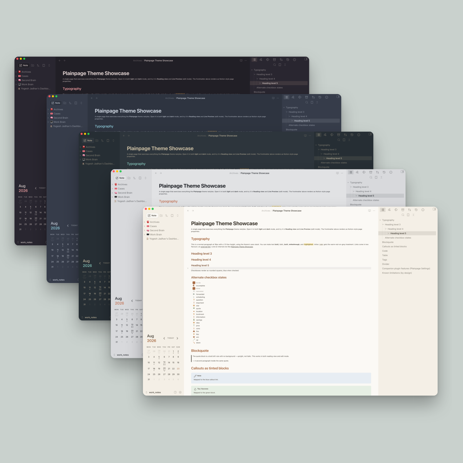
A calm, document-first theme for Obsidian, inspired by the way Notion presents a page. Flat surfaces, quiet borders, a comfortable reading column, and eleven colour palettes. Light and dark mode.
Plainpage is an independent project. It is not affiliated with, endorsed by, or connected to Notion Labs, Inc.

Plainpage is free and always will be. If it earns a place in your vault, a coffee would mean a lot and help us keep building it.
The eleven palettes need the companion plugin. Install Plainpage Settings to switch between them. Without it you stay on the default palette.
Install
1. The theme. From Obsidian (once it is in the directory): Settings, Appearance, Themes, Manage, then search for Plainpage.
To install it by hand instead, download manifest.json and theme.css from the latest release into <vault>/.obsidian/themes/Plainpage/, then pick Plainpage under Settings, Appearance.
2. The companion plugin. Settings, Community plugins, Browse, then search for Plainpage Settings. Skip this only if you are happy on the default palette: it is what switches palettes, and it also adds focus mode, the layout toggles, page icons and cover banners.
Plainpage requires Obsidian 1.8.0 or newer. On anything older, use 1.0.1.
What it covers
The whole window, not only the note:
| Area | Treated |
|---|---|
| Ribbon and left sidebar | Flattened into one quiet surface |
| Workspace tabs and title bar | Yes |
| Editor, both source and reading view | Yes |
| Right sidebar panels | Yes |
| Command palette and quick switcher | Yes |
| Settings modal | Yes |
| Status bar, scrollbars, buttons, inputs | Yes |
| Callouts, code blocks, tables, tags, properties | Yes |
Palettes
Eleven schemes, each hand-tuned for light and dark separately. Switching between them needs Plainpage Settings.
| Palette | Character | Full size |
|---|---|---|
| Plainpage | The default. Warm off-white paper, blue accent. | light · dark |
| Graphite | Cool neutral grey | light · dark |
| Sepia | Warm paper | light · dark |
| Everforest | Muted green | light · dark |
| Nord | Arctic blue-grey | light · dark |
| Rosé Pine | Muted mauve | light · dark |
| Dim | Soft contrast: darker light, lighter dark | light · dark |
| Blush | Warm rose and mauve | light · dark |
| Terracotta | Warm grey and clay | light · dark |
| Goodnotes | Peach, clay and sage | light · dark |
| Monochrome | Greyscale only. Hierarchy through tone, not hue. | light · dark |


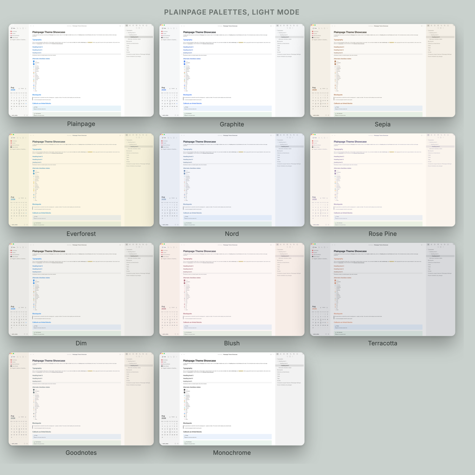
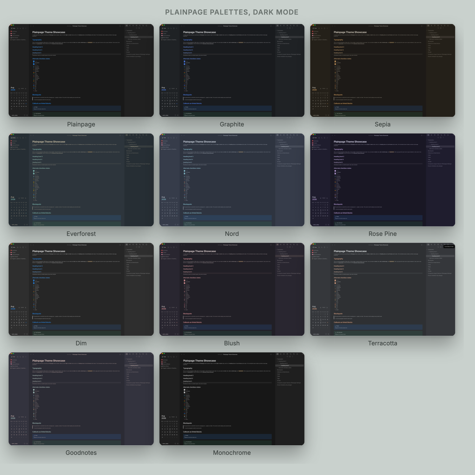
A palette redefines only the --nt-* design tokens. Everything else follows automatically.
Companion plugin
Plainpage Settings does the things a stylesheet cannot do for itself.
| Needs the plugin | Works without it |
|---|---|
| Switching between the eleven palettes | The whole look, on the default palette |
| Focus mode, borderless, full width, compact, floating panes, dim inactive panes | Every colour, type and layout rule |
| Page icons and cover banners from frontmatter | Callouts, code, tables, tags, properties |
The plugin works by toggling plainpage-* classes on <body>, and the theme styles those classes. Neither one needs the other to load, so the theme degrades cleanly: without the plugin nothing breaks, the extras simply never switch on.
Customising
Every colour, radius, spacing and font size is a CSS custom property, declared once at the top of theme.css. To change something, add a snippet:
body {
  --nt-line-width: 800px;      /* wider reading column */
  --nt-accent: #2d9964;        /* green accent */
}
The file is organised into numbered regions, each with a comment explaining what it does and why. Start there rather than searching for a selector.
Known limitations
Some Notion behaviours cannot be reproduced in CSS alone. These are documented in a block at the end of theme.css rather than faked. The short version: the block drag handle is visual only, and anything needing new DOM nodes or drag behaviour is out of scope for a theme.
Reproducing the screenshots
Every image here is a real capture of the running app, composed by a script, so the set can be rebuilt whenever the CSS changes.
- Open
Archives/Plainpage Theme Showcaseand scroll to the top. - Walk the palette list in the companion plugin's own order, capturing each one
with
Cmd+Shift+4thenSpacethen a click on the window. Do all of light mode first, then all of dark. Keep the window the same size throughout. - Put the files in
~/Desktop/plainpage-shots/. Filenames do not matter. - Run
docs/make-screenshots.py.
The script identifies each capture by the order it was taken, then verifies that
against the --nt-bg the palette declares in theme.css, and stops if any
capture is more than 8 units away from where it should be. Colour alone cannot
do the job: Plainpage, Graphite and Monochrome are all pure white in light mode,
and Rose Pine, Blush and Goodnotes sit within 5 units of each other.
It also measures where the window actually sits inside each capture and crops
to it. A Cmd+Shift+4 window shot pads the window with its drop shadow as
transparent pixels, and the padding is not symmetric: about 1.8% on the left
and 3.8% at the bottom. Trimming a flat percentage instead leaves a
transparent halo inside the rounded frame.
Composition is HTML rendered by macOS Quick Look, so there is no browser to install.
Licence
MIT. See LICENSE.