
README file from
GithubmacOS Tahoe for Obsidian
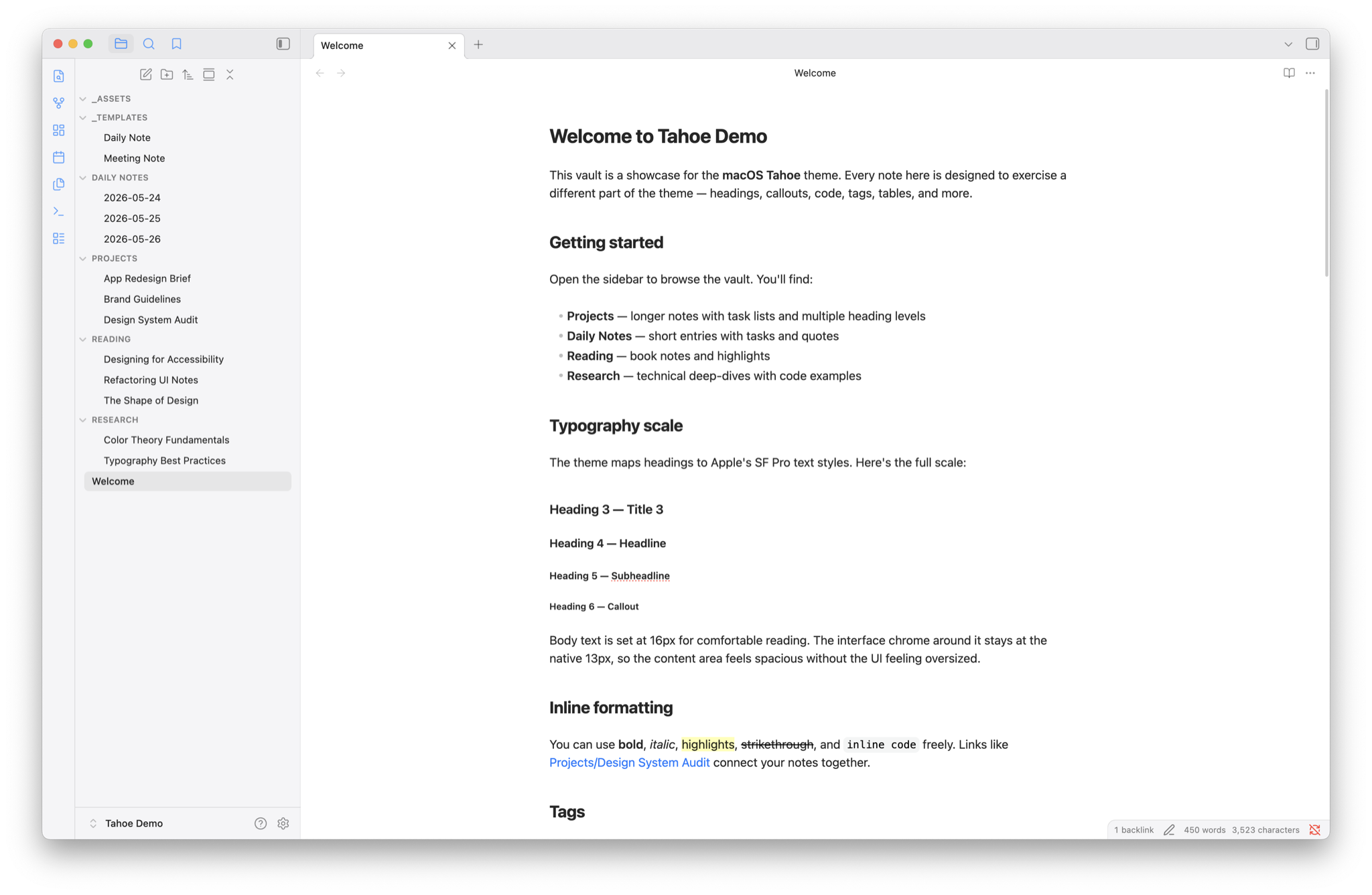
An Obsidian theme that brings the feel of a native Mac app to your writing. Every detail — from the translucent sidebars to the way buttons respond to your click — is drawn from Apple's own design language, so Obsidian sits right at home alongside Finder, Notes, and the rest of your Mac.
What makes it different
It looks like it belongs on your Mac. Sidebars use the same frosted-glass translucency you see across macOS Tahoe. Modals, menus, and the command palette all pick up the same treatment — subtle blur, soft edges, and layered depth that feels native rather than bolted on.
Under the hood: panels use
backdrop-filter: blur(30px) saturate(180%)with semi-transparentrgba()backgrounds. A subtle SVG noise texture and top-edge specular gradient are layered via CSSbackground-imageto simulate frosted glass grain and light refraction — no pseudo-elements that could break layout. When Obsidian's "Translucent window" mode is enabled, panel opacity drops further so the real desktop blur shows through.
Typography that matches your system. Headings follow Apple's exact text style scale — the same sizes, weights, and letter-spacing you see in apps like Notes and System Settings. The editor uses a comfortable 16px for reading and writing, while the surrounding interface stays at the native 13px.
Under the hood: the heading scale maps to Apple's SF Pro text styles — Large Title (26pt), Title 1 (22pt), Title 2 (17pt), Title 3 (15pt), Headline (13pt), and Callout (12pt) — with per-level
letter-spacingtracking values sourced from the HIG (e.g. -0.36px at 26pt, -0.26px at 22pt). The interface uses a split font-size approach:--font-ui-small: 13pxfor chrome,--font-text-size: 16pxfor editor content.
Your accent color, everywhere. Choose from all eight macOS system colors — Blue, Purple, Pink, Red, Orange, Yellow, Green, or Graphite — and the theme carries it through focus rings, selections, sidebar icons, and active states. Switch accents in Style Settings and the entire interface follows.
Under the hood: accent colors are the exact
NSColorsystem values (e.g.#007AFFlight /#0A84FFdark for Blue). Focus rings usecolor-mix(in srgb, var(--macos-accent) 25%, transparent)so they adapt to any accent without hardcoded values. Sidebar icons usecolor-mixwith white to lighten the accent for thin strokes, matching the visual weight of Finder's filled icons.
Syntax highlighting from Xcode. Code blocks use the exact color palette from Xcode's Default theme. Keywords, strings, types, and comments all match what you'd see in Apple's own developer tools — in both light and dark mode.
Under the hood: colors are extracted from Xcode's
.xccolorthemedefinition files. Light mode uses the classic Xcode palette — magenta keywords (#9B2393), red strings (#C41A16), deep blue numbers (#1C00CF), teal types (#3F6E74). Dark mode uses the Default (Dark) palette — hot pink keywords (#FC5FA3), coral strings (#FC6A5D), gold numbers (#D0BF69), cyan types (#5DD8FF), lavender properties (#D0A8FF).
Thoughtful motion. Buttons, sidebar items, and controls transition smoothly with timing curves modelled on macOS. Buttons gently compress when pressed. Nothing jumps or flickers.
Under the hood: interactive elements use 120–150ms ease transitions. Buttons and clickable icons apply
transform: scale(0.96)on:activeto mimic the native macOS press response. All transitions are guarded by@media (prefers-reduced-motion: reduce)which setstransition-durationandanimation-durationto0.01ms.
Every corner radius is intentional. Nested elements use concentric border radii — the inner radius is always calculated relative to the outer one, so rounded corners nest cleanly rather than looking pinched or misaligned. It's a small detail borrowed from Apple's own UI toolkit that most themes overlook.
Under the hood: the theme uses a four-tier radius scale (
--radius-s: 6px,--radius-m: 10px,--radius-l: 16px,--radius-xl: 24px). Inner elements calculate their radius ascalc(var(--radius-l) - <padding>)— for example, command palette suggestion items usecalc(var(--radius-l) - 6px)to nest concentrically within the 16px outer shell. Borders are Apple's signature 0.5px hairlines throughout.
Built for everyone
Accessibility was a priority from the start, not an afterthought.
- Reduced motion — if you've enabled "Reduce motion" in your Mac's accessibility settings, all transitions and animations are removed automatically. Nothing animates unless you want it to.
- Reduced transparency — if you prefer solid backgrounds over translucency, the theme detects this and replaces every glass effect with clean, opaque surfaces. No blur, no grain, no visual noise.
- High contrast support — text colors use Apple's semantic label system with carefully tuned opacity values, ensuring comfortable reading in both light and dark mode.
You don't need to configure anything. The theme reads your system preferences and adapts.
Under the hood: the theme uses
@media (prefers-reduced-motion: reduce)and@media (prefers-reduced-transparency: reduce)to detect system preferences. Reduced-transparency fallbacks are written with specificity that matches or exceeds the glass declarations (e.g.body.macos-glass-modals .tooltiprather than just.tooltip) so they actually override in the cascade. Text uses Apple's semantic opacity values —rgba(0,0,0,0.85)for primary,rgba(0,0,0,0.50)for secondary — rather than flat hex colors, maintaining proper contrast ratios across both modes.
Make it yours
The theme responds to Obsidian's built-in settings out of the box — no plugins needed:
- Light and dark mode — follows your Obsidian appearance setting with full support for both
- Accent color — the theme picks up whichever accent color you set in Settings > Appearance
- Translucent window — enable in Settings > Appearance for real desktop blur behind sidebars
- Font settings — your chosen text font, monospace font, and font size are all respected
For deeper customisation, install the Style Settings plugin to unlock additional options:
- Accent color override — choose from all eight macOS system colors, with separate light and dark mode variants
- Translucent panels — toggle the frosted-glass sidebar effect on or off
- Glass modals — translucent or solid overlays
- Accent sidebar icons — tint file explorer and ribbon icons with your accent color, like Finder
- Colorful headings — give each heading level its own system color
- Full-width callouts — stretch callouts to the edge of the editor
- Monospace font — choose between SF Mono, Menlo, or Monaco
Everything works with sensible defaults. Style Settings just gives you the extra dials.
Under the hood: toggles use the
class-togglepattern via Style Settings YAML embedded in a CSS comment block. Each toggle adds a class tobody(e.g.body.macos-translucent-panels), and all conditional styles are scoped to that class. This means the CSS is zero-cost when a feature is toggled off — no unusedbackdrop-filterorbackground-imagebeing computed.
Installation
- Open Obsidian and go to Settings > Appearance
- Under Themes, click Manage and search for macOS
- Click Install and use
Or install manually by downloading theme.css and manifest.json into a folder called macOS inside your vault's .obsidian/themes/ directory.
Design sources
This theme is built on specifications sourced directly from Apple:
- Apple Human Interface Guidelines
- NSColor system color documentation
- Liquid Glass — WWDC 2025
- Xcode Default theme color values (extracted from
.xccolorthemefiles) - Concentric border radius principle
License
MIT