
README file from
Github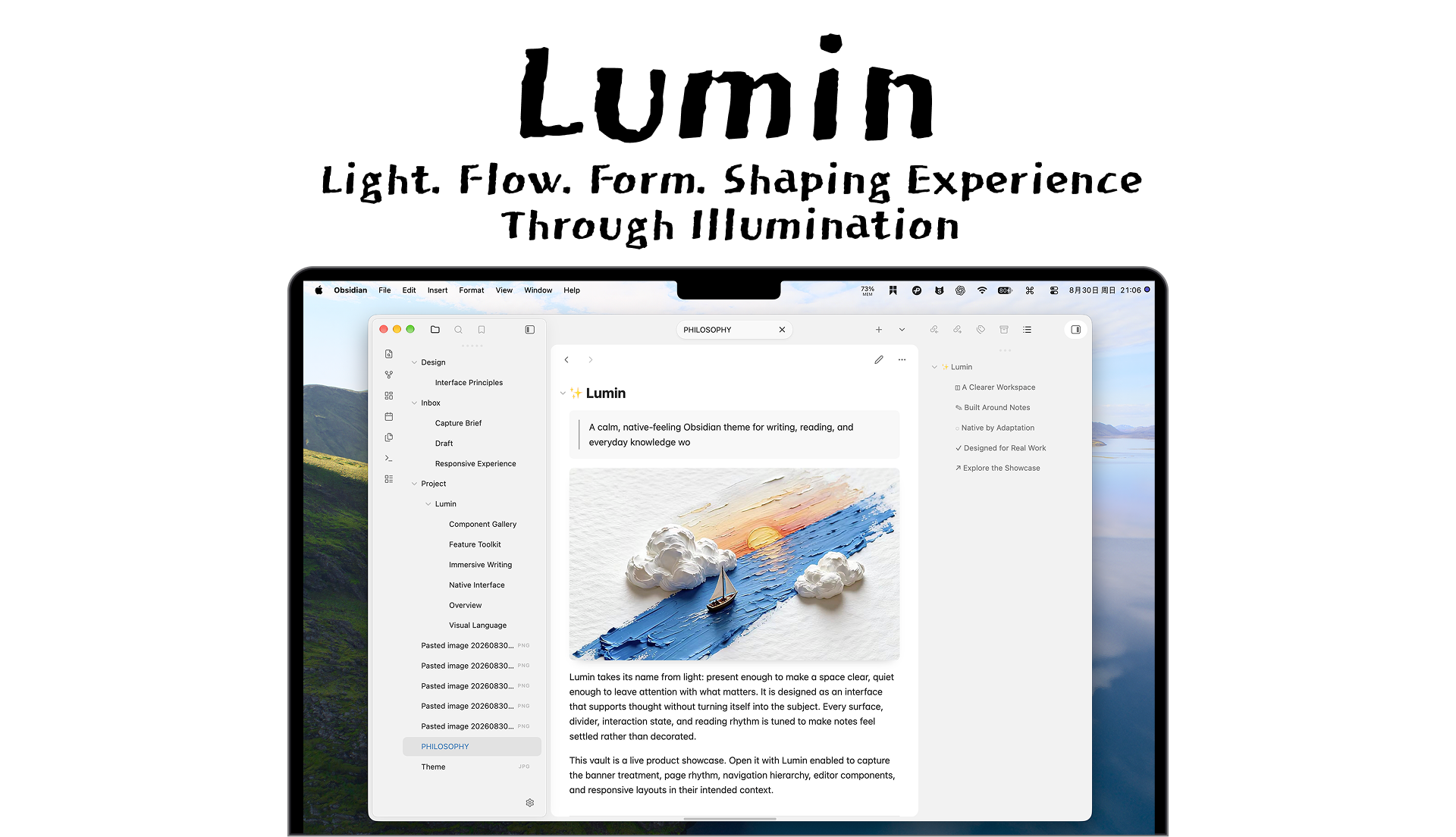
Lumin keeps the note at the center of the workspace. Its measured spacing, clear hierarchy, and platform-aware details make long writing sessions feel quieter without hiding the tools that support them.
Highlights
- Content-first workspace. Comfortable reading width, refined typography, and deliberate hierarchy for writing, review, and reference.
- A complete note surface. Thoughtful styling for properties, tables, callouts, code, tasks, embeds, banners, images, and media.
- Desktop controls when you need them. Hoverable ribbons and sidebars, focus view, compact panel actions, and centered tabs keep wide workspaces adaptable.
- Configure without CSS. Optional Style Settings controls cover color, editor, desktop behavior, and accessibility preferences.
Across Devices
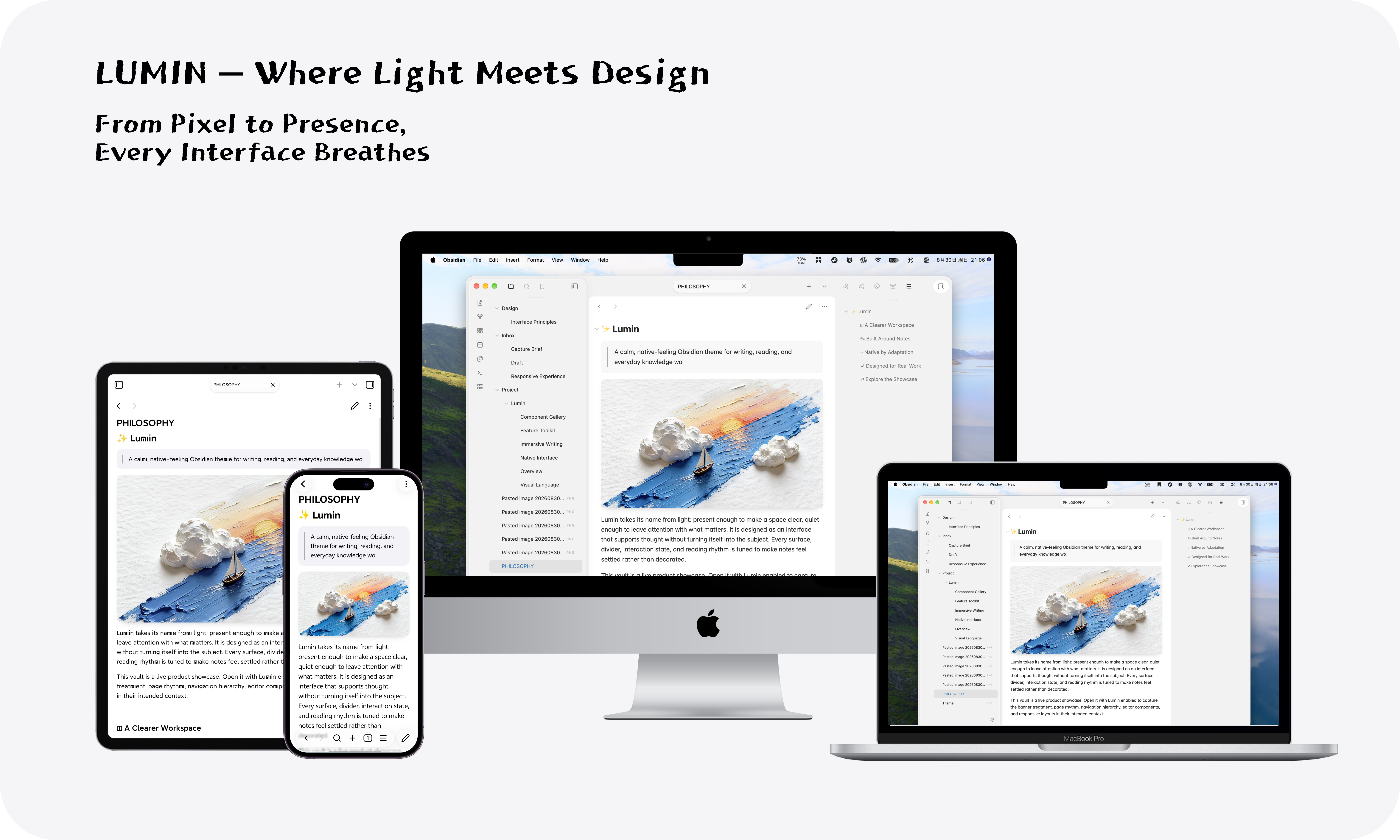
Lumin shares one visual language across every Obsidian platform while adapting density, navigation, safe-area spacing, and touch targets to the device.
| Platform | Lumin adapts |
|---|---|
| macOS, Windows, Linux | Window-aware surfaces, tabs, sidebars, and desktop interactions |
| iPad and Android tablets | Touch-sized controls, flexible drawers, and tablet settings layouts |
| iPhone and Android phones | Safe-area-aware navigation, sheets, drawers, and mobile controls |
Note Details
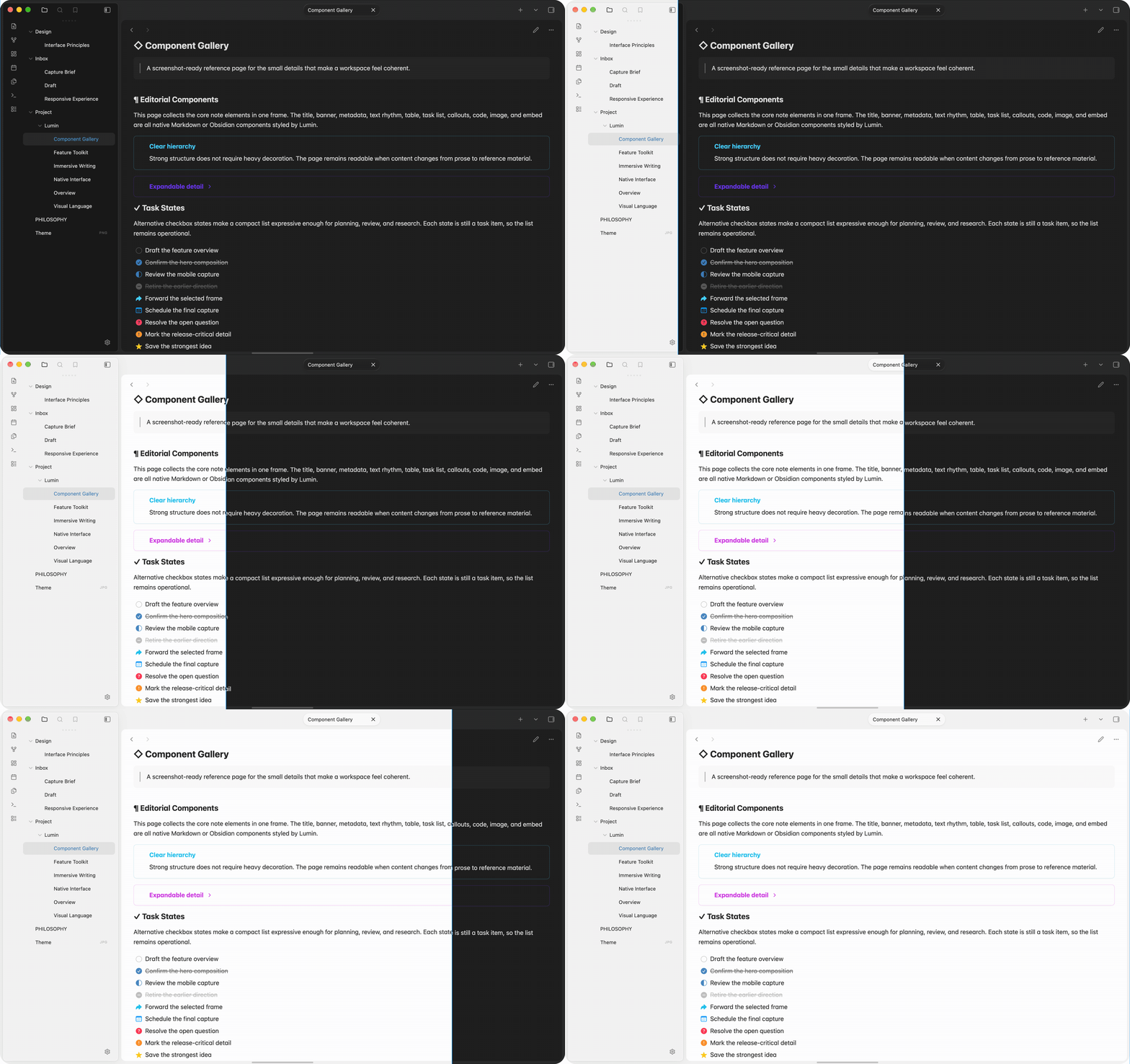
The theme makes everyday note components easier to scan without turning them into separate visual systems.
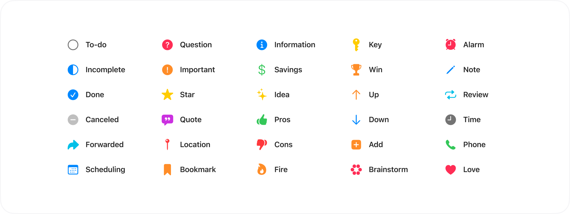
Alternative checkbox states add a compact vocabulary for tasks while preserving standard Obsidian task behavior.
Task States
Use Obsidian task syntax to give a task a more specific state. Lumin preserves the meaning of standard tasks and adds a distinct icon or treatment for the following commonly used states.
| Syntax | State |
|---|---|
- [ ] |
To-do |
- [/] |
In progress |
- [x] |
Done |
- [-] |
Canceled |
- [>] |
Forwarded |
- [<] |
Scheduled |
- [?] |
Question |
- [!] |
Important |
- [*] |
Starred |
- [I] |
Idea |
- [p] / - [c] |
Pros / cons |
Additional symbols cover quotation, location, bookmark, information, savings, key, win, time, telephone, love, and other task states.
Install
From Obsidian
- Open Settings > Appearance > Themes.
- Select Manage, search for Lumin, then install and enable it.
Manual Install
- Download
manifest.jsonandtheme.cssfrom the latest release. - Create
.obsidian/themes/Lumin/in your vault. - Put both files in that directory.
- In Settings > Appearance > Themes, select Lumin.
Customize
Lumin works without companion plugins. Install and enable Style Settings to adjust Lumin in Settings > Style Settings.
- Choose the default, mist blue, moss green, or warm gray palette in light and dark appearance.
- Tune desktop behavior, including hover ribbons, hover sidebars, focus view, tab alignment, compact panel actions, and media zoom.
- Adjust reading width, block and media width, banner treatment, active-line highlight, link underlines, and image alignment.
- Reduce motion, soften unfocused contrast changes, or adjust interface and icon sizing.
Per-Note Layouts
Use the cssclasses property in a note's frontmatter to change the layout of that note without affecting the rest of the vault.
---
cssclasses:
  - cards
  - cards-16-9
  - cards-cols-3
  - table-wide
---
| Classes | Effect |
|---|---|
cards, list-cards |
Display Dataview tables or lists as cards |
cards-cover, cards-16-9, cards-1-1, cards-2-1, cards-2-3 |
Control card image fit and aspect ratio |
cards-cols-1 through cards-cols-8 |
Set a card grid's column count |
table-wide, table-max, table-100 |
Expand tables and Dataview blocks beyond the reading column |
img-wide, img-max, img-100 |
Expand images and embeds |
bases-wide, bases-max, bases-100 |
Expand Obsidian Bases views |
table-small, table-tiny, table-nowrap, table-numbers, row-lines, col-lines |
Refine table density, wrapping, numbering, and dividers |
Integrations
Lumin includes dedicated styling for Obsidian properties, Bases, tables, callouts, banners, embeds, and task states. It also styles Dataview tables and card layouts, supports block-width utilities for Datacore blocks, and handles banner areas used by banner-style plugins.
Compatibility
Lumin requires Obsidian 1.11.6 or later. It supports light and dark appearance on macOS, Windows, Linux, Android, and iOS. Platform-specific behavior follows Obsidian's native device and window classes where available.
Lumin is intentionally content-first and close to Obsidian's native interaction model. CSS snippets that substantially replace the workspace layout may need adjustment when used with the theme.
Feedback
For bugs and feature requests, please search existing issues first, then open a new issue using the relevant template. Include your Obsidian version, operating system, and any enabled CSS snippets or plugins that affect the affected view.
Development
Source styles live in src/; the root theme.css is the distributable file. Rebuild it after SCSS changes with Node.js available:
npx --yes sass src/theme.scss theme.css --no-source-map
Commit the generated theme.css with its source changes. Run git diff --check before opening a pull request or publishing a release.
Credits
Lumin is based on Cupertino. It includes MIT-licensed snippets from Minimal and public-domain references from Alternative Checkboxes Reference Set. See third-party notices for the applicable attribution and terms.
Craft is a visual reference only; this repository does not redistribute its code or assets.
License
YiXuan's original Lumin contributions are released under the MIT License. Included third-party material remains under its own terms in third-party notices.