
README file from
GithubWhat is Kage?
Kage (影, かげ) is the trace light leaves behind. This theme rebuilds, on screen, the weight of a well-made printed book: matte surfaces, pressed lines, controlled wear, the fibre your fingertip finds when turning a page. A screen has none of that, so it is layered back in until the sharpness of the display has been worn down.
The light source is anchored outside the frame. Only its decaying tail reaches the page, so the centre stays dark and the edges glow — the opposite of a camera vignette, because here the light never comes from the front. Text sits in the darkest part, reading like ink pressed into paper.
Material carries atmosphere, text carries structure. That division is also the discipline: nothing that has to stay legible is allowed to be swallowed by mood.
Gallery
One note, one specification, two media.
| Dark (default) | Paper mode |
|---|---|
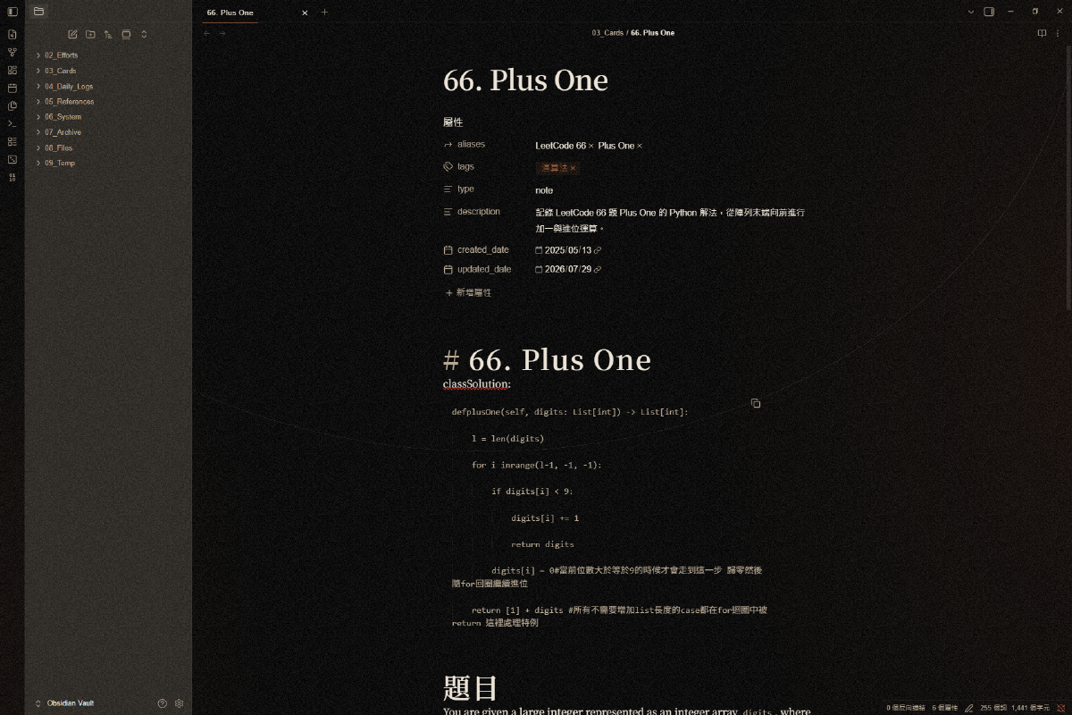 |
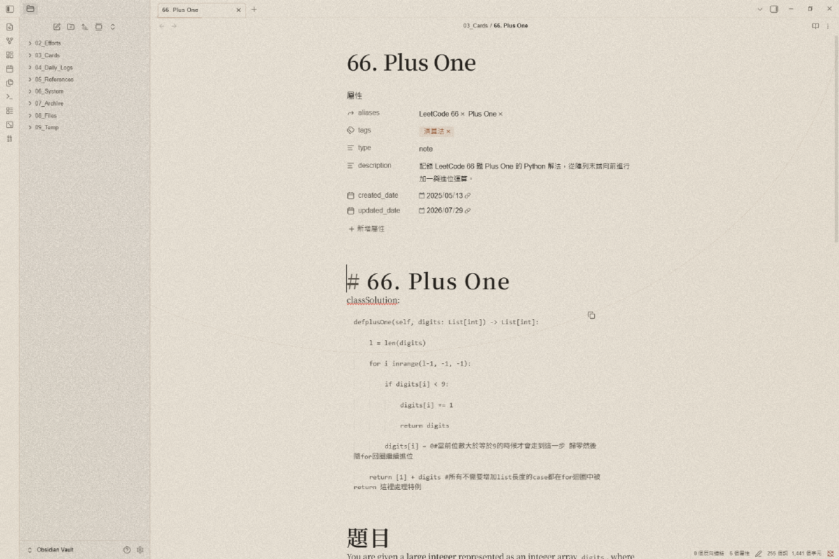 |
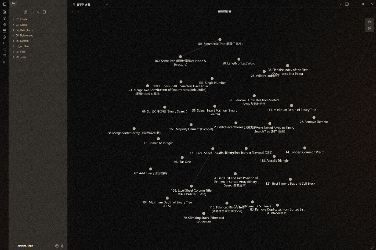
Paper mode follows Obsidian's own Base color scheme setting (Light / Dark / System). There is nothing extra to switch.
Install
From community themes: Settings → Appearance → Themes → Manage → search for Kage.
Manually: put theme.css and manifest.json into
<vault>/.obsidian/themes/Kage/, then pick Kage under Settings → Appearance
→ Themes. The folder name must be exactly Kage.
Requires Obsidian 1.5.0 or newer, with an installer (Settings → About → Installer version) no older than 1.4.5. On an older installer, Obsidian's built-in browser engine does not understand the colour-mixing syntax the theme relies on and highlight backgrounds turn transparent — downloading the installer again fixes it, and your vault is untouched.
Design
The background is layered, not painted. The drawn base is pure black, a
warm light leak is added with screen, and film grain always sits on top.
The dark grey you see is the result of that stack, not anyone's hex value.
Grain is a static material. A 200×200 greyscale image from a fixed seed. It never flickers, shifts, or moves with scrolling — paper fibre, not screen noise.
The leak is graded by page type. Hue 18–30°, strongest for narrative pages and faintest for reading pages. Notes use the faintest grade by default: atmosphere goes to the sidebars and the margins, the text column stays clean.
Paper mode mirrors the same specification. The base becomes aged paper,
the leak becomes edge yellowing and switches to multiply, and the grain —
the same image at the same strength — switches to multiply too. Dark mode
is light striking the edges of the frame; paper mode is light coming through
the sheet. Every threshold keeps its number; only the direction flips.
Typography is serif-led. Headings and body are both serif; sans is reserved for navigation, dates and ordinals. Body measure stays within 45–75 Latin characters across font sizes and families.
Decoration is restrained. 1px corners, shadows capped at 0 1px 0 — no
floating cards. Composition lines, scratches and dust are all available, but
a reading page may show only one kind at a time.
One accent family. Orange-brown runs through links, buttons, selection and graphs; colour hierarchy comes from luminance, not from more hues. As a result the Appearance → Accent colour wheel has no effect on this theme. That is deliberate.
Style Settings (optional)
With the Style Settings plugin installed, the following can be adjusted. Without the plugin the theme runs at its defaults and is fully functional.
| Setting | Default | Alternatives |
|---|---|---|
| Composition strength (leak / yellowing) | C, reading | A narrative, B structural |
| Grain strength | 0.10 | 0.085, 0.12 |
| Composition line | on | off |
| Composition shape | arc | thin line |
| Full three lines on note pages | off | on |
| Scratches | off | on |
| Dust | off | on |
Licence
MIT. The design language, colour tokens, grain asset and part of the measurement code are ported from kage-visual-kit (same author, MIT) — itemised in NOTICE.md.