README file from
GithubLucid
A clean, Apple-style frosted-glass Obsidian theme — translucent cards with real backdrop blur, a calm
blue accent with teal italics, and crisp Segoe UI typography. Dark-first with a bright light
variant. Everything resolves through --mwg-* design tokens, so a single accent picker recolours the
whole theme.
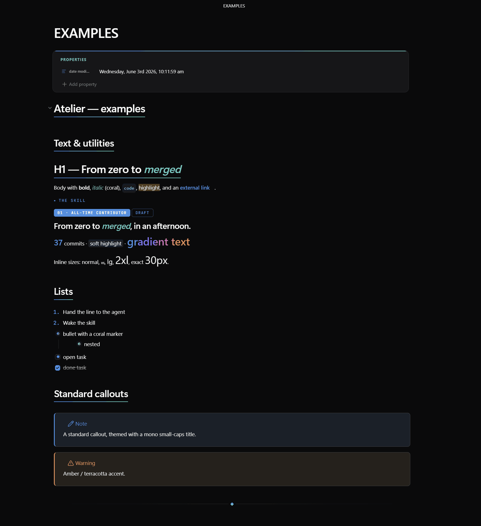
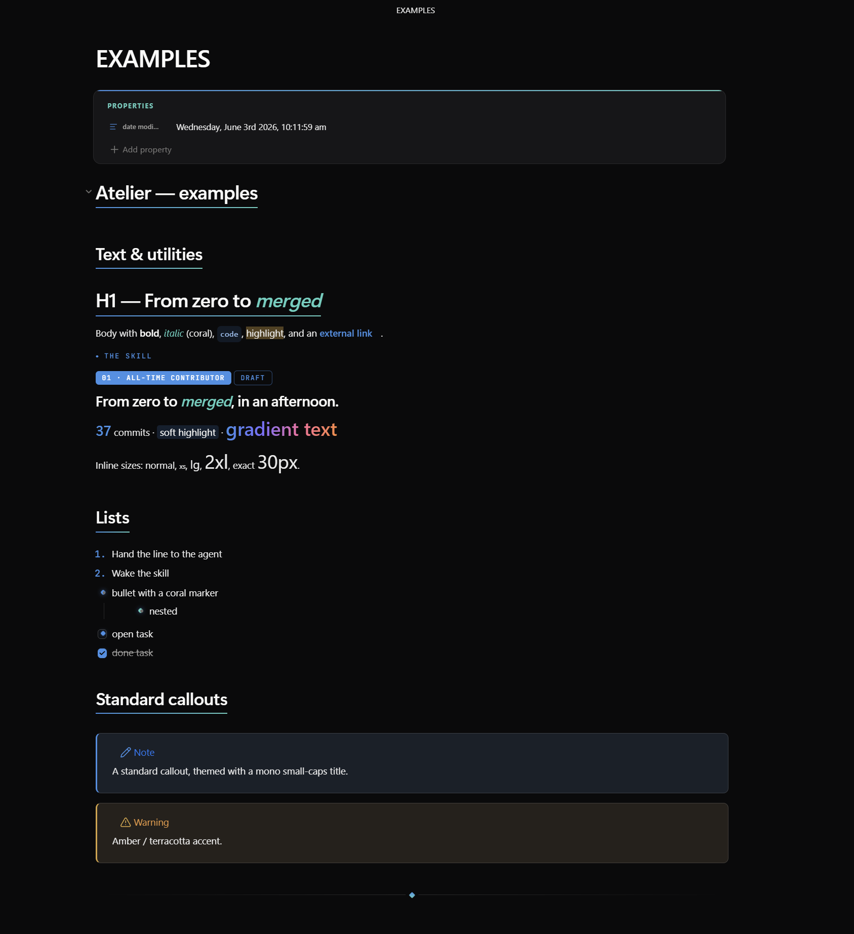
Its signature is a webpage-like card system you compose in plain Markdown, plus reusable text utilities so any run of text can be restyled inline — including an Apple-style gradient text class.
Companion theme: Atelier shares the same card / column / utility syntax. A note authored for one renders with identical layout in the other — only the skin (warm paper + coral + serif) changes.
Install
From Obsidian (once published): Settings → Appearance → Themes → Manage → search Lucid.
Manually: copy manifest.json + theme.css into <vault>/.obsidian/themes/Lucid/, then pick
Lucid under Settings → Appearance.
Requires Obsidian 1.5.0+. Install the Style Settings plugin to customise colours, fonts, sizes, the default-style dropdowns, the gradient ramp, and the glass blur. Lucid's defaults use system fonts (Segoe UI), so it works offline out of the box.
Tutorial
1. Cards — a layout + a style
Wrap any number of cards in > [!grid]; they flow into as many columns as fit and reflow on resize.
> [!grid]
> > [!card] One
> > [!card] Two
> > [!card] Three
- Lock columns:
> [!grid|cols2]…cols6. · Span:span2,span3,spanfull. · Grids nest.
Nesting rule: child cards use
>>and must be separated by a blank>line.
Pick a card style with > [!card|<style>] (bare [!card] follows the Default card style dropdown):
| Style | Look |
|---|---|
skill |
label, big title, dark command bar, blue 01 02 03 steps |
section |
flat column block — ###### I · LABEL (use in cols3) |
step |
ringed icon + ###### Step 0N (use inside a hero) |
profile |
centered avatar, label, name, link |
honor |
dark — rank badge, ringed avatar, pull-quote, big stats |
channels |
dark — table of #channel | LABEL rows |
hero |
big display heading + buttons; add split for a side-by-side hero |
Surfaces: add dark or accent. Buttons: **[Label](url)** → filled, [Label](url) → outline.
Emphasis: *italic* words render in the teal emphasis colour.
Frosted glass (translucency + backdrop blur) is applied to light/default cards & infoboxes; dark honor/CTA surfaces stay solid for legibility.
2. Multi-column notes — [!columns] + [!col|wN]
> [!columns|ruled]
> > [!col|w3]
> > ### Narrow
> > [!col|w7]
> > ### Wide
Weights w1…w10; add ruled for dividers.
3. Infobox — [!infobox|right]
A wiki-style frosted text infobox that floats left/right/center with text wrapping beside it.
4. Reusable text utilities (inline HTML)
at-kicker · at-badge(.ghost) · at-display · at-lead · at-stat · at-mark ·
at-gradient (Apple-style gradient text — override the ramp per use with style="--grad: …", or set
the stops in Style Settings).
Inline font size: at-xs … at-4xl, or exact at-fs + style="--fs: 30px". They compose —
e.g. class="at-gradient at-2xl".
5. Tags, headings, body size
Category-tinted tags; per-heading #center/#right/#left; per-note body size via cssclasses: [text-lg] or the Style Settings slider.
See EXAMPLES.md for a ready-to-paste note exercising every feature.
Customising
Settings → Style Settings → Lucid — accent & colours, italic/emphasis colour, font dropdowns, note width, roundness, default card style, card glass blur, gradient ramp (4 stops + angle), body size, and animations.
Credits
- Fonts: Segoe UI (system); JetBrains Mono for code.
- License: MIT.