
README file from
GithubRetroma Theme
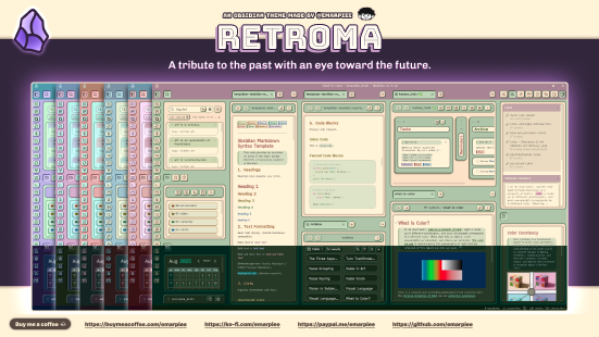
Your notes are chaotic, your vault is a mess, and every modern theme looks the same. Retroma fixes that. It draws inspiration from retro arcade machines, vintage software, and the early web, bringing back actual tactile designs and personality. You don't need design skills to make it look good, either. Simply pick a single accent color and Retroma handles the rest of the palette automatically, protecting you from your own worst styling instincts.
🖌️ Style Manager
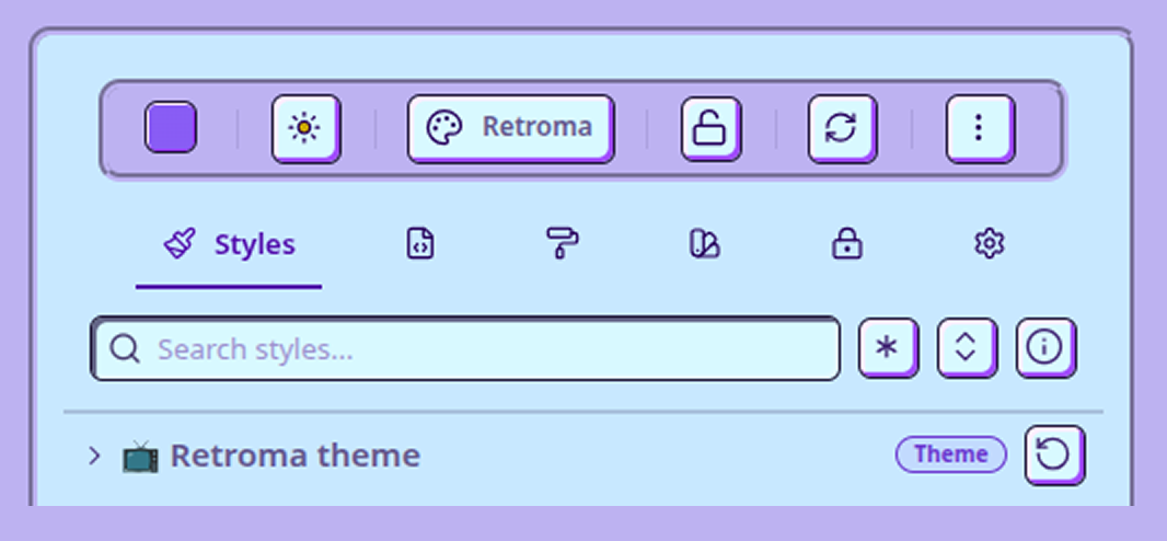
From simple visual tweaks to absolute control over every pixel, the Style Manager plugin acts as your bridge between casual styling and hardcore customization. Swap color schemes, choose from a selection of built-in retro fonts to apply globally or to specific parts like your markdown editor and canvas, push heading colors from muted to neon, fine-tune the corner roundness of your code blocks, or style your buttons to range from classic skeuomorphism to bold neubrutalism. You can even apply a vintage CRT scanline filter, go completely monochrome with a grayscale toggle, or strip away the clutter with Zen Mode to focus entirely on your writing. No judgment here, this is your chance to show off your inner perfectionist.
| Section | Description | Specific Customizations |
|---|---|---|
| 🖌️ Workspace and Panes | Shape your digital workspace. | • Theme font selection• OKLCH color scheme & accent tuner• Text color weights• Window/sidebar borders• Custom background/foreground overrides |
| ✍️ Markdown editor | Customize your primary editor, behavior, and formatting. | • Editor font selection & background colors• Simple editor header & container• Readable line length & background patterns• Blockquotes & callout box styling• Alternative checkboxes & syntax highlighting• Note & search query embeds (alignment, outlines, hover titles/links)• Heading styles, weights, sizes, and underlines• Links (internal/external & underlines)• Lists, paragraph spacing, and footnotes• Metadata properties & table styles• Tags/pills, highlighter, text selection, strikethrough, rules |
| 📦️ Button and inputs | Sculpt buttons, input fields, and touch controls. | • State transition animation speed• 3D button shadow & highlight properties• Color overrides (backgrounds, icons, borders) |
| 📊 Bases | Configure cards and table view layouts. | • Database-style table layout• Cards view layout (cover, borders, corners)• Maps view popup colors |
| 🔲 Canvas | Adjust how you visualize your knowledge. | • Floating UI controls (delay, radius, position)• Canvas colors (background, grid, cards)• Cards & groups corner roundness and borders |
| 📂 Folder and files | Customize your file explorer navigation tree. | • Simple sidebar pane header & content• File item text wrapping• Folder layout (radius, icons, indent lines)• Custom folder colors (1-15 rainbow removal) |
| ⏹️ Popups | Customize hover previews, menus, and modals. | • Hover page preview height & width• Modal backdrop dimming colors |
| Customize the built-in PDF viewer. | • Simple PDF viewer toggle• Page & thumbnail sidebar background colors• Thumbnail corner radius | |
| ☕️ Zen mode (desktop) | Focus entirely on your writing. | • Zen mode toggle & fade properties• Custom background color overrides• Pinning controls for toolbars/sidebars |
| 🎞️ Filters | Apply vintage visual overlay effects. | • Retro 8-bit pixelated icons• CRT screen effect (scanlines, vignette)• CRT text glow (brightness, glow size)• Grayscale toggles (force monochrome layout) |
| 🔗 Backlink & search | Customize link panels and search results. | • Search result match highlights• Title text colors• Search header & body backgrounds |
| 🖥️ Desktop settings | Customize window, tabs, and scrollbars. | • Active/inactive tab radius & outlines• Window title bar active/inactive colors• Status bar height & colors• Desktop scrollbar width & thumb radius |
| 📱 Mobile settings | Customize mobile navigation and toolbars. | • Simple bottom navigation bar toggle• Mobile bottom toolbar background color• Slide-out sidebar width percentage• Mobile scrollbar thickness & thumb radius |
| 🎲 Misc | Additional features and styling tools. | • Pre-designed retro callout blocks |
| 🧪 Plugin integrations | Custom styles for community plugins. | • Third-party plugin styling overrides |
🎨 Presets
If you’d rather skip the manual configurations, you can use and experiment with the sample presets below. Just download the bundle, import it into the Style Manager plugin, and apply your favorite style. You can even set schedules to switch styles automatically throughout the day, light and crisp by day, dark retro arcade by night.
A. How to Import the Presets
- Download the retroma-presets.json file.
- Open Style Manager in Obsidian.
- Click the More Actions menu (⋮ three vertical dots) in the top toolbar.
- Select Import preset…
- Either click Choose files under "Import from files" to select the downloaded
.jsonfile, or paste the raw JSON text directly into the text box. - Hit Import. The presets will now appear under your Presets tab.
B. How to Apply a Preset
- Go to the Presets tab in Style Manager.
- Click on the preset you want to use (like Retroma: Newspaper or Retroma: Sweet Strawberry).
- Select Apply > Apply to shared locker > Overwrite to load the style onto your workspace.
C. How to Save Your Own Preset
- After customizing your settings in Style Manager, go to the Presets tab.
- Click Create preset.
- Select which styles to include in your snapshot (like Active theme, Appearance, Accent color, or Retroma theme styles). You can also click Select modified to automatically check only your changes.
- Click Save preset to store your custom setup for quick access later.
Better Canvas
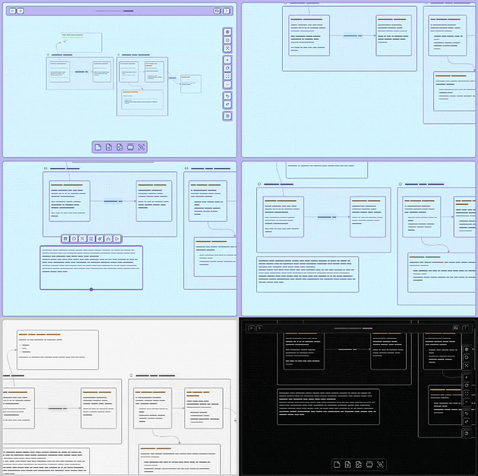
The floating UI elements in Canvas now automatically hides when panning or actively editing card content.
Alternative Checkboxes
Requires Style Manager plugin.
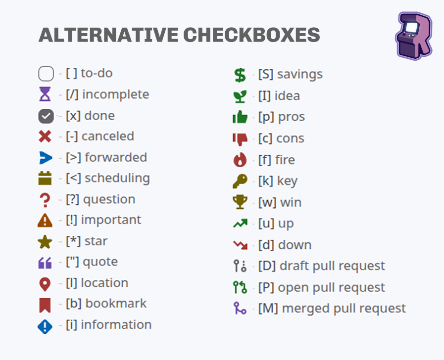
Retroma includes built-in styling for 23 alternative checkbox types. To use them, write standard markdown checkboxes containing any of the supported keys inside:
| Key | Type | Description | Key | Type | Description |
|---|---|---|---|---|---|
[/] |
Incomplete | Hourglass / progress | [S] |
Savings | Dollar sign |
[-] |
Cancelled | Cross / canceled task | [I] |
Idea | Seedling |
[>] |
Forwarded | Rightward arrow | [p] |
Pros | Thumbs up |
[<] |
Scheduling | Calendar icon | [c] |
Cons | Thumbs down |
[?] |
Question | Help / question mark | [f] |
Fire | Fire icon |
[!] |
Important | Exclamation / warning | [k] |
Key | Key icon |
[*] |
Star | Star icon | [w] |
Win | Trophy icon |
["] |
Quote | Quote mark | [u] |
Up | Arrow trend up |
[l] |
Location | Map pin icon | [d] |
Down | Arrow trend down |
[b] |
Bookmark | Ribbon bookmark | [D] |
Draft PR | Git draft pull request |
[i] |
Information | Info exclamation | [P] |
Open PR | Git open pull request |
[M] |
Merged PR | Git merged pull request |
Per-Note Font
You can override the font on a per-note basis using Obsidian's built-in cssclasses property combined with any of Retroma's rtm-font-* classes. This lets individual notes use a different typeface without touching your global Style Manager settings.
How to Use
Add a cssclasses property to the note's frontmatter with one of the class names from the table below:
---
cssclasses:
  - rtm-font-special-elite
---
Available Font Classes
| Class | Font |
|---|---|
rtm-font-atkinson-hyperlegible |
Atkinson Hyperlegible |
rtm-font-cascadia-code |
Cascadia Code |
rtm-font-caveat |
Caveat |
rtm-font-courier-prime |
Courier Prime |
rtm-font-excalifont |
Excalifont |
rtm-font-fraunces |
Fraunces |
rtm-font-ia-writer-mono |
iA Writer Mono |
rtm-font-press-start-2p |
Press Start 2P |
rtm-font-space-grotesk |
Space Grotesk |
rtm-font-special-elite |
Special Elite |
rtm-font-vt323 |
VT323 |
rtm-font-w95font |
W95font |
Only one
rtm-font-*class should be applied per note. Using multiple font classes at the same time produces unpredictable results.
Per-Note Accent Color & Color Scheme
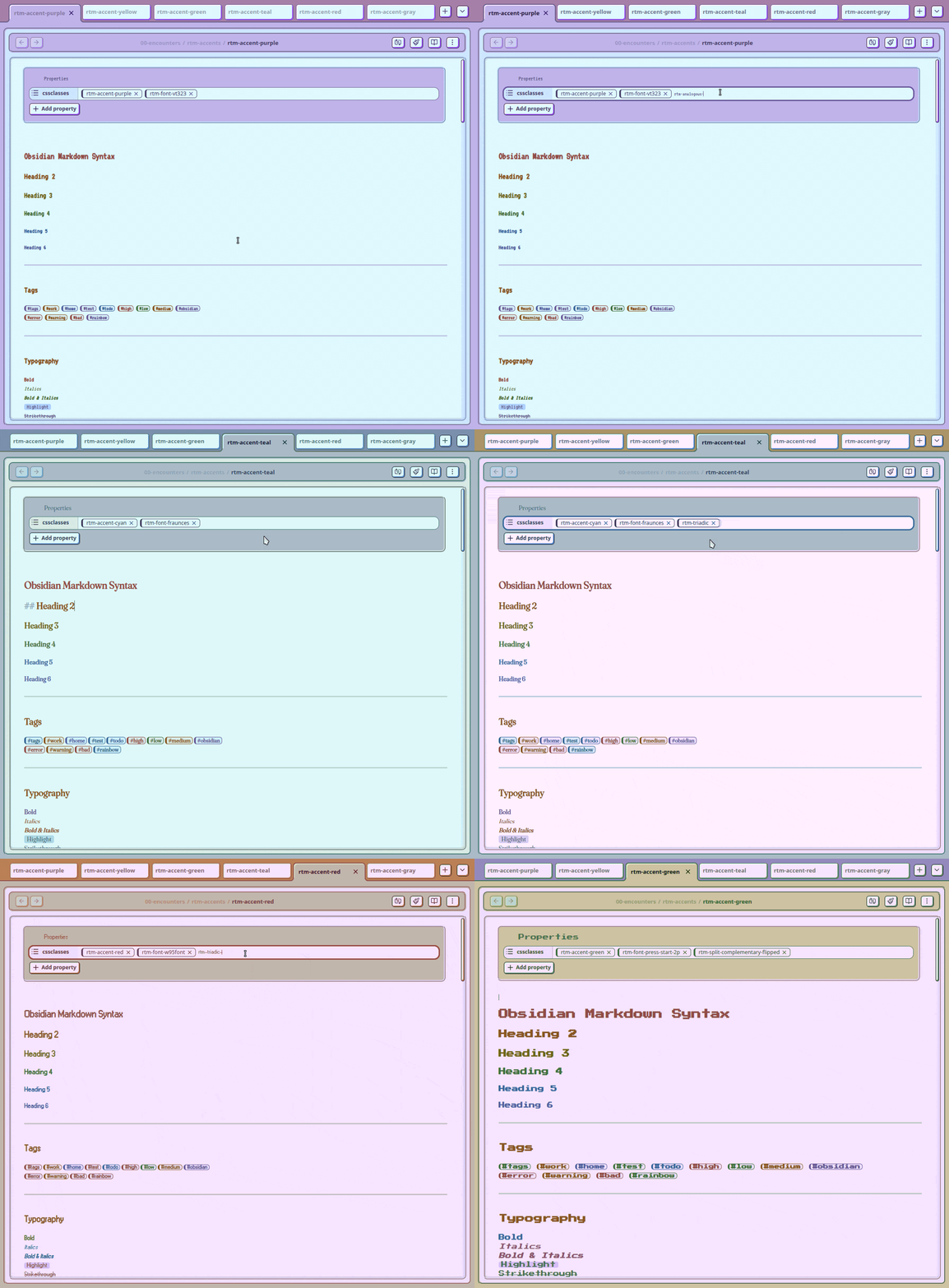
You can override the accent color and color scheme on a per-note basis using Obsidian's cssclasses property. The override is scoped to the active leaf, so only the note you are currently viewing changes — your global Style Manager accent stays untouched.
How to Use
Add one or both of the following class types to the note's frontmatter:
---
cssclasses:
  - rtm-accent-teal
  - rtm-triadic
---
Available Accent Color Classes
| Class | Color |
|---|---|
rtm-accent-red |
Red |
rtm-accent-orange |
Orange |
rtm-accent-yellow |
Yellow |
rtm-accent-green |
Green |
rtm-accent-blue |
Blue |
rtm-accent-indigo |
Indigo |
rtm-accent-violet |
Violet |
rtm-accent-purple |
Purple |
rtm-accent-vermillion |
Vermillion |
rtm-accent-amber |
Amber |
rtm-accent-lime |
Lime |
rtm-accent-teal |
Teal |
rtm-accent-magenta |
Magenta |
rtm-accent-rose |
Rose |
rtm-accent-cyan |
Cyan |
rtm-accent-gray |
Gray |
Available Color Scheme Classes
| Class | Scheme |
|---|---|
rtm-analogous |
Analogous |
rtm-analogous-flipped |
Analogous (flipped) |
rtm-split-complementary |
Split-complementary |
rtm-split-complementary-flipped |
Split-complementary (flipped) |
rtm-triadic |
Triadic |
rtm-triadic-flipped |
Triadic (flipped) |
rtm-monochromatic |
Monochromatic |
rtm-monochromatic-flipped |
Monochromatic (flipped) |
Accent color and color scheme classes can be combined freely. Only one class from each group should be used per note.
Retroma Callouts
Requires Style Manager plugin.
A collection of 79 styled callouts for Obsidian, themed around vintage stationery, retro media hardware, photography, and academic materials.
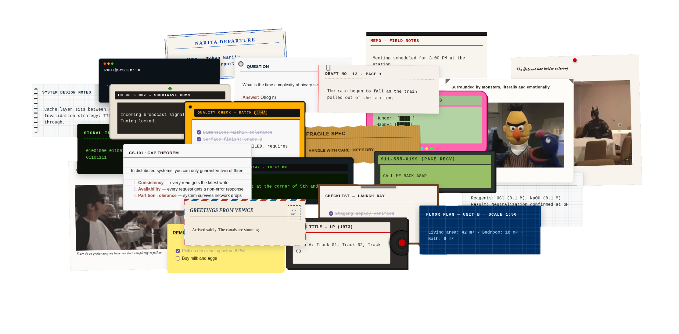
Basic Usage
Use the standard Obsidian callout syntax with any callout name from the table below:
> [!callout-name] Optional Title
> Your content goes here.
Example:
> [!polaroid-1] ROAD TRIP — OCT 1991
> Stopped at the diner near Route 66.
Size Variants
Every callout supports three width sizes. Append -s, -m, or -l to the callout name:
| Suffix | Name | Width | Behaviour |
|---|---|---|---|
-s |
Small | 320 px | Notepad / index-card |
-m |
Medium | 520 px | Mid-width, centered |
-l |
Large | 100% | Full container width |
> [!notepad-s] Small
> Compact, centered.

> [!notepad-m] Medium
> Half-width, centered.

> [!notepad-l] Large
> Full width.
Using a callout without a size suffix renders it at its own default width as defined in the CSS.
Stickynote Colors
The stickynote callout comes in all seven rainbow colors. Combine the color name with an optional size suffix:
> [!stickynote-yellow] REMINDER
> Don't forget the milk.

> [!stickynote-red-s] URGENT
> Call back before noon.

> [!stickynote-blue-m] NOTE
> Mid-width blue sticky.
Available colors: red · orange · yellow · green · blue · indigo · violet
Foldable Callouts
Add + (open by default) or - (closed by default) after the name:
> [!indexcard-m]+ Expandable
> Content is visible by default, click to collapse.

> [!flashcard]- Hidden answer
> Revealed only on click.
Full Callout Reference
📷 Photo-Film
| Callout | Description | Callout | Description |
|---|---|---|---|
polaroid-1 |
Classic white-border polaroid photo | polaroid-2 |
Polaroid variant with alternate styling |
film |
35 mm film canister / roll | filmstrip |
Film strip with frame borders |
negative |
Photographic film negative | photoalbum |
Scrapbook-style photo album page |
photoslide |
Mounted slide transparency | photomount |
Photo mount / corner-tab style |
📼 Media-Hardware
| Callout | Description | Callout | Description |
|---|---|---|---|
floppy |
3½" floppy disk label | cassette-1 |
Cassette tape — variant 1 |
cassette-2 |
Cassette tape — variant 2 | vinyl |
Vinyl LP record sleeve |
reeltoreel |
Reel-to-reel tape recorder | radio |
AM/FM radio broadcast |
transistor |
Transistor radio / shortwave | eurorack |
Eurorack modular panel |
walkietalkie |
Walkie-talkie transmission | calculator |
Vintage pocket calculator |
pager-1 |
Numeric pager — variant 1 | pager-2 |
Numeric pager — variant 2 |
pagerunit |
Alphanumeric pager unit | terminal |
Green-screen terminal |
matrixstream |
Matrix / data-stream display | pcbboard |
PCB / circuit board |
tamagotchi |
Tamagotchi pet status screen | punchedtape |
Punched paper tape |
marquee |
Arcade marquee header | arcademarquee |
Full arcade cabinet marquee |
highscore |
High-score leaderboard |
📝 Office-Stationery
| Callout | Description | Callout | Description |
|---|---|---|---|
notepad |
Yellow lined notepad | postcard-1 |
Air mail postcard — variant 1 |
postcard-2 |
Air mail postcard — variant 2 | touristcard |
Tourist destination card |
artpostcard |
Art / museum postcard | ticketstub |
Event ticket stub |
scrapbook |
Craft scrapbook page | receipt-1 |
Paper receipt — variant 1 |
receipt-2 |
Paper receipt — variant 2 | matchbook |
Hotel matchbook cover |
mailbox |
Vintage mailbox / letter | indexcard |
3×5 lined index card |
filingtab |
Filing folder with tab | luggagetag |
Luggage / baggage tag |
krafttag |
Kraft paper gift tag | duedate |
Library due-date slip |
visastamp |
Visa / entry stamp | museumtag |
Museum object label |
toploader |
Card top-loader sleeve | stickynote-red |
Sticky note — red |
stickynote-orange |
Sticky note — orange | stickynote-yellow |
Sticky note — yellow |
stickynote-green |
Sticky note — green | stickynote-blue |
Sticky note — blue |
stickynote-indigo |
Sticky note — indigo | stickynote-violet |
Sticky note — violet |
legalpad |
Yellow legal pad | gridnotebook |
Graph-paper notebook |
clipboard |
Clipboard with paper | dailycalendar |
Daily desk calendar |
indextab |
Index / bookmark tab | kraftpaper |
Kraft wrapping paper |
graphmemo |
Graph-paper memo | library |
Library catalog card |
news |
Newspaper / broadsheet |
🎓 Academics-Journaling
| Callout | Description | Callout | Description |
|---|---|---|---|
compbook |
Composition book | chalkboard |
Chalkboard / blackboard |
ruler |
Wooden ruler | librarycard |
Library borrowing card |
flashcard |
Study flashcard | labnotebook |
Lab / science notebook |
blueprint |
Technical blueprint | fieldnote |
Field notes journal |
typewriter |
Typewritten manuscript page | inspection |
Inspection / checklist form |
🔖 Vintage-Stationery & Tactile Paper
| Callout | Description | Callout | Description |
|---|---|---|---|
typewriter-page |
Typewriter page with paper clip detail | vintage-ticket |
Vintage event / travel ticket (ADMIT ONE badge) |
passport-stamp |
Passport entry stamp with notched corners | cardboard-cutout-shape |
Corrugated cardboard with torn top & bottom edges |
Quick Reference Cheat Sheet
A ready-to-use file with one complete, copy-pasteable example of every callout is here.
⬇️ Retroma Installations
Obsidian Community Theme
- Open Settings: In Obsidian, click the gear icon in the bottom-left corner to open your settings.
- Go to Appearance: From the left-hand sidebar, click on "Appearance."
- Manage Community Themes: Look for the "Themes" section and click the "Manage" button. This will open up the community themes browser.
- Find Retroma: In the search bar at the top, type "Retroma." The theme should appear in the list below.
- Install and Use: Click on "Retroma" and then click the "Install and use" button. Obsidian will automatically download the theme and apply it to your vault.
Manual
- Download the Theme: First, download the source code for the theme.
- Extract the Files: Unzip the downloaded folder to access its contents.
- Find Your Themes Folder: Navigate to your Obsidian vault. Inside, look for the
.obsidian/themes/directory. - Create a New Theme Folder: Inside the
themesdirectory, create a new folder and name itRetroma. - Move the Theme Files: Copy the
theme.cssandmanifest.jsonfiles from the unzipped download and place them into the newRetromafolder you just created. - Restart and Apply: Close and reopen Obsidian. Go to Settings > Appearance and select Retroma from the theme list to activate it.
🌱 Contribute to the Project
I welcome contributions of all kinds! If you're interested in helping out, please follow these guidelines.
🐞 Found a Bug?
- Check the issues to see if the bug has already been reported.
- If not, open a new issue. Please provide a clear title and a detailed description, including steps to reproduce the bug.
🔖 Want a New Feature?
- Check the issues to see if the feature has already been requested.
- If not, create a pull request or open a new issue and describe the feature you'd like to see.
🗃️ Resources
Fonts used in the theme:
- Atkinson Hyperlegible
- Cascadia Code
- Caveat
- Courier Prime
- Excalifont
- Fraunces
- iA Writer Mono
- Space Grotesk
- Special Elite
- VT323
- W95font
📍 Note from the Developer
Retroma uses an algorithmic color system powered natively by CSS oklch(). Instead of relying on static hex codes, the theme dynamically calculates your entire palette, including background colors, foreground elements, and UI depth across dark and light modes directly from your chosen accent color.
🦚 Why Use OKLCH over HSL or RGB?
OKLCH is a modern CSS color space designed around how human eyes actually perceive color, rather than how computer screens generate it. Legacy formats like hsl() treat colors purely mathematically, meaning a 50% lightness yellow looks blindingly bright while a 50% lightness blue looks very dark.
OKLCH fixes these limitations through perceptual lightness: a lightness value of 60% appears equally bright to the human eye regardless of the hue. Because lightness remains uniform across all colors, creating accessible high-contrast UI design tokens, manipulating palettes, and building light/dark themes becomes purely mathematical, completely predictable, and dramatically easier.
For technical details, check out the official W3C CSS Color Module Level 4 Specification or the MDN Web Docs for oklch()
☕️ Buy Me A Coffee
Donations help me pay the bills, stay sane, and spoil my cat 🐱 Thanks for the support!
Retroma – Written with 💜, with passion, and with cats by my side.