
README file from
GithubSpace to think
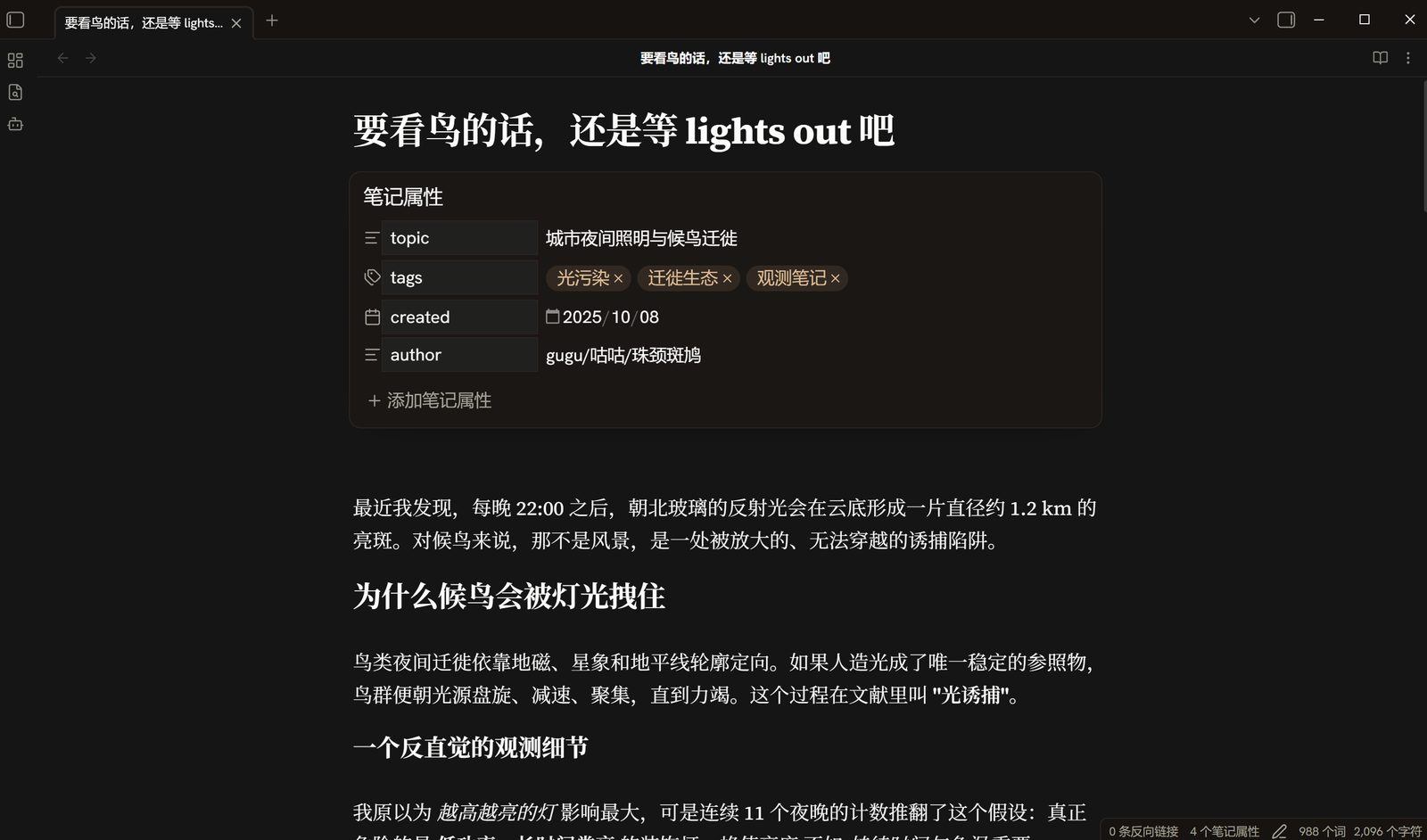
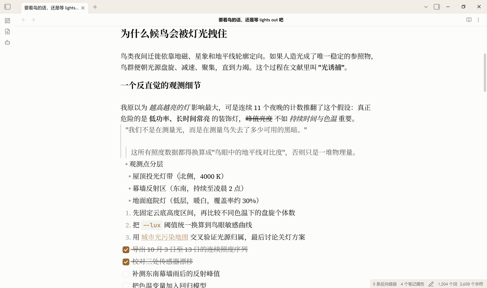
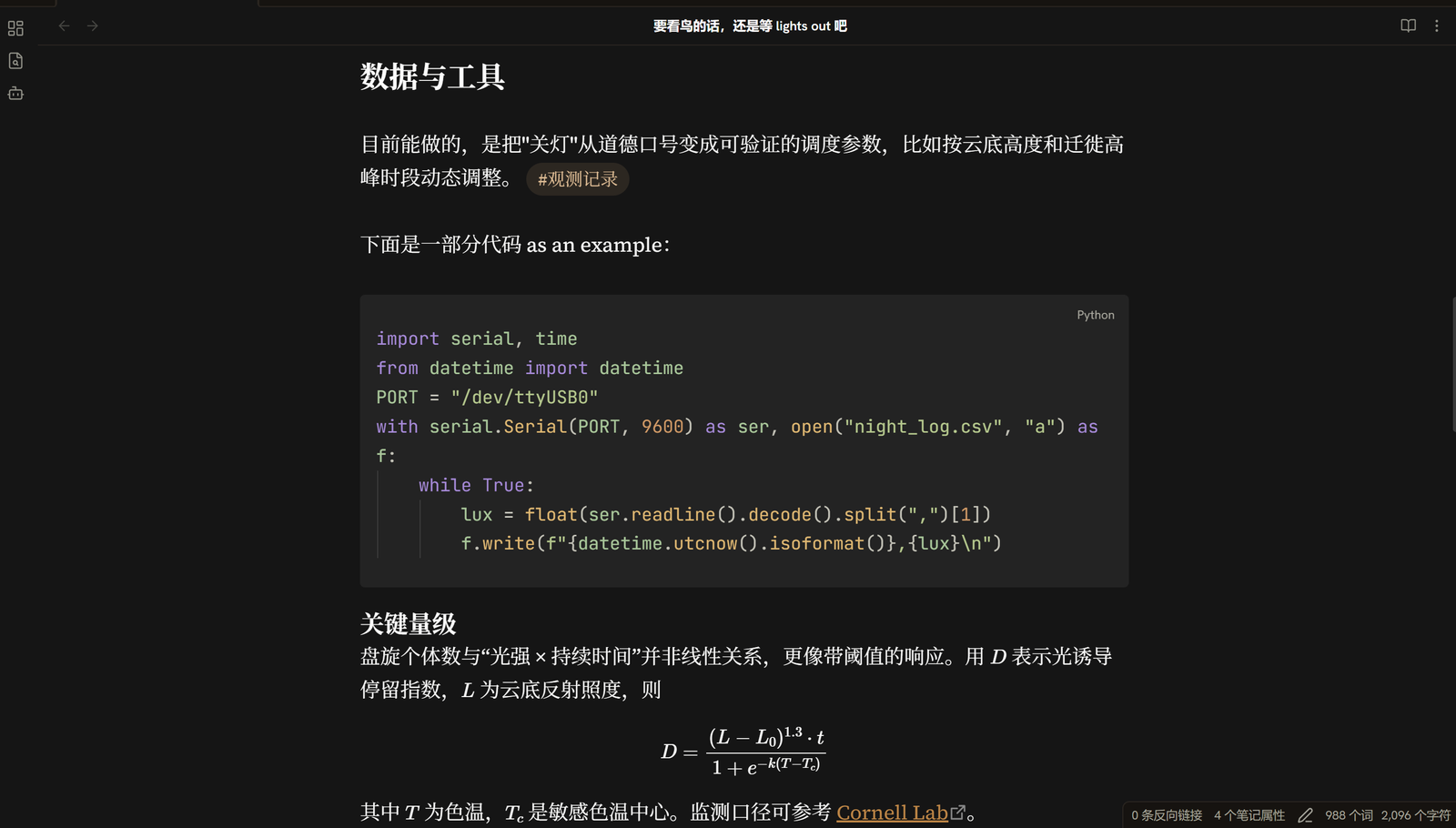
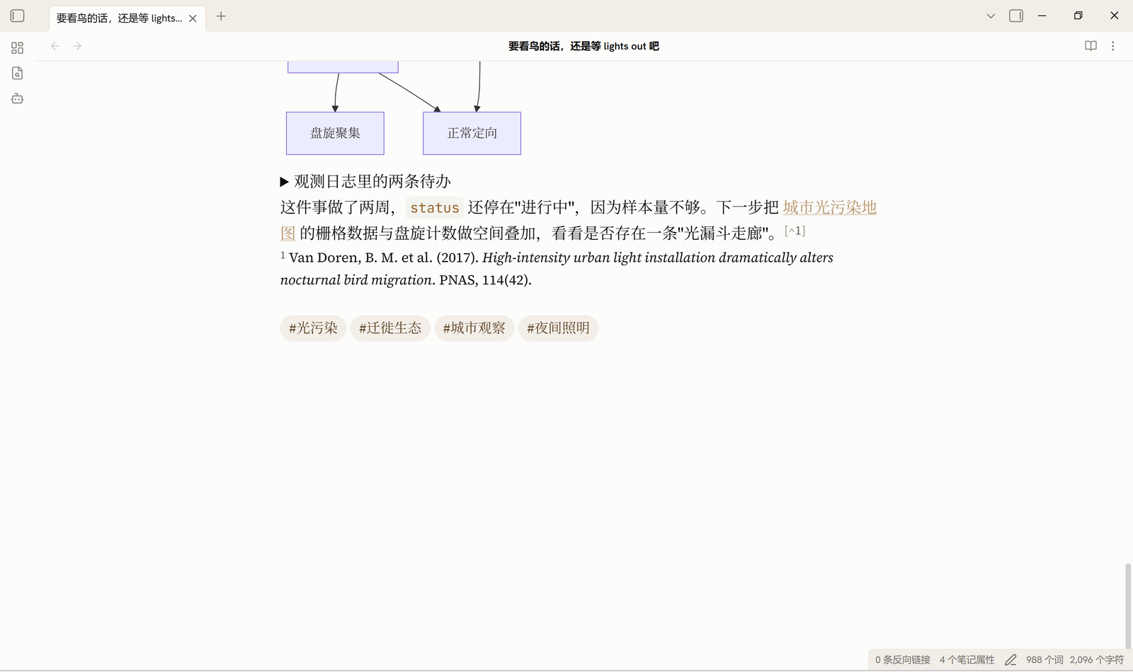
A warm, quiet Obsidian theme. Ivory reading surface, a slightly deeper parchment chrome layer, warm hairlines instead of shadows, and a single muted brown-gold accent.
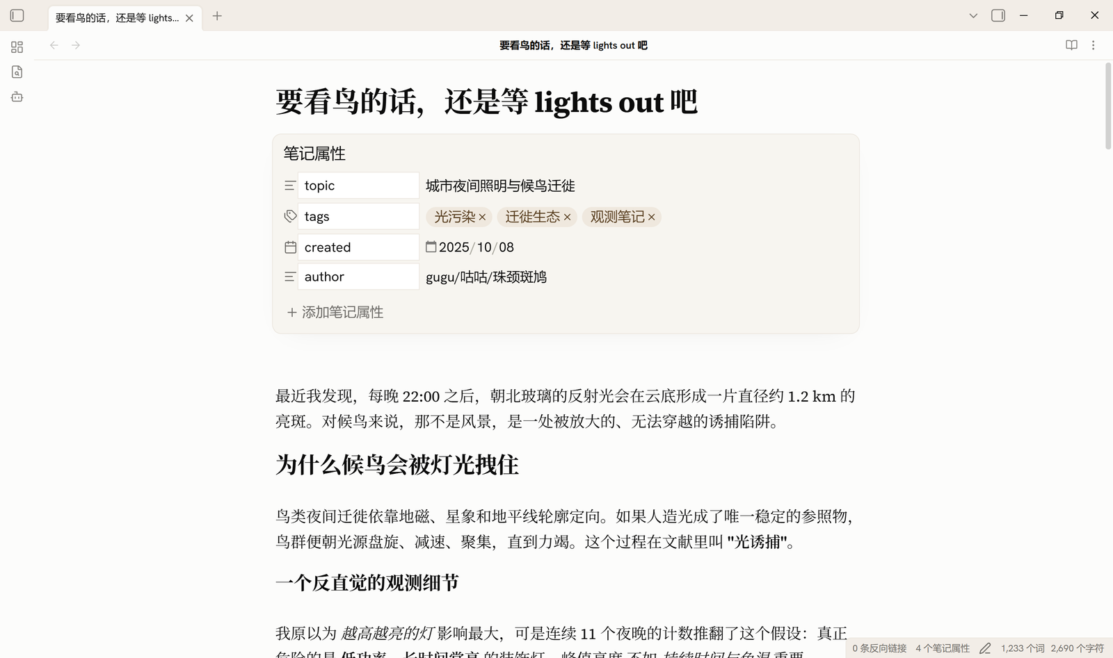
Screenshots
| Light | Dark |
|---|---|
|
 |
 |
 |
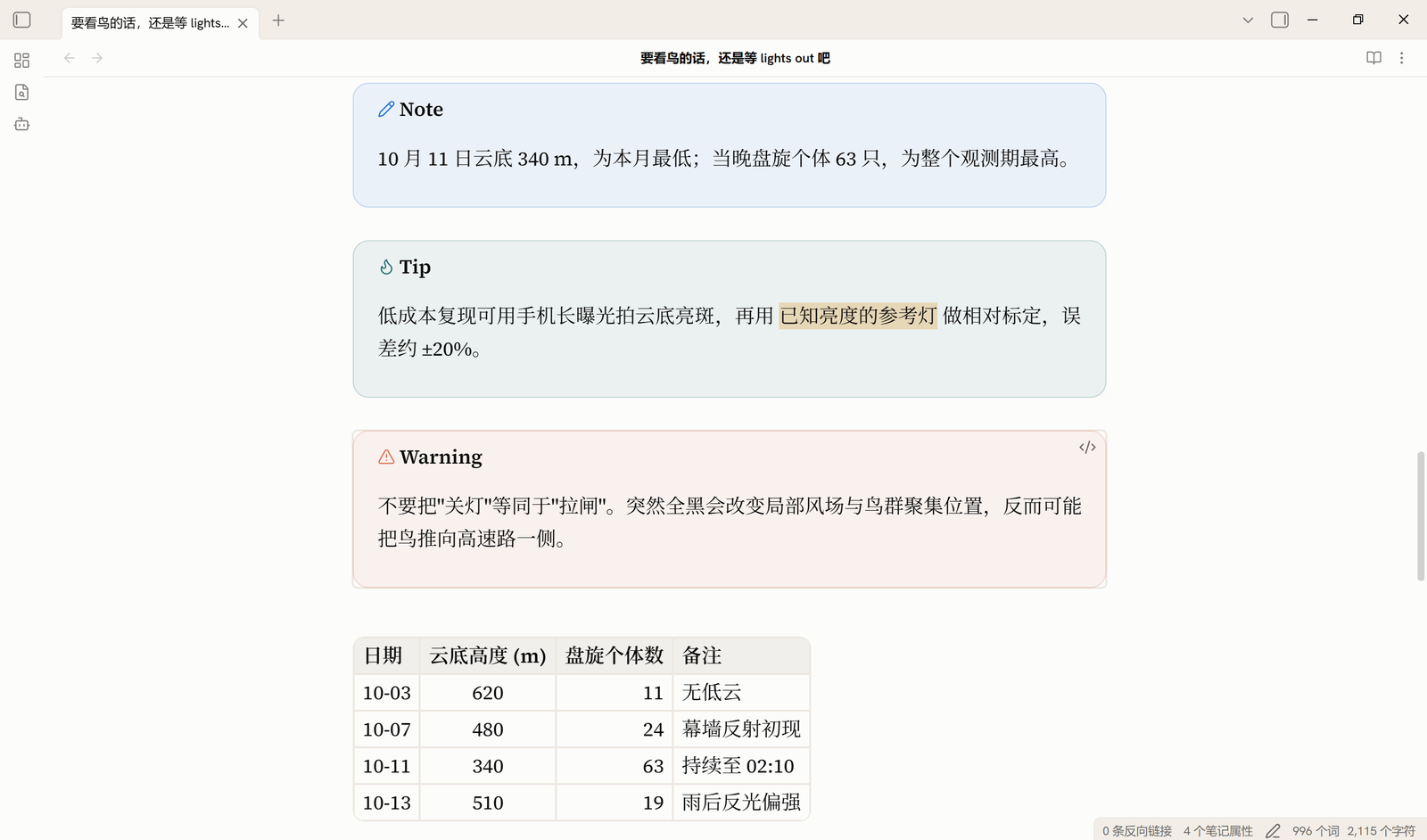 |
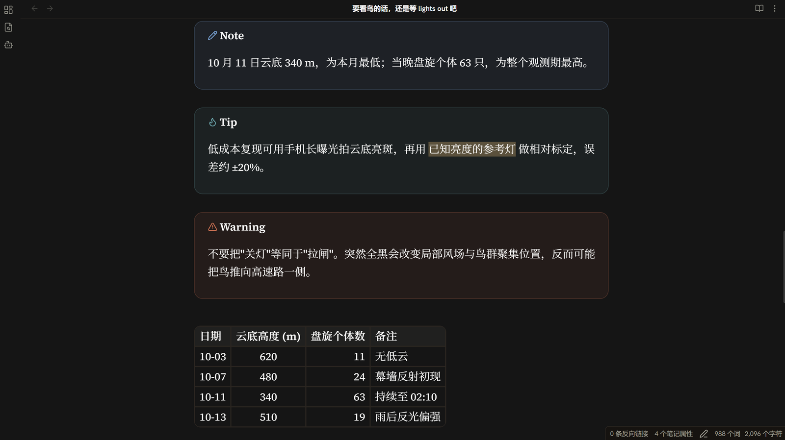 |
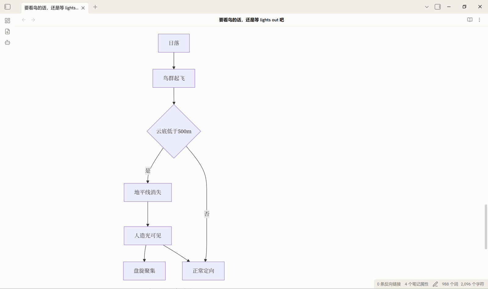 |
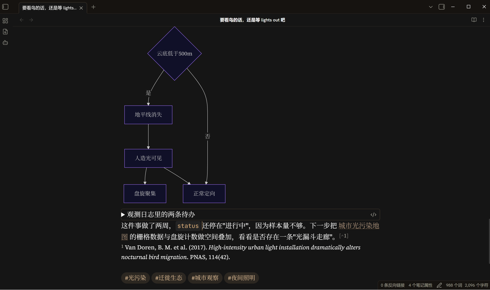 |
 |
Design
Two planes. Content sits on --background-primary; everything that frames
it — titlebar, ribbon, tab bar, both sidebars — sits on --background-secondary.
They are separated by a 1px warm hairline rather than a shadow, so the window
reads as one continuous sheet of paper with a slightly deeper frame.
A welded active tab. The active tab has left/top/right borders, no bottom
border, and margin-bottom: -1px, so it opens into the pane below instead of
floating as a separate box.
One muted accent. A desaturated brown-gold, #99672e in light mode and
#d7ab79 in dark. Because the dark accent is a light colour,
--text-on-accent flips to dark ink in dark mode — the same token drives the
checkbox tick, so it stays visible either way.
Colours
| Role | Light | Dark |
|---|---|---|
| Reading surface | #fcfcfb |
#151515 |
| Chrome | #f2ede7 |
#161310 |
| Hairline | #ede8e1 |
#2a2520 |
| Body text | #0b0b0b |
#fcfcfb |
| Accent | #99672e |
#d7ab79 |
Fonts
Three typefaces are embedded directly in theme.css as base64, so the theme
renders as designed with no network access and no font installation.
Obsidian injects theme CSS as text into a <style> element rather than
linking it, so relative url() paths cannot resolve inside a theme. Embedding is
the only reliable option — which is also why other font-carrying community themes
inline theirs.
The stacks still front-load the commercial typefaces this design was drawn against, so anyone who owns them gets them automatically:
- UI: Styrene B → Hanken Grotesk (embedded) → system sans
- Reading: Tiempos Text → Source Serif 4 (embedded) → Georgia → serif
- Code: Söhne Mono → Berkeley Mono → JetBrains Mono (embedded) → monospace
- CJK: Noto Serif SC → Source Han Serif SC → 思源宋体 → system CJK sans
The embedded faces are SIL OFL 1.1 licensed and may be redistributed. Their
license texts are in fonts/LICENSE-OFL.txt; the
original .woff2 files are kept in fonts/ so the embedded data can be
verified. Neither is loaded at runtime.
CJK note. Chinese/Japanese/Korean prefers a proper CJK serif when one is installed, so the two scripts share a voice. It deliberately does not fall back to Songti or SimSun, which render too thin on screen — when no CJK serif is present the text uses the system CJK sans instead. Nothing is bundled for CJK; only family names are referenced, so no CJK font is redistributed.
The interface keeps a sans stack, so the file explorer and menus stay in the system UI face while note text is set in a serif. That split is intentional.
Installation
- Download this folder.
- Drop it into
<your vault>/.obsidian/themes/Space to think/. - Obsidian → Settings → Appearance → Theme → Space to think.
Or, once it is in the community list: Settings → Appearance → Manage → Browse → search "Space to think".
Notes
- Set Obsidian's window frame style to Custom frame or Hidden if you
want the
.titlebarrules to apply; with the native frame there is no.titlebarelement and nothing changes. - The theme ships no Style Settings block. The palette is intentionally fixed;
edit the two
.theme-light/.theme-darkblocks at the top oftheme.cssto retune it.
Credits
Written from scratch: the stylesheet was authored for this theme rather than derived from an existing one. The palette and the two-plane chrome idea were arrived at after studying Claude's own desktop interface alongside several warm community themes — notably Claude Warm by Amo. That is a debt of inspiration, not of code.
Bundled typefaces — Hanken Grotesk, Source Serif 4 and
JetBrains Mono — are by their respective authors and licensed under the
SIL Open Font License 1.1. See
fonts/LICENSE-OFL.txt.
License
MIT — see LICENSE. The three embedded typefaces are not covered
by that grant; they remain under the SIL OFL 1.1, reproduced in
fonts/LICENSE-OFL.txt.