

README file from
Github✨MagicUser✨ Theme for Obsidian
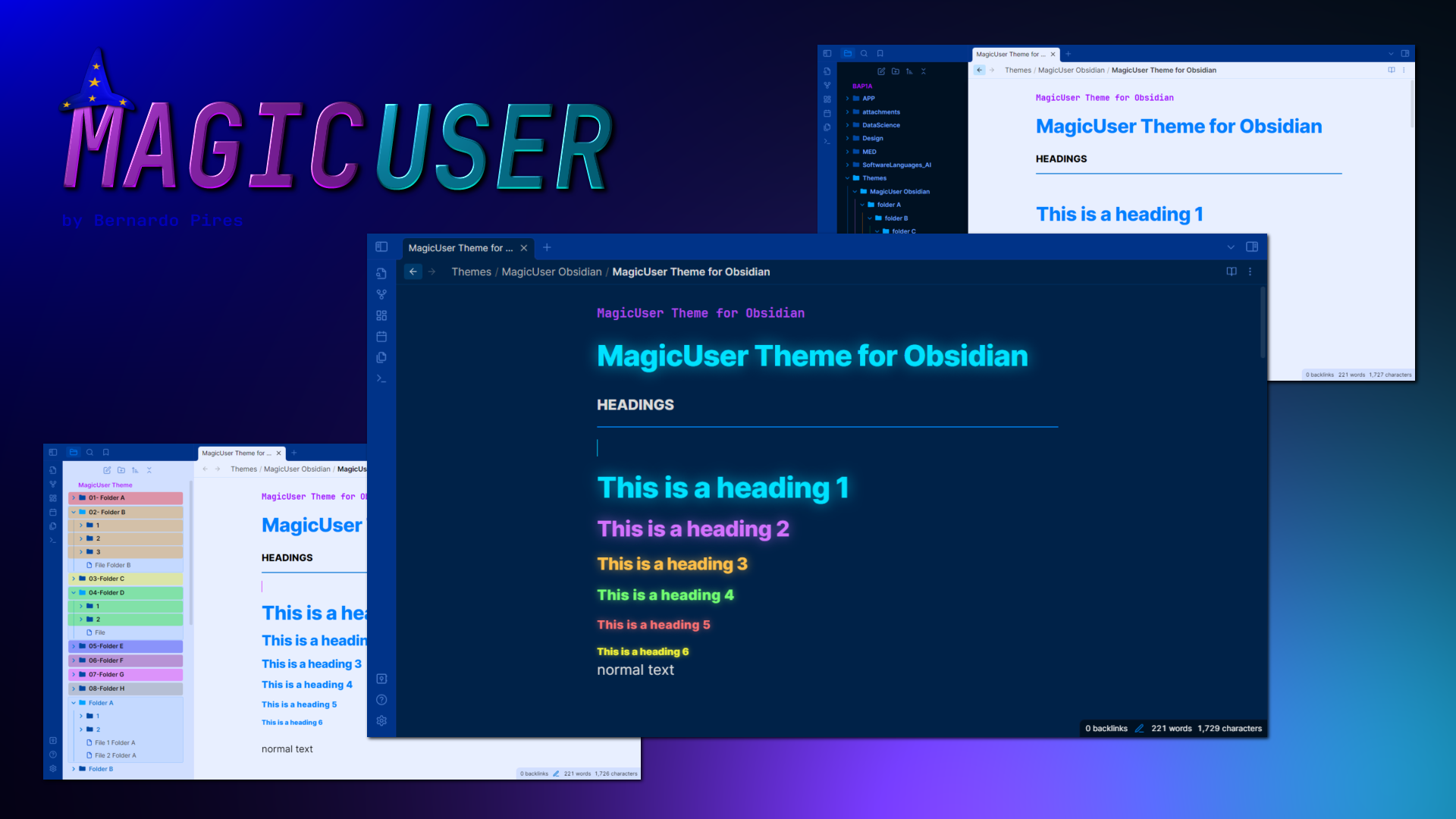
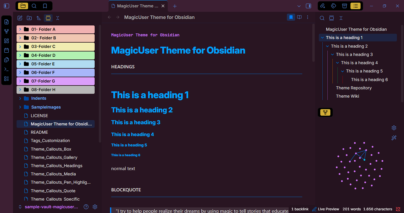
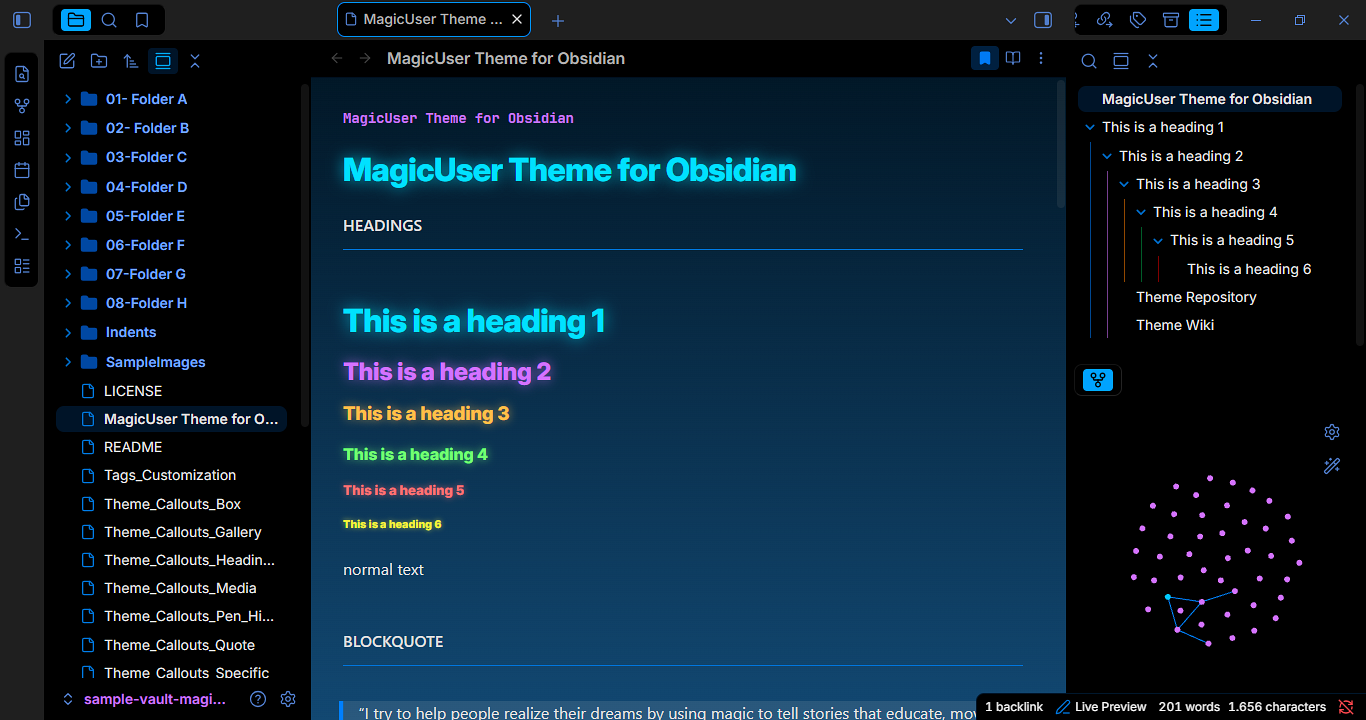
✨ MagicUser is a custom theme for Obsidian.md that provides a pleasant and focused note-taking experience, with light and dark themes for day and night use.
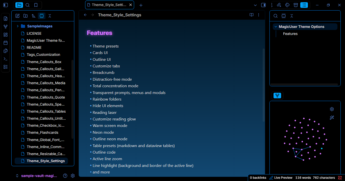
In conjunction with the Style Settings community plugin, MagicUser offers 200+ options for customization, including multiple preset themes, UI modes, and many special effects. Whether you prefer a clean, minimalist look or a vibrant interface, you can adjust colors, fonts, and layouts to match your workflow and personal color palette aesthetic.
Rapid customization: Use the Preset themes and quick start Style Settings menu to skip the deep customization and achieve a polished, personalized workflow in minutes.
Installation
-
Open Obsidian Settings -> select Appearance
-
Themes -> click Manage -> search for MagicUser
-
Select the theme -> click Install and use
Built-in Themes
No extra plugin required.
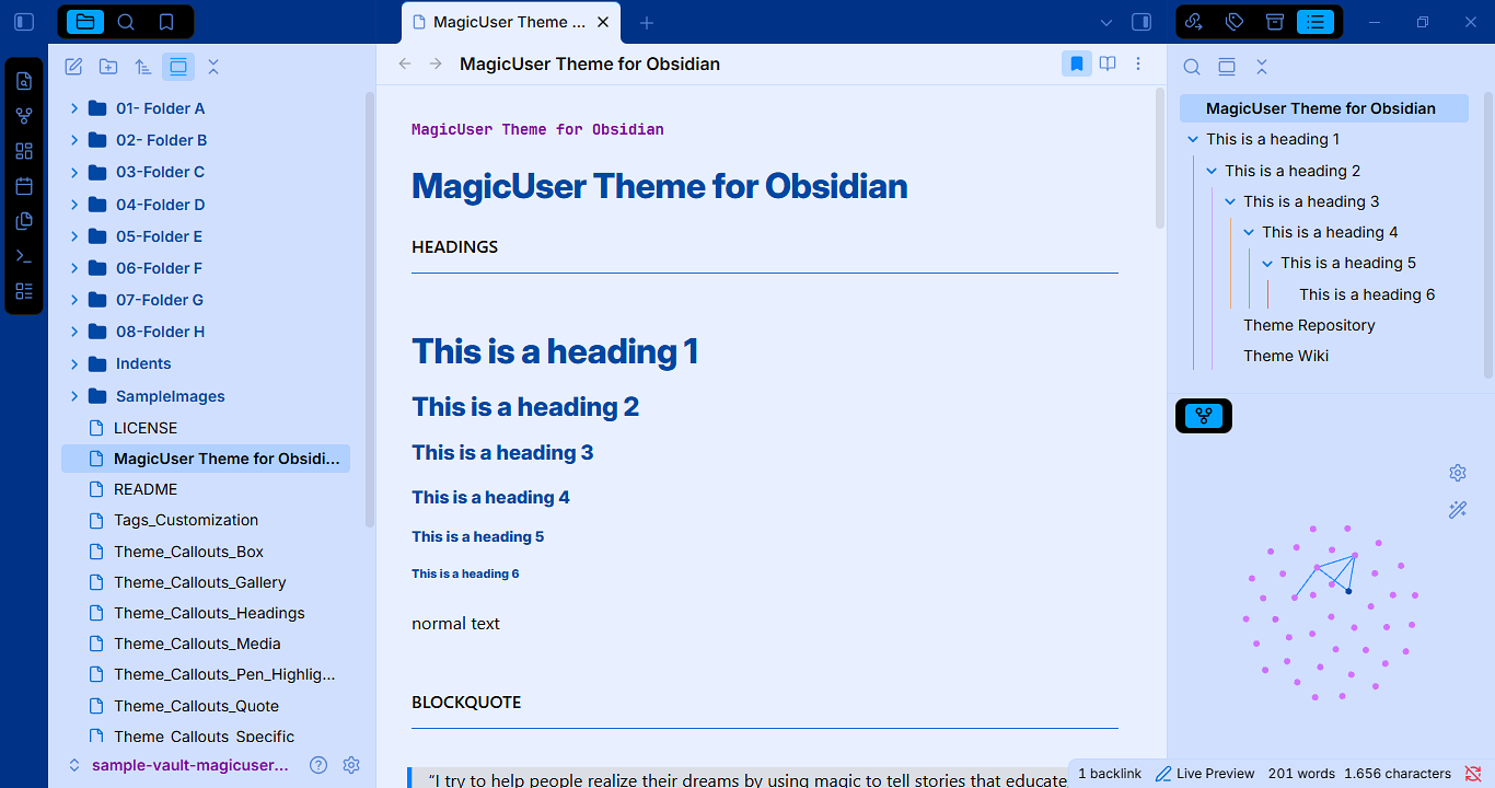
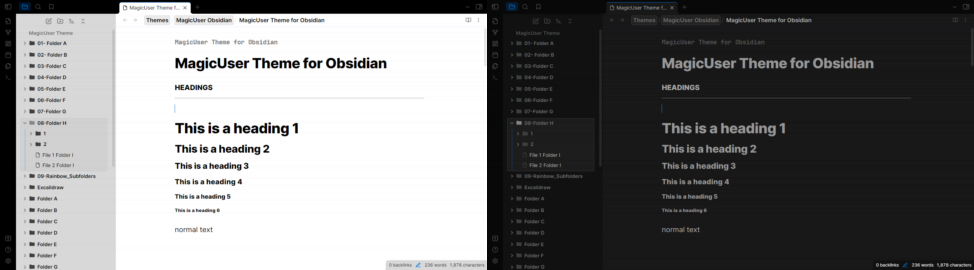
MagicUser (Default) - Light Theme
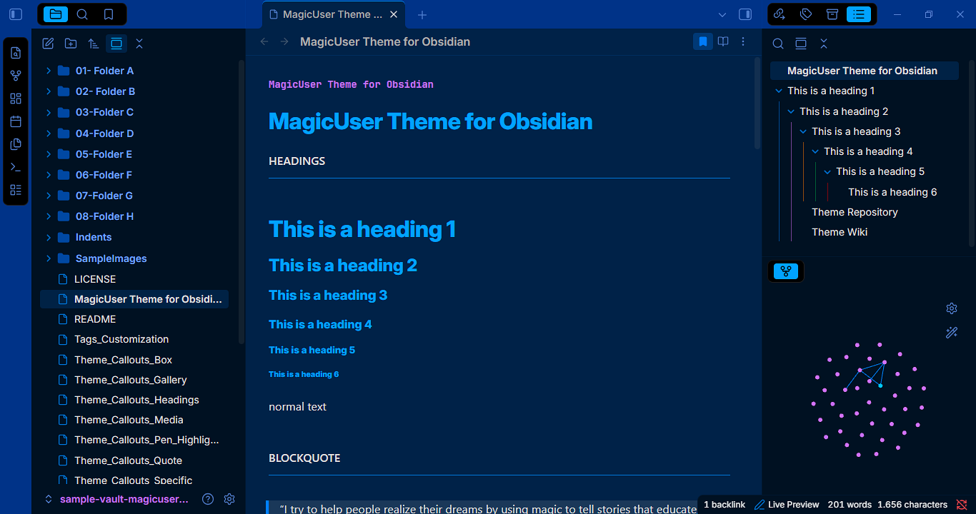
MagicUser (Default) - Dark Theme
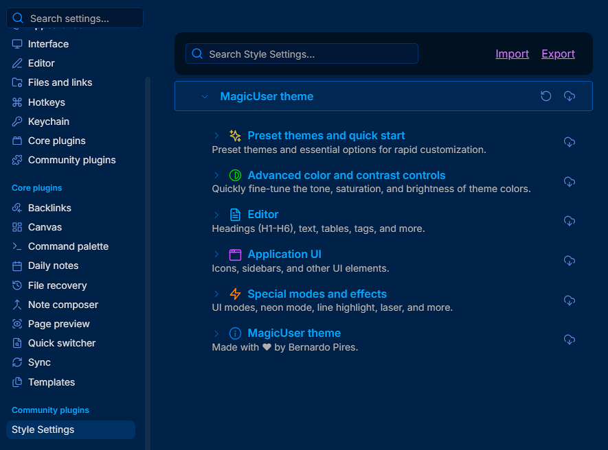
Style Settings - Theme Options
Style Settings community plugin required.
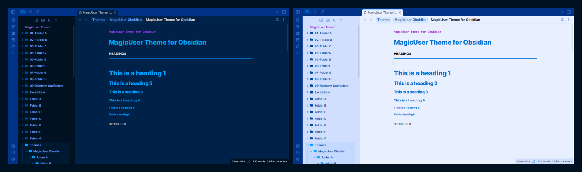
Preset Themes
MagicUser (Default)
MagicUser Room Lamp
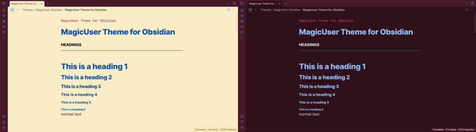
MagicUser Purple
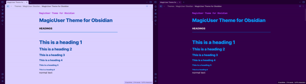
MagicUser Teal
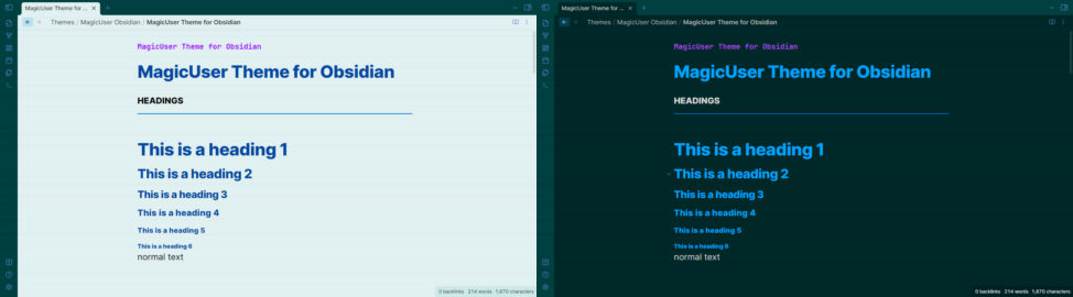
MagicUser Gray
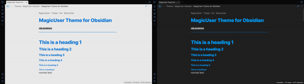
MagicUser Camouflage
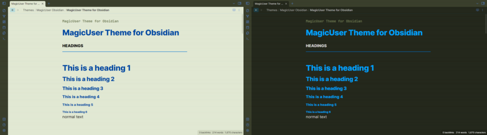
MagicUser Moon
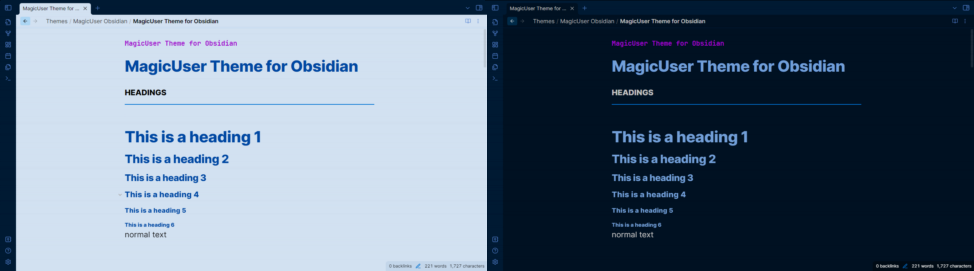
MagicUser Teacher
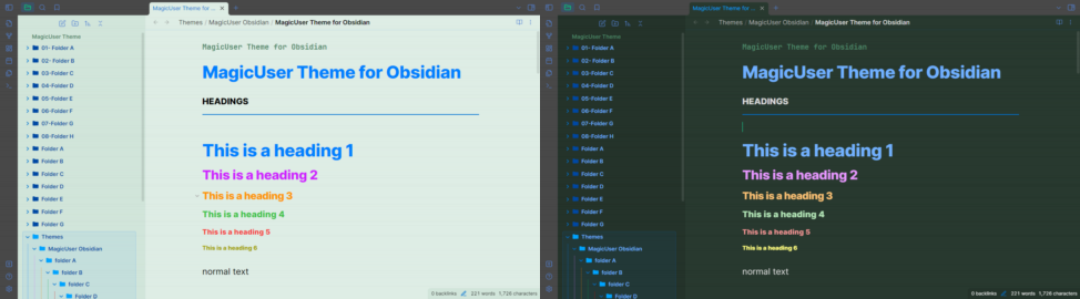
MagicUser Creativity
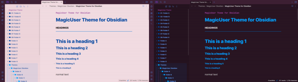
MagicUser Concentration
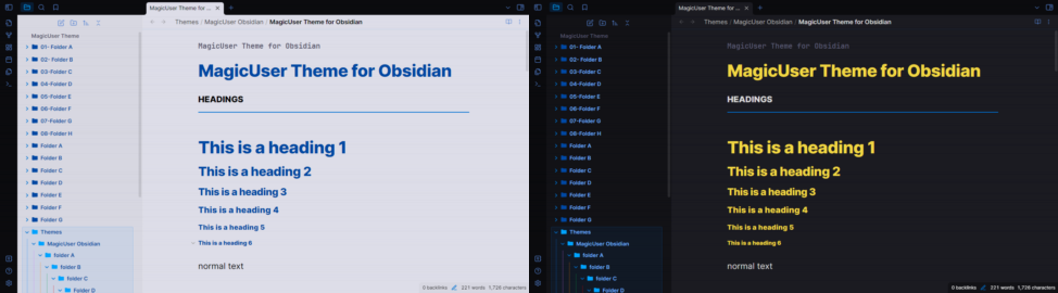
MagicUser Stealth
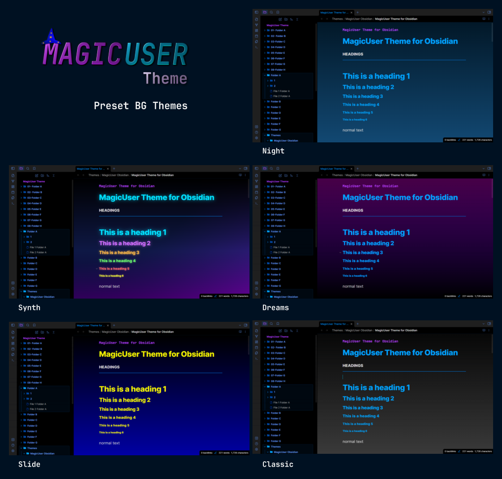
MagicUser BG Themes
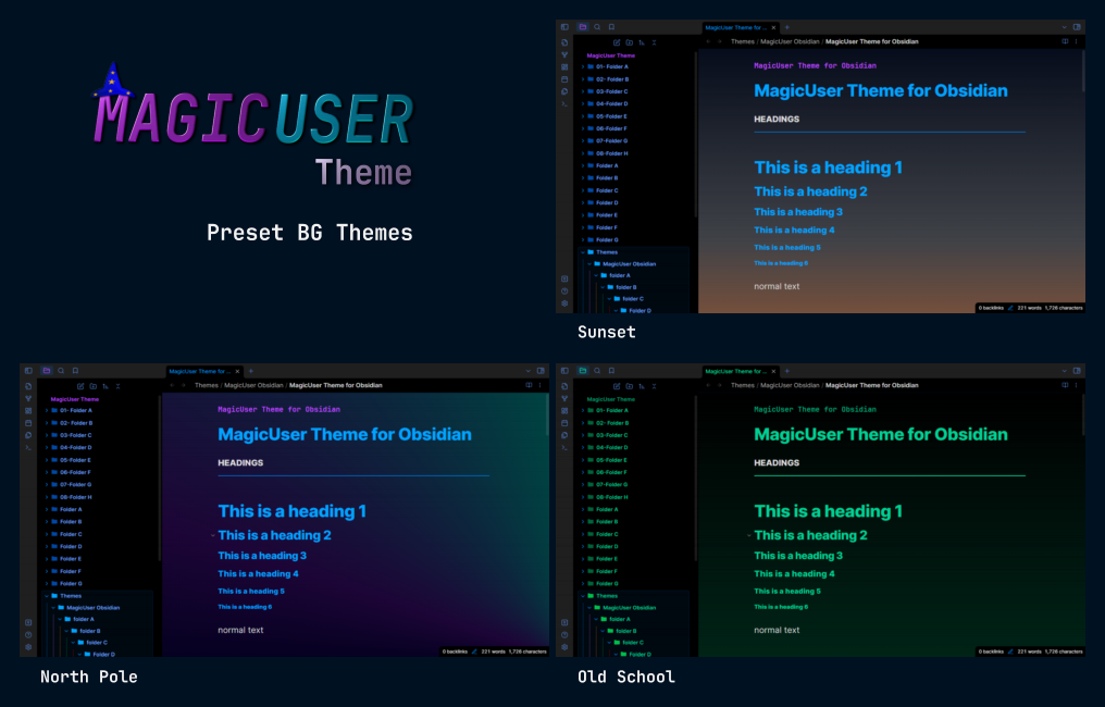
MagicUser BG Themes (Light Themes)
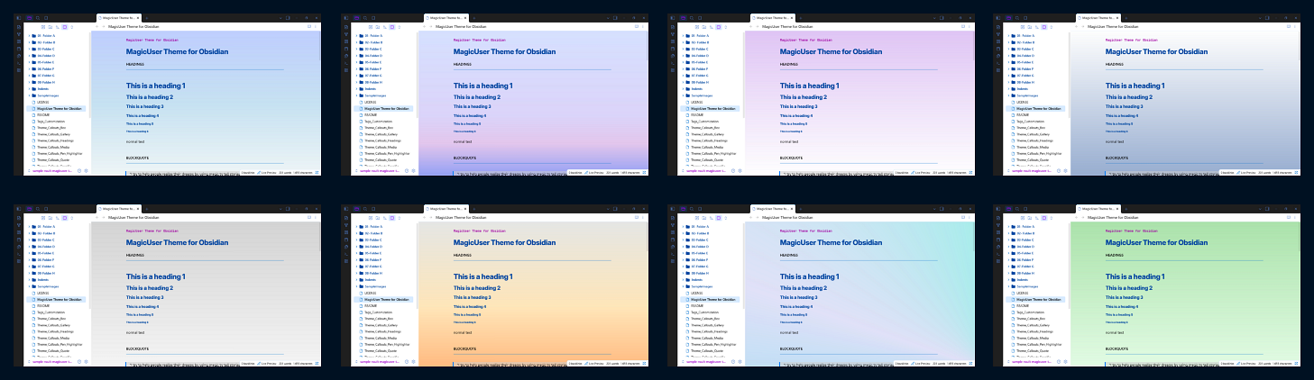
MagicUser BG Themes options:
-
Darken background slider (all preset BG themes - dark mode). You can darken the background of all preset BG themes to improve readability.
-
Lighten background slider (all preset BG themes - light mode).
MagicUser Chroma Amulet Theme
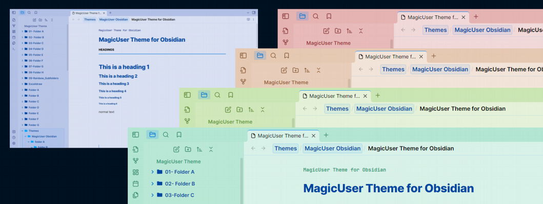
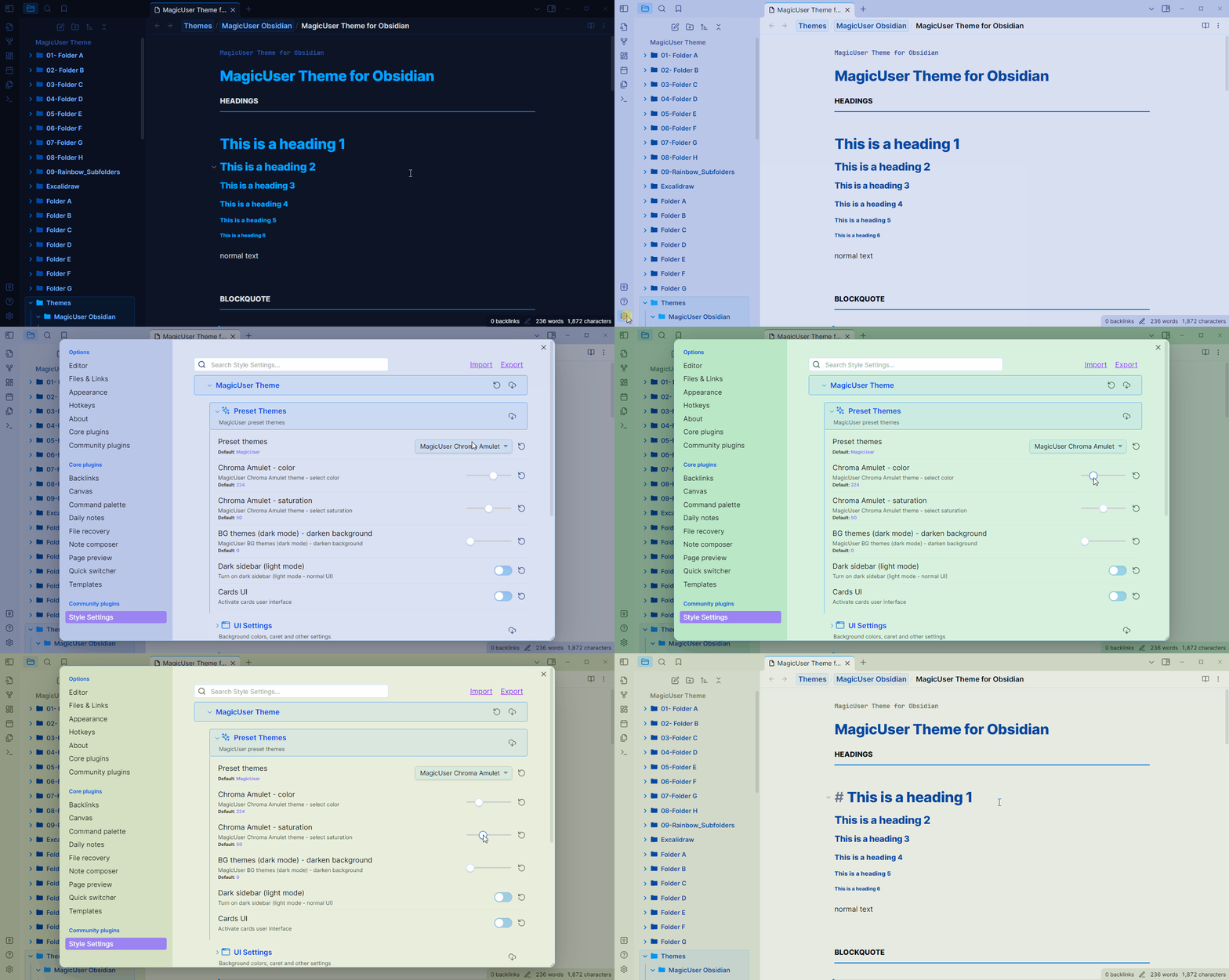
The Chroma Amulet preset is a special preset that you can use to create multiple color themes.
How it Works:
- Select "MagicUser Chroma Amulet" preset.
- Select theme color using the first slider: color.
- Adjust the level of saturation using the second slider (turn this one closer to zero to greyish tones).
MagicUser Chroma Amulet theme does not affect your accent color. So you can still use your favorite accent color with your chosen theme colors.
MagicUser Accent Theme
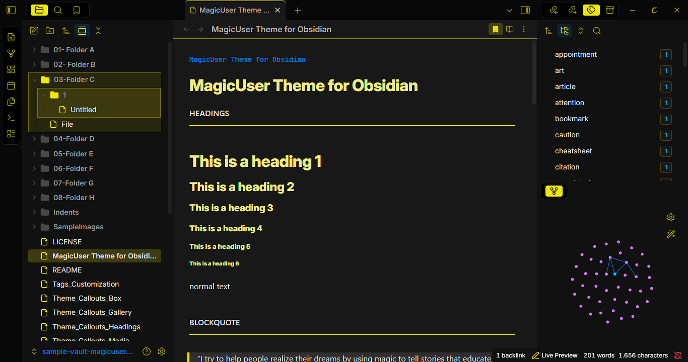
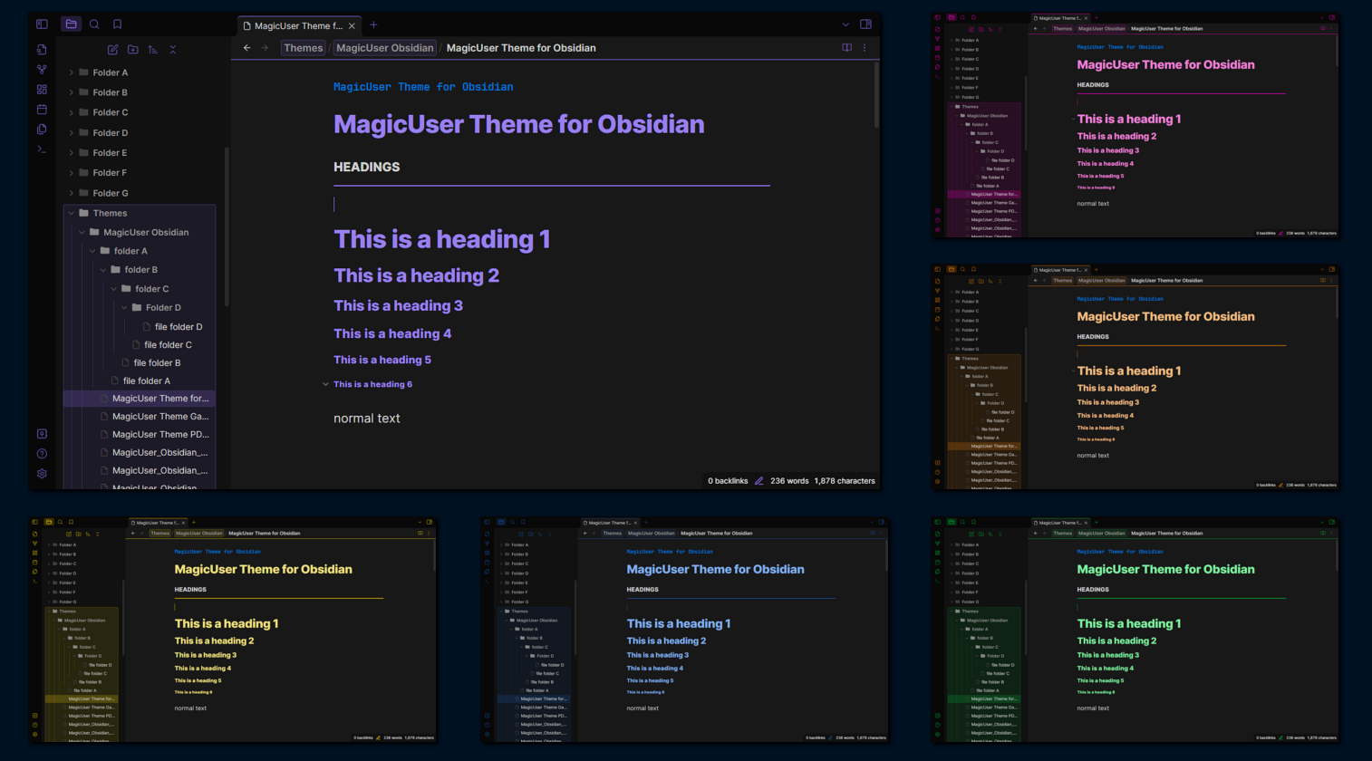
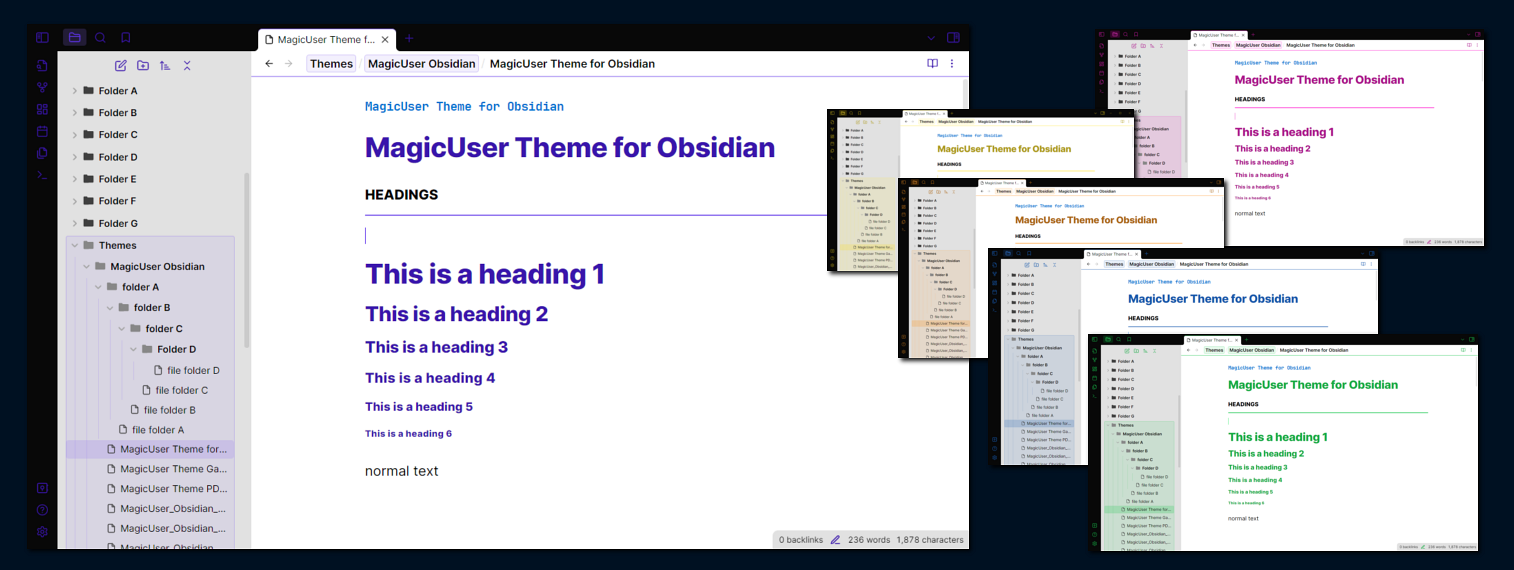
The MagicUser Accent theme is also a special preset that you can use to create multiple color themes.
How it Works:
- Select "MagicUser Accent" preset.
- Select accent color (Obsidian -> accent color picker).
The theme will adjust according to the selected accent color (headings, icons, borders, blockquote border, lists and other UI elements).
Advanced Color and Contrast Controls
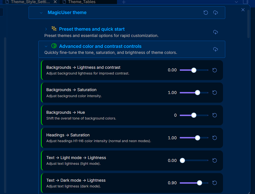
Advanced Color and Contrast Controls (Style Settings menu): Main theme colors now use the OKLCH color space format for uniform visual perception, bringing this advanced color technology to the theme. You can fine-tune background tone, saturation, and lightness to achieve the best contrast and visualization possible according to your preferences and setup (monitor, room lighting, etc).
Menu options (easy-to-use sliders for granular control):
- Backgrounds -> Lightness.
- Backgrounds -> Saturation (0 results in grayscale colors - icons will still be colored).
- Backgrounds -> Hue (shifts the color of the preset theme).
- Headings -> Saturation (for normal and neon modes).
- Text Lightness for Light and Dark modes (independent controllers).
Global Font Mode
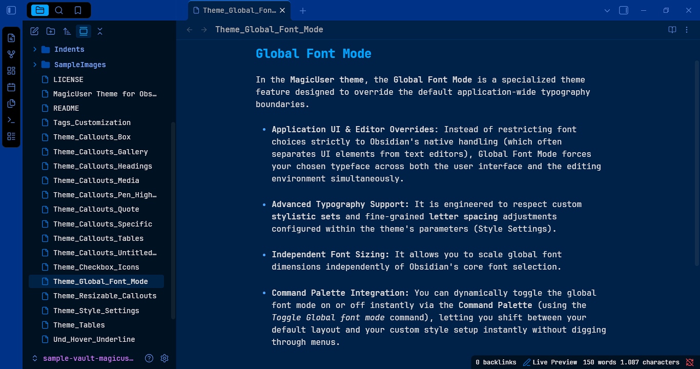
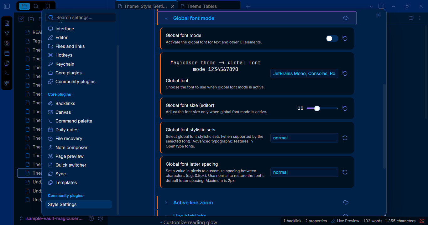
In the MagicUser theme, the Global Font Mode is a specialized theme feature designed to override the default application-wide typography boundaries.
-
Application UI & Editor Overrides: Instead of restricting font choices strictly to Obsidian's native handling (which often separates UI elements from text editors), Global Font Mode forces your chosen typeface across both the user interface and the editing environment simultaneously.
-
Advanced Typography Support: It is engineered to respect custom stylistic sets and fine-grained letter spacing adjustments configured within the theme's parameters (Style Settings).
-
Independent Font Sizing: It allows you to scale global font dimensions independently of Obsidian's core font selection.
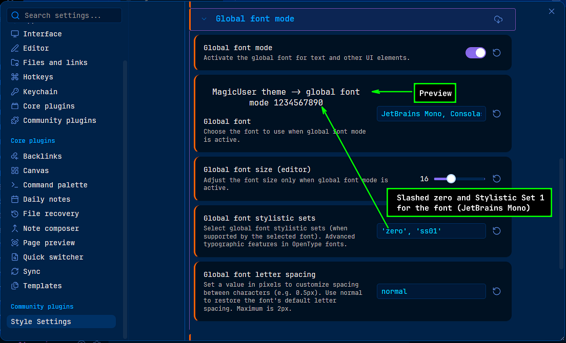
- Command Palette Integration: You can dynamically toggle the global font mode on or off instantly via the Command Palette (using the Toggle Global font mode command), letting you shift between your default layout and your custom style setup instantly without digging through menus.
MagicUser Page Backgrounds (MUP)
No extra plugin required.
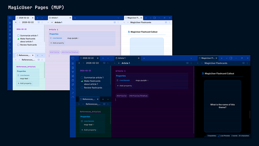
MagicUser Page (MUP) Backgrounds allow you to visually categorize your notes based on their purpose. Instead of every note looking the same, you can assign "modes" to specific notes for better mental context-switching.
Whether you are using the MagicUser default theme or one of the built-in Preset Themes, applying a mup-colorName class will override the background for that specific note while maintaining the rest of your theme's styling.
Available Colors
mup-whiteormup-black(Smart Inversion: Black in dark mode / White in light mode)mup-bluemup-purplemup-tealmup-greenmup-yellowmup-grayormup-grey
Use Background Colors For Improved Creative Workflow
Assigning background colors helps you visually categorize a note's type or status at a glance. Color coding is entirely optional—often, using just two or three colors for your most critical notes creates the most effective workflow.
While you can use any color of the preset mup-colors for any purpose, here are a few examples to implement mixed colored background to a workflow:
- Default Theme Background (No cssclasses property): Default preset theme background color for general-purpose note-taking.
- Drafting (
mup-gray): Gray background color for drafts. - References (
mup-teal): Teal background color for research references. - Experimental (
mup-purple): Purple background color for brainstorming or writing down new ideas. - Media Viewer and/or Flashcards (
mup-black): For notes with images and/or embedded videos, as well as with MagicUser Flashcards.
Smart Inversion (
mup-blackandmup-white):Black background in dark mode.
White background in light mode.
How to Use
Add the desired color to the cssclasses property in your note's Properties or directly to your note in Source mode (YAML Frontmatter):
---
cssclasses:
  - mup-purple
---
Automatic Rainbow Folders
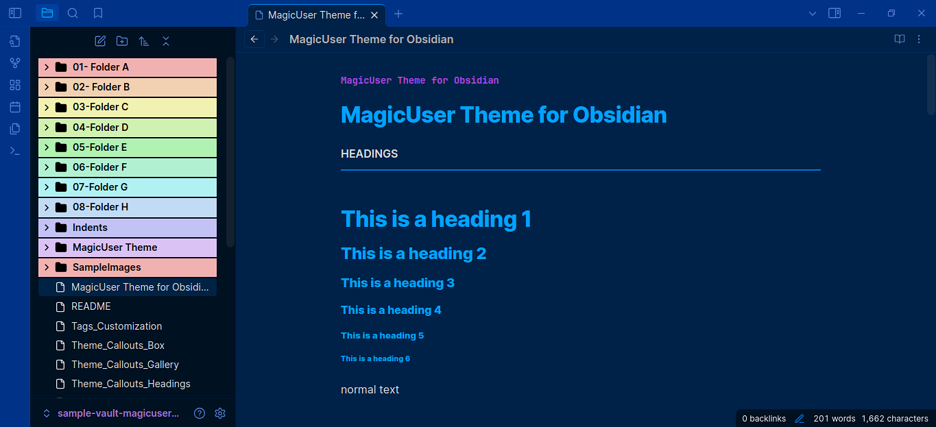
- Automatic Rainbow Colored Folders. You can activate/deactivate this feature using the Command Palette.
Automatic Rainbow-Colored Folder Names and Icons
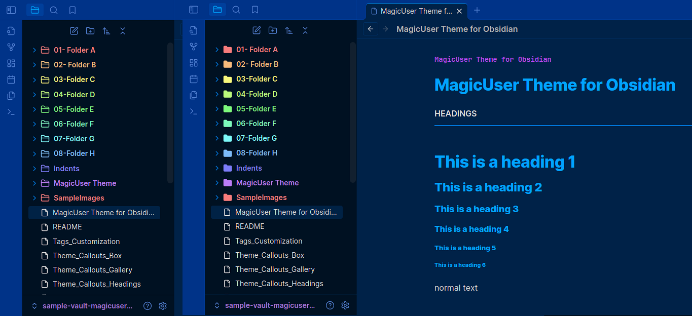
- Automatic Rainbow-Colored Folder Names and Icons. Folder and subfolder names and icons will be colored (no background color change). You can also toggle this feature (activate/deactivate) using the Command Palette.
Initial Color for Automatic Rainbow Folders (Slider)
- This feature allows you to set the starting color for the automatic rainbow color scheme applied to your folders and subfolders. This means you can determine the color assigned to the first folder in a hierarchy, and subsequent folders will follow the rainbow spectrum from that point.
Numbered Rainbow Folders
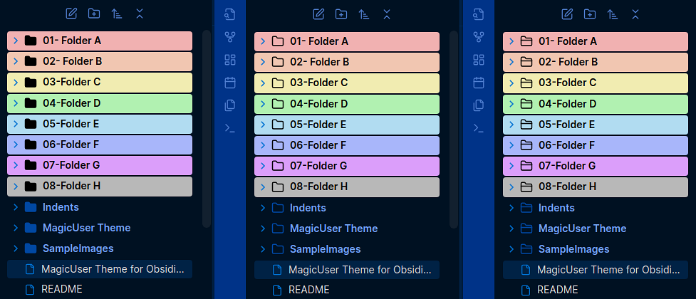
- When activated, this mode will highlight the background of folders starting with the numbers "01" and/or "001" to "08" and/or "008" (according to the order of rainbow colors plus the gray color, 8th color). It will work with folders starting with "01 Folder name" to "08 Folder name".
- All subfolders will have the same color of the top folder.
Select Folder Icons (3 Styles)
-
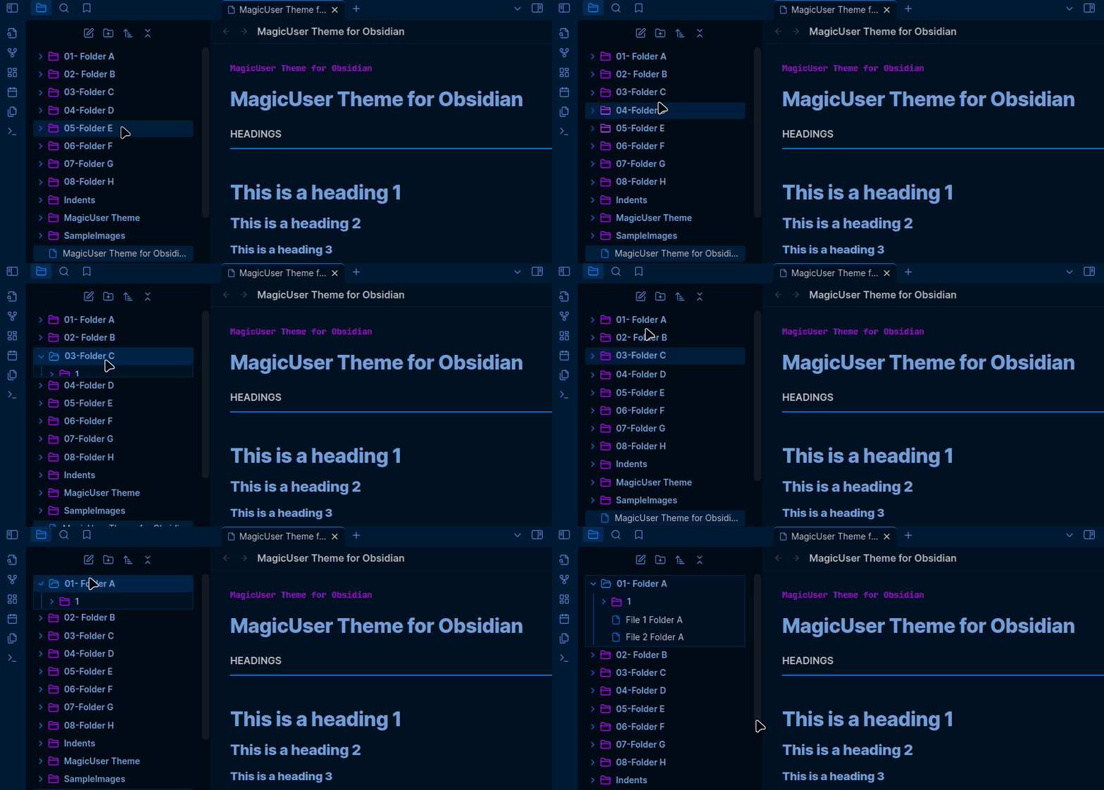
Folder Icon Styles: You can select from 3 different folder styles for open and closed states (in Style Settings).
-
Folder and File Colors:
- You can select colors more intuitively using color pickers.
- You can select specific colors for closed folders, open folders, and files (for both light and dark modes).
-
You can also show/hide folder icons and file icons.
Cards UI
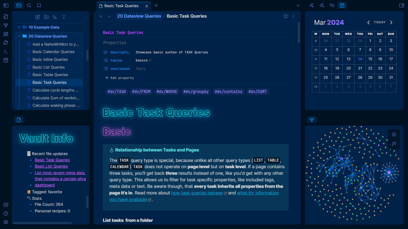
Outline UI - Sidebars and Active Icons
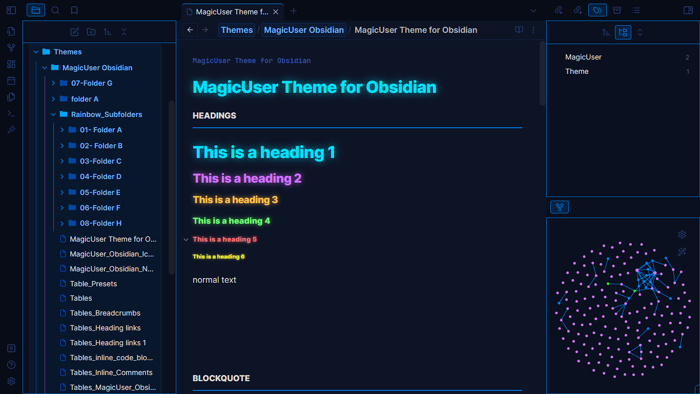
- Outline UI - sidebars
- Outline UI - active icons and elements
- Outline UI - select border color (light/dark modes)
Tabs

- Select the style of the tabs (3 options): default tabs, square tabs and pill tabs. You can also customize other tabs colors.
Breadcrumb
-
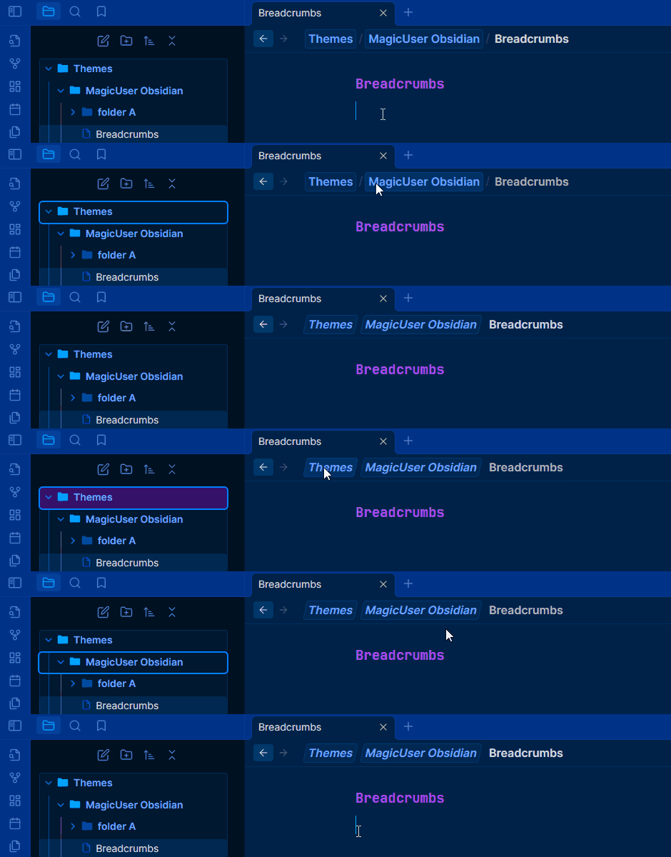
New breadcrumb layout (view header breadcrumb). The breadcrumb folders will have the same border and background colors of the sidebar open folder area (file explorer).
-
You can also have an additional layout (Slanted breadcrumb - without the
/separator and more compact. You can activate the slanted breadcrumb layout using Style Settings.
MagicUser laser
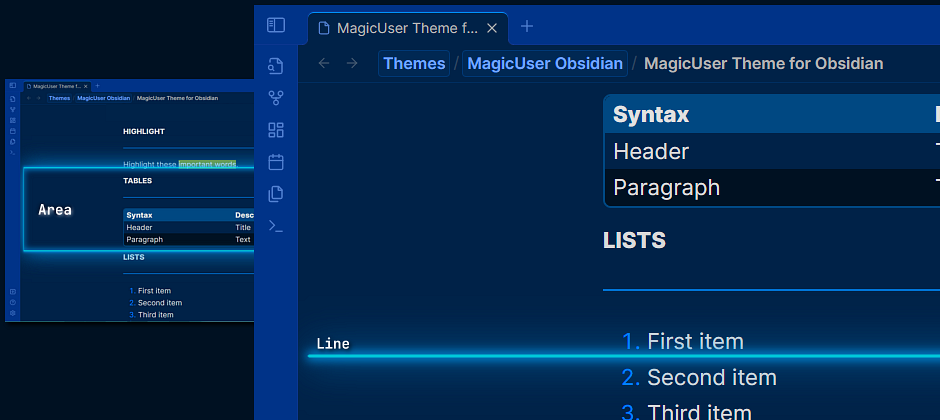
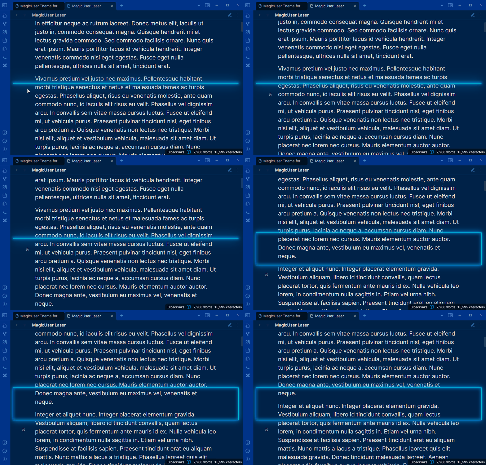
Enhance your reading experience with personalized reading focus and comfort.
- MagicUser laser will be displayed in live preview, source and reading modes.
Reading Mode: Reading Glow Effect and Reading Indicator
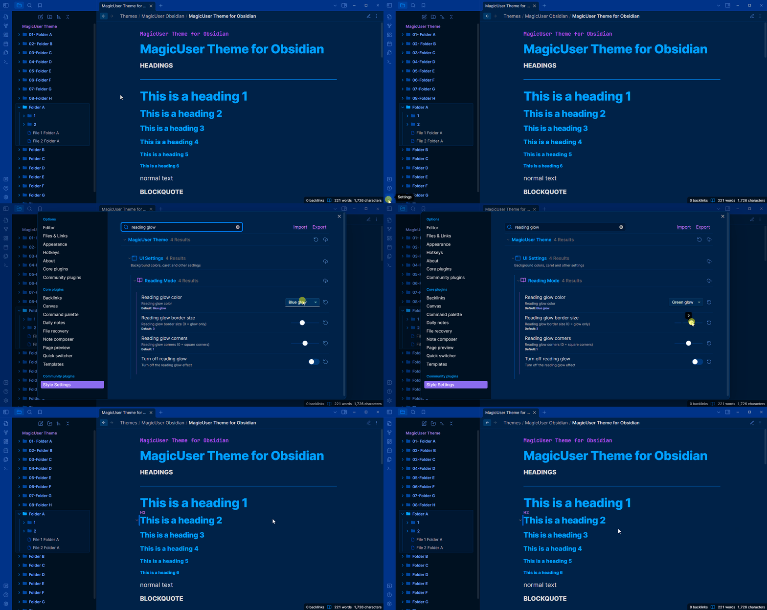
- Reading Mode: Reading glow effect.
- Style Settings: Reading glow color (7 colors).
- Style Settings: Reading glow border size.
- Style Settings: Reading glow corners size (0 = square corners).
Active Line Zoom
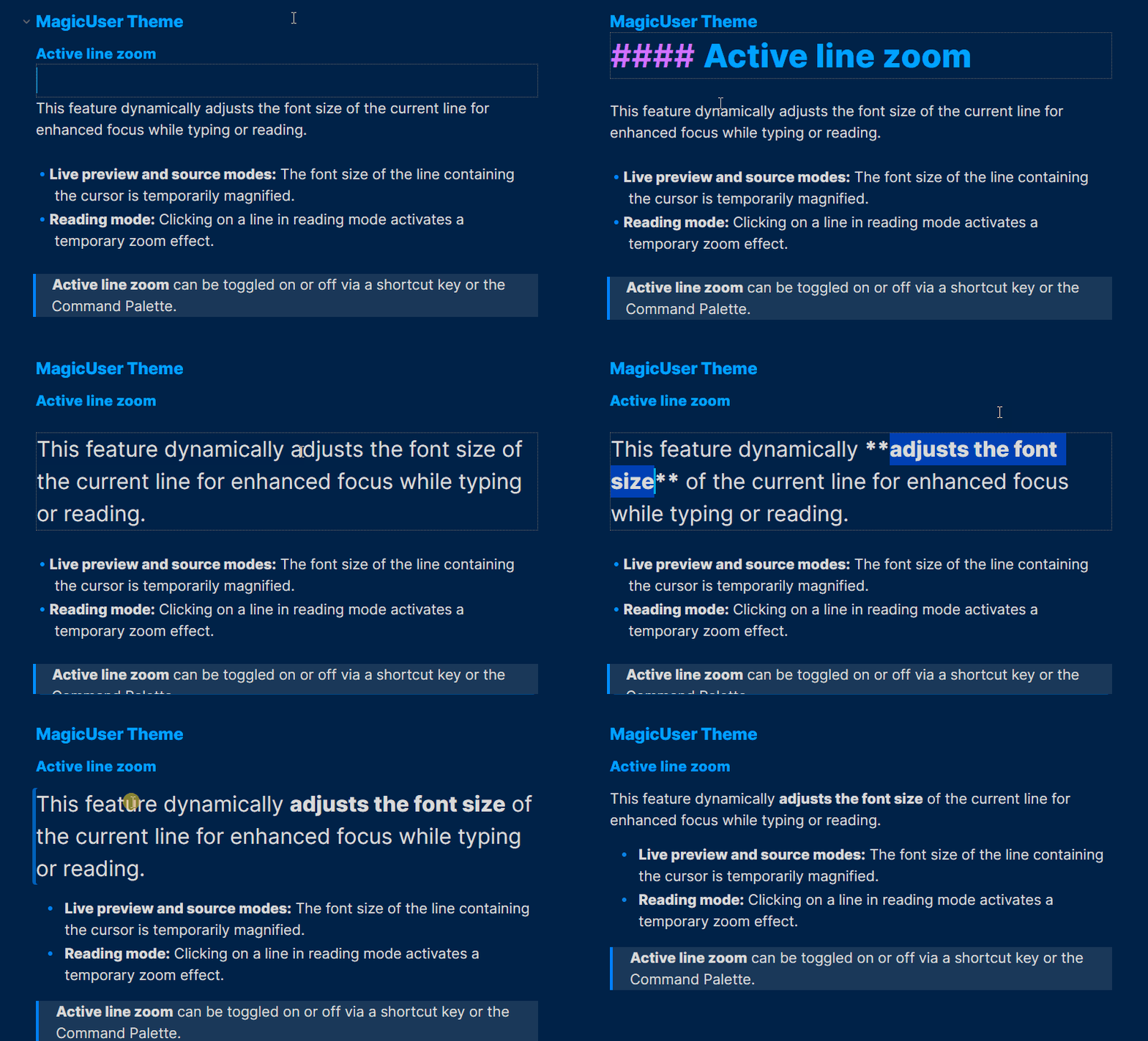
This feature dynamically adjusts the font size of the current line for enhanced focus while typing or reading.
- Live preview and source modes: The font size of the line containing the cursor is temporarily magnified.
- Reading mode: Clicking on a line in reading mode activates a temporary zoom effect.
- Active line zoom can be toggled on or off via a shortcut key or the Command Palette.
Hover Underline
[!important] Required Snippet:
magicuser_underline_effects.cssPlease check the
/snippetsfolder in this repository to download it.
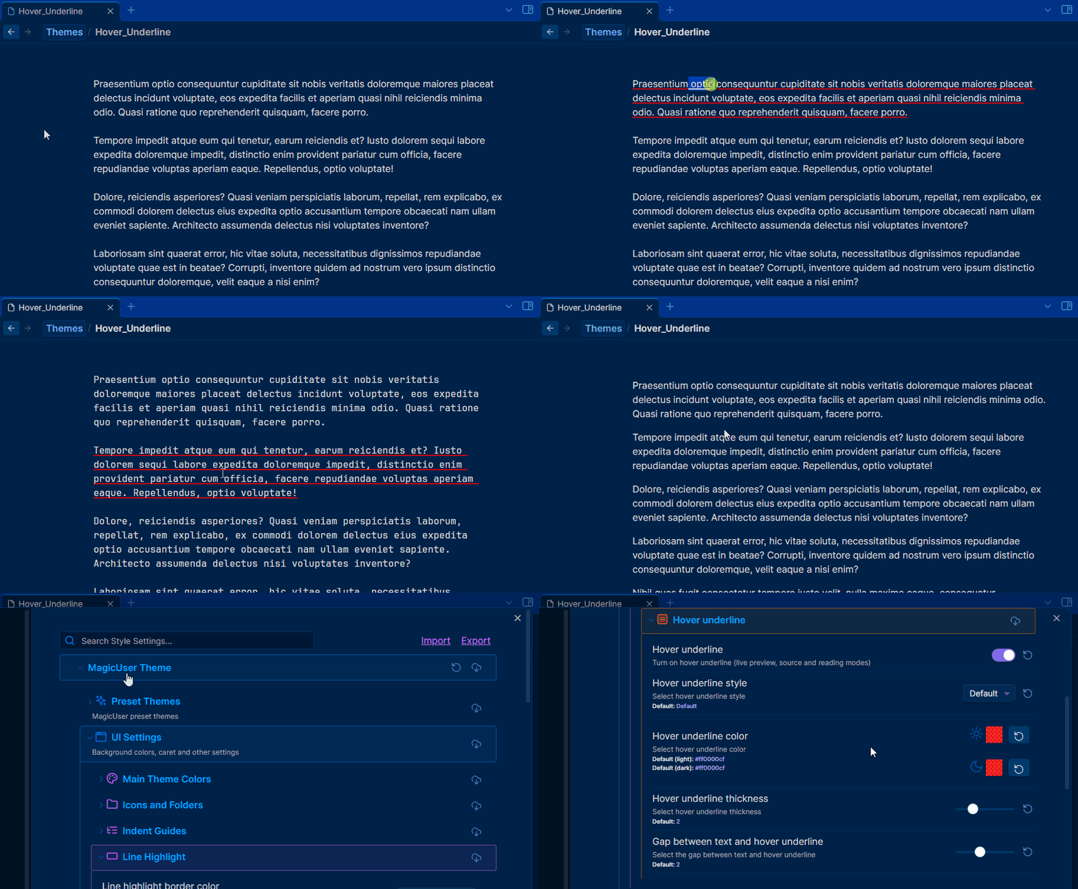
Hover underline (live preview, source and reading modes).
- Toggle hover underline (shortcut and/or Command Palette).
Colored Indent Guides
You can customize the indent guides colors using the Style Settings plugin (independent colors for light and dark modes).
Sidebar Open Folder Area
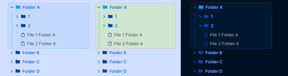
- Style Settings: select sidebar open folder area border color.
- Style Settings: select sidebar open folder area background color.
- Style Settings: hide sidebar open folder area.
Neon Mode
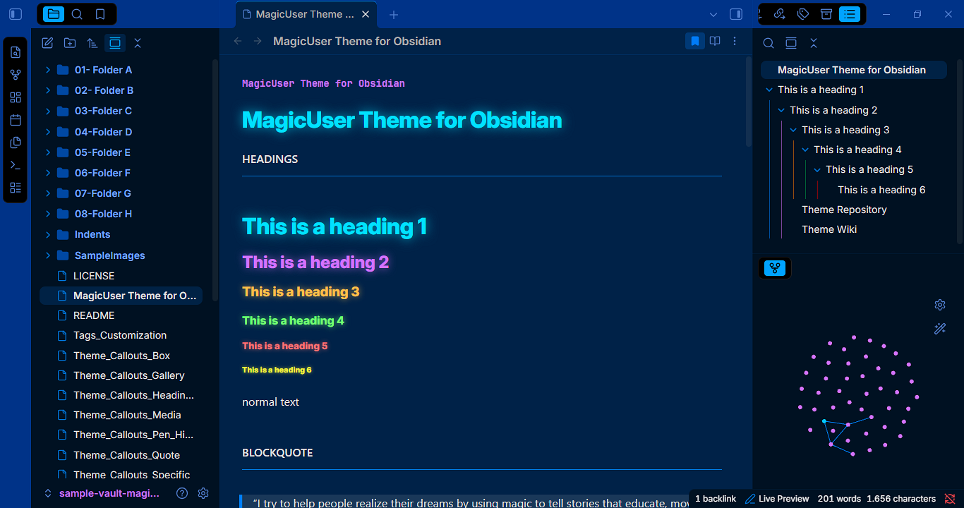
Neon Mode Custom Headings Colors
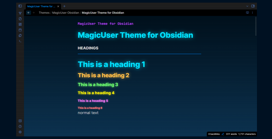
You can customize the neon mode headings colors using the Neon Mode Headings submenu.
Outline Neon Mode
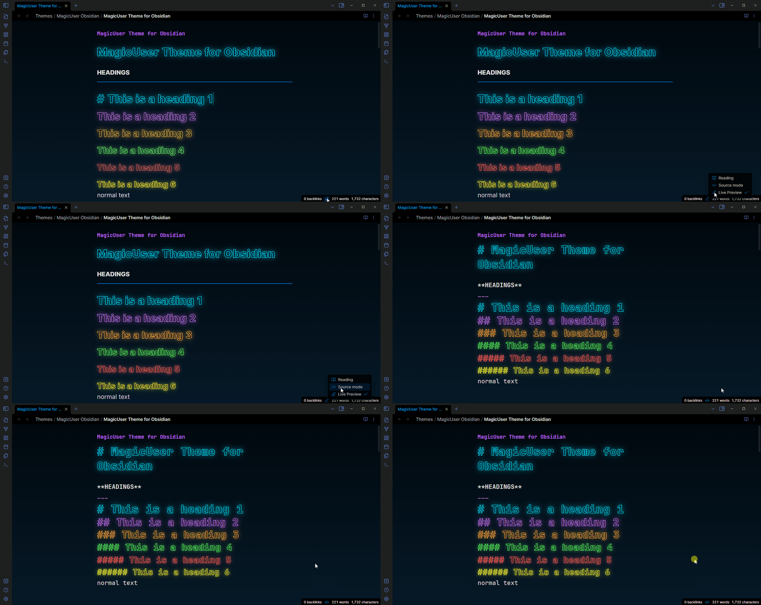
Outline Neon mode enlarges headings for effortless reading, all while keeping your text neon-highlighted. Choose your preferred style.
Underline Headings
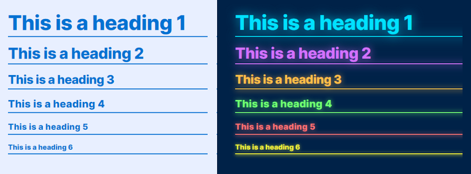
- Normal mode
- Neon mode
- Outline neon mode
You can toggle underline headings using a shortcut or the Command Palette.
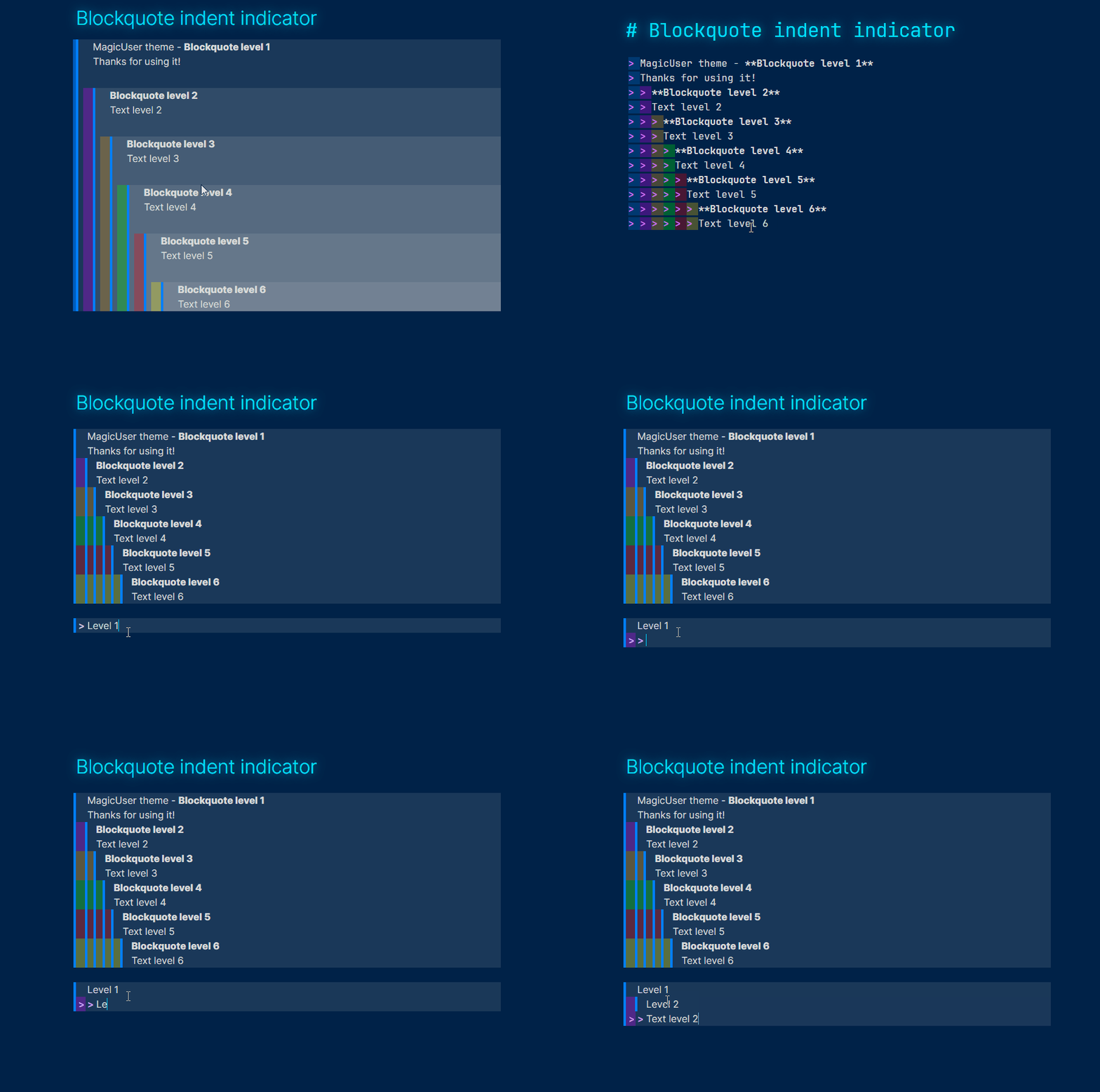
Blockquote Indent Indicator
Tags Customization - Colored Tags
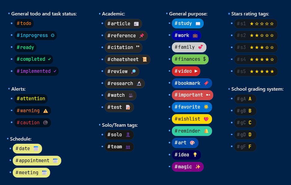
44 preset tags layout with icons
- **General todo and task status**:
  - #todo
  - #inprogress
  - #ready
  - #completed
  - #implemented

- **Alerts**
  - #attention
  - #warning
  - #caution

- **Academic**:
  - #article
  - #reference
  - #citation
  - #cheatsheet
  - #review
  - #research
  - #watch
  - #test

- **Solo/Team tags**:
  - #solo
  - #team

- **Schedule**:
  - #date
  - #appointment
  - #meeting

- **General purpose**:
  - #study
  - #work
  - #family
  - #finances
  - #video
  - #bookmark
  - #important
  - #favorite
  - #wishlist
  - #reminder
  - #art
  - #idea
  - #magic

- **Stars rating tags**:
  - #s1
  - #s2
  - #s3
  - #s4
  - #s5

- **School grading system**:
  - #gA
  - #gB
  - #gC
  - #gD
  - #gF
Warm Screen Mode
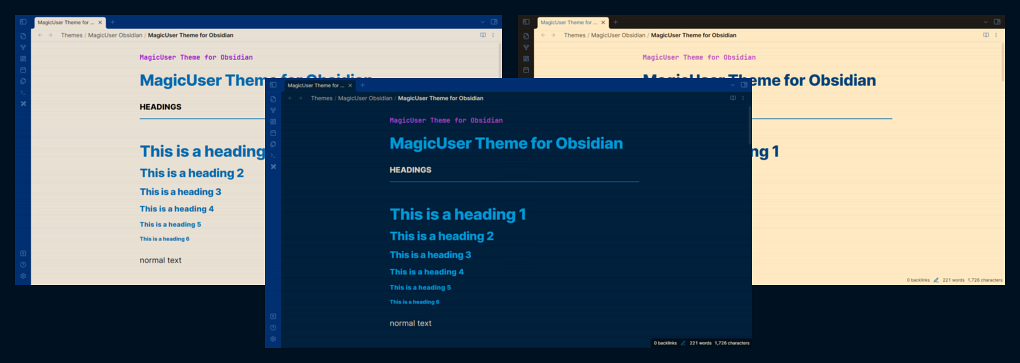
- Instead of just dimming the screen, the warm scren mode adjusts the light spectrum towards warmer tones (red, orange, yellow) and reduces cooler tones (e.g. blue).
- Warmer tones are considered less harsh on the eyes, especially in low-light environments or extended use.
- The warm screen mode can create a more relaxing and soothing atmosphere for reading, working, or viewing media.
- If you embed PDFs, you will be able to read them with warmer screen color.
Adjust the Intensity
- You can adjust the warm screen mode intensity (using the slider).
- To turn it off, set the slider to zero (default option).
Distraction-free Mode
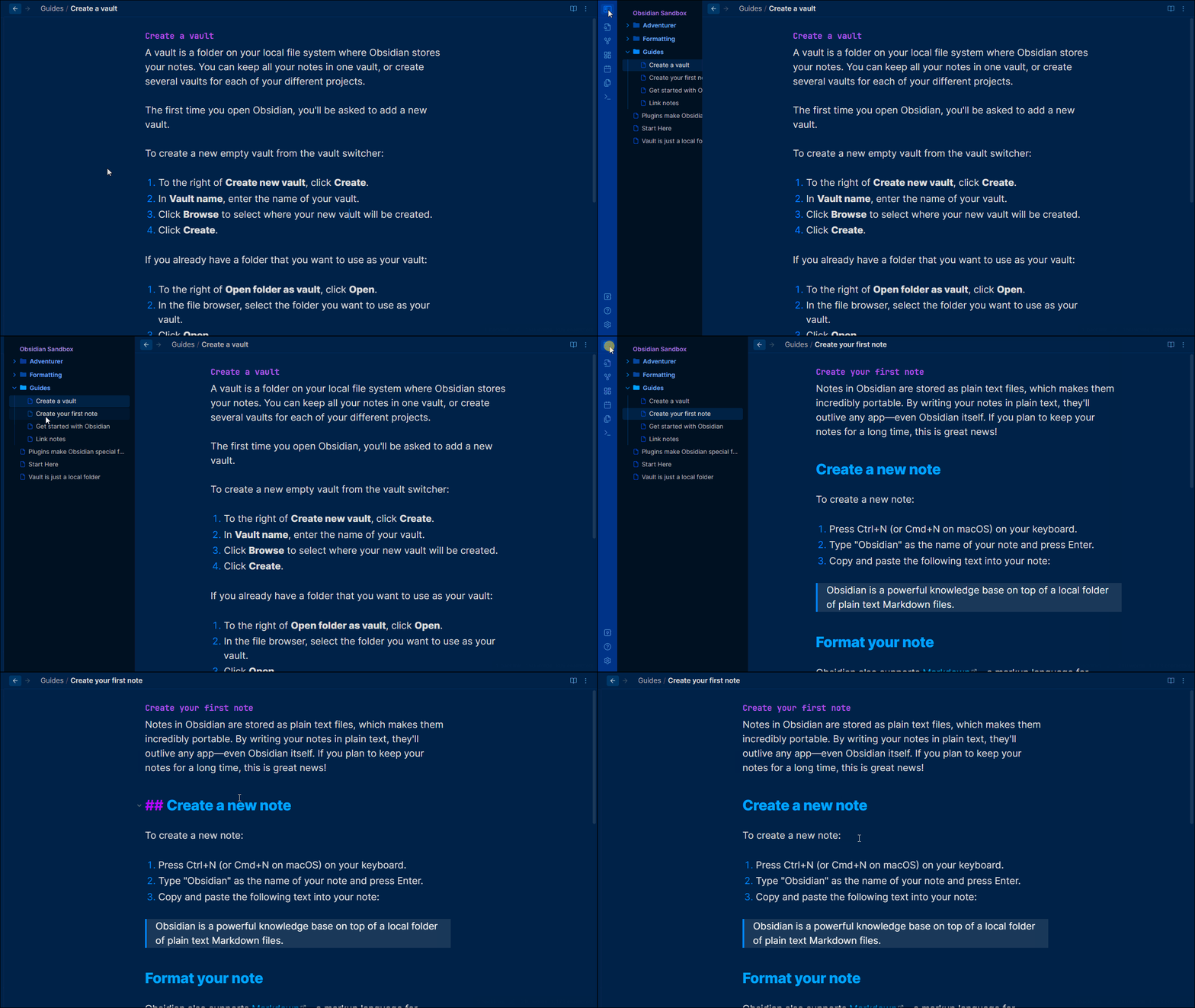
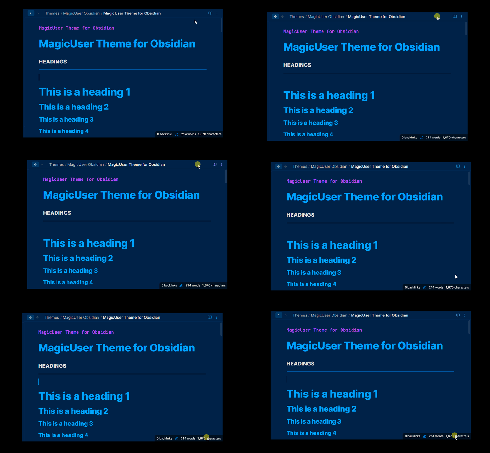
To show the left ribbon, place your cursor on the left side of the screen, it will hide again when you move your cursor away from the left side of the screen.
- You can also auto hide the status bar (UI Advanced).
Total Concentration Mode
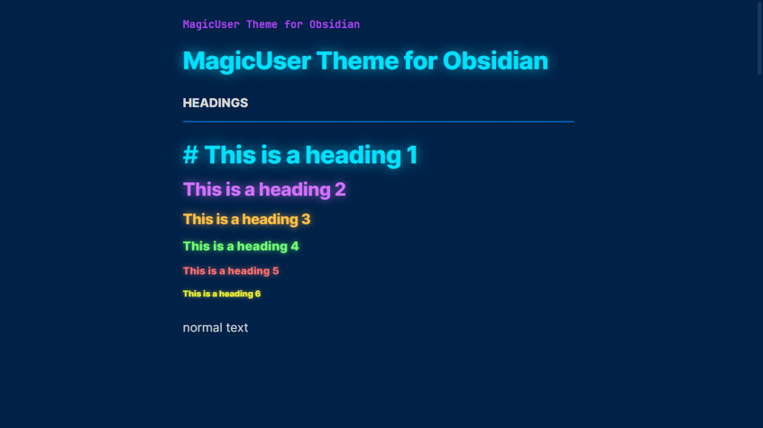
Total concentration mode goes beyond distraction-free mode. It creates a state of flow unhindered by any visual interruptions. Focus solely on your writing or reading.
- Toggle total concentration mode quickly using a shortcut or Command Palette.
Transparent Menus, Modals and Prompts
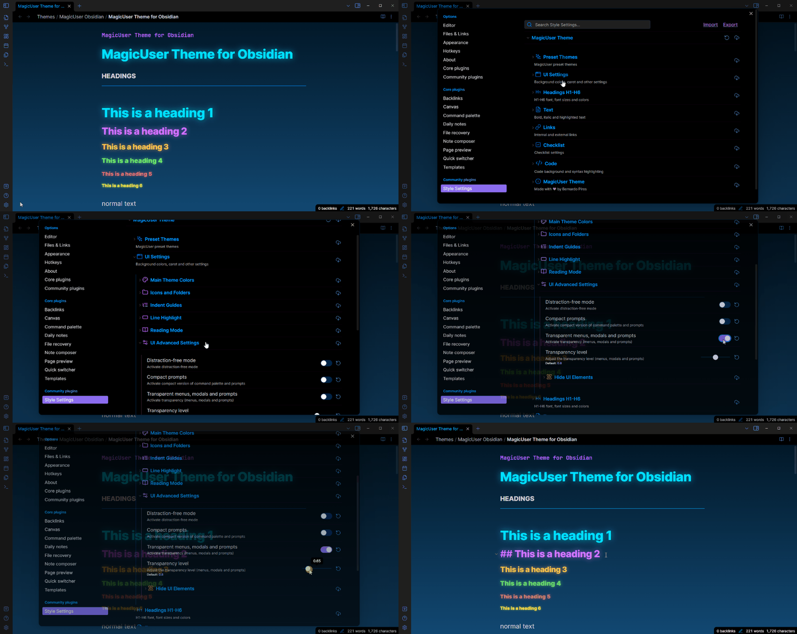
Compact Prompts
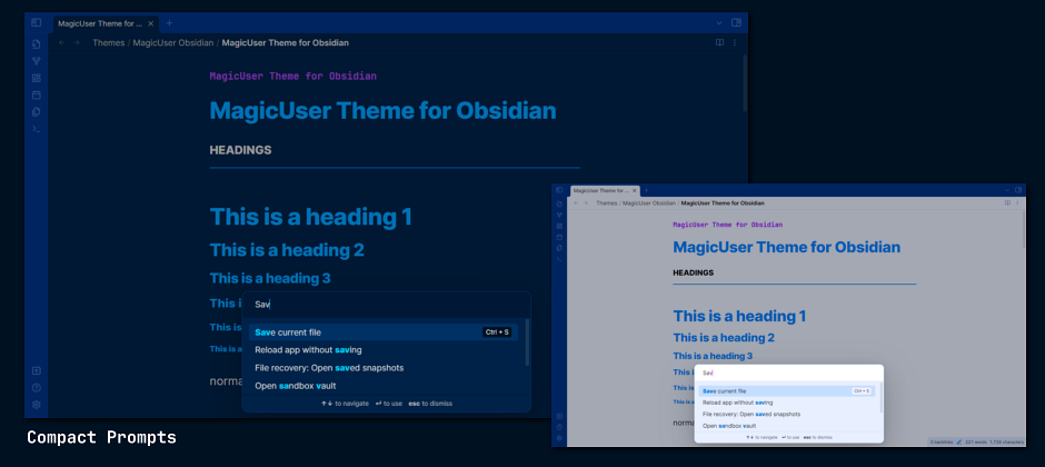
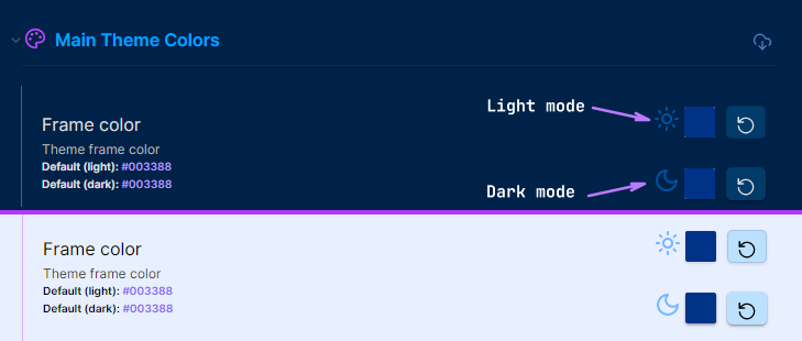
Style Settings - Customize Colors for Light and Dark Modes
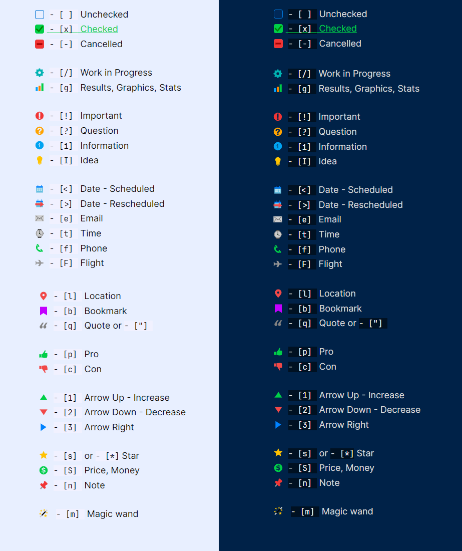
Custom Checkbox Icons
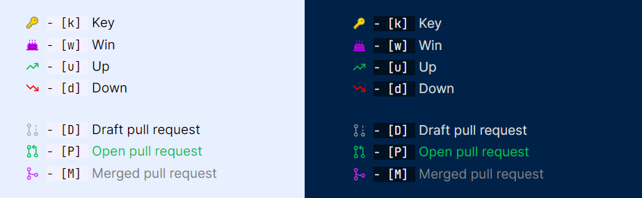
Checkbox Icons (Extra 1)
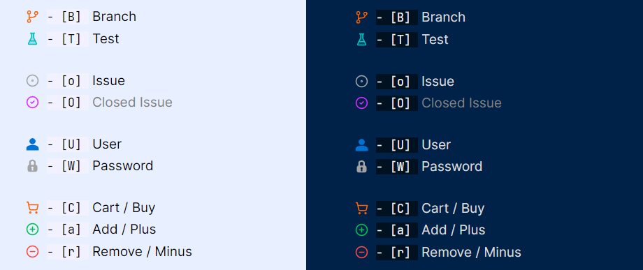
Checkbox Icons (Extra 2 and 3)
Checkbox Shape
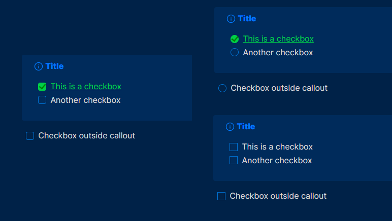
- Checkbox shape: default (rounded corners), square and circle.
Additional Callouts
Gallery Callouts
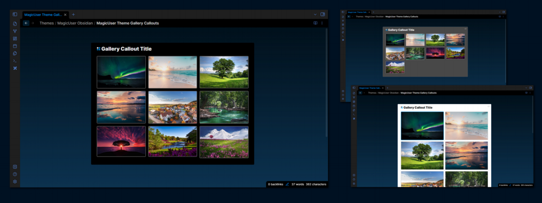
> [!g- + color] Callout Title
> [!g- + color|number of columns] Callout Title
Number of columns: 1 - 5
Colors: white, black, gray
-
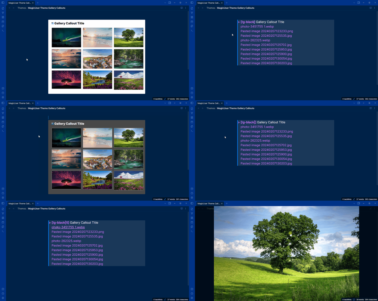
Create image galleries. You can quickly organize and display your images in columns (1 to 5 columns).
-
Gallery callouts in reading mode are interactive. Clicking and holding any image thumbnail within a gallery callout triggers a lightbox effect. This immerses you in the image by gently dimming the background, allowing you to appreciate its details without distractions.
-
Number of columns: The default callout option is 3 columns, if you don't add
|numberof columns. You can quickly change image gallery display by changing this number (1 - 5 columns).
Examples:
White background color - default (3 columns)
> [!g-white] Your Callout Title
> Place image 1 link (image 1)
> Place image 2 link (image 2)
> Place image n link (image n)
Gray background color - 5 columns
> [!g-gray|5] Your Callout Title
> Place image 1 link (image 1)
> Place image 2 link (image 2)
> Place image n link (image n)
Media Callouts
> [!m- + color] Callout Title
Colors: white, black, gray
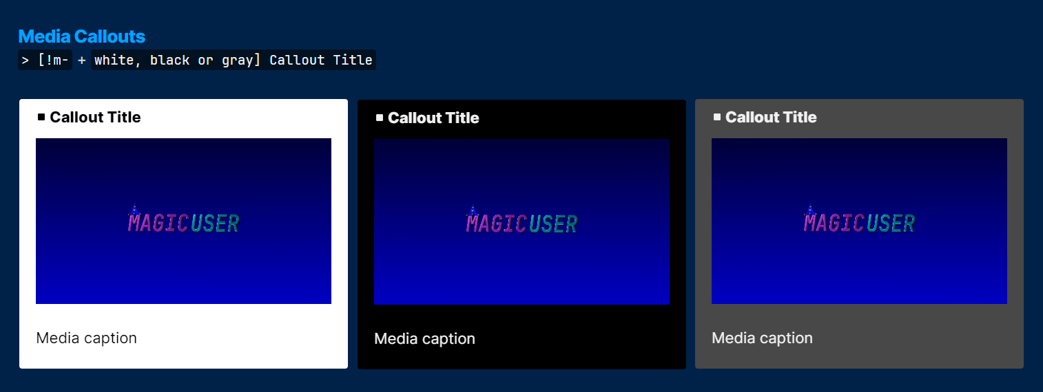
Table Callouts
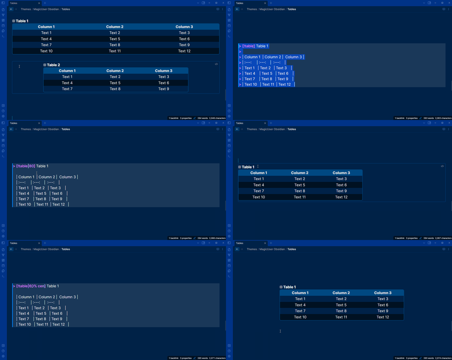
> [!table]
You can add a table inside the table callout and adjust the table size/width according to the page.
> [!table + |30% - 100%] (percentage of the page occupied by the table)
- Values: 30%, 40%, 50%, 60%, 70%, 80%, 90% and 100%.
- You can also center the table (just add
centerafter the percentage). - Don't forget to leave an empty line before inserting the table.
Check it out the examples below.
Default Table Callout
> [!table] Table 1
>
> | Column 1  | Column 2 |  Column 3 |
> | :---:     | :---:    |  :---:    |
> | Text 1    | Text 2   | Text 3    |
> | Text 4    | Text 5   | Text 6    |
> | Text 7    | Text 8   | Text 9    |
Table 70%
> [!table|70%] Table 1
>
> | Column 1  | Column 2 |  Column 3 |
> | :---:     | :---:    |  :---:    |
> | Text 1    | Text 2   | Text 3    |
> | Text 4    | Text 5   | Text 6    |
> | Text 7    | Text 8   | Text 9    |
Table 50% width and centered
- add
percentage center
> [!table|50% center] Table 1
>
> | Column 1  | Column 2 |  Column 3 |
> | :---:     | :---:    |  :---:    |
> | Text 1    | Text 2   | Text 3    |
> | Text 4    | Text 5   | Text 6    |
> | Text 7    | Text 8   | Text 9    |
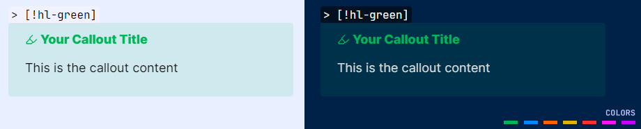
Highlighter Callouts
> [!hl- + color] Your Callout Title
Colors: green, blue, orange, yellow, red, pink, purple
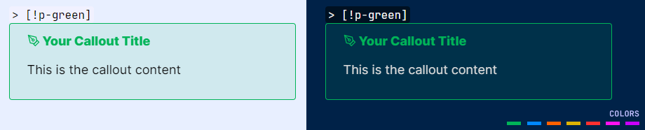
Pen Callouts
> [!p- + color] Your Callout Title
Colors: green, blue, orange, yellow, red, pink, purple
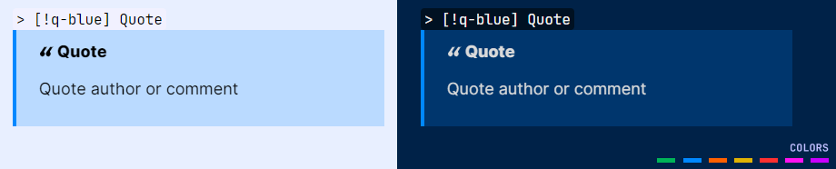
Quote Callouts
> [!q- + color] Quote
Colors: green, blue, orange, yellow, red, pink, purple
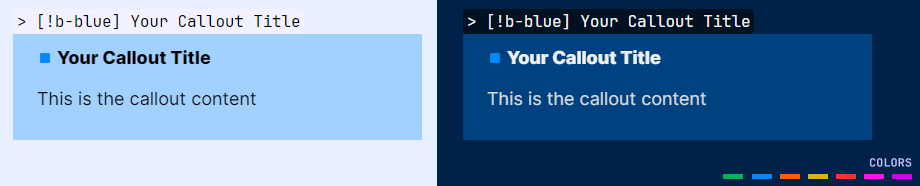
Box Callouts
> [!b- + color] Your Callout Title
Colors: green, blue, orange, yellow, red, pink, purple
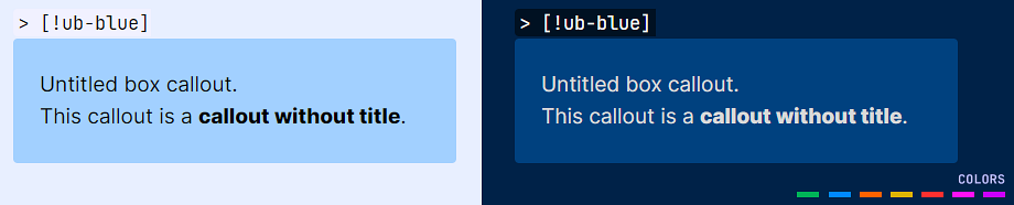
Untitled Box Callouts
> [!ub- + color]
Colors: green, blue, orange, yellow, red, pink, purple
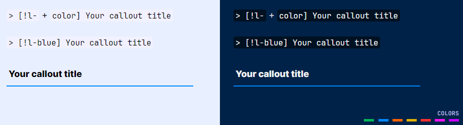
Line Callouts
> [!l- + color] Your Title
Colors: green, blue, orange, yellow, red, pink, purple
Center the content by adding |center as shown below:
> [l-+ color|center] Your callout title
To align right, use |right.
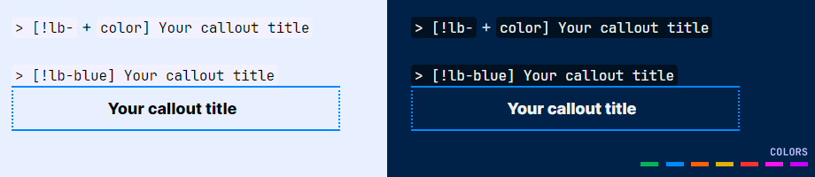
Line Box Callouts
> [!lb- + color] Your Title
Colors: green, blue, orange, yellow, red, pink, purple
Callout Headings (H1 - H6)
> [!h1 to h6- + color] Your Title
Colors: green, blue, orange, yellow, red, pink, purple
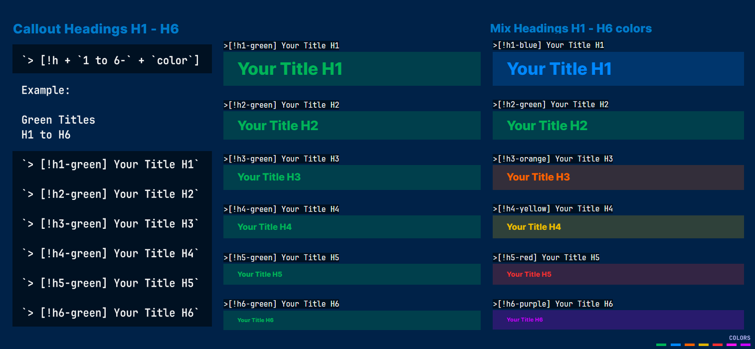
Center the callout heading by adding |center as shown below:
> [h1 to h6- + color|center] Your callout title
To align right, use |right.
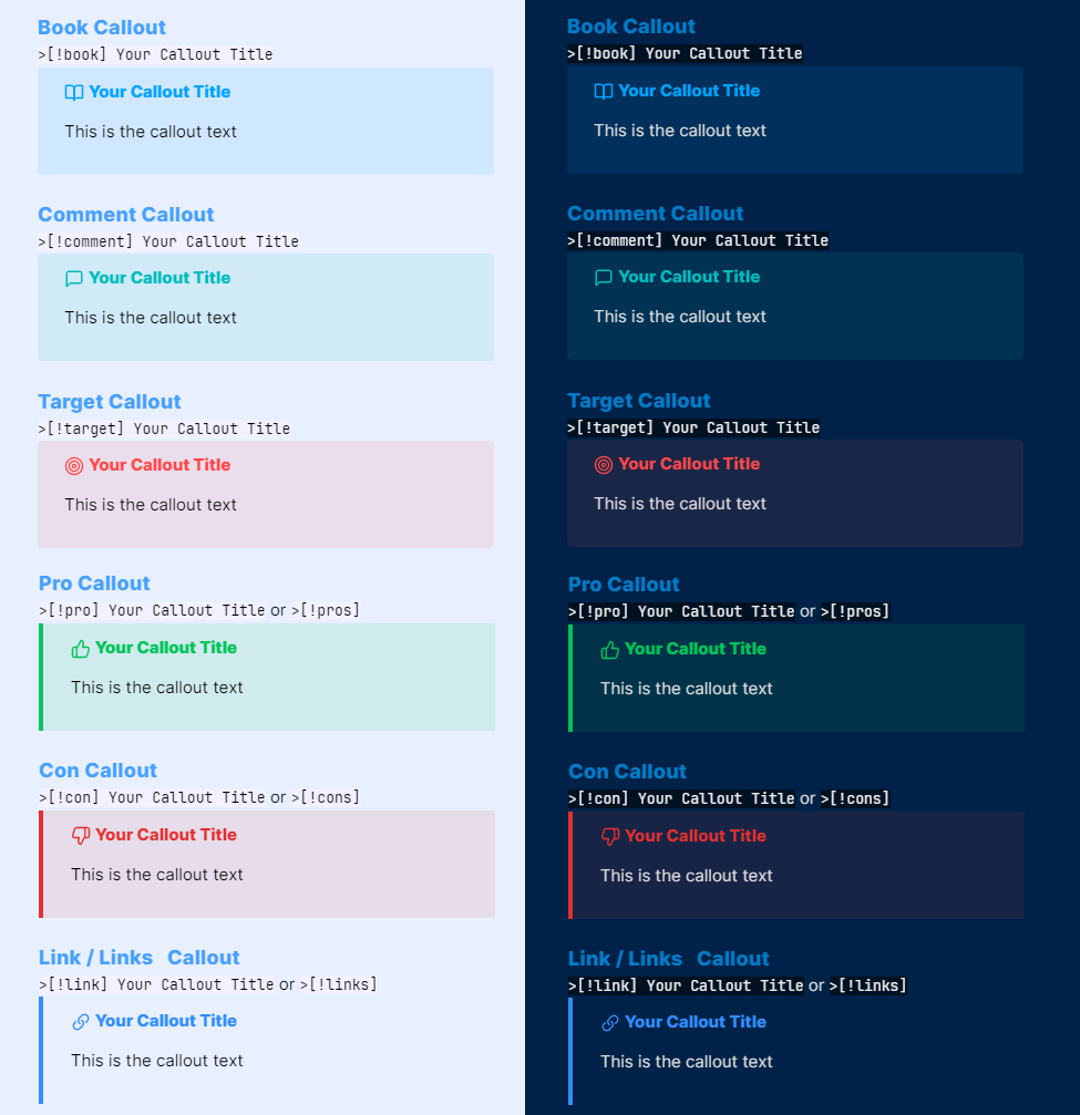
Specific Callouts
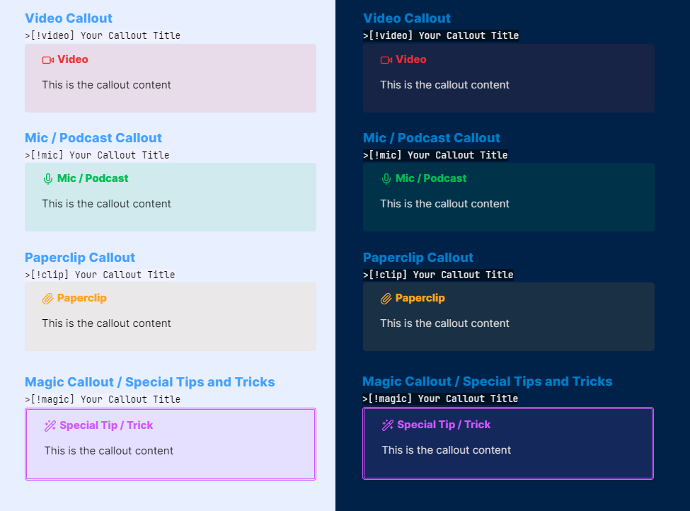
> [!video]
> [!mic]
> [!clip] or > [!paperclip]
> [!book]
> [!comment]
> [!target]
> [!pro] or > [!pros]
> [!con] or > [!cons]
> [!link] or > [!links]
> [!magic]
Flashcard Callouts
[!important] Required Snippet:
magicuser_flashcards.cssPlease check the
/snippetsfolder in this repository to download it.
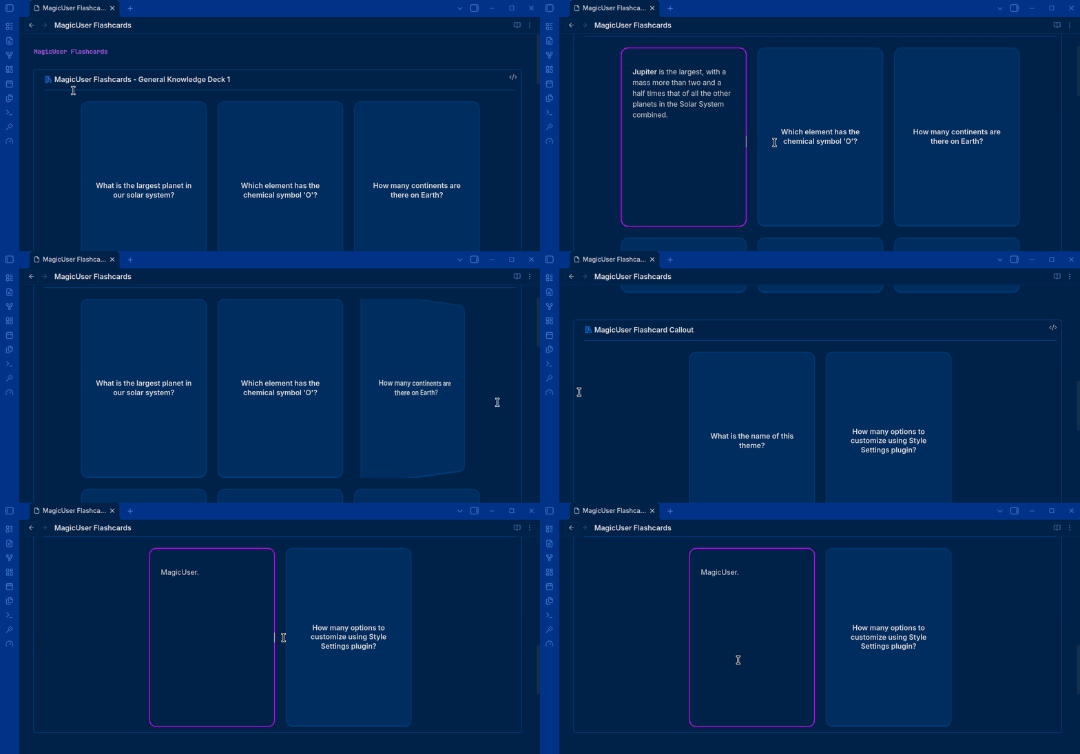
- Use flashcards to practice active recall and track your study progress. You can create individual flashcards or organize them into groups for specific subjects.
- The theme provides color guides to visually distinguish groups and individual flashcard callout headers, making it easier to categorize, edit, and create flashcards accurately.
Questions: Add text or images to create visual cues.
Answers: Use Markdown to structure your learning. This includes:
- Highlights for key concepts.
- Links to related notes or external sources.
- Add images, video or audio references.
Syntax: Group of Flashcards
Use the [!fc-group] prefix to containerize multiple [!fc] cards.
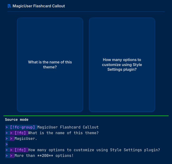
> [!fc-group] Flashcard group title
> > [!fc] Question 1
> > Answer 1.
>
> > [!fc] Question 2
> > Answer 2.
Syntax: Individual Flashcard (Ungrouped)
Use only the [!fc] prefix.
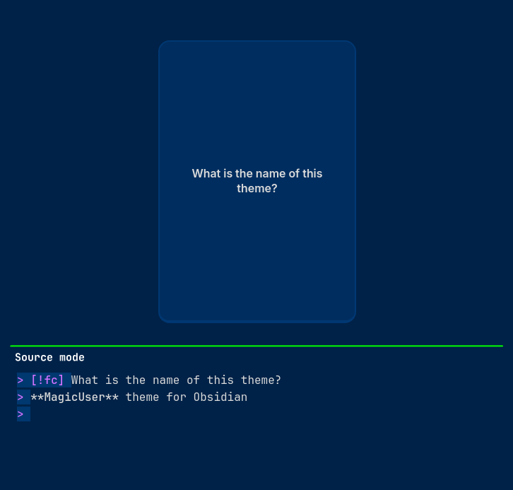
> [!fc] Question 1
> Answer 1.
Example of grouped flashcards (3 cards):
> [!fc-group] MagicUser Flashcards - General Knowledge Deck 1
> > [!fc] What is the largest planet in our solar system?
> > **Jupiter** is the largest, with a mass more than two and a half times that of all the other planets in the Solar System combined.
>
> > [!fc] Which element has the chemical symbol 'O'?
> > **Oxygen**. It is a highly reactive nonmetal and an oxidizing agent that readily forms oxides with most elements.
>
> > [!fc] How many continents are there on Earth?
> > There are **seven**:
> > 1. North America
> > 2. South America
> > 3. Africa
> > 4. Europe
> > 5. Asia
> > 6. Oceania
> > 7. Antarctica
Disabling Animations
If you prefer a static view, add |no-animation to the flashcard group callout header:
> [!fc-group|no-animation] Static Flashcard Group
> > [!fc] This card will not flip.
> > The answer is visible or appears without transition.
Customization (via Style Settings)
Fine-tune your study experience via the Style Settings plugin. Settings can be configured independently for Light and Dark modes:
- Dimensions: Adjust flashcard width and height using sliders.
- Colors: Customize the front background and front text colors.
- Borders: Select the answer border color to match your personal theme preferences.
Resize Callouts
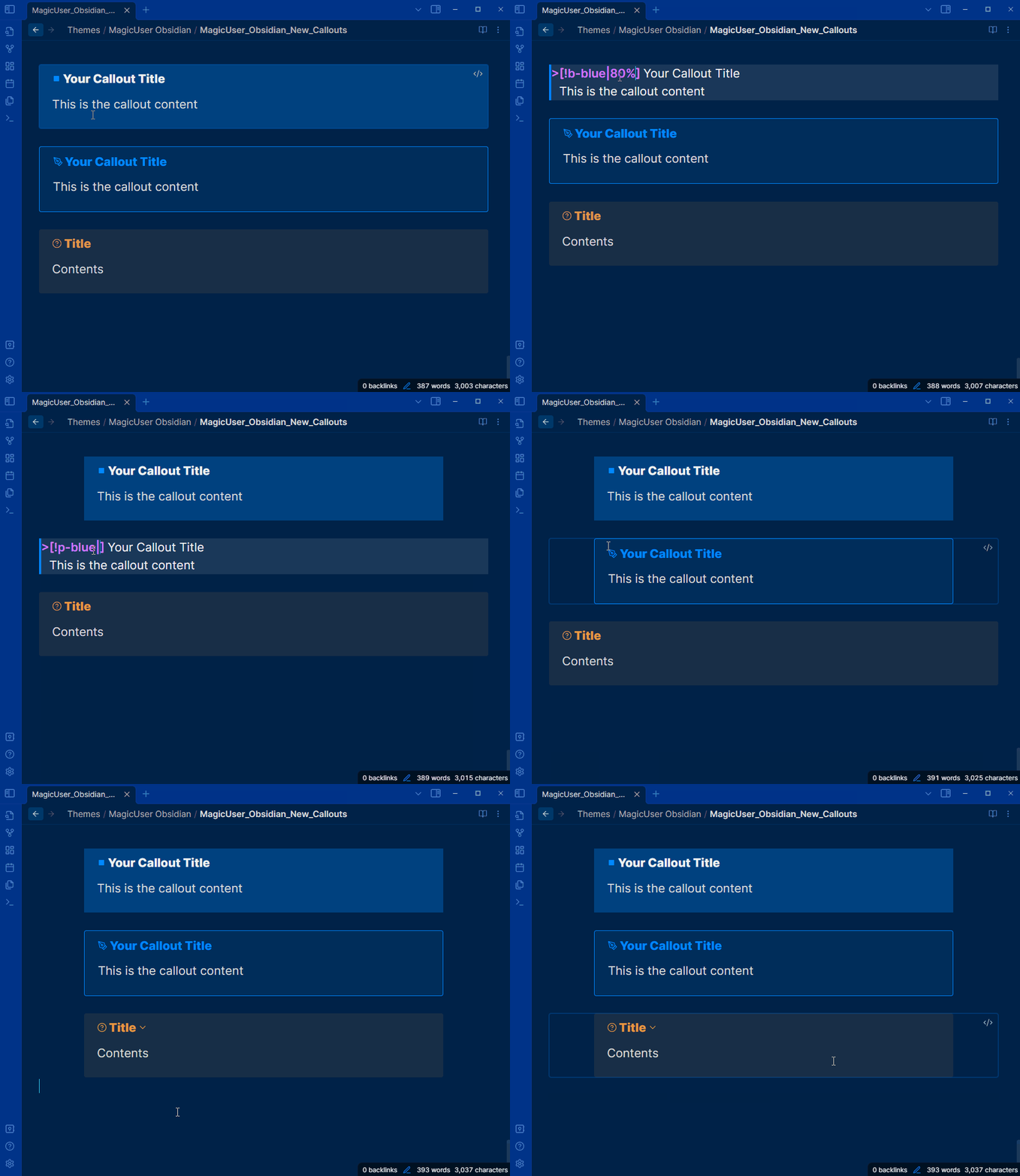
- All callouts can be resized. You can use the same syntax as table callouts in other callouts to resize them on screen (also center them).
> [!callout-name|percentage] or
> [!callout-name|percentage center]
> [!question|80% center] Your callout title
> Your callout content
- Values: 30%, 40%, 50%, 60%, 70%, 80%, 90% and 100%.
- You can also center the callout (just add
centerafter the percentage)
Caret Colors for Improved Visibility
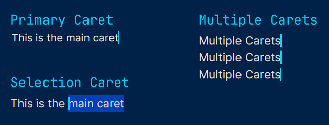
Caret Width (Selection and Multiple Cursors)
-
When selecting text, the main edit cursor/caret will have a different width for better visibility (no blinking caret).
-
Additional carets/cursors have a different width and no blinking carets (solid appearance).
Active line background and border colors
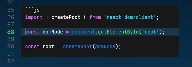
- It works inside code samples and normal editor areas.
- Active line number will have the same color of the text cursor/caret.
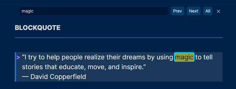
Search Highlight and Text Highlight
-
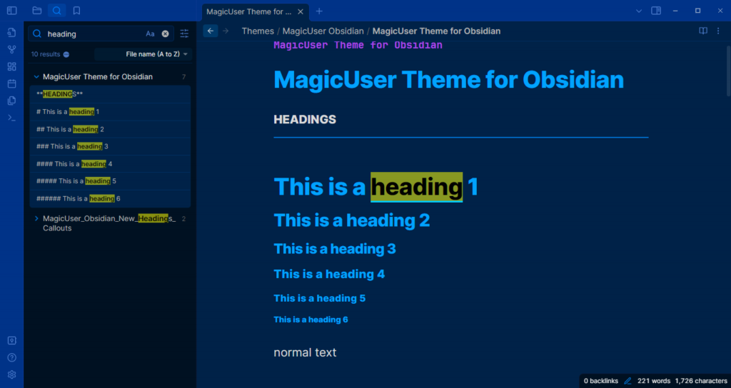
Global search highlight, linked mentions and outline text highlight.
-
The search result text in live preview, source and reading modes will appear in black text color with highlighted background (default is yellow, but you can select any highlight color using the Style Settings).
-
In live preview and source modes, the text will also appear underlined to be easier to find. It works for all types of text (normal text, bold, italic, links, tags, code and headings).
-
Note: The underline will be the same color of your text cursor/caret color.
-
Outline highlight: When you click on the item (using the outline) it will highlight the text the same way (search). I think it will be easier to read, especially when using different colors for H1-H6 titles (normal mode and neon mode).
Search Highlight in Current Note
Inline Comments
-
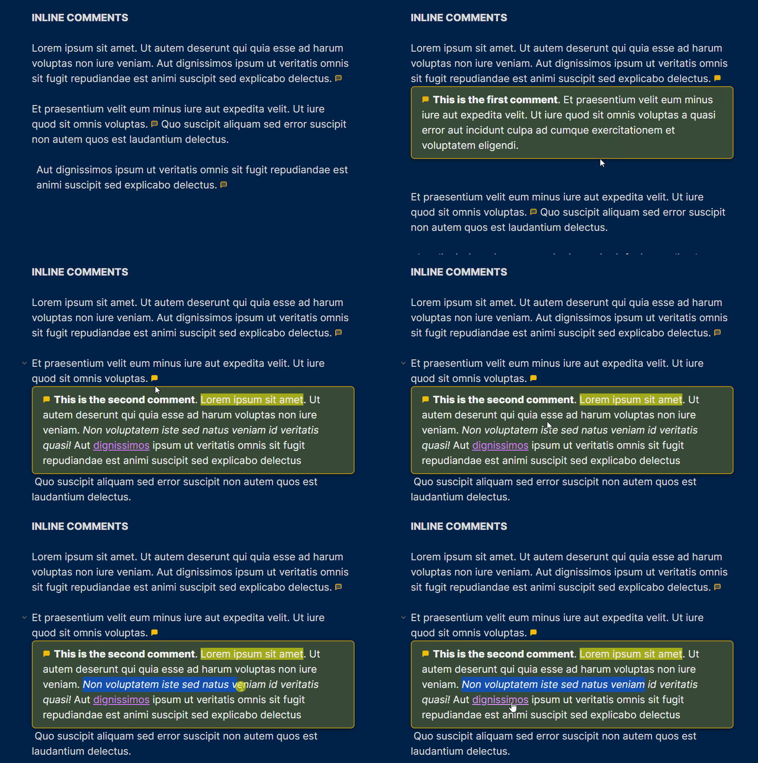
Inline interactive comments. You can add inline comments to any part of your note, and when you hover over it, the content will be displayed in a box. The comment icon will be highlighted.
-
You can add HTML bold
<b>, italic<i>, links<a href>,<u>,<mark>tags in order to format your comments to make it easier to you to review them. -
They were designed for quick comments 1 - 4 paragraphs.
-
The inline comments will not be printed or exported to PDF.
Syntax:
- Add the
<i>tag with the classmuc(MagicUser Comment) - Inside
<i class="muc">just add a<span>tag with your comment. There is no need to add any class to the span tag.
Example
This is the text of your note <i class="muc">
  <span>
    This is your first inline comment.
  </span>
</i>
- If you're used to HTML, just make it one line:
This is the text of your note <i class="muc"><span>This is your inline comment.</span></i>
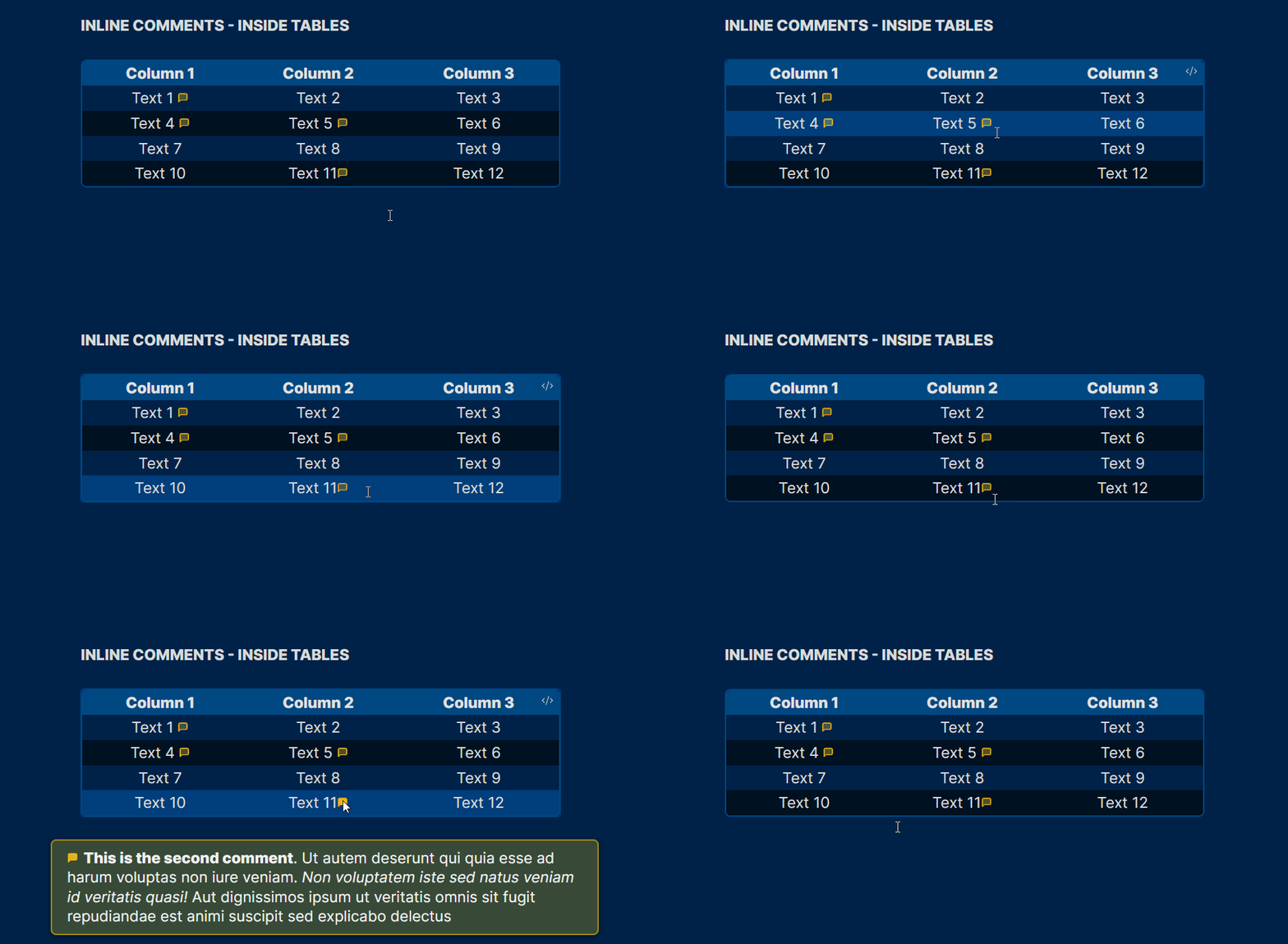
Inline Comments Inside Tables
Underlined Text Colors
[!important] Required Snippet:
magicuser_underline_effects.cssPlease check the
/snippetsfolder in this repository to download it.
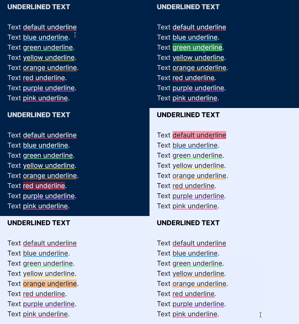
The default underline color is red, but you can change it using the Style Settings plugin. You can also add 7 classes to make the text underlined. When you hover the underlined text it will become highlighted (underlined too). Please check the syntax below.
Text <u>underlined text</u>.
The classes below can quickly change the color of the underline (just the color names): blue, green, orange, yellow, red, purple and pink (7 colors).
Text <u>default underline</u>
Text <u class="blue">blue underline</u>.
Text <u class="green">green underline</u>.
Text <u class="yellow">yellow underline</u>.
Text <u class="orange">orange underline</u>.
Text <u class="red">red underline</u>.
Text <u class="purple">purple underline</u>.
Text <u class="pink">pink underline</u>.
Note: The color of the text will remain the same, to avoid confusion with links.
Hidden Text Underline
[!important] Required Snippet:
magicuser_underline_effects.cssPlease check the
/snippetsfolder in this repository to download it.
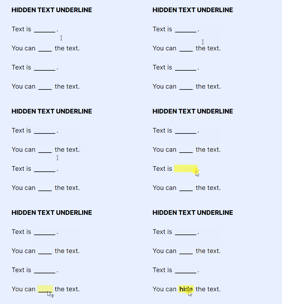
A) Show text on hover (hide text on live preview and reading modes)
Add the hide class to the <u> HTML tags.
You can <u class="hide">hide</u> the text.
B) Show text on click and hold (hide text on live preview and reading modes)
Add the hide-c class to the <u> HTML tags (it will reveal on click).
You can <u class="hide-c">hide</u> the text.
C) Hide text on reading mode only - show on hover
Add the hide-r class to the <u> HTML tags. It will reveal on hover (reading mode).
You can <u class="hide-r">hide</u> the text.
D) Hide text on reading mode only - show on click
Add the hide-rc class to the <u> HTML tags. It will reveal on click (reading mode).
You can <u class="hide-rc">hide</u> the text.
- The hidden text will appear on hover or on click (bolder and highlighted). You can change the background (highlight) and foreground color using the Style Settings options (different colors for light and dark modes).
E) Hide on reading mode only - show on hover - full width
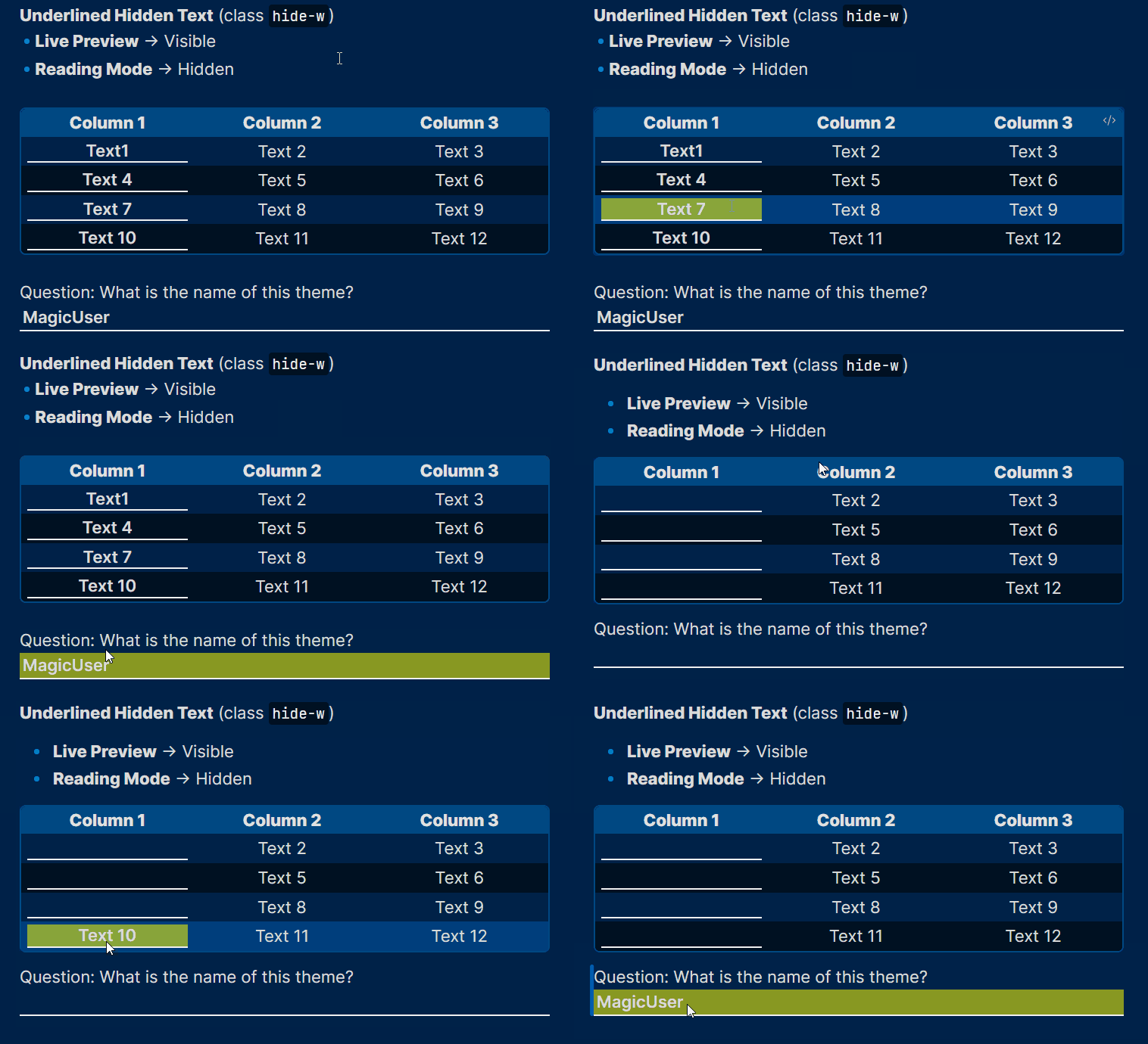
- Add the
hide-wclass. It will hide the text on reading mode and occupy the full width of the parent element (table column) or page.
Question: What is the name of this theme? <u class="hide-w">MagicUser</u>
Highlighted Text Colors
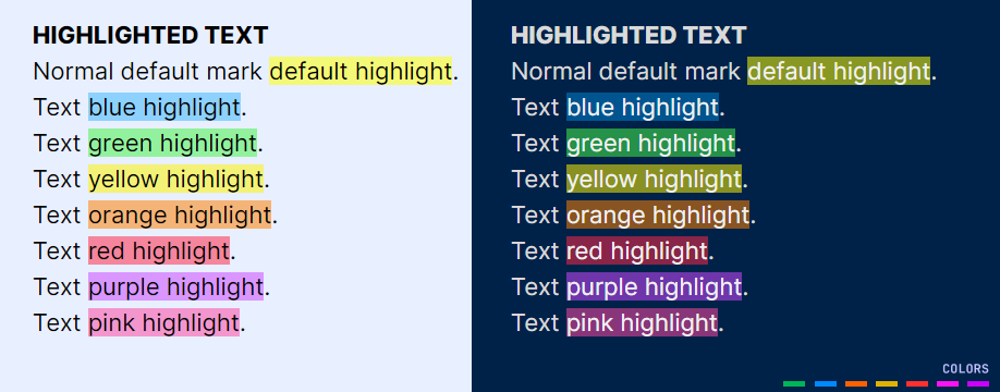
Text <mark>highlighted text</mark>
The default is yellow. But you can quickly change its color by adding the same 7 classes of the underlined text (just the color names). Please check it out below:
Normal default mark <mark>default highlight</mark>.
Text <mark class="blue">blue highlight</mark>.
Text <mark class="green">green highlight</mark>.
Text <mark class="yellow">yellow highlight</mark>.
Text <mark class="orange">orange highlight</mark>.
Text <mark class="red">red highlight</mark>.
Text <mark class="purple">purple highlight</mark>.
Text <mark class="pink">pink highlight</mark>.
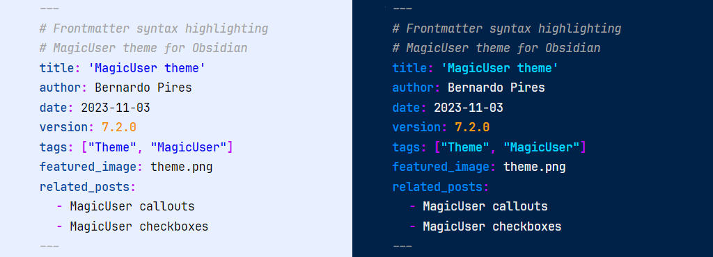
Metadata highlighting
Tables Layout
Default theme table layout:
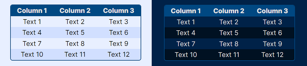
- Improved table layout (all preset themes - light and dark modes). The colors of the tables will adapt to the different background colors of the preset themes.
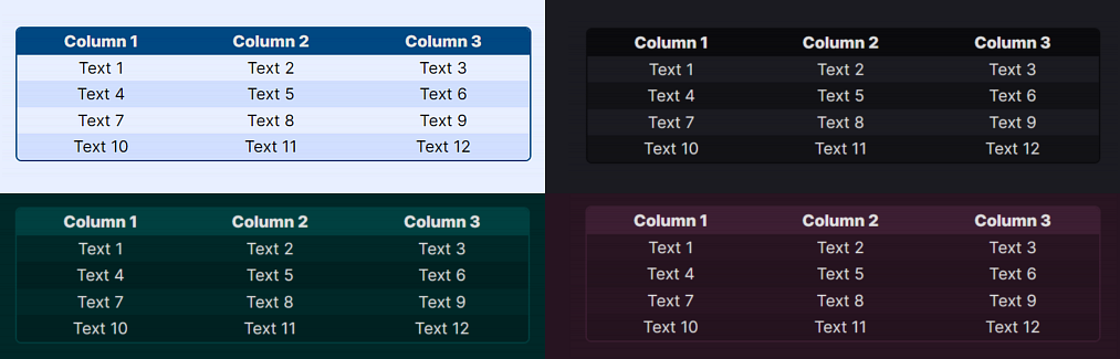
- Independent table colors for light and dark modes, you can also select outer and inner border widths (sliders).
Table rounded corners (removed in theme version 19.2.0)
Preset Tables
Style Settings: Preset tables
table1(column-striped table)table2table3table4(with accent color)table5(with accent color)table6(with accent color)- Default table (main theme table layout)
- New: Numbered table (rows and columns have numbers). You can customize the numbers background color.
- New: Plain data (simple layout for dataview tables)
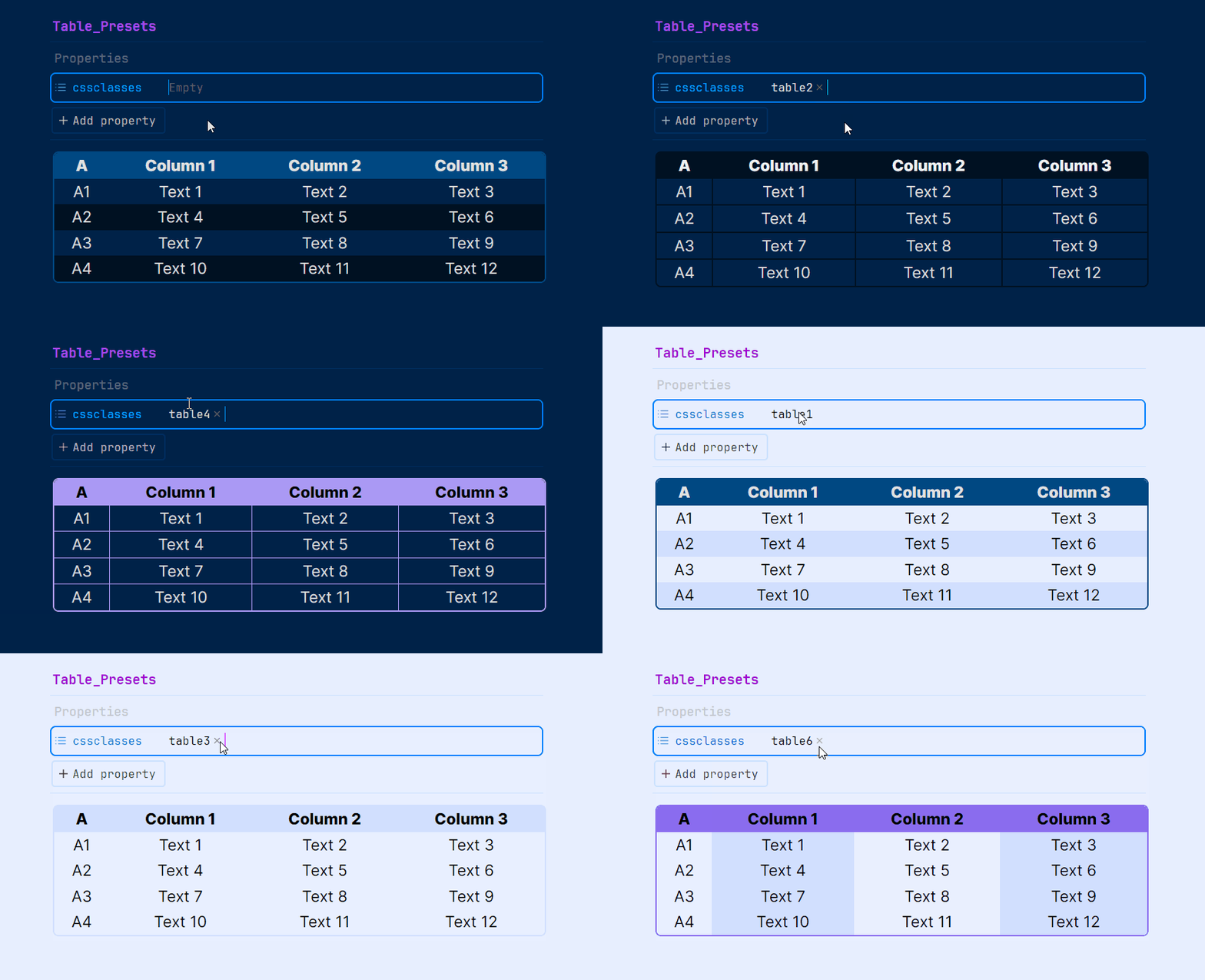
To achieve the desired table layout for specific notes, you can apply the above CSS classes (table1 to table6).
Properties -> cssclasses ->
table1totable6
Dataview Tables to Cards
[!important] Required Snippet:
magicuser_dataview_tables_to_cards.cssPlease check the
/snippetsfolder in this repository to download it.
-
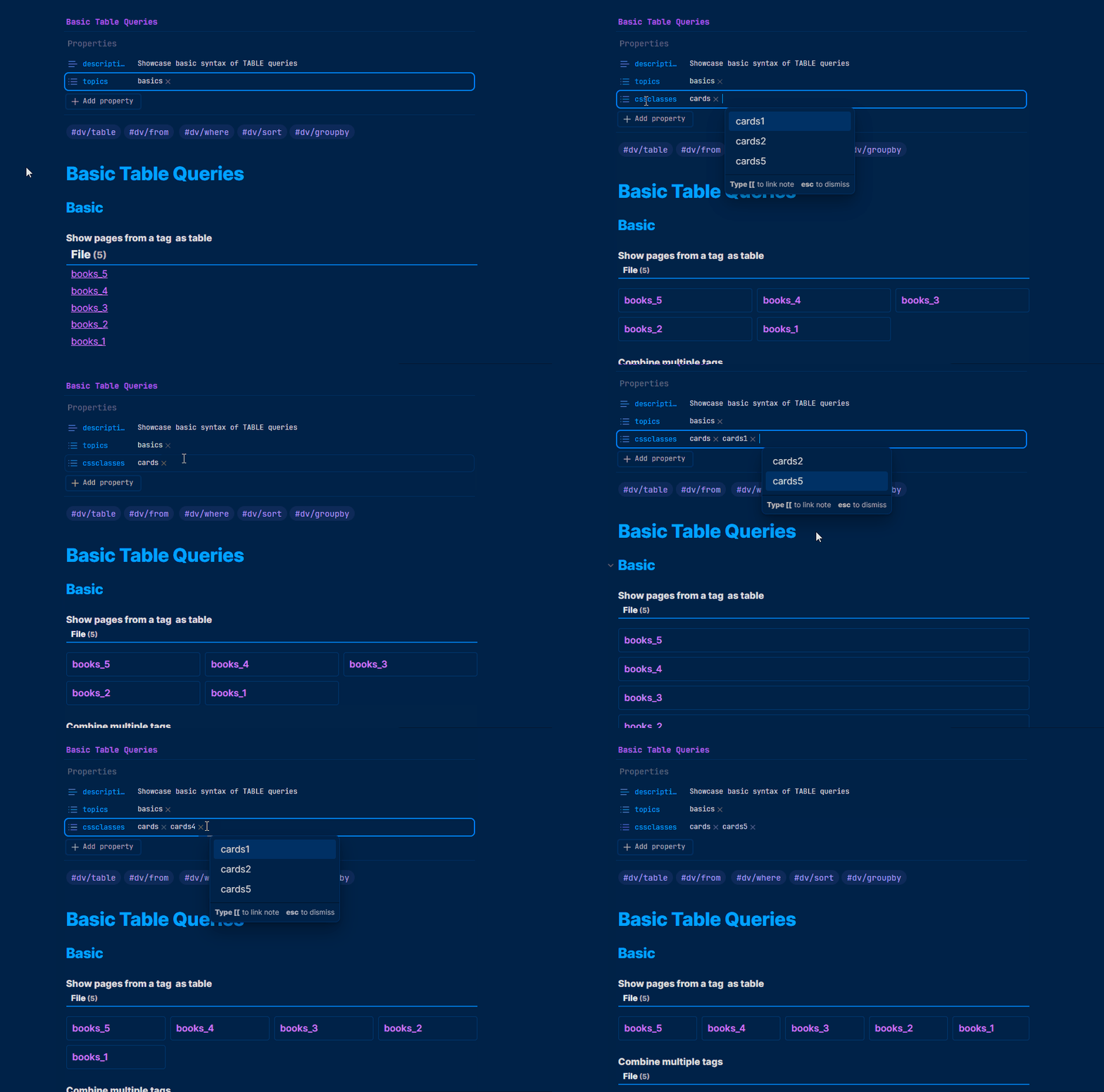
Dataview tables can be converted to cards. Add cssclasses property (with
cardsclass) on the note you want to transform the dataview tables to cards. This cards class was inspired by @kepano excellent Minimal theme, but it is a different code and look. I hope you also find it useful. -
The default
cardsclass will add 3 columns maximum. If you want just 2 columns addcards cards2(cssclasses property).
---
# Display table to cards (2 columns)
cssclasses:
  - cards
  - cards2
---
- You can add 5 additional classes:
cards1,cards2,cards3,cards4andcards5(corresponding to the number of columns - 1 to 5 columns). I think this is easy to remember and implement.
---
# Display table to cards (5 columns)
cssclasses:
  - cards
  - cards5
---
Footnotes
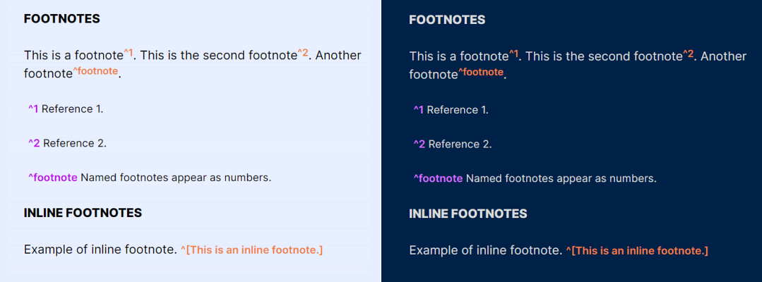
- You can customize the color of the footnotes (Style Settings). The default color is purple (light/dark modes).
Mermaid
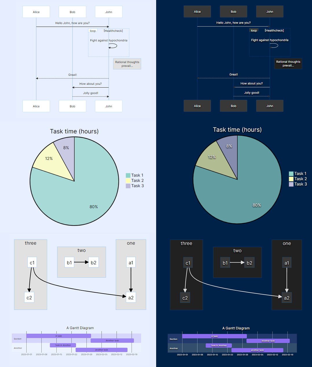
Code Theme (Light and Dark)
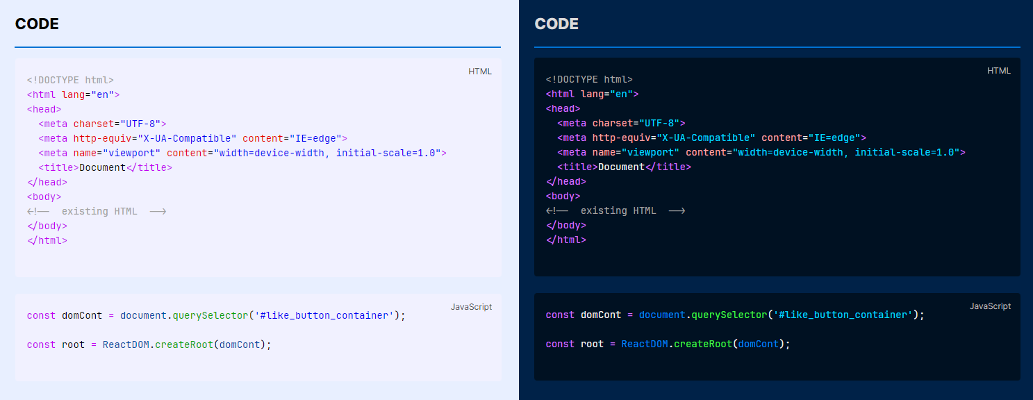
The syntax highlighting in this theme is similar to the MagicUser themes for VS Code (MagicUser and MagicUser Light Blue).
Outline Code
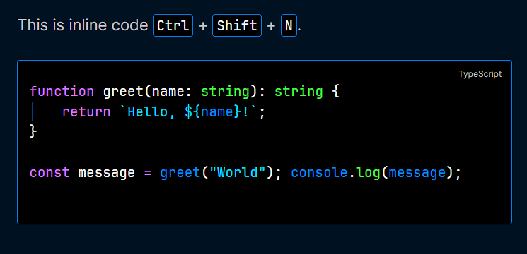
- Outline inline code and outline code block: Add inline code and code block border color (independent outline). You can select independent colors for inline and code block elements (light and dark modes).
- You can toggle the outline inline code and outline code block using the command palette (or shortcut key).
- Select inline code border color.
- Select code block border color.
Plugins Compatibility
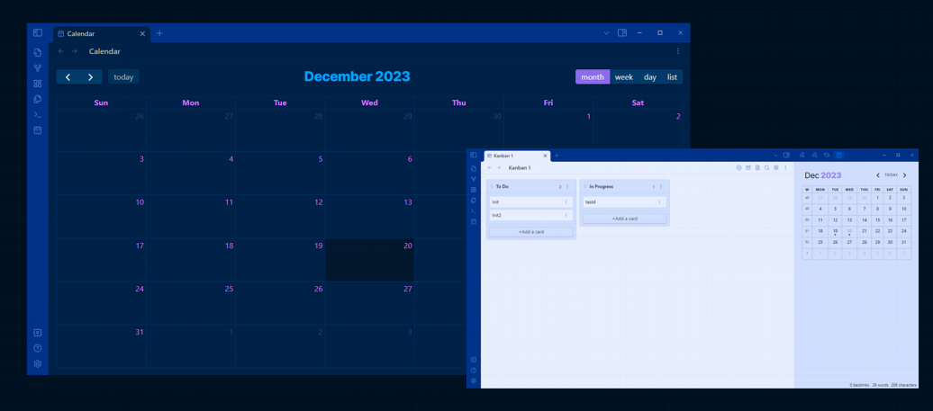
- Style Settings
- Excalidraw
- Dataview
- Dashboard Navigator
- Kanban
- Calendar
- Full Calendar
- Tasks
- Commander
- Banners
Why is it called MagicUser?
The name “MagicUser” for the themes I create has a deep meaning for me:
-
Like a Magic User Class: It references the concept of a “MagicUser” class in object-oriented programming languages. Similar to how a programmer uses a class to define objects. MagicUser class would be used to create magic users. Notably, “MagicUser” follows the common convention in many programming languages of writing class names in PascalCase, where the first letter of each word is capitalized.
-
Personal Connection: But there’s a deeper meaning! This resonates strongly with me because in the late 80s and 90s, I played a game series that had a huge impact on my life, called Quest for Glory (originally known as Hero’s Quest: So You Want to Be a Hero). You could play as a fighter, a thief, or as a magic user/wizard. As you can guess, I played as the magic user.
-
In the second game, there was a quest where the player could strive to become a Paladin. The core values of the Paladin class resonated deeply with me. Still remember that board of quests, one of them was “The Way of the Paladin: To seek. To learn. To do.” Even though it was a game, the values became a guiding light for me, emphasizing seeking knowledge, continuous learning, and using that knowledge and your abilities to help others.
-
If you played the game and were good enough to become a Paladin, this only happened at the end of the second game (or during the third game).
-
While themes may come and go, hopefully, the underlying message will remain a constant.
Now you know the reasons why it’s called MagicUser.
Feedback
Have suggestions for new features, usability improvements, or found a bug? Your feedback is appreciated! Submit an issue on GitHub and I'll do my best to respond as soon as possible. Every voice matters and helps shape the future of this theme. Thanks.
License and Acknowledgements
MagicUser Theme for Obsidian
MIT License ⓒ Bernardo Pires
Most of the icons for the checkboxes and the quote icon were created by me (MIT License). You can find the comment in the embedded SVGs.
The icons used by the file icon, other callouts and some checkboxes icons are from Lucide Icons used by Obsidian. The Lucide icon library is licensed under the ISC License.
Some checkbox icons were inspired by the excellent Minimal Theme by Stephan Ango (@kepano) and the Things Theme by Colin Eckert (@colineckert). You can find more information about @kepano and @colineckert below, please check their themes and support their work:
Style Settings Community Plugin
- Thanks to Matthew Meyers (@mgmeyers) for the amazing Style Settings Plugin. Excellent work.
Thanks for the Suggestions
I would like to express my gratitude to everyone who offered suggestions, tested each new feature, and provided invaluable feedback. Thanks to your attention to detail and constructive criticism, the theme has evolved into what it is today.
- @alitekdemir - suggestion to add the extra checkboxes (extra 1 - screenshot), based on Minimal and Things Themes. I hope you also find them useful.
- @YannMiro - suggestion to show/hide file icons.
- @zhouxinghong - reading mode suggestions (display H1-H6 labels on hover, colored H1-H6 labels) and colored indent guides in file explorer. Style Settings Theme Options (collapse indicator color). Rounded tables suggestion.
- @ll14m4n - dataview tables and stacked mode suggestions. Suggestion to change neon heading colors and links in headings (when neon mode is on).
- @golden234431 (Obsidian Forum) - inline title font size.
- @fred.joe3697 (Obsidian Forum) - underlined text color, hidden text underline and inline comments suggestions. Callouts without title suggestion. Preset tables suggestions, disable table row background change and table text color. Hover underline suggestion.
- @New (Obsidian Forum) - note width suggestion.
- @YonKuma (Obsidian Forum) - hide headings labels.
- @merlinuwe - scrollbars customization suggestion. Numbered tables suggestion. Colored indent guides for lists. Hide indent guides and suggestions (issue #62). Open in new window border.
- @indigofairyx - outline code and outline blockquote suggestion. Outline sidebars. Transparent menus blur effect. Tags suggestions.
- @Medullitus - panel divider hover color suggestion (Style Settings option). Suggestion to select the color of sidebar tags count number.
- @tr_mstein (Obsidian Forum) - independent outline code for inline code and code block.
- @damiankorcz - disable alternative checkboxes suggestion.
- @TineKolenik - hide tabs icons suggestion.
- @chrsdk - highlighted text foreground color suggestion. Line margins for mobile phone.
I'm also grateful to everyone who took the time to star this repository. It really gives me extra motivation to keep improving this theme. I hope you find it useful in your daily work/study.
Special congratulations to the Obsidian.md team for creating a great software application.