
README file from
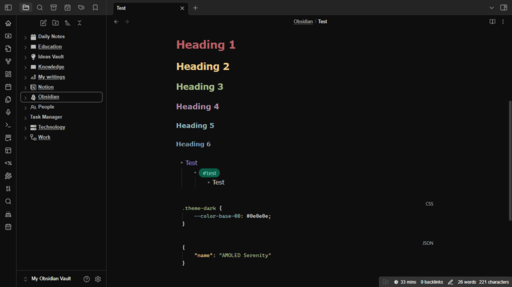
GithubAMOLED Serenity is a dark Obsidian theme built for screens that can switch a pixel off. Deep blacks, a low-contrast Nord palette, and 160 settings you can change without opening a single line of CSS.
Who this is for
This theme is built for long sessions on a good panel. Specifically:
- Displays with a contrast ratio above 1:3000. OLED, AMOLED, and the better VA panels. On those,
#0e0e0ereads as genuinely black and the dark greys stay separate from it. - People who stare at notes for hours. The palette is deliberately low-contrast. Pure white text on pure black is the harshest combination a screen can produce, so the body text sits at
#ddddddinstead, and the accents are Nord rather than anything saturated. - Battery, on OLED. A black pixel on an OLED panel draws no power. On an LCD it draws exactly as much as a white one, because the backlight is on regardless. Physics does not care which theme you picked.
Now, the honest caveat. On a cheap IPS panel with a 1:800 contrast ratio, the darker greys smear into the background and the sidebar looks like it is switched off. That is a display limitation, not a bug, and it is fixable: open Text Colors and Sidebar and Navigation in Style Settings and raise them. Every one of those values is exposed for exactly this reason.
Features
- Real AMOLED black.
--color-base-00drives every surface, so nothing is "nearly" black while one panel stays grey. There is a toggle for true#000000if you want it. - Nord accent palette. Six accents plus two frost tones, all adjustable.
- 160 Style Settings controls, including on/off toggles for each styled area. Colors, fonts, sizes, spacing, radii, scrollbars, callouts, tables, code syntax. The full list is below.
- Three embedded fonts, plus a free-text field for any font installed on your system.
- Custom background images, with opacity and blur, off by default.
- Contrast you can raise. Text, sidebar, tab, and icon colors are all individually exposed.
- Callouts, tables, canvas and graph view are all themed and all adjustable.
Installation
From Obsidian
Settings → Appearance → Themes → Manage → search AMOLED Serenity → Use.
Manually
git clone https://github.com/darthdemono/AMOLED-Serenity.git
Copy theme.css and manifest.json into <your vault>/.obsidian/themes/AMOLED Serenity/, then pick the theme under Settings → Appearance.
N.B: The folder name has to be exactly AMOLED Serenity. Obsidian matches it against the name field in manifest.json, and it will silently ignore the theme if they disagree.
Customization
Install the Style Settings plugin, then open Settings → Style Settings → AMOLED Serenity. Everything below is there. Nothing requires editing CSS.
Every setting writes to a CSS variable, listed in the tables so you can override it in a snippet if you prefer that. The theme is checked on every build to make sure each control writes a variable that something actually reads, which was not true before version 1.2.0.
The two things worth knowing first
Pure AMOLED Background forces #000000 everywhere and overrides your Base Dark choice while it is on. That is intended. If you want a custom background color, leave this toggle off and set Base Dark instead.
Custom fonts beat the dropdowns. Each font has a dropdown and a free-text field. Fill in the text field and it wins; leave it empty and the dropdown applies. So you are not limited to the list.
Custom background images
Turn on Custom Background Image, then put a URL in Background Image URL. It has to keep the url() wrapper:
url("app://local/C:/Users/you/Pictures/wall.jpg")
On Linux and macOS the path looks like url("app://local/home/you/Pictures/wall.jpg"). Remote URLs work too.
Then set opacity. The default is 0.25 and that is deliberate: this is an AMOLED theme, and anything above roughly 0.4 lights up every pixel behind your notes and throws away the reason you installed it. Blur is there if the image competes with your text.
The image sits on a fixed layer behind the workspace, and the app chrome is made transparent so it shows through. When the toggle is off, none of that CSS applies.
Every setting
160 controls, grouped as they appear in the Style Settings panel.
Features
| Setting | Control | Default | Variable | Notes |
|---|---|---|---|---|
| Pure AMOLED Background | toggle | off |
(class) | Force true black (#000000) everywhere. Overrides Base Dark below. |
| Style Tables | toggle | on |
(class) | Turn off to fall back to Obsidian's own table appearance. |
| Style Callouts | toggle | on |
(class) | Turn off to restore Obsidian's callout padding, radius, border and background tint. Callout colours still follow the accent palette, because Obsidian derives them from it. |
| Style Canvas | toggle | on |
(class) | Turn off to restore Obsidian's canvas background, dot grid and card labels. |
| Style Graph View | toggle | on |
(class) | Turn off to restore Obsidian's graph view colours. |
| Custom Background Image | toggle | off |
(class) | Show an image behind the workspace. Turn this on, then set the URL below. |
| Background Image URL | text | none |
--custom-bg-image |
Example: url("app://local/C:/Users/you/Pictures/bg.jpg"). Keep the url("...") wrapper. Use "none" to disable. |
| Background Image Opacity | slider | 0.25 (0–1) |
--custom-bg-opacity |
Lower keeps text readable. This is an AMOLED theme; anything above ~0.4 costs you the black. |
| Background Image Blur | slider | 0 (0–40) |
--custom-bg-blur |
Blur radius in pixels. |
| Background Image Size | dropdown | cover |
--custom-bg-size |
|
| Background Image Position | dropdown | center |
--custom-bg-position |
Typography
| Setting | Control | Default | Variable | Notes |
|---|---|---|---|---|
| Header Font | dropdown | Inter |
--header-font |
Inter ships with Obsidian. Bricolage Grotesque, Roboto and Montserrat are embedded in this theme. The rest only work if installed on your system. |
| Custom Header Font | text | (empty) |
--header-font-custom |
Any font family installed on your system. Overrides the dropdown above when set. Leave empty to use the dropdown. |
| Body Font | dropdown | Inter |
--body-font |
Roboto and Montserrat are Latin-1 subsets and fall back for accented characters. |
| Custom Body Font | text | (empty) |
--body-font-custom |
Overrides the dropdown above when set. Leave empty to use the dropdown. |
| Monospace Font | dropdown | ui-monospace |
--monospace-font |
Code blocks and inline code. |
| Custom Monospace Font | text | (empty) |
--monospace-font-custom |
Overrides the dropdown above when set. Leave empty to use the dropdown. |
| Editor Font Size | text | 16px |
--font-text-size |
|
| Editor Line Width | text | 700px |
--file-line-width |
Heading Sizes
| Setting | Control | Default | Variable | Notes |
|---|---|---|---|---|
| H1 Font Size | text | 2.2em |
--h1-size |
|
| H2 Font Size | text | 1.8em |
--h2-size |
|
| H3 Font Size | text | 1.5em |
--h3-size |
|
| H4 Font Size | text | 1.3em |
--h4-size |
|
| H5 Font Size | text | 1.1em |
--h5-size |
|
| H6 Font Size | text | 1em |
--h6-size |
Heading Colors
| Setting | Control | Default | Variable | Notes |
|---|---|---|---|---|
| H1 Color | colour | var(--red) |
--h1-color |
|
| H2 Color | colour | var(--yellow) |
--h2-color |
|
| H3 Color | colour | var(--green) |
--h3-color |
|
| H4 Color | colour | var(--purple) |
--h4-color |
|
| H5 Color | colour | var(--frost0) |
--h5-color |
|
| H6 Color | colour | var(--frost2) |
--h6-color |
Note Title
| Setting | Control | Default | Variable | Notes |
|---|---|---|---|---|
| Inline Title Color | colour | var(--text-primary) |
--inline-title-color |
|
| Inline Title Size | text | 2.2em |
--inline-title-size |
|
| Inline Title Weight | text | 700 |
--inline-title-weight |
Accent Colors
| Setting | Control | Default | Variable | Notes |
|---|---|---|---|---|
| Primary Accent | colour | var(--frost0) |
--primary-accent |
Links, active states and interactive highlights. |
| Secondary Accent | colour | var(--frost2) |
--secondary-accent |
Hover state for the above. |
| Red | colour | #bf616a |
--red + --red-rgb |
Also writes --red-rgb, which feeds Obsidian's own colour palette and so drives callouts and canvas colours. |
| Orange | colour | #d08770 |
--orange + --orange-rgb |
Also writes --orange-rgb, which feeds Obsidian's own colour palette and so drives callouts and canvas colours. |
| Yellow | colour | #ebcb8b |
--yellow + --yellow-rgb |
Also writes --yellow-rgb, which feeds Obsidian's own colour palette and so drives callouts and canvas colours. |
| Green | colour | #a3be8c |
--green + --green-rgb |
Also writes --green-rgb, which feeds Obsidian's own colour palette and so drives callouts and canvas colours. |
| Purple | colour | #b48ead |
--purple + --purple-rgb |
Also writes --purple-rgb, which feeds Obsidian's own colour palette and so drives callouts and canvas colours. |
| Cyan Frost | colour | #8fbcbb |
--frost0 + --frost0-rgb |
Also writes --frost0-rgb, which feeds Obsidian's own colour palette and so drives callouts and canvas colours. |
| Blue Frost | colour | #81a1c1 |
--frost2 + --frost2-rgb |
Also writes --frost2-rgb, which feeds Obsidian's own colour palette and so drives callouts and canvas colours. |
Base Colors
The greyscale ramp. Base Dark is the page background; the rest step up toward white.
| Setting | Control | Default | Variable | Notes |
|---|---|---|---|---|
| Base Dark (background) | colour | #0e0e0e |
--color-base-00 |
|
| Darker Secondary | colour | #343434 |
--color-base-05 |
|
| Slightly Lighter Dark | colour | #242424 |
--color-base-10 |
|
| Even Lighter Dark | colour | #1a1a1a |
--color-base-20 |
|
| Soft Highlight | colour | #262626 |
--color-base-25 |
|
| Dark Gray | colour | #333333 |
--color-base-30 |
|
| Medium Dark | colour | #363636 |
--color-base-35 |
|
| Mid-Tone Gray | colour | #4a4a4a |
--color-base-40 |
|
| Light Gray | colour | #666666 |
--color-base-50 |
|
| Lighter Gray | colour | #999999 |
--color-base-60 |
|
| Almost White Gray | colour | #bbbbbb |
--color-base-70 |
|
| Very Light Gray | colour | #dddddd |
--color-base-80 |
|
| Almost White | colour | #eeeeee |
--color-base-90 |
|
| Pure White | colour | #ffffff |
--color-base-100 |
Text Colors
Raise these if you are on a panel with a contrast ratio below about 3000:1, where the darker greys stop separating from the background.
| Setting | Control | Default | Variable | Notes |
|---|---|---|---|---|
| Primary Text | colour | var(--color-base-80) |
--text-primary |
|
| Secondary Text | colour | var(--color-base-60) |
--text-secondary |
Muted text: metadata, inactive tabs, sidebar detail. |
| Faint Text | colour | var(--color-base-50) |
--text-tertiary |
Line numbers and the dimmest UI text. |
| Error Text | colour | var(--red) |
--text-error |
|
| Warning Text | colour | var(--yellow) |
--text-warning |
|
| Bold Text | colour | var(--color-base-100) |
--bold-color |
|
| Italic Text | colour | var(--frost0) |
--italic-color |
|
| Highlight Background | colour | rgba(235, 203, 139, 0.35) |
--text-highlight-bg |
Sidebar and Navigation
The file explorer, outline and tab headers. Raise these if the sidebar reads too dark.
| Setting | Control | Default | Variable | Notes |
|---|---|---|---|---|
| Sidebar Text | colour | var(--color-base-70) |
--nav-item-color |
|
| Sidebar Text (hover) | colour | var(--color-base-90) |
--nav-item-color-hover |
|
| Sidebar Text (active) | colour | var(--color-base-100) |
--nav-item-color-active |
|
| Sidebar Background (hover) | colour | var(--color-base-20) |
--nav-item-background-hover |
|
| Sidebar Background (active) | colour | var(--color-base-25) |
--nav-item-background-active |
|
| Sidebar Font Size | text | 14px |
--nav-item-size |
|
| Sidebar Font Weight | text | 400 |
--nav-item-weight |
|
| Indentation Guide | colour | var(--color-base-30) |
--nav-indentation-guide-color |
|
| Icon Color | colour | var(--color-base-70) |
--icon-color |
|
| Icon Color (hover) | colour | var(--color-base-90) |
--icon-color-hover |
|
| Icon Color (active) | colour | var(--primary-accent) |
--icon-color-active |
|
| Tab Text | colour | var(--color-base-60) |
--tab-text-color |
|
| Tab Text (active) | colour | var(--color-base-90) |
--tab-text-color-active |
|
| Titlebar Text | colour | var(--text-primary) |
--titlebar-text-color |
|
| Pane Divider | colour | var(--color-base-20) |
--divider-color |
Buttons
| Setting | Control | Default | Variable | Notes |
|---|---|---|---|---|
| Button Background | colour | var(--background-primary) |
--button-background |
|
| Button Text | colour | var(--color-base-80) |
--button-text |
|
| Button Border | colour | var(--background-primary) |
--button-border |
Selection and Focus
| Setting | Control | Default | Variable | Notes |
|---|---|---|---|---|
| Focus Border | colour | var(--purple) |
--focus-border |
|
| Selection Background | colour | rgba(163, 190, 140, 0.35) |
--selection-background |
Background behind selected text. |
Markdown Elements
| Setting | Control | Default | Variable | Notes |
|---|---|---|---|---|
| Blockquote Text | colour | var(--text-secondary) |
--blockquote-color |
|
| Blockquote Border | colour | var(--purple) |
--blockquote-border-color |
|
| Blockquote Border Thickness | text | 3px |
--blockquote-border-thickness |
|
| Horizontal Rule | colour | var(--color-base-30) |
--hr-color |
|
| Horizontal Rule Thickness | text | 2px |
--hr-thickness |
|
| List Bullet | colour | var(--color-base-60) |
--list-marker-color |
|
| Tag Text | colour | var(--frost0) |
--tag-color |
|
| Tag Background | colour | rgba(143, 188, 187, 0.15) |
--tag-background |
|
| Checkbox Fill | colour | var(--primary-accent) |
--checkbox-color |
|
| Checkbox Tick | colour | var(--color-base-00) |
--checkbox-marker-color |
|
| Checkbox Border | colour | var(--color-base-40) |
--checkbox-border-color |
Tables
| Setting | Control | Default | Variable | Notes |
|---|---|---|---|---|
| Header Styling | toggle | on |
(class) | Give the header row its own background and hover colour. |
| Zebra Striping | toggle | on |
(class) | Tint alternating rows. |
| Column Striping | toggle | off |
(class) | Tint alternating columns. Off by default: Obsidian paints column stripes on the cell and row stripes on the row, and the cell wins, so having both on gives you a checkerboard instead of columns. |
| Table Background | colour | rgba(0, 0, 0, 0) |
--table-background |
|
| Header Background | colour | var(--color-base-35) |
--table-header-background |
Sits clearly above both the page background and the row stripe (1.60:1 and 1.44:1). The old value was only 1.12:1 against the stripe, which read as the same shade. |
| Header Background (hover) | colour | var(--color-base-40) |
--table-header-background-hover |
Must be lighter than the header background, not darker. |
| Header Text | colour | var(--text-primary) |
--table-header-color |
|
| Header Weight | text | 600 |
--table-header-weight |
|
| Header Size | text | 0.9em |
--table-header-size |
|
| Cell Text | colour | var(--text-primary) |
--table-text-color |
|
| Cell Text Size | text | 0.95em |
--table-text-size |
|
| Line Height | text | 1.5 |
--table-line-height |
|
| Alternating Row | colour | var(--color-base-20) |
--table-row-alt-background |
Zebra striping. Kept subtle (1.11:1 against the background) because a strong stripe on an AMOLED panel is a row of lit pixels. |
| Row (hover) | colour | var(--color-base-25) |
--table-row-background-hover |
Deliberately the same as the alternating-row hover, so the highlight reads the same whether or not the row is striped. |
| Alternating Row (hover) | colour | var(--color-base-25) |
--table-row-alt-background-hover |
|
| Alternating Column Colour | colour | var(--color-base-10) |
--table-column-alt-color |
Only applies when Column Striping is on. |
| Border | colour | var(--color-base-20) |
--table-border-color |
|
| Border Width | text | 1px |
--table-border-width |
|
| Header Border Width | text | 2px |
--table-header-border-width |
|
| Header Border | colour | var(--color-base-40) |
--table-header-border-color |
Border colour for the header cells. Note that Header Border Width sets the border on TOP of the header row, not under it. |
| Column Max Width | text | none |
--table-column-max-width |
|
| Cell Wrapping | dropdown | normal |
--table-white-space |
|
| Cell Alignment | dropdown | top |
--table-cell-vertical-alignment |
|
| Selection | colour | rgba(143, 188, 187, 0.10) |
--table-selection |
|
| Selection Border | colour | var(--primary-accent) |
--table-selection-border-color |
Code
| Setting | Control | Default | Variable | Notes |
|---|---|---|---|---|
| Code Background | colour | var(--background-primary) |
--code-background |
|
| Default | colour | var(--color-base-80) |
--code-normal |
|
| Comment | colour | var(--color-base-50) |
--code-comment |
|
| Function | colour | var(--yellow) |
--code-function |
|
| Important | colour | var(--orange) |
--code-important |
|
| Keyword | colour | var(--purple) |
--code-keyword |
|
| Property | colour | var(--frost0) |
--code-property |
|
| Punctuation | colour | var(--color-base-60) |
--code-punctuation |
|
| String | colour | var(--green) |
--code-string |
|
| Tag | colour | var(--red) |
--code-tag |
|
| Value | colour | var(--purple) |
--code-value |
Callouts
| Setting | Control | Default | Variable | Notes |
|---|---|---|---|---|
| Corner Radius | text | 8px |
--callout-radius |
|
| Padding | text | 12px 16px |
--callout-padding |
|
| Border Width | text | 1px |
--callout-border-width |
|
| Border Opacity | slider | 0.25 (0–1) |
--callout-border-opacity |
|
| Background Opacity | slider | 0.08 (0–0.4) |
--callout-bg-opacity |
How strongly a callout tints its background. Obsidian hardcodes 0.10; this theme ships 0.08, because a lit background is what an AMOLED theme is trying to avoid. |
| Title Weight | text | 600 |
--callout-title-weight |
|
| Title Padding | text | 0 |
--callout-title-padding |
|
| Content Padding | text | 0 |
--callout-content-padding |
|
| Blend Mode | dropdown | normal |
--callout-blend-mode |
Canvas
Canvas node colours follow the accent palette above, because Obsidian derives them from it.
| Setting | Control | Default | Variable | Notes |
|---|---|---|---|---|
| Canvas Background | colour | var(--background-primary) |
--canvas-background |
|
| Dot Grid | colour | var(--color-base-20) |
--canvas-dot-pattern |
|
| Card Label | colour | var(--text-tertiary) |
--canvas-card-label-color |
|
| Controls Radius | text | 8px |
--canvas-controls-radius |
Graph View
| Setting | Control | Default | Variable | Notes |
|---|---|---|---|---|
| Link Line | colour | var(--color-base-30) |
--graph-line |
|
| Node | colour | var(--color-base-70) |
--graph-node |
|
| Node (focused) | colour | var(--primary-accent) |
--graph-node-focused |
|
| Tag Node | colour | var(--yellow) |
--graph-node-tag |
|
| Attachment Node | colour | var(--purple) |
--graph-node-attachment |
|
| Unresolved Node | colour | var(--color-base-40) |
--graph-node-unresolved |
|
| Node Label | colour | var(--text-primary) |
--graph-text |
Scrollbar
| Setting | Control | Default | Variable | Notes |
|---|---|---|---|---|
| Track | colour | rgba(0, 0, 0, 0) |
--scrollbar-bg |
|
| Thumb | colour | var(--color-base-30) |
--scrollbar-thumb-bg |
|
| Thumb (active) | colour | var(--color-base-40) |
--scrollbar-active-thumb-bg |
Corners
| Setting | Control | Default | Variable | Notes |
|---|---|---|---|---|
| Small Radius | text | 4px |
--radius-s |
|
| Medium Radius | text | 6px |
--radius-m |
|
| Large Radius | text | 10px |
--radius-l |
Status Bar
| Setting | Control | Default | Variable | Notes |
|---|---|---|---|---|
| Status Bar Background | colour | var(--color-base-05) |
--status-bar-background |
|
| Status Bar Foreground | colour | var(--color-base-100) |
--status-bar-foreground |
Callouts, tables, canvas and graph view
All four are themed, all four are adjustable, and all four can be switched off.
Under Features there is a toggle for each: Style Tables, Style Callouts, Style Canvas, Style Graph View. They are on by default. Turn one off and that area falls back to Obsidian's own appearance, using the values read out of Obsidian's own stylesheet rather than an approximation of them.
Switching a feature off also overrides anything you configured for it, instead of leaving half of your changes applied. If Style Tables is off, the table settings do nothing until you turn it back on.
Tables have three further toggles of their own: Header Styling, Zebra Striping, and Column Striping.
Callouts are the interesting case. Obsidian defines fourteen callout types (note, tip, warning, bug, and so on) but it does not give each one its own colour. It derives them from an eight-colour palette: --color-red, --color-orange, --color-yellow, --color-green, --color-cyan, --color-blue, --color-purple, --color-pink.
So this theme overrides the palette rather than the fourteen callout variables. Change Red under Accent Colors and every red callout follows, along with the red canvas nodes and everything else Obsidian tints from it. One control, and the whole app stays consistent.
That also makes it version-proof. Older Obsidian reads the palette as RGB triplets, current Obsidian reads it as hex, and the accent pickers write both. Nothing to keep in sync by hand.
The one thing overridden directly is the callout background tint. Obsidian hardcodes it at 10%, which lights up a block of pixels behind your text. The default here is 8% and it is a slider, so you can take it to zero. That override is wrapped in an @supports check, so builds without color-mix() keep Obsidian's stock behaviour instead of losing the background entirely.
Tables are driven by the 21 table variables Obsidian actually reads — header background and hover, alternating rows and columns, cell text size, line height, wrapping, vertical alignment, selection colour, border widths. No custom selectors, so an Obsidian update cannot break them.
Canvas gets its background, dot grid, card label colour, and control radius. Node colours follow the accent palette, same as callouts.
Graph view gets all seven of its variables: link lines, ordinary nodes, focused nodes, tag nodes, attachment nodes, unresolved nodes, and label text.
N.B: None of this is done with hand-written selectors matching Obsidian's internal class names. It is variables the whole way down, which is why it keeps working when Obsidian ships a new version and renames a container.
Fonts
Three fonts are embedded in theme.css as base64. They are opt-in. The default is Inter, which ships with Obsidian, so a fresh install loads none of them.
| Font | Coverage | Weights | Notes |
|---|---|---|---|
| Inter | Full | All | Default. Ships with Obsidian, costs nothing. |
| Bricolage Grotesque | Latin-1 + most of Latin Extended-A | Variable, 200–800 | A variable font, with width and optical size axes as well. |
| Roboto | Latin-1 only | 400 | Subset. 228 glyphs. |
| Montserrat | Latin-1 only | 400 | Subset. 243 glyphs. |
Roboto and Montserrat are subsets, so anything outside Latin-1 falls back to another font mid-word. If you write Polish, Czech, Turkish, Hungarian, or any Baltic language, use Inter or Bricolage Grotesque. The unicode-range in the CSS declares this, so the fallback is clean rather than a row of boxes.
The dropdowns also list system fonts (Georgia, Segoe UI, JetBrains Mono, and others). Those only work if the font is installed on your machine. If it is not, Obsidian falls back and nothing breaks.
For anything not in the list, use the Custom Header Font, Custom Body Font, and Custom Monospace Font fields. Type the family name exactly as the system reports it.
Editing the CSS directly
If you would rather not use the plugin, the variables are all at the top of theme.css under .theme-dark:
--color-base-00through--color-base-100— the greyscale ramp.00is the background.--red,--orange,--yellow,--green,--purple,--frost0,--frost2— the Nord accents.--primary-accent/--secondary-accent— links, active states, hover.--text-primary,--text-secondary,--text-tertiary— the text ramp, brightest to dimmest.
Below those sits a block labelled Obsidian core variable mapping. Leave it alone unless you know why you are changing it. Those lines alias the theme's own names onto the variables Obsidian actually paints with, and they are the reason the settings above them do anything at all.
Building
theme.css is generated. Do not hand-edit the @settings block or the .theme-dark block — edit dev/theme_spec.py and regenerate:
pip install pyyaml tinycss2 fonttools brotli
python3 dev/build_theme.py      # regenerate theme.css from the spec
python3 dev/build_docs.py       # regenerate the settings table in this README
python3 dev/validate_theme.py   # 12 checks, exits non-zero on failure
Both the settings panel and the CSS variables come from one table, which is what stops a control from writing a variable nothing reads. The validator also confirms the embedded fonts still decode after any edit. build_theme.py reads the font blobs back out of the existing theme.css, so the payload is never re-encoded and the build is reproducible byte-for-byte.
What is not covered
Light mode. Everything lives under .theme-dark, so switching Obsidian to light mode gives you stock Obsidian. This is an AMOLED theme and a white AMOLED theme would be a contradiction.
Inspiration
- SakuraIsayeki's Vanilla AMOLED Theme
- Sskki-exe's Vanilla AMOLED Theme Color
- Insanum's Obsidian Nord Theme
- VSCode Amoled Black Theme
- Colineckert's Obsidian Things Theme
Changelog
1 September 2026 (1.5.0)
- Feature toggles. Tables, callouts, canvas and graph view can each be switched off, falling back to Obsidian's own appearance. All on by default.
- Table sub-toggles: Header Styling, Zebra Striping, and Column Striping (off by default, for the reason in 1.4.1).
- Switching a feature off overrides anything you set for it in Style Settings, rather than half-applying. Off means off.
- The off states restore Obsidian's real defaults, read out of its stylesheet rather than guessed.
1 September 2026 (1.4.2)
- Table headers are now visibly distinct. The header sat at 1.12:1 against the row stripe, which reads as the same shade. It is now
#363636: 1.60:1 against the page and 1.44:1 against the stripe. - Fixed header hover going the wrong way. Hover was darker than the header itself, so hovering dimmed it. It is now lighter.
- Fixed header hover not working at all. The header-background rule added in 1.4.1 outranked Obsidian's own hover rule and suppressed it. Restated at higher specificity.
- Added Header Border, so header and body are separated by a rule as well as a fill.
1 September 2026 (1.4.1)
- Fixed the checkerboard pattern in tables. Row striping and column striping were both switched on. Obsidian paints row stripes on the row and column stripes on the cell, and the cell wins, so odd rows came out solid and even rows came out checkered. Column striping is now off by default, which is Obsidian's own default, and it is still there as a setting if you want it.
- Fixed the table header losing every second cell. Obsidian applies the alternating-column background to
<th>too, and that rule outranks the header background. With column striping off it would have blanked every second header cell. The header background is now reasserted at matching specificity. - Softened the row stripe from
#242424to#1a1a1a(1.11:1 against the background). A strong stripe on an AMOLED panel is a row of lit pixels. - Row hover is now uniform whether or not the row is striped.
1 September 2026 (1.4.0)
- Callouts, tables, canvas and graph view are themed. 32 new controls. All of it driven by Obsidian's own variables, with no hand-written selectors, so an Obsidian update cannot break it.
- Accent colors now drive the whole app. The seven accents each write both a hex value and an RGB triplet, and those feed Obsidian's eight-color palette. Change Red once and every red callout, canvas node and tinted surface follows, on old and current Obsidian alike.
- Callout background tint is adjustable and defaults to 8% rather than Obsidian's hardcoded 10%.
- 21 table controls, 7 graph view controls, 4 canvas controls.
- Author details updated.
1 September 2026 (1.3.0)
- 120 Style Settings controls, up from 22. New groups: Sidebar and Navigation, Markdown Elements, Tables, Code, Callouts, Scrollbar, Corners, and Note Title.
- Fixed the sidebar being too dark. File explorer text ran at a 3.36:1 contrast ratio against the background. It now runs at 10.06:1, and hover and active states are separately adjustable.
- Raised the text ramp. Muted text went from 3.36:1 to 6.78:1, and faint text from 2.18:1 to 3.36:1. The old faint value failed WCAG outright, which is a problem on a theme people use at low brightness.
- Custom background images, with opacity, blur, size, and position.
- Custom font fields. Any font on your system, for headers, body, and monospace. The dropdowns gained 22 more options.
- Font licences are now shipped. See below.
- Background reverted to
#0e0e0e. 1.2.0 darkened it to#0a0a0e; that was too far.
1 September 2026 (1.2.0)
- Fixed Style Settings. A duplicate, non-functional block of
--style-settings-*declarations was removed, and the real block gained the base, text, button, and selection groups that had been advertised but were unreachable. - Fixed the accent colors. Primary and Secondary Accent wrote variables that nothing read, so changing them did nothing at all. They now drive links, hover states, and interactive highlights.
- Fixed Pure AMOLED Background. The selector was a descendant combinator, but Style Settings applies its class to the same element that carries
.theme-dark, so it never matched once. - Fixed theme variables not reaching Obsidian. Text, selection, focus, border, and interactive colors were declared under names Obsidian does not read.
- Fixed the embedded fonts. Bricolage Grotesque is a variable font declared without weight descriptors, which pins it to its default instance — ExtraBold 800. It would have rendered every glyph extra-bold.
- Heading sizes gained real defaults, so the settings panel stopped reporting values the theme was not using.
31 January 2025 (1.1.0)
- Style Settings compatibility introduced.
- Improved code syntax highlighting.
- Optimized performance.
Licence
The theme is MIT.
The three fonts embedded in theme.css are not. Bricolage Grotesque and Montserrat are under the SIL Open Font License 1.1; Roboto is under Apache 2.0. If you fork this theme or vendor theme.css into something else, you are redistributing those fonts and their licences come with them.
THIRD-PARTY.md— per-font copyright, designer, licence, and what was modified.LICENSES/— the full licence texts.
Author
darthdemono — https://darthdemono.com
Open an issue for bugs or requests. If a setting does not do what its name says, that is a bug and I want to know.