
README file from
GithubWrapper Icon
Render Iconify icons with custom inline text in your notes, using locally downloaded icon sets — no internet connection needed once the icons are saved.

`/ico mdi:home;Home`
is rendered as an inline Home label with the mdi:home icon in front of it. The icon is fetched from a local Iconify JSON file and wrapped together with your text, so both stay on one line.
Features
- Inline icon + text wrapper — write
`/ico <set>:<icon>;<text>`in any note and it renders as a single inline element. - Fully offline — icons are stored as local JSON files inside the plugin folder. Nothing is fetched from the network while reading or editing.
- Icon set downloader — search Iconify collections from the settings tab or a command and download them as offline JSON.
- Live Preview support — icons render directly in the editor; click one to jump back to the source and edit it.
- Reading View support — icons also render in Reading View via a Markdown post-processor.
- Autocomplete — start typing
`/icoand the plugin suggests icons from your downloaded sets. - Customizable delimiter — choose the separator between the icon name and the text (default
;).
Installation
Copy main.js, manifest.json, and styles.css to your vault:
<VaultFolder>/.obsidian/plugins/wrapper-icon/
Then enable Wrapper Icon in Settings → Community plugins.
Usage
Use the icon inside a code span with this syntax:
`/ico <icon-set>:<icon-name><delimiter><text>`
<icon-set>— the Iconify collection prefix (e.g.mdi,lucide,ph).<icon-name>— an icon name from that collection.<delimiter>— the separator character,;by default (configurable in settings).<text>— the text shown next to the icon. Can be empty to show only the icon.
Examples:
`/ico mdi:home;Home`
`/ico lucide:user;Profile`
`/ico ph:check-circle`
⚠️ The
<icon-set>:<icon-name>prefix is required — the plugin only renders icons that are present in your locally downloaded sets.
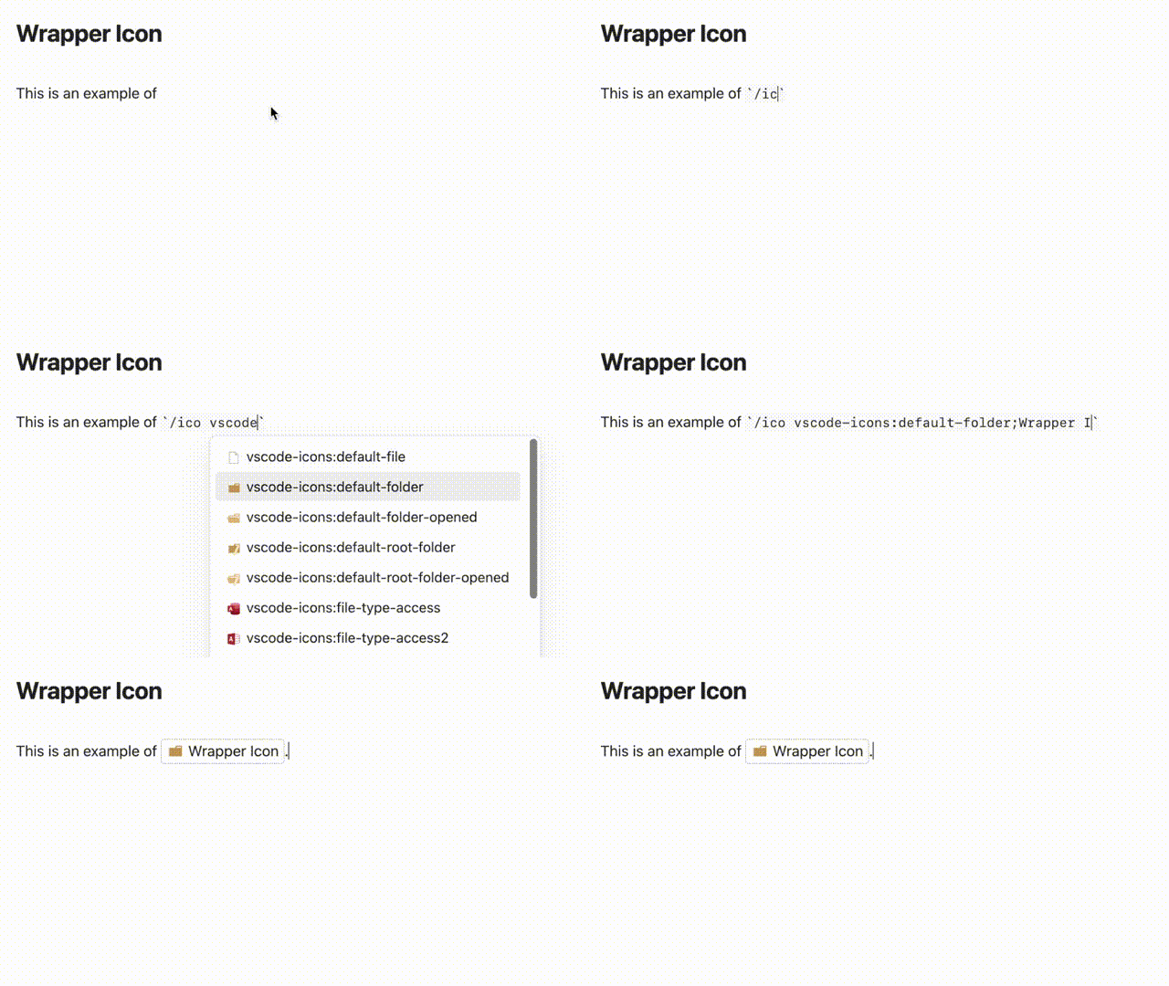
Example in GIF:
In the editor
- Live Preview: icons are rendered inline as you type. Click a rendered icon to select and edit its source.
- Source mode: write the raw
`/ico ...`text. - Autocomplete: type
`/icoand pick an icon from the suggestion popup; the delimiter is inserted automatically.
Getting started: download an icon set
Icon sets are downloaded from the official @iconify-json packages (via jsDelivr, falling back to unpkg). This is the only step that needs a network connection.
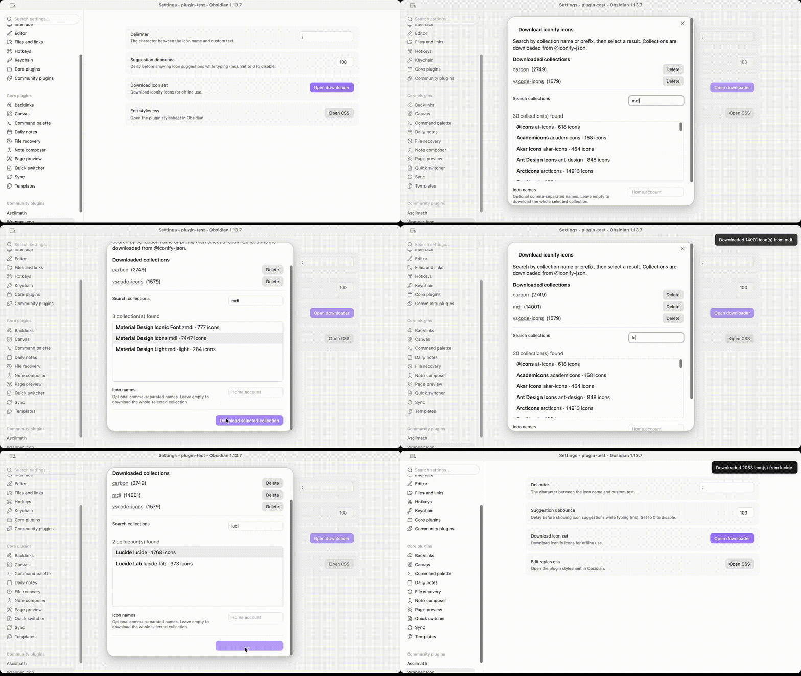
- Run the command Download iconify icon set, or go to Settings → Wrapper Icon → Download icon set.
- Search for a collection (by name or prefix), e.g.
Material Design Icons. - Select the collection. Optionally enter a comma-separated list of icon names (leave empty to download the whole collection — some collections are large).
- Click Download selected collection.
The set is saved to .obsidian/plugins/wrapper-icon/assets/<prefix>.json and is available immediately, offline.
To add icons to an already downloaded set, delete the set from the downloader (or the assets folder) and download it again.
Example in GIF:
Settings
| Setting | Description |
|---|---|
| Delimiter | The character between the icon name and the custom text (default ;). |
| Suggestion debounce | The delay (in milliseconds) before the autocomplete suggestions appear. |
| Download icon set | Opens the Iconify collection downloader. |
| Edit styles.css | Opens the plugin stylesheet (desktop only) so you can customize icon size, color, and layout. |
Commands
| Command | Description |
|---|---|
| Reload local icon sets | Re-reads the JSON files in assets/, picking up sets added or changed manually. |
| Download iconify icon set | Opens the collection downloader. |
Customizing the style
By default each wrapper is drawn with a thin dashed outline (0.5px dashed, 0.25rem radius) and the icon uses currentColor, sized relative to the surrounding text. To change this, edit styles.css (button in settings) or add your own CSS targeting the .plug-wrap-icon / .plug-wrap-icon-icon classes, e.g. to remove the outline and recolor/resize the icon:
.plug-wrap-icon {
  border: none;
  padding: 0;
}
.plug-wrap-icon-icon {
  color: var(--text-accent);
  width: 1.4em;
  height: 1.4em;
}
Development
This plugin is built with TypeScript and esbuild. Requires Node.js 18+.
npm install       # install dependencies
npm run dev       # compile in watch mode
npm run build     # type-check (tsc) and produce a production build in main.js
npm run lint      # oxlint check
npm run format    # format source files with oxfmt
Release
- Bump the version in
manifest.json(SemVer) andversions.json, or runnpm version patch|minor|major. - Create a GitHub release tagged with the exact version (no leading
v) and attachmain.js,manifest.json, andstyles.css.