
README file from
GithubMaterial Icons Inline
Render Google Material Icons in Obsidian using the !icon[name] markdown syntax.
Demo
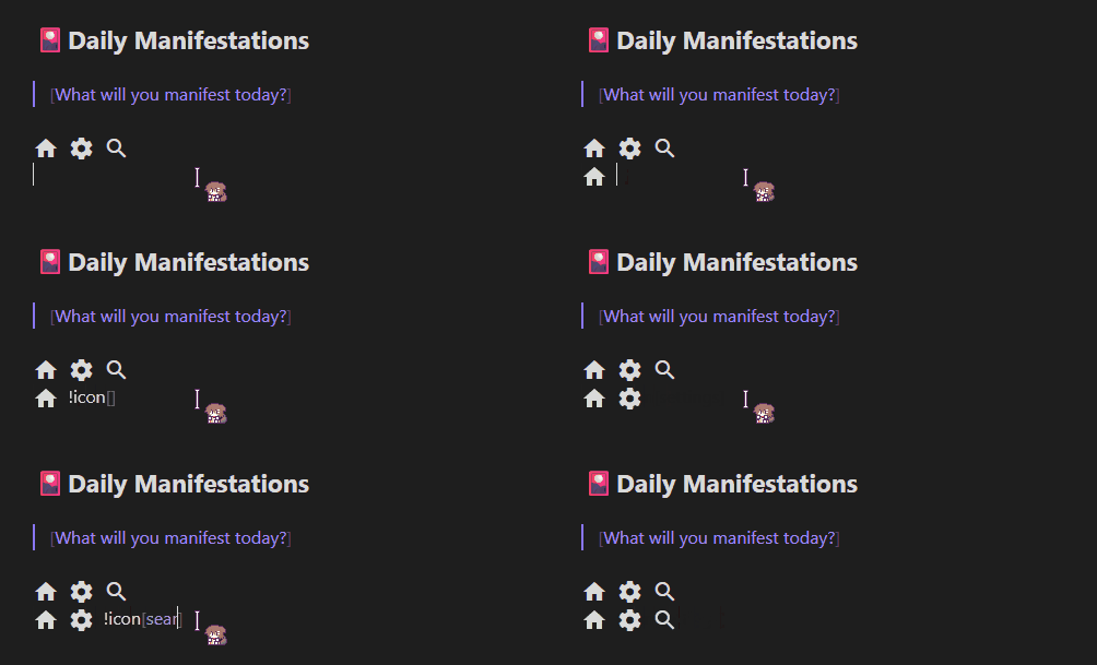
Note: The animated mouse cursor seen in the demo is by Haku.
Features
- Live Preview — icons render as you type; click to reveal raw syntax, click away to render again
- Reading view — icons render in reading view and exported notes
- 2,500+ icons — full Google Material Icons library
- Simple syntax —
!icon[home],!icon[settings],!icon[check_circle] - Configurable — set any CSS size or color via plugin settings
- Works offline — the icon font is bundled with the plugin; no network requests, no API key
Installation
Via Community Plugins (recommended)
- Open Obsidian → Settings → Community plugins → Browse
- Search for Material Icons Inline
- Click Install, then Enable
Manual
- Download
main.js,manifest.jsonandstyles.cssfrom the latest release - Copy the three files to
<vault>/.obsidian/plugins/material-icons-inline/ - Enable the plugin under Settings → Community plugins
Build from Source
git clone https://github.com/meiorz/material-icons-obsidian
cd material-icons-obsidian
npm install
npm run build
Copy main.js, manifest.json and styles.css to your vault's plugin folder.
Usage
Syntax
!icon[icon_name]
Icon names are lowercase with underscores, matching the names shown on the Google Material Icons site.
Examples
!icon[home] Home
!icon[settings] Settings
!icon[search] Search
!icon[check_circle] Task completed
!icon[error] Something went wrong
!icon[arrow_forward] Next  !icon[arrow_back] Previous
Finding Icon Names
- Visit Google Material Icons
- Search for the icon you want
- Copy the name shown below it — uses underscores, all lowercase
- Example: "Check Circle" →
!icon[check_circle]
Live Preview Behavior
In the editor, icons behave like Obsidian's image embeds:
| State | What you see |
|---|---|
| Cursor elsewhere | Rendered icon |
Cursor inside !icon[...] |
Raw syntax |
This lets you edit the icon name without switching modes.
Settings
Access via Settings → Material Icons Inline.
| Setting | Default | Accepts |
|---|---|---|
| Icon Size | 24px |
Any CSS length: 16px, 1.5em, 2rem |
| Icon Color | currentColor |
Any CSS color: red, #ff0000, rgb(255,0,0) |
Invalid values fall back to the default silently.
How It Works
- Font loading — The Material Icons font is embedded in
styles.css(generated at build time fromstyles.src.css), which Obsidian loads and unloads with the plugin. No network requests are made. - Live Preview — A CodeMirror 6
ViewPluginscans visible text for!icon[name]patterns and replaces them withDecoration.replacewidgets. Decorations are removed when the cursor enters the token range, revealing the raw syntax. - Reading view — A markdown post-processor uses
TreeWalkerto find text nodes and replaces each match with an<i class="material-icons-inline">element viaDocumentFragment. - Styling — Icon size and color are passed to
styles.cssas the CSS variables--material-icons-inline-sizeand--material-icons-inline-color.
Customization
Change the Syntax
Edit the regex in parseAndCreateIconHTML() and buildDecorations() in main.ts:
// Current: !icon[home]
const iconRegex = /!icon\[([a-z0-9_]+)\]/g;

// Alternative: {{icon:home}}
const iconRegex = /{{icon:([a-z0-9_]+)}}/g;
Change Default Size or Color
Edit DEFAULT_SETTINGS in main.ts:
const DEFAULT_SETTINGS: MaterialIconsSettings = {
    iconSize: '20px',
    iconColor: 'currentColor'
}
Testing
npm test              # run all tests
npm run test:watch    # watch mode
npm run test:coverage # coverage report
Troubleshooting
Icons not showing in editor
- Confirm the plugin is enabled under Settings → Community plugins
- Make sure you are in Live Preview mode, not Source mode (Source mode does not render decorations)
- Reload the vault with
Ctrl+R
Icons not showing in reading view
- Make sure
styles.cssis in the plugin folder next tomain.js(it contains the icon font) - Reload the vault with
Ctrl+R
Wrong icon appears
- Double-check the name at Google Material Icons
- Names must be lowercase with underscores:
check_circlenotcheck circleorCheck_Circle
Settings change not reflected
- Settings apply on next render; toggle reading view or move the cursor out of the icon token to refresh
Common Icons
| Syntax | Description |
|---|---|
!icon[home] |
Home |
!icon[settings] |
Settings |
!icon[search] |
Search |
!icon[edit] |
Edit |
!icon[delete] |
Delete |
!icon[check_circle] |
Done / Completed |
!icon[error] |
Error |
!icon[warning] |
Warning |
!icon[info] |
Information |
!icon[favorite] |
Favorite |
!icon[bookmark] |
Bookmark |
!icon[arrow_forward] |
Next |
!icon[arrow_back] |
Previous |
!icon[download] |
Download |
!icon[upload] |
Upload |
!icon[star] |
Star |
Acknowledgements
-
Mouse Cursor: The 戌神ころね (Inugami Korone) animated mouse cursor seen in
demo.gifis created by Haku and is not affiliated with this plugin. You can download the cursor here. -
Icon font: Material Icons by Google, licensed under the Apache License 2.0. The font is bundled from the
material-iconsnpm package.
License
MIT
Author
Contributing
Pull requests and issues welcome.