
README file from
GithubInteractive Grid
Arrange an itinerary, schedule, seating chart, or storyboard inside an Obsidian note. Give rows and columns your own labels, add notes under column headings, and lay out colored cards across one or more cells. The grid lives in the note and works offline.
Upgrading from 1.0.0? If you already made a grid, convert its opening fence so it renders in 1.1.0.
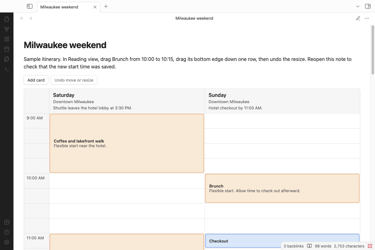
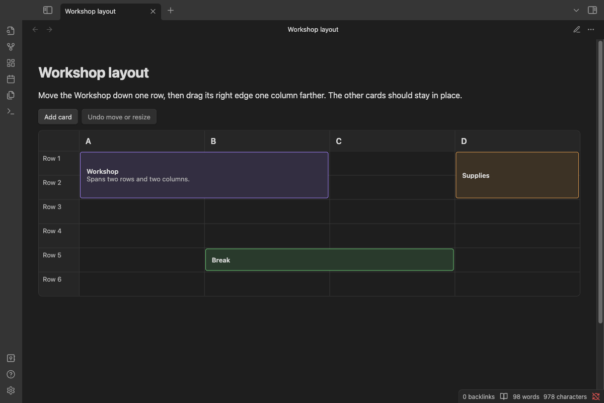
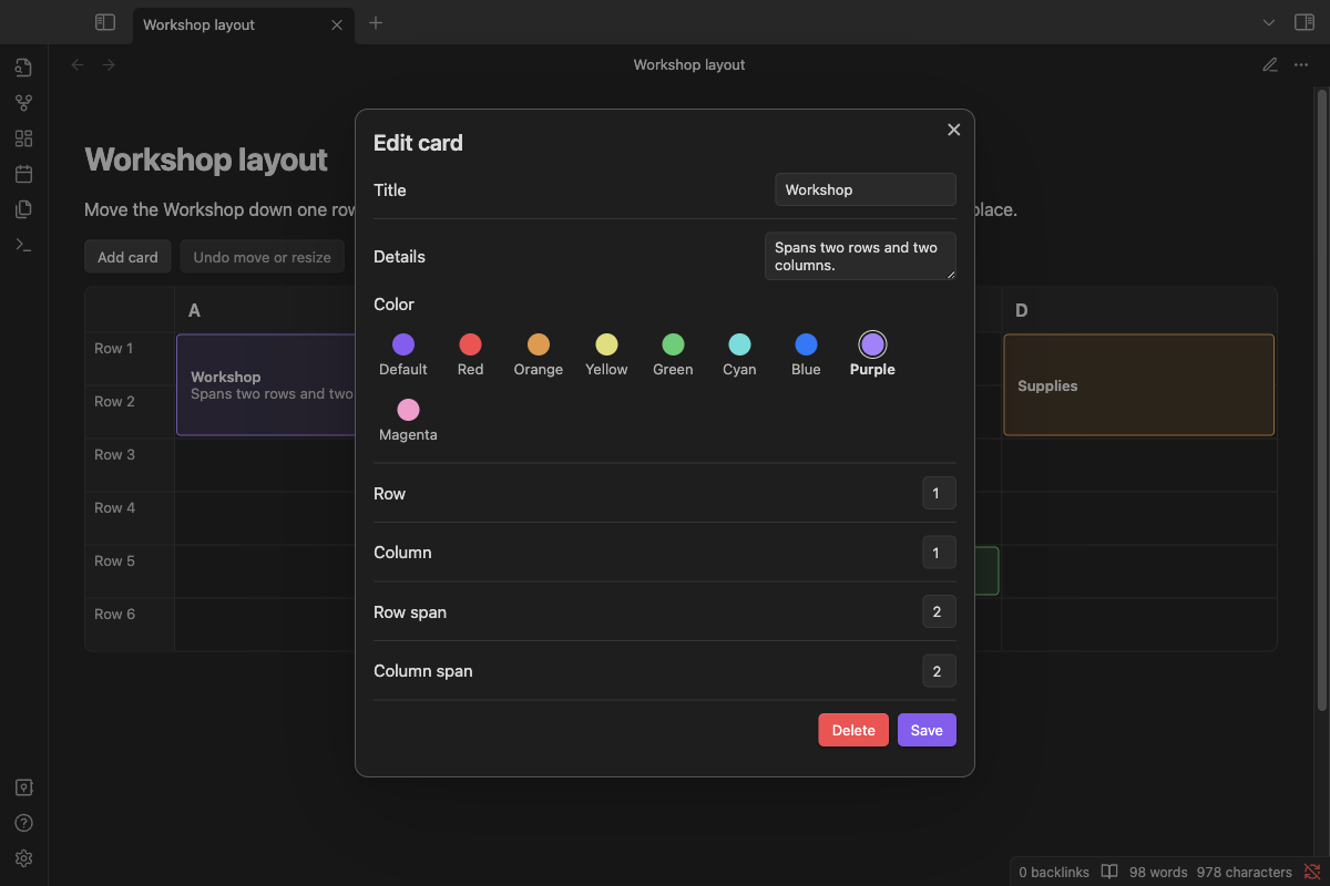
Try the demo
Run npm ci and npm run demo from the repository. Open the test-vault folder as a vault in Obsidian and enable Interactive Grid under Settings → Community plugins if prompted. Open Milwaukee weekend in Reading view for the sample itinerary or Workshop layout for a card spanning rows and columns.
For manual installation in another vault, copy the release's main.js, manifest.json, and styles.css into .obsidian/plugins/interactive-grid/ and enable Interactive Grid.
Create a grid
Paste a top-level fenced interactive-grid block into a note, then open Reading view or move the Live Preview cursor outside the block.
```interactive-grid
{
  "id": "weekend",
  "rows": ["10:00", "", "10:30", ""],
  "columns": [
    { "label": "Saturday", "note": "Meet in the lobby." },
    { "label": "Sunday", "note": "Checkout by 11." }
  ],
  "cards": [
    {
      "id": "brunch",
      "title": "Brunch",
      "details": "Flexible start.",
      "color": "orange",
      "row": 1,
      "column": 2,
      "rowSpan": 2,
      "columnSpan": 1
    }
  ]
}
```
Use a unique grid ID per note and a unique card ID per grid. Coordinates start at 1. The row and column arrays determine the size, up to 500 rows and 50 columns. Empty row labels hide the text while retaining the row. Column notes and card details are optional plain text. The color palette includes Default (your theme accent), Red, Orange, Yellow, Green, Cyan, Blue, Purple, and Magenta. Use the lowercase name when editing the block directly.
Upgrade grids from 1.0.0
Version 1.1.0 uses the interactive-grid fence to avoid conflicts with other plugins. If you created grids in 1.0.0, open each affected note and run Interactive Grid: Convert legacy grid blocks in current note from the command palette. It changes only the opening label on valid Interactive Grid blocks in that note. Card content, colors, and positions are preserved.
You can also change the opening label from grid to interactive-grid by hand in Source mode. New grids already using interactive-grid are ready to use.
Arrange cards
- Choose Add card or double-click an empty cell. Click or tap a card to edit its content, color, or position.
- Drag a card body to move it. Drag any of its four edges to resize it. The outline shows the snapped position. A red outline indicates an invalid position.
- With the keyboard, tab to the card or an edge and use the arrow keys to move or resize one cell at a time. Press Enter on the card to open its editor. The position fields also work for precise edits on touchscreens.
- Undo move or resize restores the previous position in the current session. The button is available while the grid still matches the saved move or resize.
- Each cell can belong to one card. Invalid drops leave the card and its neighbors in place.
Edits are saved to the code block. If its source changes before a write, reopen the note and retry. Use Source mode to edit labels or other grid settings directly.
Development
npm run check runs the official Obsidian ESLint rules, unit tests, TypeScript compilation, and release checks. npm run package stages the three release assets. See RELEASING.md for the desktop smoke test and publication steps.
MIT licensed. See LICENSE and third-party notices.