
README file from
GithubFlexible Tasks
An Obsidian plugin for interactive task checkboxes inside Markdown table cells — and custom task statuses everywhere, rendered by your theme.
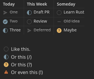
Why
A Markdown table cell is inline-only, so a task like - [ ] One written in a cell renders as dead text: Obsidian never turns it into a checkbox, and task plugins skip it. Flexible Tasks turns those cell tasks into real, interactive checkboxes and writes toggles back to the source file. It also adds a right-click status menu to ordinary block-list tasks, so you can set any status without retyping the marker.
Features
- Checkboxes in table cells — the thing the Markdown format won't do. Click to toggle, right-click to set any status.
- Custom statuses —
[ ],[x],[/],[-],[>],[?],[!], and any other single character round-trip faithfully in the source. - Renders in both Reading view and Live Preview.
- Defers to your theme. The plugin puts a real checkbox carrying
data-task="<char>"in place; your checkbox theme draws the status icon. Nothing is overridden. - Off-book statuses stand out. A character the plugin doesn't plan for is shown with the Important indicator instead of a plain check, so an unusual status never masquerades as done.
Themes
Status icons are drawn by your checkbox theme, not by the plugin. Flexible Tasks puts a real checkbox carrying data-task="<char>" in place; any theme that styles task statuses from data-task renders the icons.
- Minimal — works out of the box. This is the theme the plugin is developed against.
- Other checkbox themes — many render custom statuses too, but some ship the feature turned off. For example, Prism renders them once you install the Style Settings plugin and enable Prism → "Enable Prism Alternative Checkboxes" (it defaults to off). Other themes have their own equivalent toggle. These aren't officially tested, but the standard
data-taskmechanism means they generally work once their alternative-checkbox styling is enabled. - Default theme / no checkbox styling — statuses still round-trip in the source and appear on hover, but render as plain checkboxes without a per-status glyph.
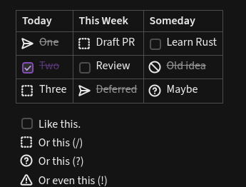
Whatever the theme, the status character is always preserved in your Markdown — only the rendered glyph depends on the theme.
Usage
Write a table whose cells contain tasks:
| Today       | This Week      | Someday          |
| :---------- | :------------- | :--------------- |
| - [>] One   | - [/] Draft PR | - [ ] Learn Rust |
| - [x] Two   | - [ ] Review   | - [-] Old idea   |
| - [/] Three | - [>] Deferred | - [?] Maybe      |
Each - [ ] becomes a clickable checkbox.
Setting a status
Every status beyond a plain done/to-do toggle lives on the right-click — on both surfaces, so nothing is hidden behind a hotkey or command palette entry:
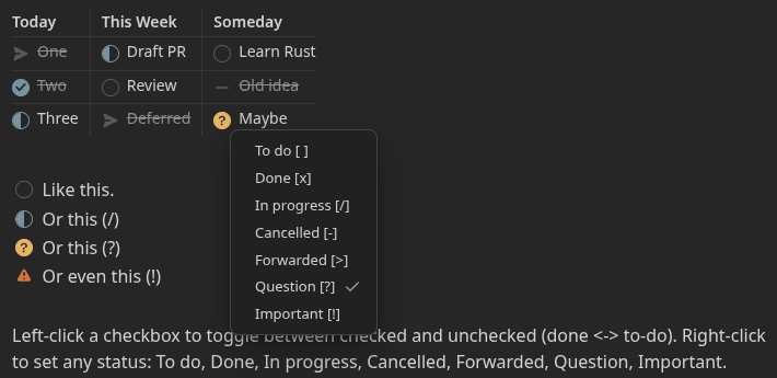
- Reading view — left-click a checkbox to toggle done ↔ to-do; right-click it to open the status menu and choose any status (
[ ],[x],[/],[-],[>],[?],[!]). - Editor (Live Preview / source) — right-click anywhere on a task line and choose Checkbox choices, then pick a status.
In short: left-click is the quick done/to-do toggle; right-click is how you reach the full status set.
Settings
- Style block-list tasks too — also add the right-click status menu to ordinary (non-table) list tasks in Reading view. On by default.
Development
npm install
npm run dev     # watch build -> main.js
npm run build   # type-check + production bundle
For a live dev loop, symlink this folder into a test vault's plugin directory:
ln -s "$(pwd)" /path/to/TestVault/.obsidian/plugins/flexible-tasks
Then enable Flexible Tasks in the vault's community-plugin settings and use "Reload app without saving" (or the Hot-Reload plugin) after each build.
Contributing
Bug reports, ideas, and pull requests are welcome — see CONTRIBUTING.md for the dev loop, the UAT plan, and the defer-to-theme architecture to keep in mind.
License
GPL-2.0-only. See LICENSE.