
README file from
GithubCustom Badges
Introduction
A light-weight plugin for displaying inline "badges" in Obsidian.md, with support for user-defined badge types, icons and colors.
Forked from gapmiss/badges (MIT). Custom Badges is an independent plugin and is not affiliated with the original.
Installation
Via BRAT (early access):
- Install the BRAT plugin
- BRAT settings > Add Beta Plugin
- Enter
AbbaraS/custom-badges
Manually:
- download
main.js,manifest.json&styles.cssfrom the latest release - create a new folder
/path/to/vault/.obsidian/plugins/custom-badges - move all 3 files into that folder
- Settings > Community plugins > reload Installed plugins
- enable plugin
Commands
Insert badge — opens a fuzzy-search picker listing every badge defined in settings, each with its icon. Choosing one inserts the badge at the cursor. If text is selected when you run the command, that text becomes the badge value; otherwise the badge gets a placeholder (see Settings).
Bind it to a hotkey under Settings > Hotkeys, or run it from the command palette.
Settings
All badge types live in Settings > Custom Badges. New installs start with five defaults — note, info, success, warning and error — which you can edit or delete like any badge you add yourself. Deleted defaults can be brought back with Restore default badges.
Each badge has:
| field | details |
|---|---|
| Key | what you type: [!!key:text] |
| Label | text shown for the shorthand [!!key] |
| Icon | a Lucide icon name, e.g. smile-plus |
| Colour | #hex, R,G,B, rgb(…) or a CSS variable such as var(--color-red-rgb) |
| Placeholder | what Insert badge puts in the badge when nothing is selected: empty, the badge's label, or custom text. "Default" uses the global Default placeholder setting. |
[!NOTE] Upgrading from 1.1.x: your existing custom badges are kept and added after the defaults. The old list of ~90 built-in types has been removed. Notes that use one of them still render, using the key as the icon name and label, but without the old colour. Add the key in settings to give it a colour again.
Usage
default syntax
`[!!KEY:VAL]`
| syntax | details |
|---|---|
KEY |
the type and name of the ICON |
VAL |
the value and text displayed |
shorthand syntax
For badges defined in settings, you can omit the value and colon:
`[!!KEY]`
For example, [!!success] displays as "Success" with a checkmark icon. For a key that isn't in settings, the key itself is shown, e.g. [!!rocket] displays as "Rocket".
[!TIP] In addition to the badges in settings, you can use any Lucide icon name as the
KEY. For example:[!!rocket:launched]or[!!heart:favorite].
[!IMPORTANT] the
VALcannot contain either the|pipe or the:colon symbols, as they are used as delimiters for the custom syntax. See Usage in tables for using badges inside Markdown tables.
example
`[!!note:note]`
`[!!info:info]`
`[!!success]`
`[!!warning:check this]`
`[!!error:failed]`
`[!!rocket:launched]`
Github
syntax
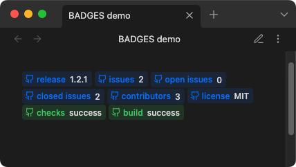
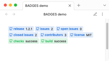
`[!!|GHX>KEY:VAL]`
| syntax | details |
|---|---|
| | | start pipe symbol |
GHX |
Github style, either ghb for the blue style or ghs for the green success style |
> |
greater than symbol (delimiter) |
KEY:VAL |
KEY is the type or label, VAL is the value text displayed. e.g. release:1.0.0 |
example
`[!!|ghb>release:1.2.1]`
`[!!|ghb>issues:2]`
`[!!|ghb>open issues:0]`
`[!!|ghb>closed issues:2]`
`[!!|ghb>contributors:3]`
`[!!|ghb>license:MIT]`
`[!!|ghs>checks:success]`
`[!!|ghs>build:success]`
results
Plain-text
syntax
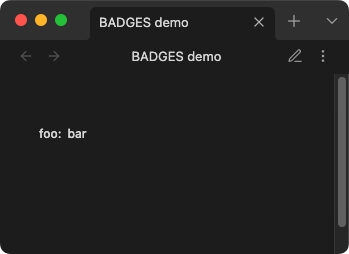
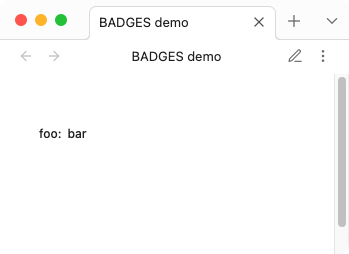
`[!!|KEY:VAL]`
| syntax | details |
|---|---|
| | | start pipe symbol |
KEY:VAL |
KEY is the type, VAL is the value |
example
`[!!|foo:bar]`
results
custom
syntax
`[!!|ICON|KEY:VAL|COLOR-RGB]`
| syntax | details |
|---|---|
| | | start pipe symbol |
ICON |
Lucide icon name. e.g. dice or lucide-dice |
| | | pipe symbol |
KEY:VAL |
KEY is the type or label, VAL is the value text displayed. e.g. release:1.0.0 |
| | | pipe symbol |
COLOR-RGB (optional, defaults to currentColor) |
3 (R.G.B.) numeric (0-255) values, separated by commas. e.g. 144,144,144 or CSS variable e.g. var(--color-red-rgb) |
[!NOTE] The
KEYis used for the aria-label (accessibility) and is not displayed visually. Only theVALtext is shown. To display a label, include it in theVAL:`[!!|tag|release:Release 1.2.1]`or simply:
`[!!|tag|:Release 1.2.1]`
[!IMPORTANT] Custom syntax requires actual Lucide icon names (e.g.,
pen-tool,message-square). Badge keys from settings likenoteorsuccessonly work with standard syntax. For example, use[!!|pencil|note:text|color]not[!!|note|note:text|color].
example
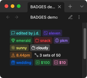
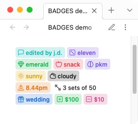
`[!!|message-square|comment:edited by j.d.|var(--color-cyan-rgb)]`
`[!!|dice|roll:eleven|120,82,238]`
`[!!|gem|mineral:emerald|var(--my-custom-rgb)]`
`[!!|apple|fruit:snack|var(--color-red-rgb)]`
`[!!|brain|brain:pkm|var(--color-purple-rgb)]`
`[!!|sun|weather:sunny|var(--color-yellow-rgb)]`
`[!!|cloudy|weather:cloudy|var(--mono-rgb-100)]`
`[!!|sunset|weather:8.44pm|var(--color-orange-rgb)]`
`[!!|dumbbell|reps:3 sets of 50|var(--mono-rgb-00)]`
`[!!|gift|event:wedding|var(--color-blue-rgb)]`
`[!!|plus-square|credit:$100|var(--color-green-rgb)]`
`[!!|minus-square|debit:$10|var(--color-pink-rgb)]`
results
Links
Badges can be made clickable by adding a link using the >> syntax.
syntax
`[!!KEY:VAL>>LINK]`
| syntax | details |
|---|---|
>> |
link delimiter |
LINK |
wikilink [[Note]] or external URL https://... |
examples
`[!!info:Documentation>>https://obsidian.md]`
`[!!note:See also>>[[My Note]]]`
`[!!tip:Jump to section>>[[My Note#Heading]]]`
[!NOTE] Links work with all badge types including custom badges.
Usage in tables
When using badges inside Markdown tables, the | pipe character conflicts with the table cell separator. To work around this, use escaped pipes \| instead of | in your badge syntax.
syntax
`[!!\|ICON\|KEY:VAL\|COLOR-RGB]`
example
| Task | Status |
| ---- | ------ |
| Review code | `[!!\|snowflake\|comment:On Hold\|var(--color-cyan-rgb)]` |
| Write docs | `[!!success:Done]` |
[!NOTE] Badges without pipes (e.g.
[!!success:Done]) work in tables without any changes.
CSS
Custom CSS styles can be applied via CSS snippets. All colors and styles can be over-written just the same.
See CSS snippets - Obsidian Help
variables
body {
	/* border */
	--inline-badge-border-color: transparent;
	--inline-badge-border-radius: var(--radius-s);
	--inline-badge-border: 1px solid var(--inline-badge-border-color);
	/* example custom color */
	--my-custom-rgb: var(--color-green-rgb);
}
/* example CSS customization */
.inline-badge[data-inline-badge^="vault"] {
	--badge-color: var(--my-custom-rgb);
	color: rgba(var(--badge-color), .88);
	background-color: rgba(var(--badge-color),.22);
}
Styling plain-text badges by type
Plain-text badges include a data-badge-type attribute containing the KEY value, enabling CSS targeting of specific badge types.
examples
/* Style all "Status" badges */
.inline-badge-extra[data-badge-type="Status"] {
	background-color: rgba(var(--color-green-rgb), .22);
	color: rgba(var(--color-green-rgb), .88);
}

/* Style "Priority" badges differently */
.inline-badge-extra[data-badge-type="Priority"] {
	background-color: rgba(var(--color-red-rgb), .22);
	color: rgba(var(--color-red-rgb), .88);
}
Dataview
Badges can act similarly to a key-value store(database) for querying via default search or Dataview plugin.
View and copy example dataview queries: badges-dataview
Development
Clone this repo
cd /path/to/vault/.obsidian/plugins
git clone https://github.com/AbbaraS/custom-badges.git
cd badges
Install packages and run
npm i
npm run dev
Enable plugin
- open
Settings→Community plugins - enable the
Badgesplugin.
Notes
Thanks to Markdown Furigana Plugin as an example implementation of Live Preview.
Lucide Icons: https://lucide.dev
Lucide Icons LICENSE: https://lucide.dev/license