
README file from
Github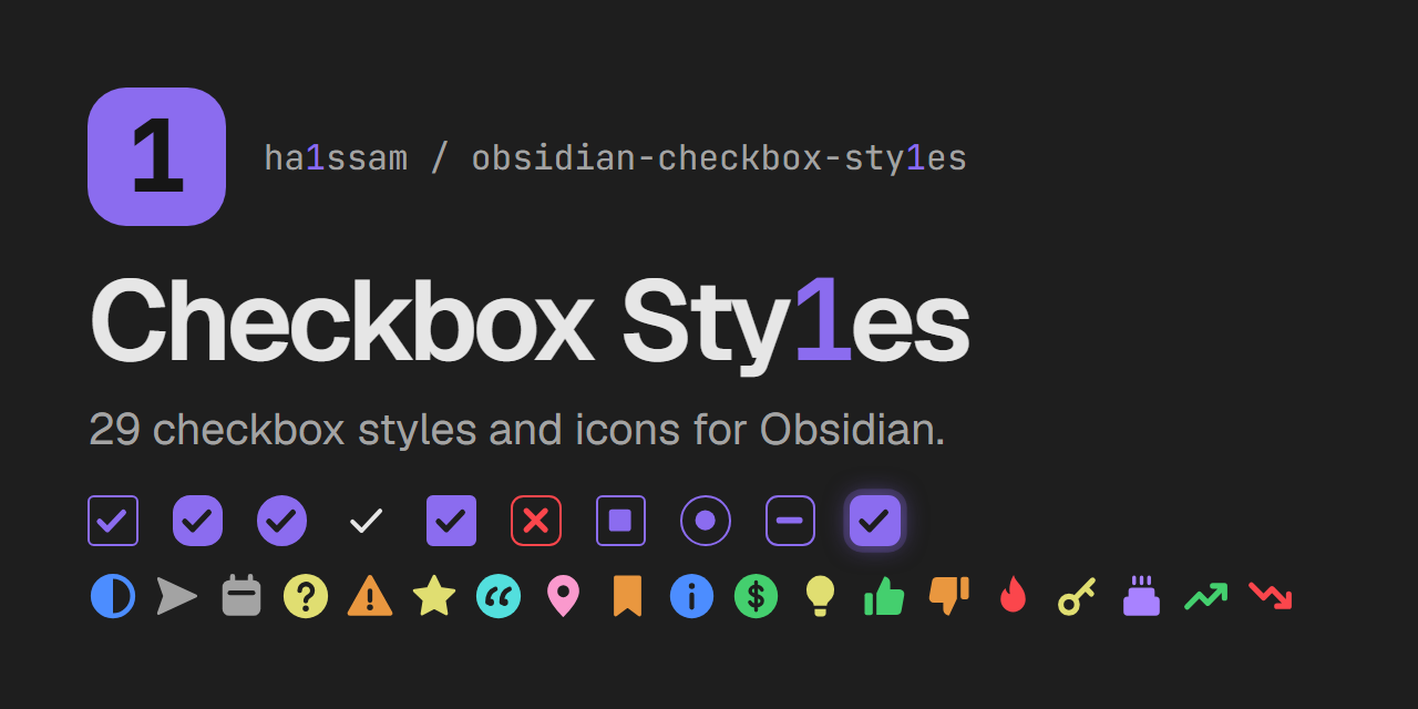
Checkbox Sty1es
Pick a visual style for each task checkbox in Obsidian. Clicking an unchecked task opens a menu with 29 styles: ten checkbox shapes and 19 colored icons. Each style changes how the checkbox looks and can apply a matching effect to the task text.
Checkbox shapes
| Style | Text effect | Written to the note |
|---|---|---|
| Classic | strikethrough | - [c] |
| Rounded | muted | - [r] |
| Circle | accent color | - [o] |
| Minimal | faint | - [m] |
| Filled | bold | - [f] |
| Cross | red strikethrough (cancelled) | - [-] |
| Square | underline | - [s] |
| Dot | italic (in progress) | - [.] |
| Dash | dashed underline (postponed) | - [~] |
| Glow | glowing text | - [g] |
Icons
Icon styles replace the checkbox with a colored icon. Most leave the text as it is.
| Style | Text effect | Written to the note |
|---|---|---|
| In progress | none | - [/] |
| Forwarded | muted | - [>] |
| Scheduled | muted | - [<] |
| Question | none | - [?] |
| Important | bold | - [!] |
| Star | none | - [*] |
| Quote | italic | - ["] |
| Location | none | - [l] |
| Bookmark | none | - [b] |
| Info | none | - [i] |
| Savings | none | - [S] |
| Idea | none | - [I] |
| Pro | none | - [p] |
| Con | none | - [C] |
| Fire | none | - [F] |
| Key | none | - [k] |
| Win | none | - [w] |
| Up | none | - [u] |
| Down | none | - [d] |
How it works
- The chosen style is stored as the character between the brackets, so tasks stay plain Markdown tasks. Nothing else in the note is changed.
- One mouse button opens the style menu and the other checks and unchecks the task. You choose which is which in the settings.
- Checking a task with the other button writes a plain
[x], shown in the default style chosen in the settings. Unchecked tasks use that style too. - Colors come from the current theme's variables, so the styles follow light and dark themes.
Uncheck all tasks
The uncheck-all action unchecks every task in the open note. Use it again right away and the tasks go back to how they were; once you change anything in the note, the saved state is dropped so nothing you edited is overwritten. It is off by default: in the settings you can turn on a button for it at the top of each note, record a keyboard shortcut for it, or both.
Settings
- Menu button — left click or right click opens the style menu; the other button checks and unchecks the task.
- Uncheck-all button — show the uncheck-all button at the top of each note.
- Uncheck-all hotkey — record a keyboard shortcut for unchecking all tasks in the current note.
- Default style — the style applied when you check a task with the other button, and the look of unchecked and
[x]tasks.
Limitations
- Plugins that only treat
[x]as done (for example Tasks or Dataview queries) may not count styled tasks as completed. - Themes that ship their own alternate checkbox icons may override some styles.
- Checkboxes inside embeds, canvas cards and callouts keep the native click behavior.
Development
npm install
npm run build
styles.css is generated from src/styles.base.css and the style registry in src/checkbox-styles.ts. To add a style, add one entry to BOX_STYLES or ICON_STYLES with a unique char.